"SLC21/WK2: Introduction to Logo Design
2 comments
If I talk about logo then it is a visual representation of particular identification of brands which conveys its values, motives and personality with uniqueness .There are most effective logo designs which needs a clear and relevant know how of brand, brand target and about its audience as well as basic design principles which can drive human perception and perspectives.
Key elements of a Logo
Here are some of key elements of logo designing:-
• Logo should be easy to recognize and easy to understand and should have its reproduction in multiple mediums which may include in medium of business cards, digital screens etc.
• A good and creative login is always that which makes a difference of one particular brand with all other brands.
• There should be something different in a logo design to differentiate with other competitors of brands like there should be that key words that are easy to remember as well as that are interesting.
• Logo should always made in such a way that it may be a reflection of brand values, quality and a creative slogan of brand.
• Logo should have a good color combination because it can add attractiveness by evoking emotions in people.
• Last but not least,there should always be legibility throughout a logo design.
Logo design type
• Word mark is a logo design type in which text based logos are used like Google, Facebook etc.
• Letterforms are those logo designs which have initial based logo like McDonald's.
• Iconic logo designs are logos made on specifying different symbols like for iphone Apple 🍎 is a symbol.
• Combination mark logo is a type of logo design which include combining of icon text such as Burger King etc.
Definitely,there's a great role and impact of a logo at a brand because logo always acts as expression or face of a particular brand so for establishment of recognition of a particular logo,for developing and building trust and to drive engagement of customer logo design is really impactful and important.
Below is a brief explanation of roles of logo;
• Logo is a helpful way to make a difference of particular brand with other brands that are competitors.
• Logo are helpful in facilitating customers recognition and their memory.
• Logos create an emotional and attractive bond with customers.
• Logos are self communicating in terms of conveying values, personality and motives of brand.
Impact of a logo on a brand
• In positive impacts logo can play a role in increasing awareness on a particular brand regarding brand recognitions.
• In positive impact good logo is helpful in enhancing overall image of brand which foster trust.
• In positive impact it may differentiate a brand as well as promote growth of a particular business and brand.
• In negative effects,if logo is not attractive and clear then it creates a poor image of particular brand.
• If there's lack of recognition of any brand then brand will fail to establish properly.
• Poor logo will cause confusion with brand values , recognition and personality and will make brand and business down.
Which things should be included in a logo designs or what are do's and which things should not be included in a logo design and what are don'ts I am going to discuss here with some pictorial demonstrations.
DO's and Don'ts
• You should keep it simple (Do's)and there should not be too much explanation about brand in a logo design (Don'ts)
Point 1 about simplicity and complexity
Good(Do's) :
• A simple logo which is unique and related to brand.
• Brand recognition with name.
• Little creative description in hardly one line.
 | Simplicity in design |
|---|
Bad(Don'ts):
• Any logo which is similar to other brands and there's no creativity.
• Brand recognition very similar to other brands.
• Too much brand description.
• Too much complexity by including range of elements.
Point 2 about scalability and intricate details in a logo
• Scalability in a logo design defined as clearity and legibility and lack of intricate information or details.
 | Legibility (✅) Intricate information (❌) |
|---|
Good(Do's):
• If there is legibility and clearity in written text.
Bad:
• If there is intricate information or details.
Point 3 is about uniqueness or casualty
Good(Do's):
• If there is any differentiating element from other brands.
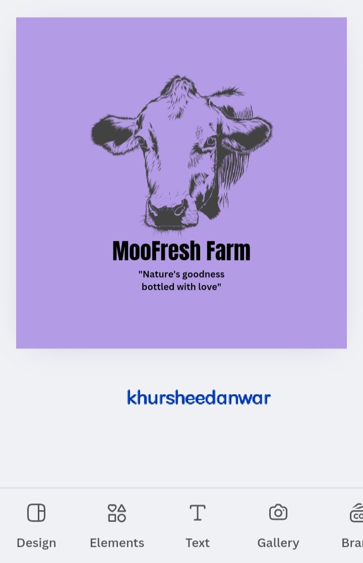
• For example Here is a unique cow face 🐮 logo for dairy farm business.
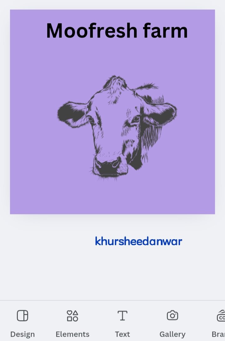 | Cow face unique logo |
|---|
Bad(Don'ts):
• If there is not any differentiating element from other brands.
• For example here is a casual milk 🥛 logo for dairy farm.
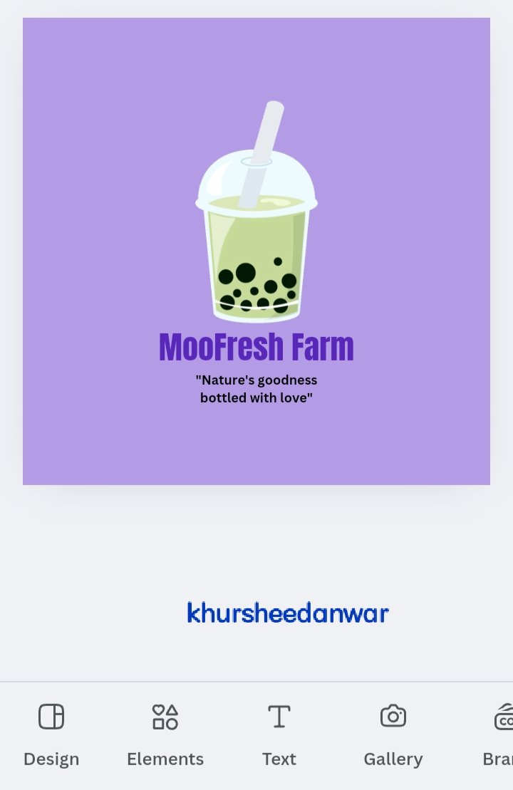 | Milk glass casual logo |
|---|
Point 4 is relevance or irrelevance
Good(Do's):
• If logo,text and description in logo design is relevant.
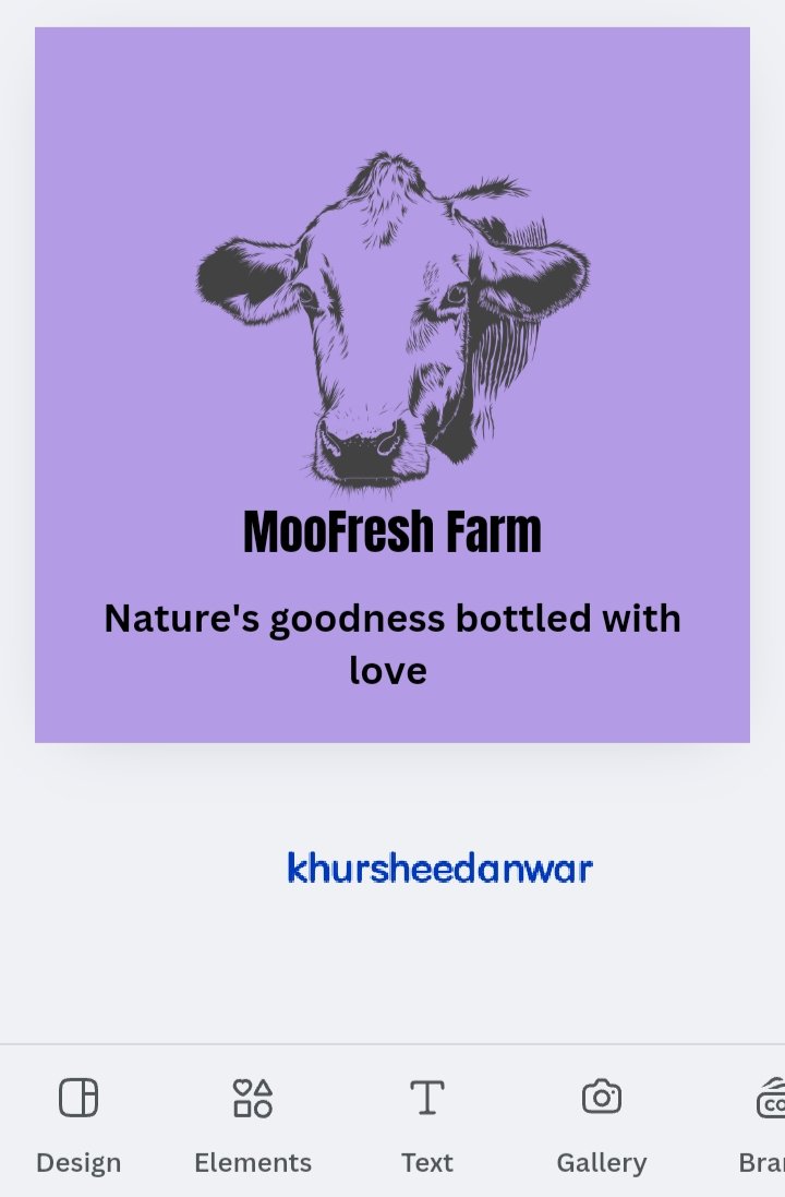
For example;Nature's goodness bottled with love is description for dairy farm business logo design.
 | Relevant information in design |
|---|
Bad(Don'ts):
• If logo,text and description in logo design is irreleVance
For example;Stay sound with nature is description for dairy farm business logo design.
Point 5 is color consideration or not
 | Lavender and dark purple contrast |
|---|
Good(Do's):
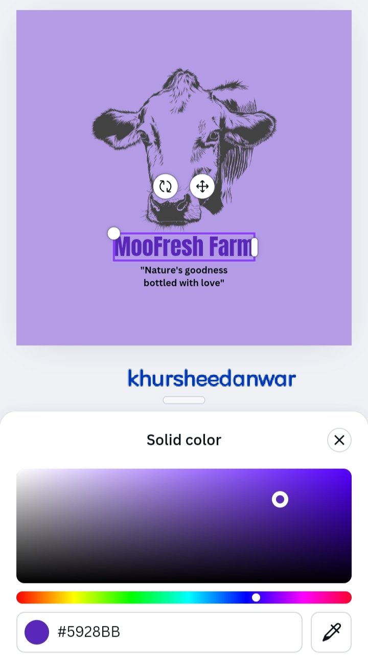
• If you have followed color theory by choosing proper colors.
For example;If lavendar have contrast with dark purple.
Bad(Don'ts):
• If you have not followed color theory by choosing proper colors.
For example;If lavendar have contrast with red.
Point 6 is font size consideration or not
Good(Do's):
• If brand name or brand recognition font size is enlarged than brand general description.
 | Brand name is greater than description |
|---|
• MooFresh Farm is brand name which is greater than description.
Bad(Don'ts):
• If brand name or brand recognition font size is smaller and not prominent than brand general description
 | Brand description font size enlarged |
|---|
Point 7 is aligned or not
Good(Do's):
• If all elements are properly aligned.
For example;Here all elements are centralized and equally or properly spaced.
 | Alignment (✅) |
|---|
Bad(Don'ts):
• If all elements are not properly aligned.
For example;Here all elements are randomly distributed and not equally or properly spaced.
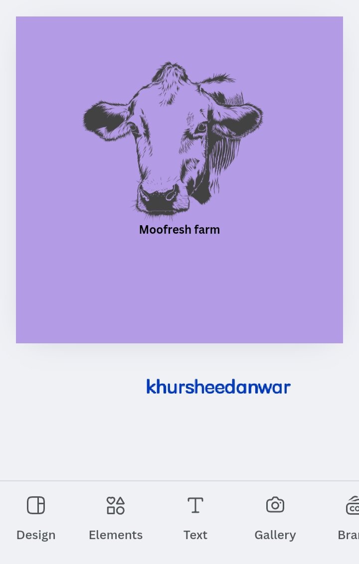 | Alignment (❌) |
|---|
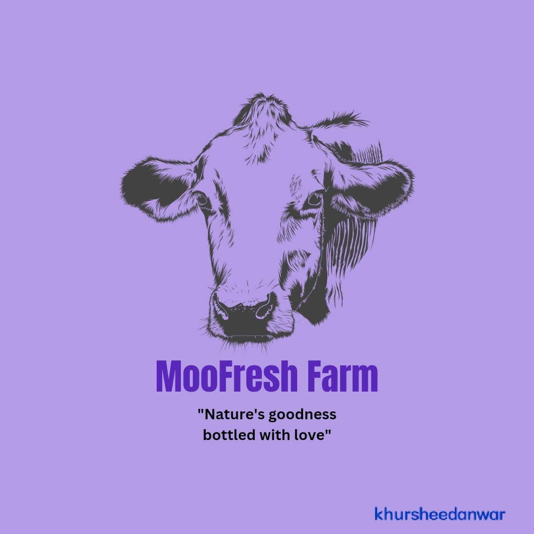
• For making this design first of all I imagine that there is a person who wants to design a logo for his dairy farm.
• I imagine that upon asking from that person about his brand name and brief description he told me that his brand name is MooFresh Farm and description is Nature's goodness bottled with love.
 |  |  |
|---|
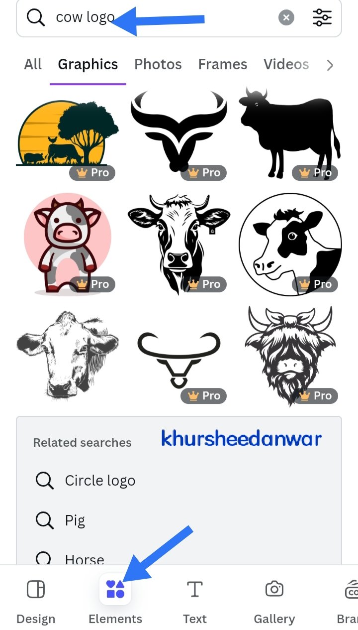
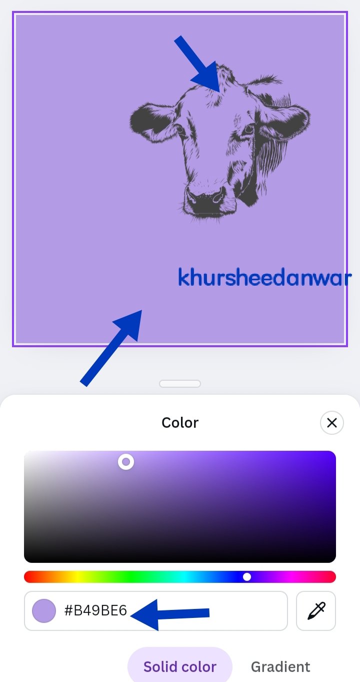
• First of all I open canva app and I search for Instagram size post.
• After that I locate elements option and then I searched for cow creative logo.
• After selecting logo I add it to page and you can see that this is a unit logo I have selected which is most important thing when you design a logo.
• After that I take care of font size of brand name that it should be written boldly and clearly so that I may maintain legibility and scalability throughout my logo design.

• After that I wrote little description of brand name and below brand name I write Nature's goodness bottled with love.
• I keep font size of brand description little them brand name.
• Then I choosed colour combinations wisely by focusing on colour theory. You can see in my final design that I choose like purple and dark purple because they get mixed with each other properly according to color theory.
• Now this is final design you can see in the picture in which I choosed black colour for description of brand because logo is also in black.
• At last, I watermarked this design with my username @khursheedanwar so that I may prevent my design from intellectual theft.
I want to invite @kouba01,@stef1,@patjewell,@wilmer1988,@steemdoctor1
Comments