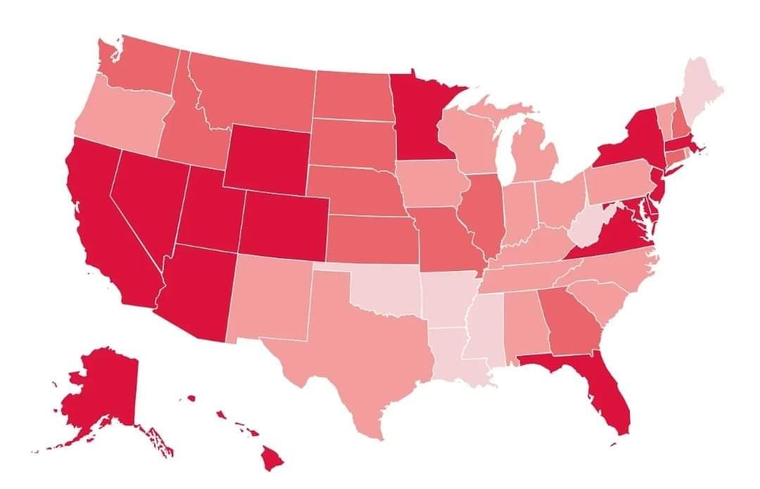
Nate Silver had this map in his latest post.
3 comments

It is really dumb when you actually look into it.
The map purports to show cumulative inflation since January 2021. But what it is actually showing is "additional costs", rather than percentage. So much of this is just rich versus poor states.
If you just go by percentage instead. The range is only ~18-22% cumulative inflation. So states have had fairly similar inflation.
The methodology is a bit weird too, so I don't really put much stock in it. Since the official data is only down to the census region, they apply the census region to each state. But I think it makes the region outliers look worse than they probably are in that regard. And they only look at a few spending categories.
Anyways I don't think there is a there there. States have had fairly similar inflation.
Comments