SLC | S21W2 | Introduction to Logo Design
6 comments
Assalamu Alaikum Wa Rahmatullahi everyone is well, I am well by the grace of Alhamdulillah. I came up with a new article that is basically a blog about design. It is a platform where the authorities have organized a beautiful competition of information.
I now want to participate in a contest related to logo design. Which is very nicely posted by @lhorgic brother, I invite some of my friends to start writing. @suboohi, @ninapenda @wilmer1988
The logo is an important thing, which is clearly understood by the logo of a platform or any or any organization. People think of making logos only when people want to express something in front of people. There is also a big difference between posters and logos. This logo is placed in every place every day and named in shopping malls or any organization.
Someone does this logo for their own business and someone does it for their personal shopping mall, for their own shop or a personal website or online shopping mall. Also, the logos of that organization or any shopping mall or personal business focus very seriously in front of the people. These designs can't make normal people that easy.
To do this, first of all, we must focus on that design, train, or learn through a video bus. This logo has to be made in such a way that the branding name is clearly shaped, As well as shortcuts, some writing and designs can make more beauty to the logo. Here is some of the discussion I have about the logo.
Everything has a role and the role is never an impact, there is a role, there is an effect and the effect never comes without an introduction. There can be many effects behind the logo. First of all, attraction, attraction is very important. When people and clients increase the attraction of that logo. I will check what is behind the logo, the background will be good. And try to justify it first. Those who will be familiar with the logo in different places, because of that logo, it will provide a great attraction to contact with the background behind that organization or people. And if he sees that the logo design is not good, then how much he will try to check the background.
People can only understand the impact when the role is very beautiful. We can understand the impact when our business improves, the organization improves, people are attracted through this role, then we understand that it is the only logo effect. Besides, respect is very important as well as business and commerce. Also the identity of the person and the branding identity, the producing identity. Everything affects only through the introduction of this logo. Logo rates make each background extremely powerful. And this effect is always increasing by wishing for longevity. The logo design is very beautiful and has clear language that people can clearly refer to. And gain trust and increase interest in background checks.
To create a logo, we have to keep several things in mind, which is a thing to do about creating a logo. Such as monogram logo: This is a type of type of graphic related logo. There is also a single letter logo, it is basically beautifully designed by a letter. There may be a word mark logo, this logo is designed to catch the name of the company. Then there may be the branding mark logo. It's a fairly simple logo designed by some letters and different icons. All these things and what is needed to create the logo are the things that we do the most.
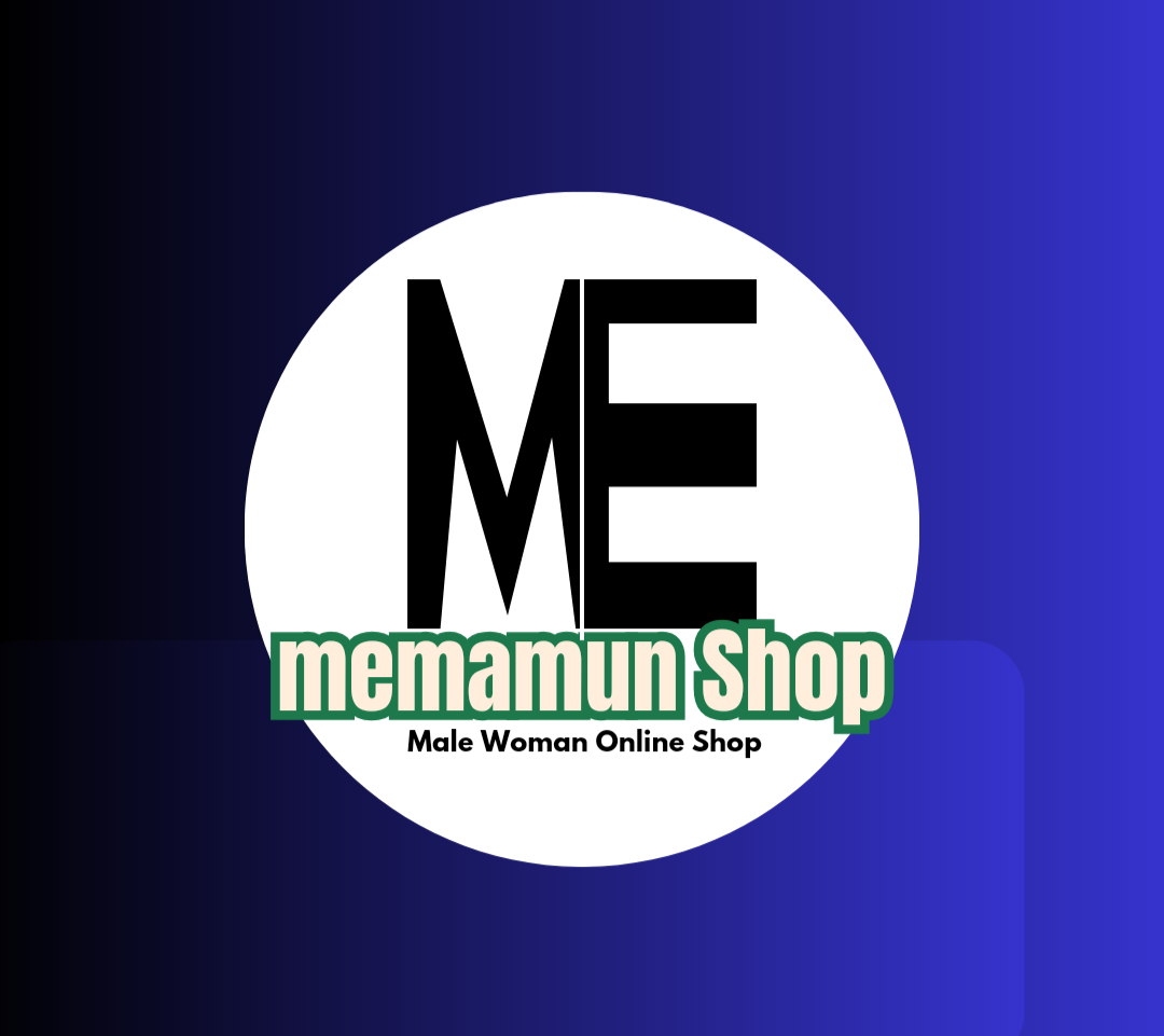
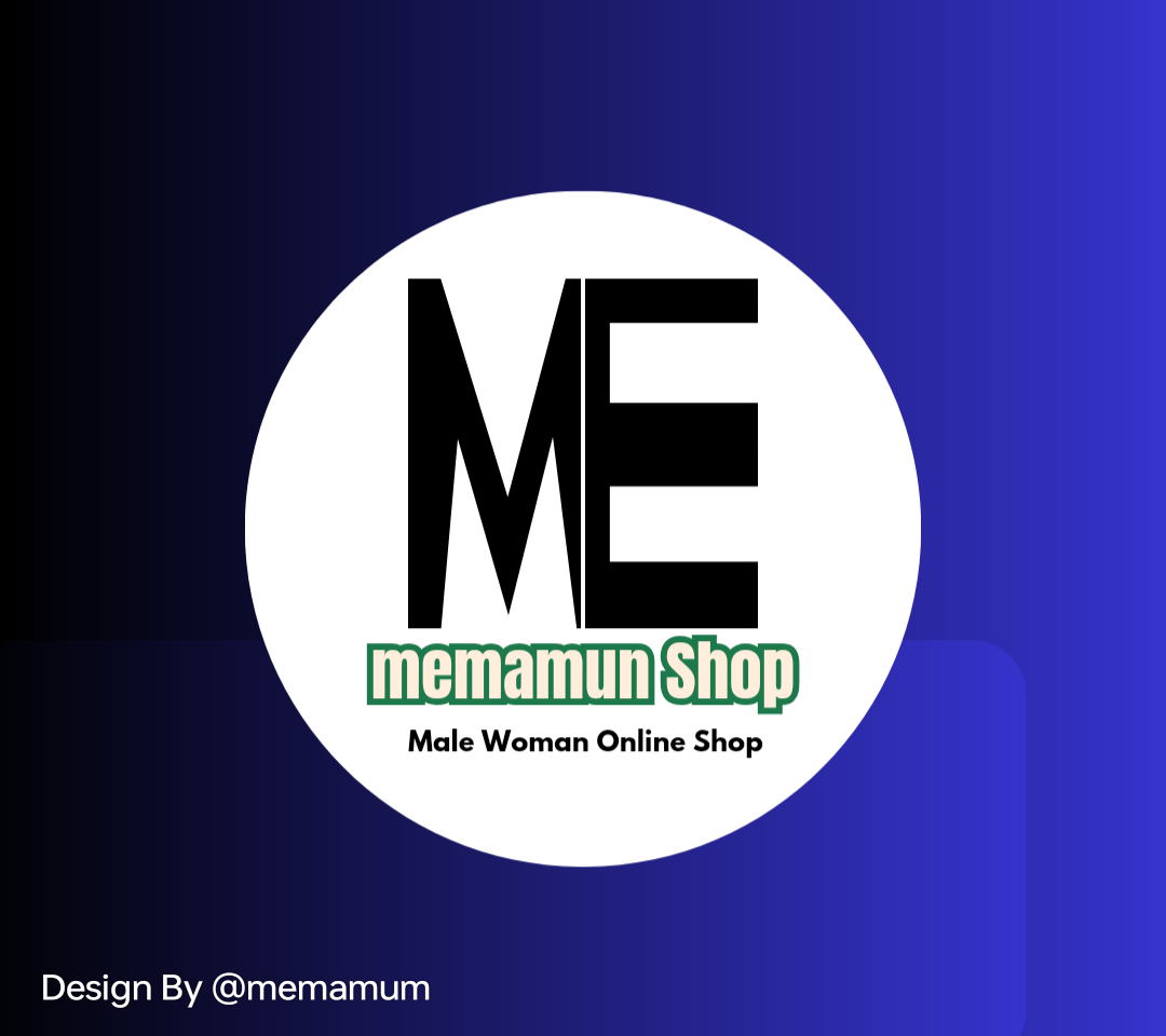
The way I entered a canva beautifully. Then I took it with different icons and cut it out to make the letters first. In addition to the letters. Sleek thick, small large designs by various icons. Then the color combination, keeping the balance right. The vending name is a little bigger and the short pack name is written a little shorter. It is very important to balance everything in a design. As I will present myself I have designed two, From it you can understand which one you liked and what did not like. This is the love and dislike that it basically affects the attraction of people. Excited to see that the name has become very big. The balance was not right. On the other side, I tried to keep the balance in the right place.
 |
|---|
 |
|---|
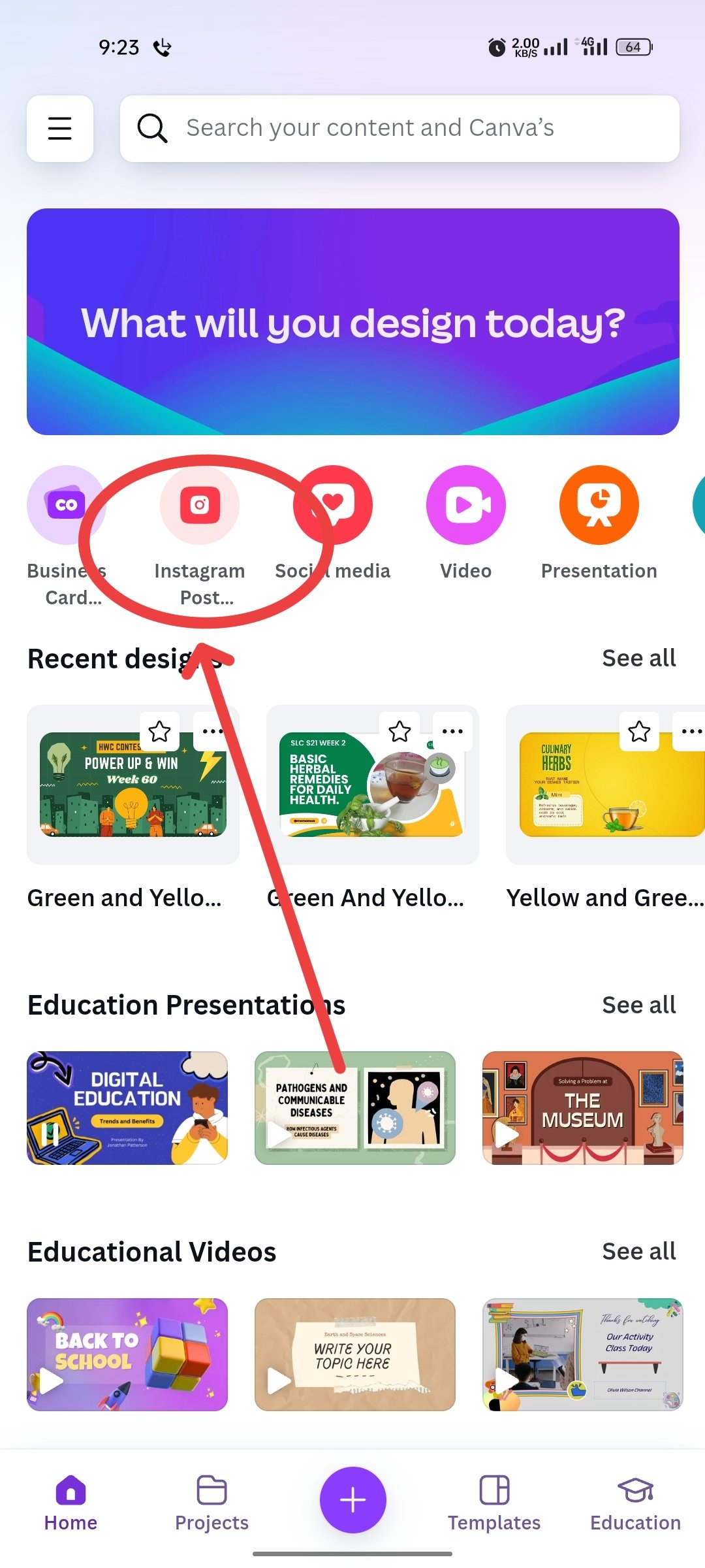
I tried my mobile by a Canv app to design a logo. Then I entered the app on my mobile. Since then I have been presenting step by stay to your country. Let's get started then.
Step 1
 |  |  |
|---|
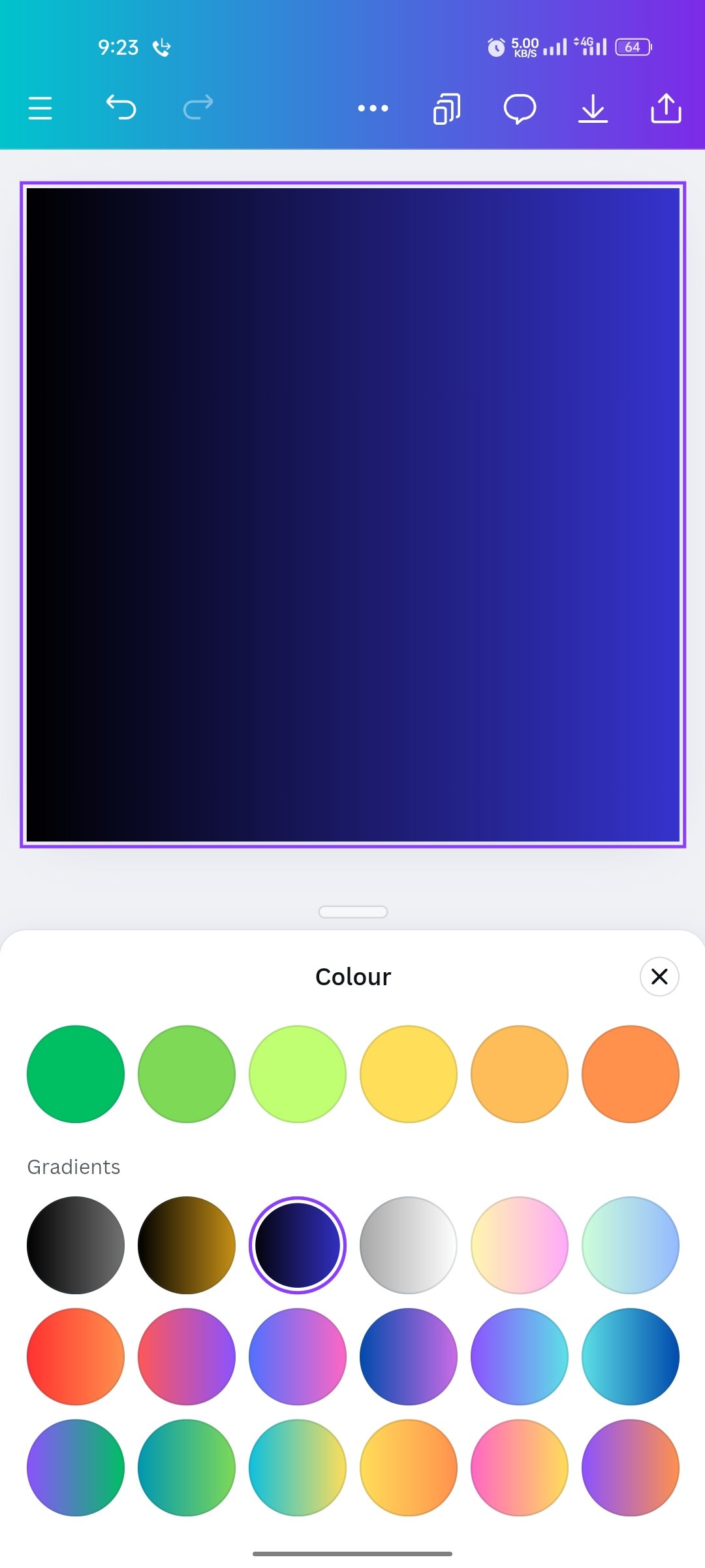
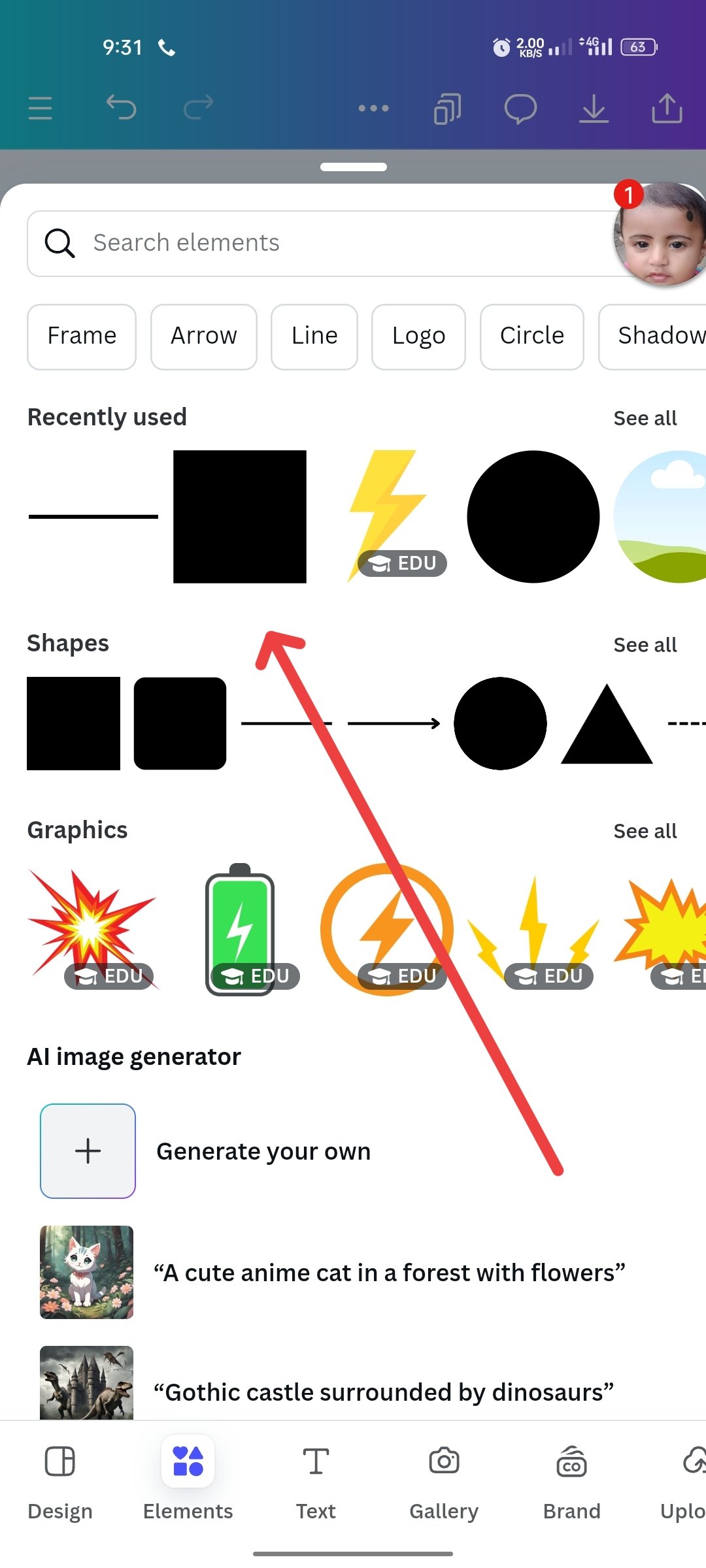
- As you can see, first I set an image of the Instagram post. Then I turned the image into a color. Then I clicked on the element below to add an icon. I clicked the icon that shows the triple sign and took it.
Step 2
 |  |  |
|---|
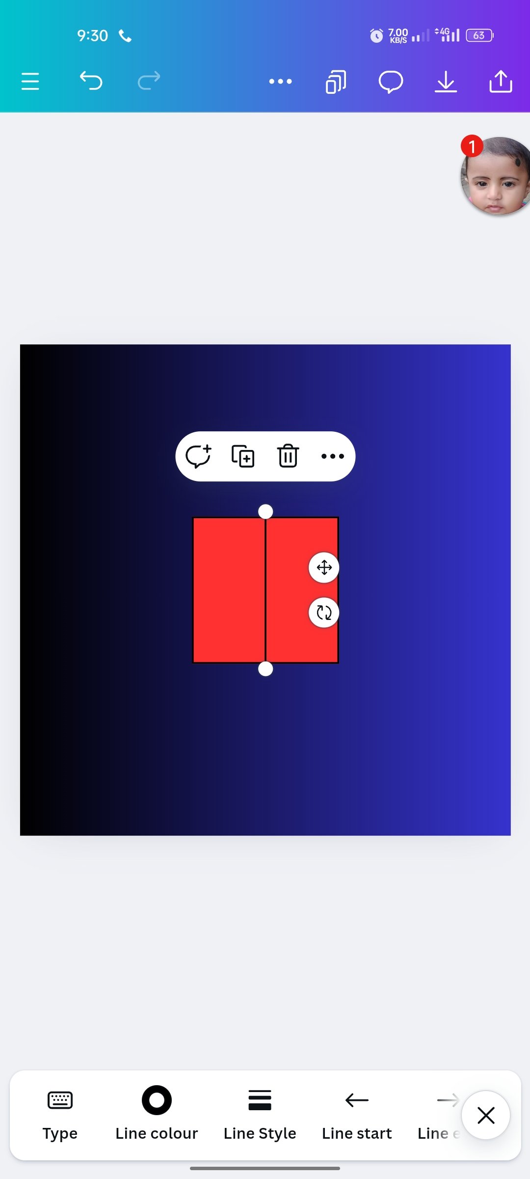
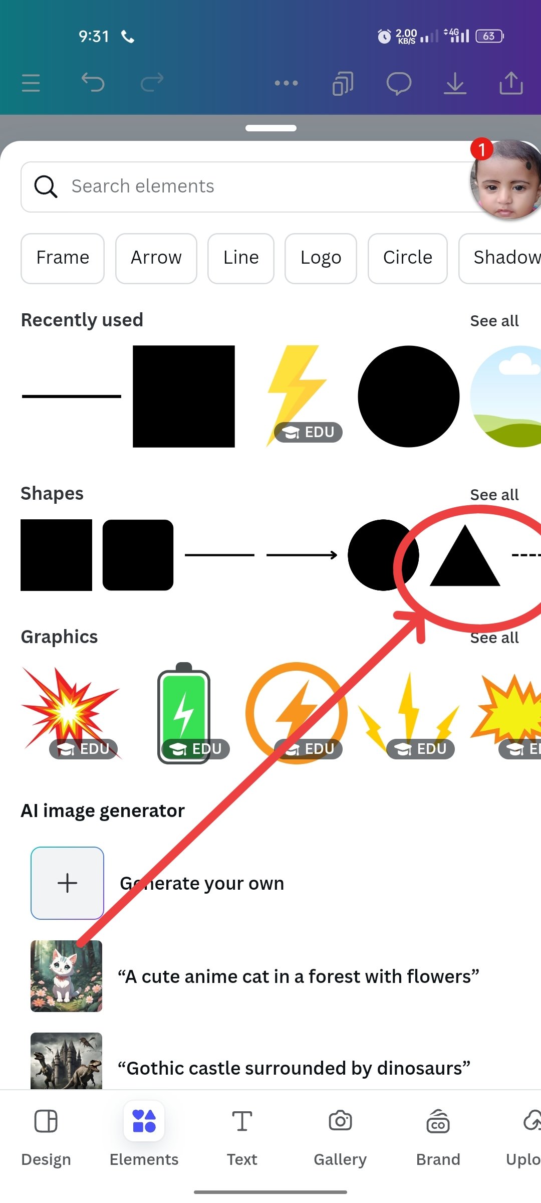
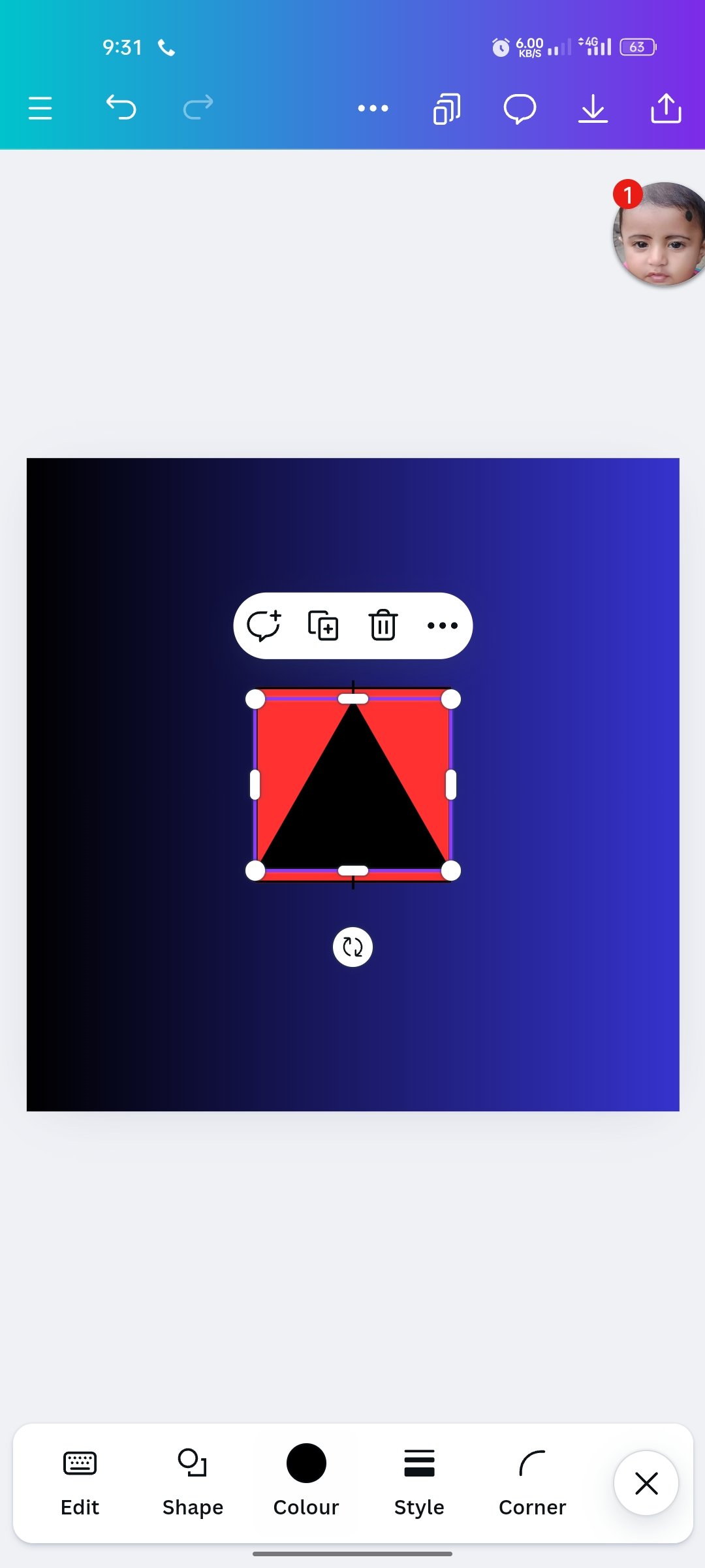
- Then I came up with a stick-like icon and put a scar in the middle. Then I came up with a three-particle icon. And with that I will write an M size letter. I will write "M" on the side of the middle and write "E" on its side, I arranged the icon with a balance.
Step 3
 |  |  |
|---|
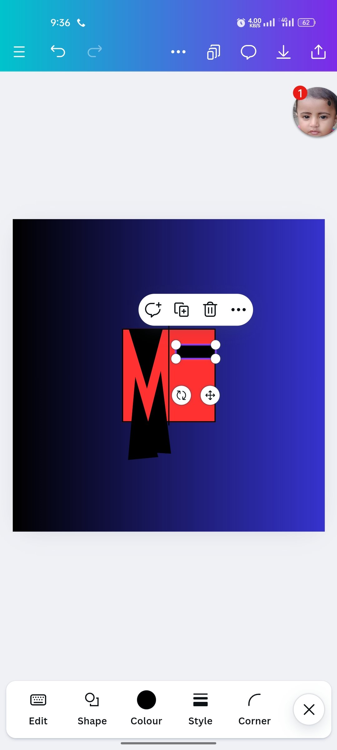
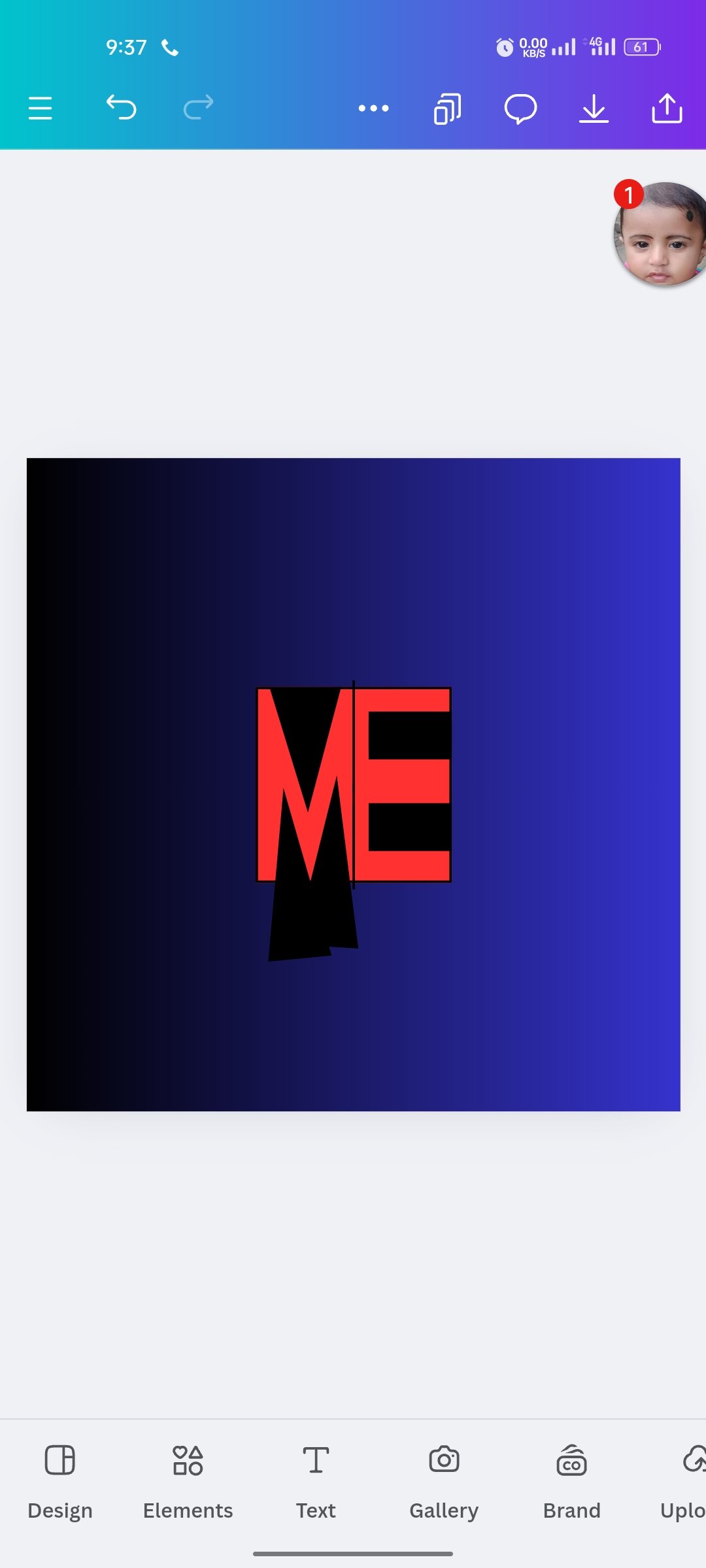
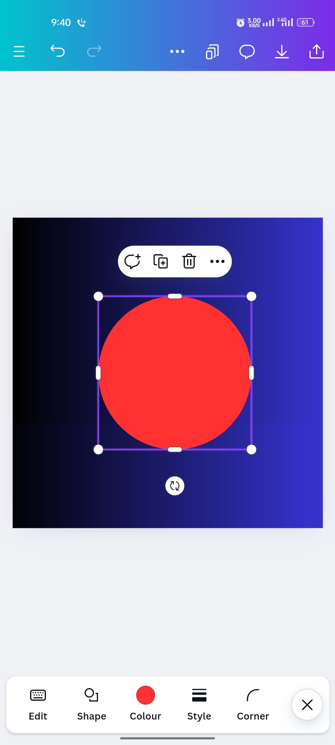
- With that three-cone icon, I took an M size. And I took the E size next to it. What you can see. I brought a round size icon on this article. Then put it on it. Then I'll put it in a circle on the back of my logo.
Step 4
 |  |  |
|---|
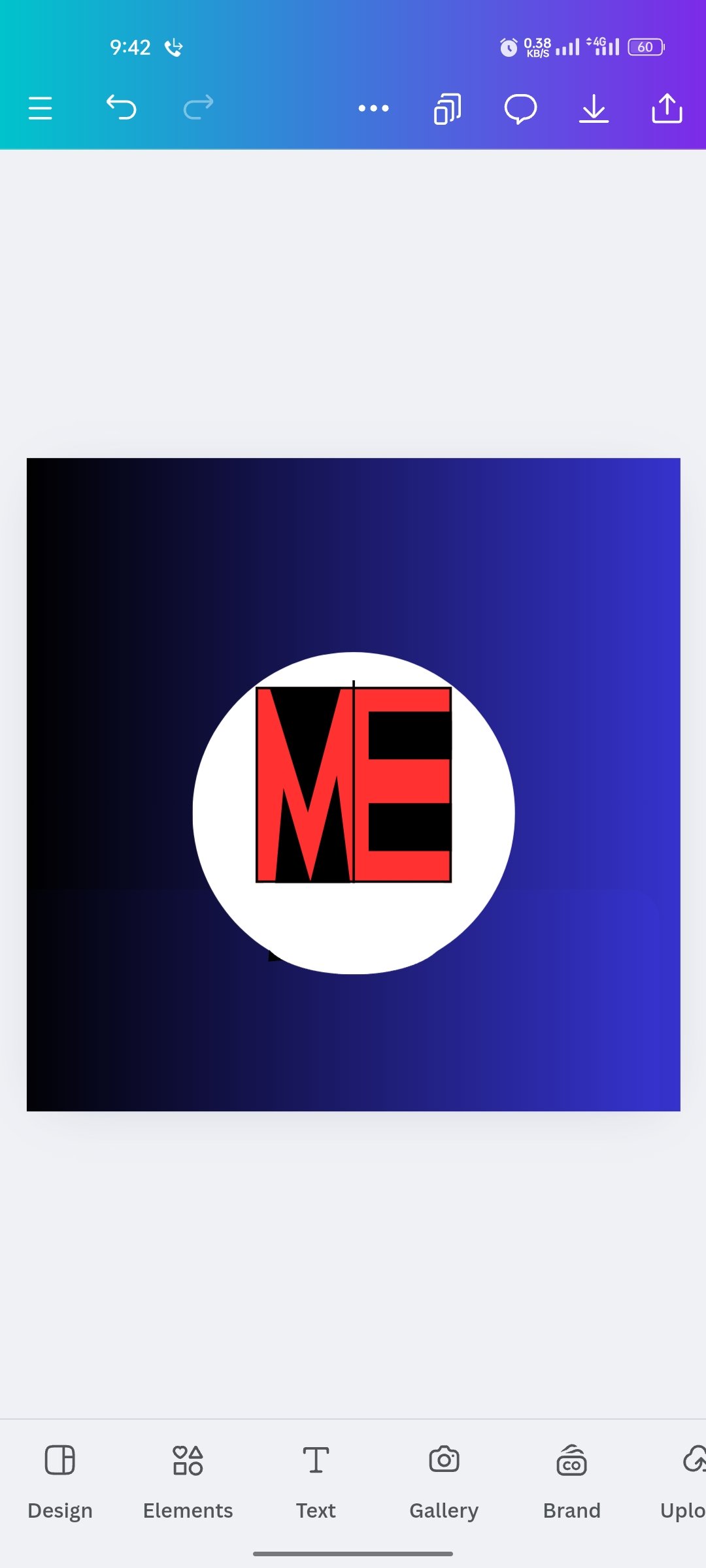
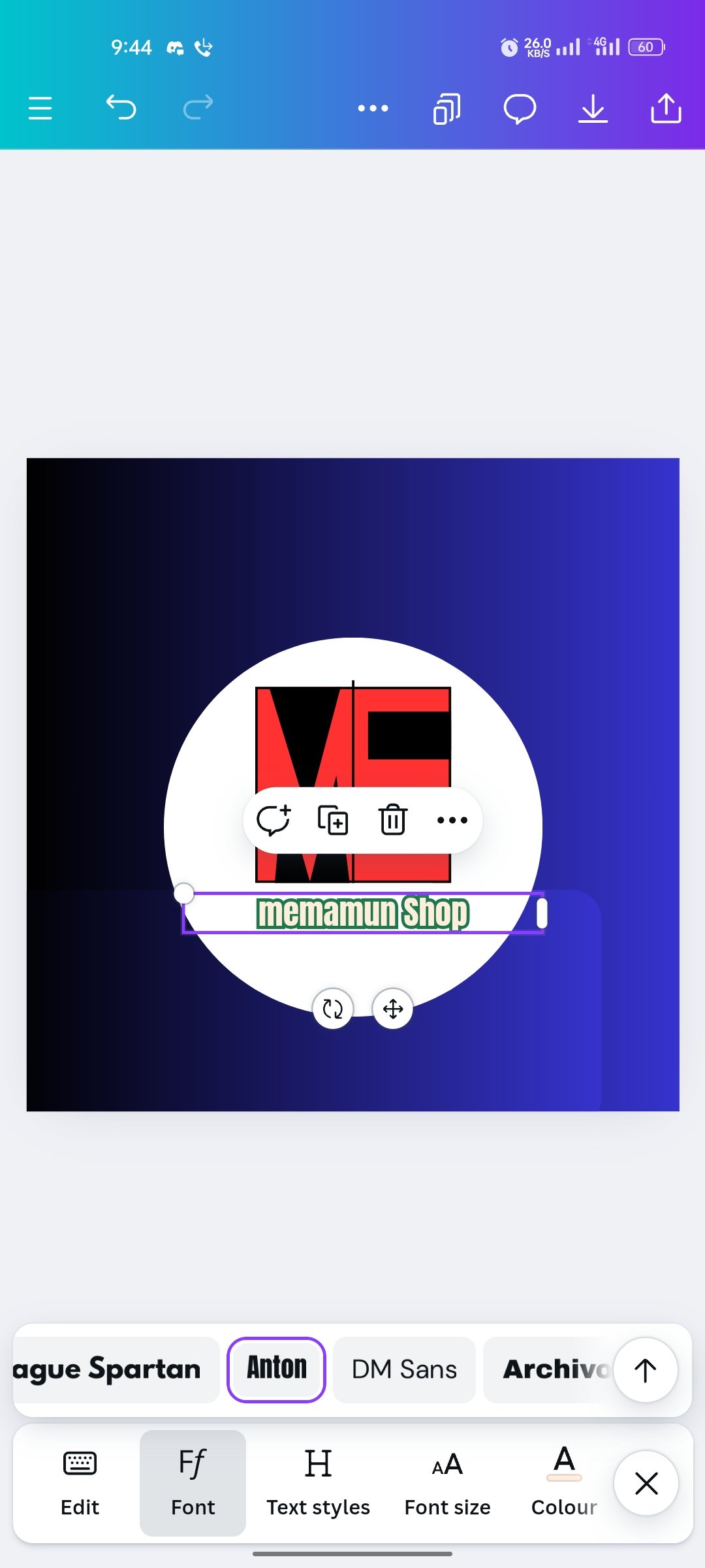
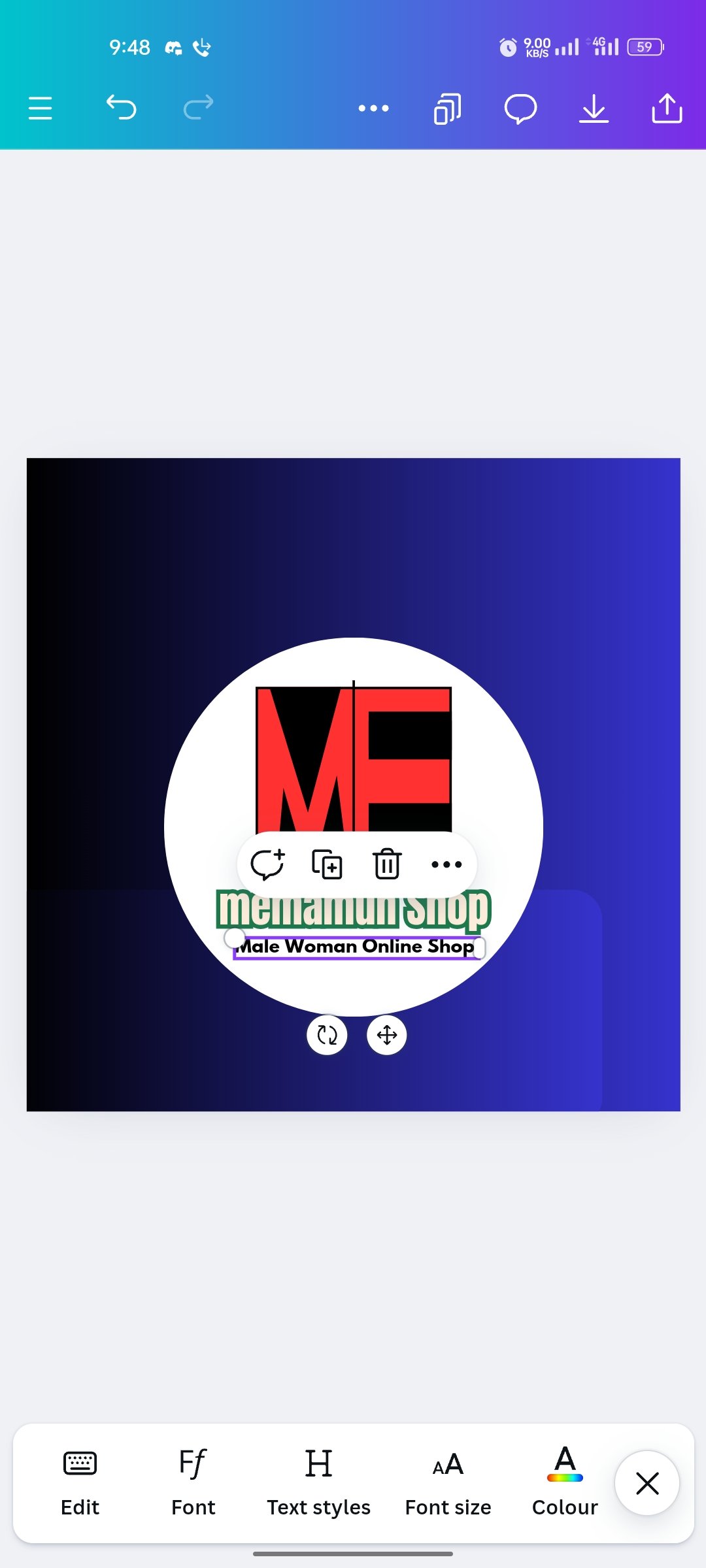
- I left the round icon behind and turned it white. Now my logo has become clear. Now I've capitalized my brand name here, and made it thicker with ANTON font. I also shortened the shortcut name to a balance. I'm going to bring something else to the next stage.
Step 5
 |  |
|---|
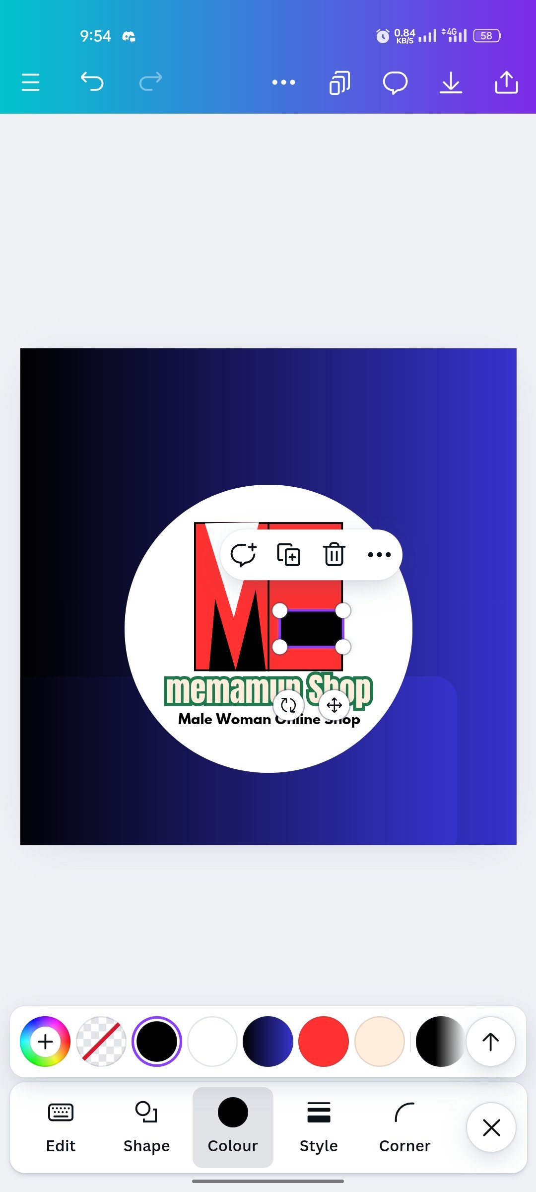
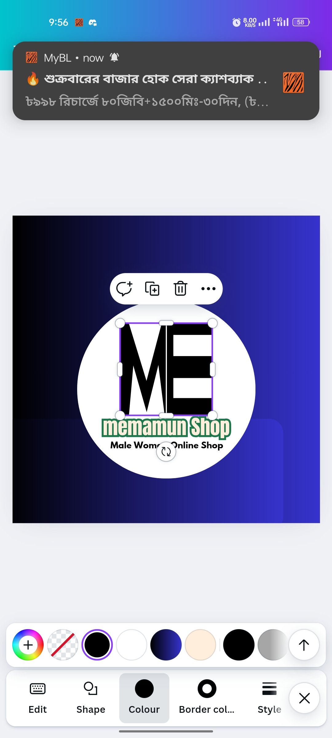
- Then you can see that the black color in my person is white and I will match it with the background in the back, then you can see that the background is white in the back and the letters are clearly shaped. Hey a logo I like and a nice logo for my personal business.

The design of my log is done. I don't know how you liked it, but because I liked it, I gave you a design like this. Also, to my dear sir who has inquired, I know it will not seem very good to him. Because he's a great designer. Since I have written so far, everyone will be fine, healthy. Allah ...
Best Regards
@memamun
Comments