SLC | S21W 3 | Logo Design - Part 2
4 comments
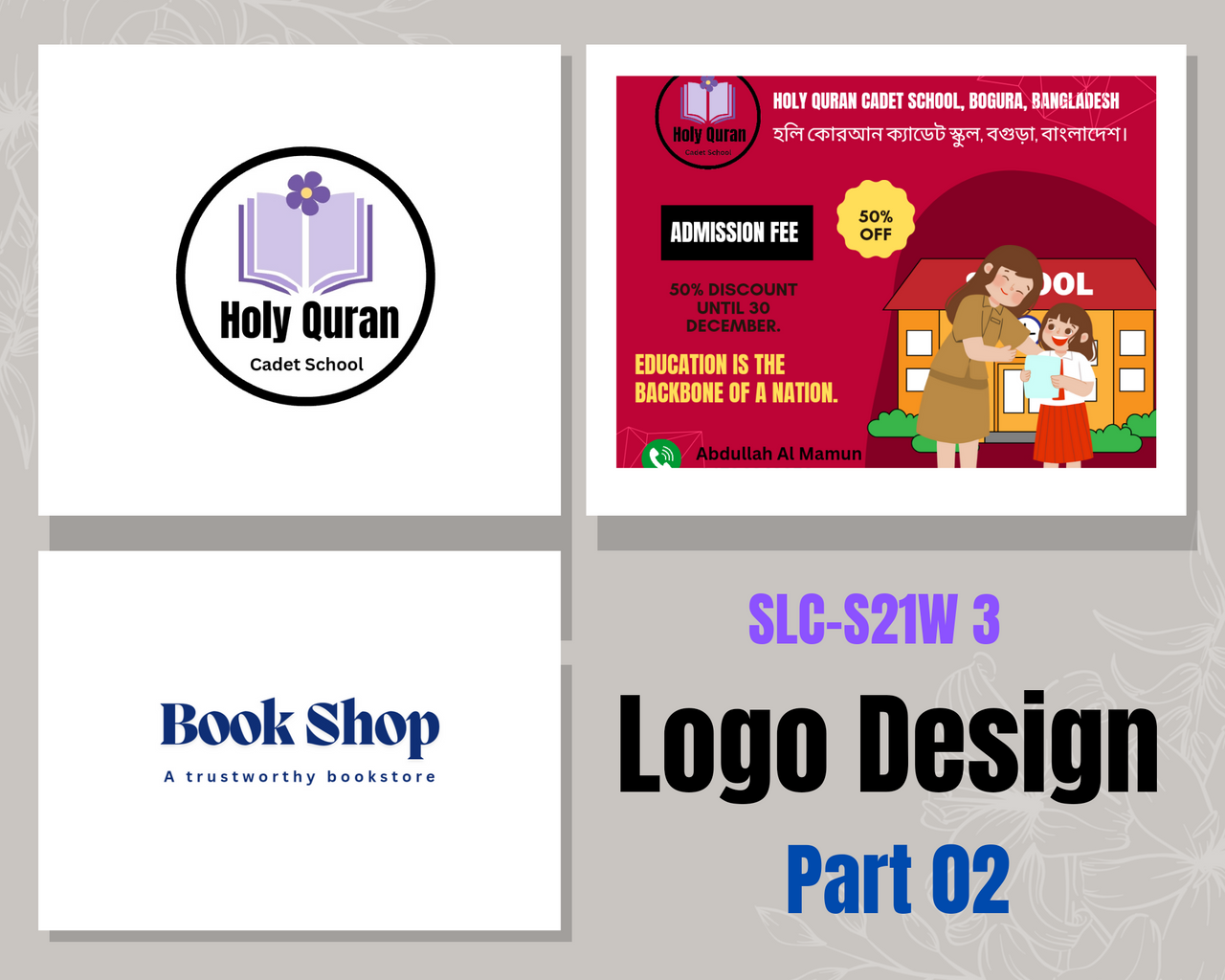
Assalamu Alaikum Wa Rahmatullah, I hope everyone is well, I am also well by the grace of Alhamdulillah. I came to a new article that is an article in the third week of the engagement contest. Here my favorite @lhorgic brother has gained very good skills in graphics design. Anyway, I will try to write in that context, try to present. Before that, I invited some of my friends. They are. @shohana1, @wilmer1988 and @ninapenda.

Here are the types of logos mentioned:–
Wordmark logo: Wordmark logo is a logo that is usually used to create a brand name, this logo does not have any graphics work, only a brand name is usually created in the form of a logo through triography.
- Features:- Which brand name is commonly mentioned. Can be presented simply in different cases.
Monogram logo: This logo is usually highlighted by designing the first letter of the brand's name in the form of graphics.
- Properties:- Instead of the full name of the brand, only the first letter is abbreviated to mark the entire brand.
- Netflix, for example, is simply denoted with N.
BrandMark Logo: This logo is created only by a brand symbol or symbol, such as the Apple company only by the Apple symbol by a bird symbol on Twitter.
- Features:-This type of logo is usually unique for which it is very easy to remember.
Abstract Logo: This logo is usually reflected by an imaginary image of a realistic object, such as a realistic object made with a geometric shape.
- Features: Easy to remember, and unique.
Modernly designed. - This logo should be used when any drinks and sauces are packaged.
Mascot logo:- This logo is commonly used in various restaurants, or realistic everyday activities. This logo is designed through various cartoons, animations.
- Features: Unique design is easily memorable for that reason.
- As the animation image is related to the brand, it has a mixture of emotions, which attracts the customer.
Emblem logo: This logo is designed within a certain range, the logo is usually used for the badges of educational institutions, university schools, etc., logos of various sports products, cars, mobiles, etc.
- Features:- Attractive to look at, so easy to remember. Logos are usually intricate but attractive.
- For example, BMW logo.
Combination Logo: This logo is usually created by adding typography and product images, various symbols. This logo is used for the names of different restaurants, different clothing businesses.
- For example: Burger King is the addition of a burger symbol to the name of this brand along with the typography.
- Features: Attractive to look at and easy to remember.

In this section I will do some exercises about Wordmark logo and emblem logo. Since above I have discussed 7 logos in detail. So here I will create a logo here with the focus of 2 subject to that discussion. I am presenting here step by step.
First, I was ready to get the wordmark logo. I'm presenting it here step by step. Since it is the word brother, the word should be arranged beautifully with the letters. So I'm presenting it step by step.
1st Step
 |  |  |
|---|
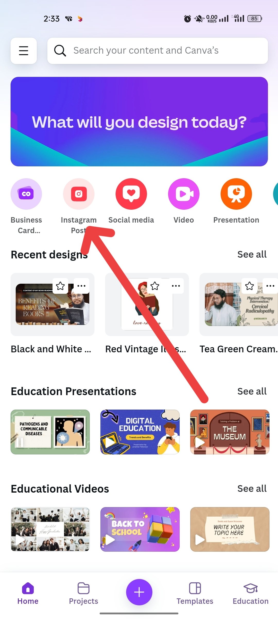
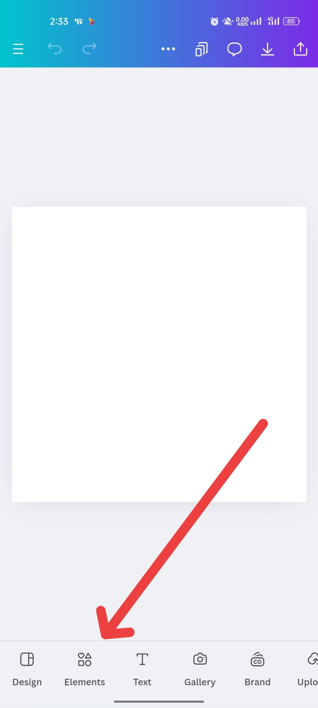
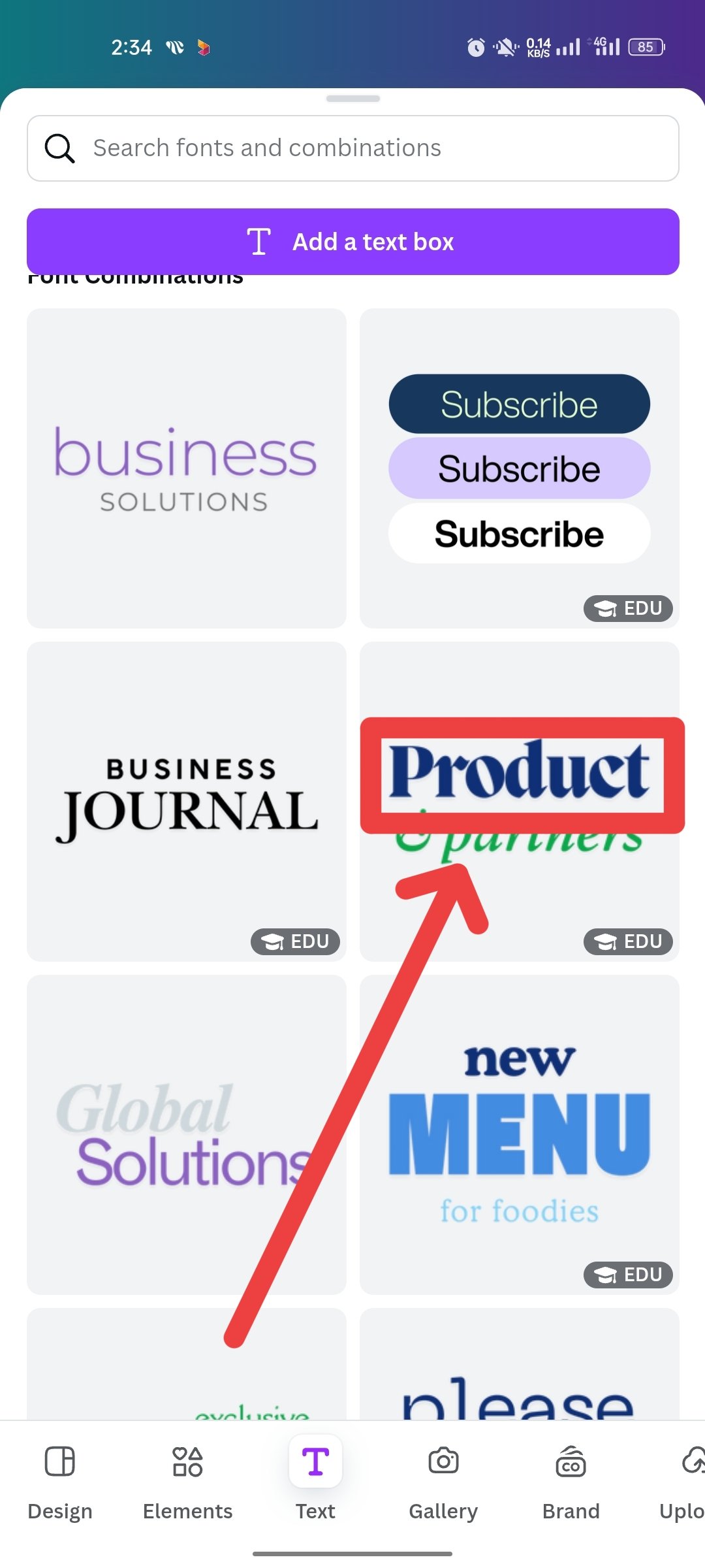
First, after I entered my Canva app, I took an image photo of Instagram. It's basically a size of Instagram. After clicking it, I clicked on the text again, then I took the font that was marked.
2nd Step
 |  |  |
|---|
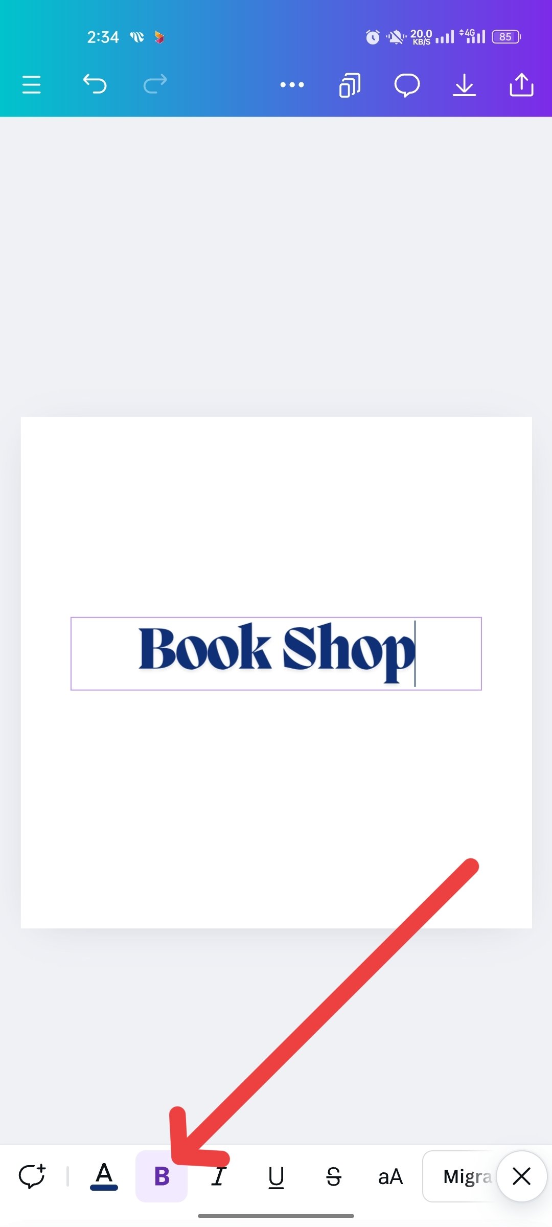
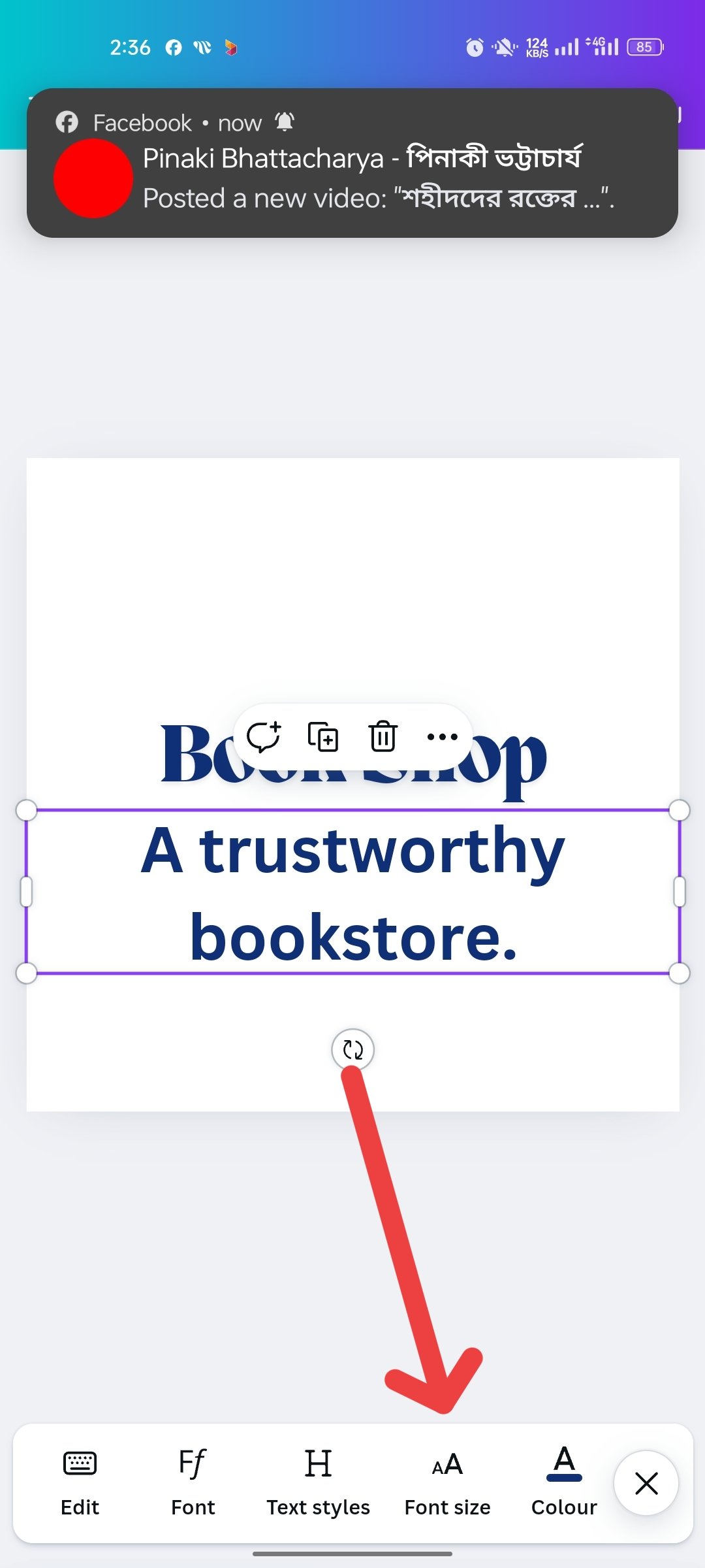
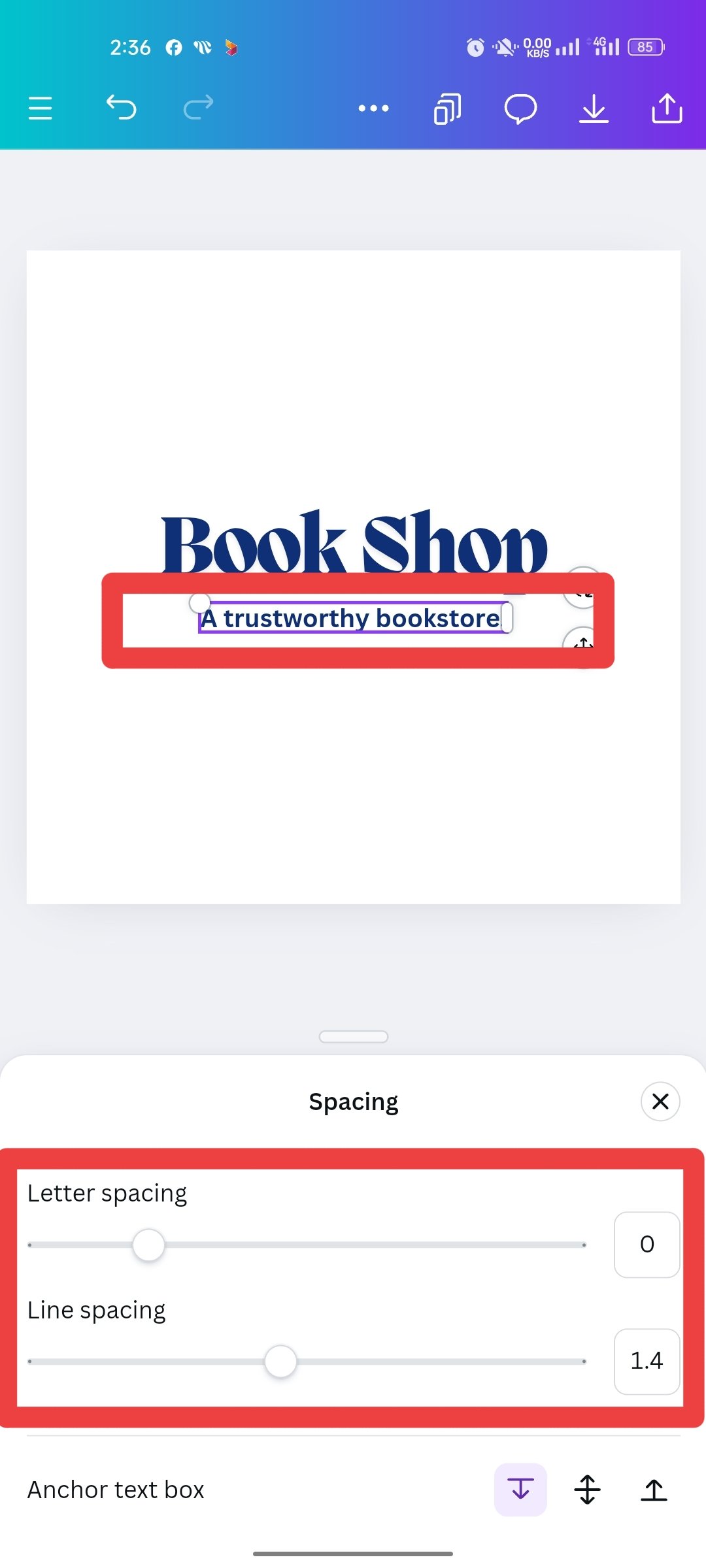
I put the "Book Shop" text as a position to create a logo. And I made it with the ANTON font. After writing this, I clicked on the test again to take a short text. Then I wrote a small post. I have shortened the text "A trustworthy Bookshop" below the logo text.
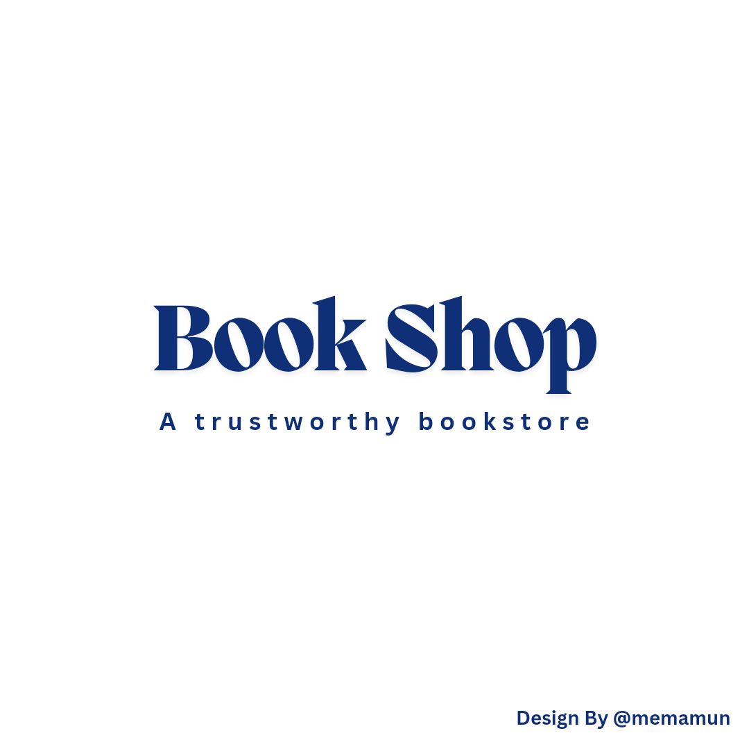
Complete My Wordmark Logo Design
 |
|---|
I created this logo in a very short time. The logo is called the WordMark logo. After designing the logo, I put my name on a site. To make sure I did this design.
That's the logo I'm going to design right now. It's called the Emblem Logo, which I discussed above. Since it is created in the center of an educational institution or some such institution. We will create a logo centered on educational institutions.
1st Step
 |  |  |
|---|
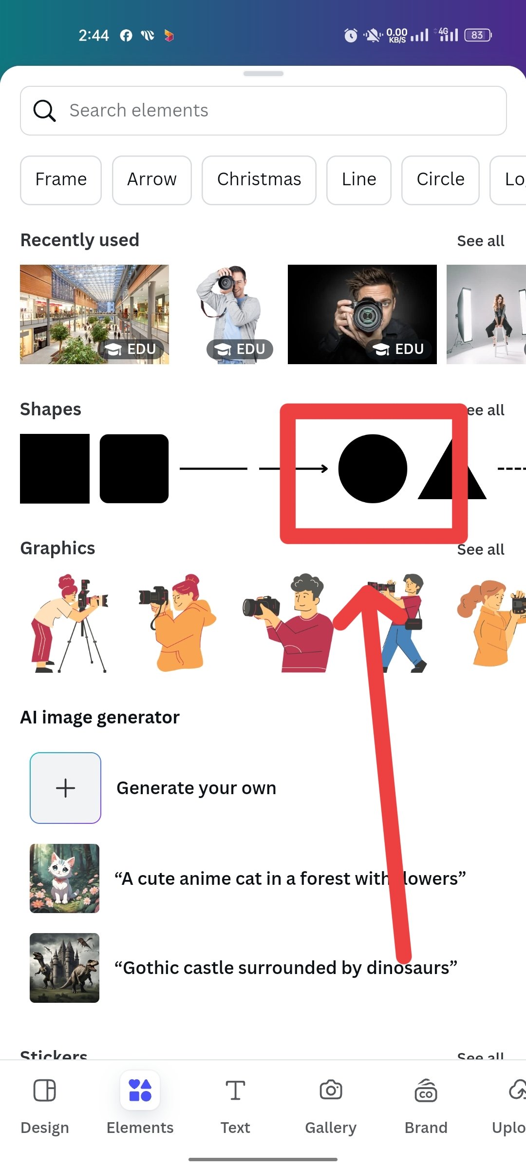
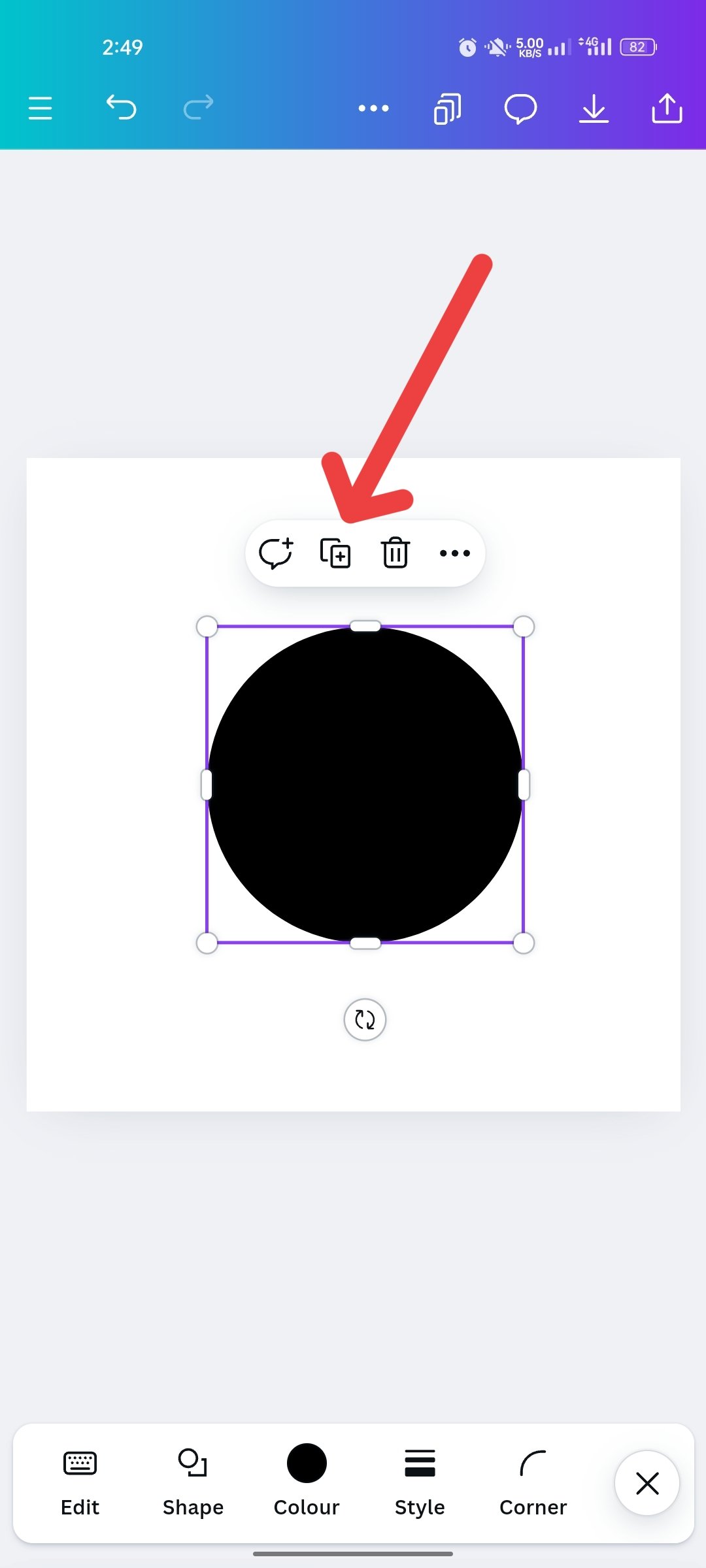
Here too, I first entered you, then took a size photo of Instagram. Then I clicked on Element. Then I took a round icon. That's why now I'm going to create a logo with it. So I took these black icons. You can also see the plus sign next to the round icon so I will click there to double.
2nd Step
 |  |  |
|---|
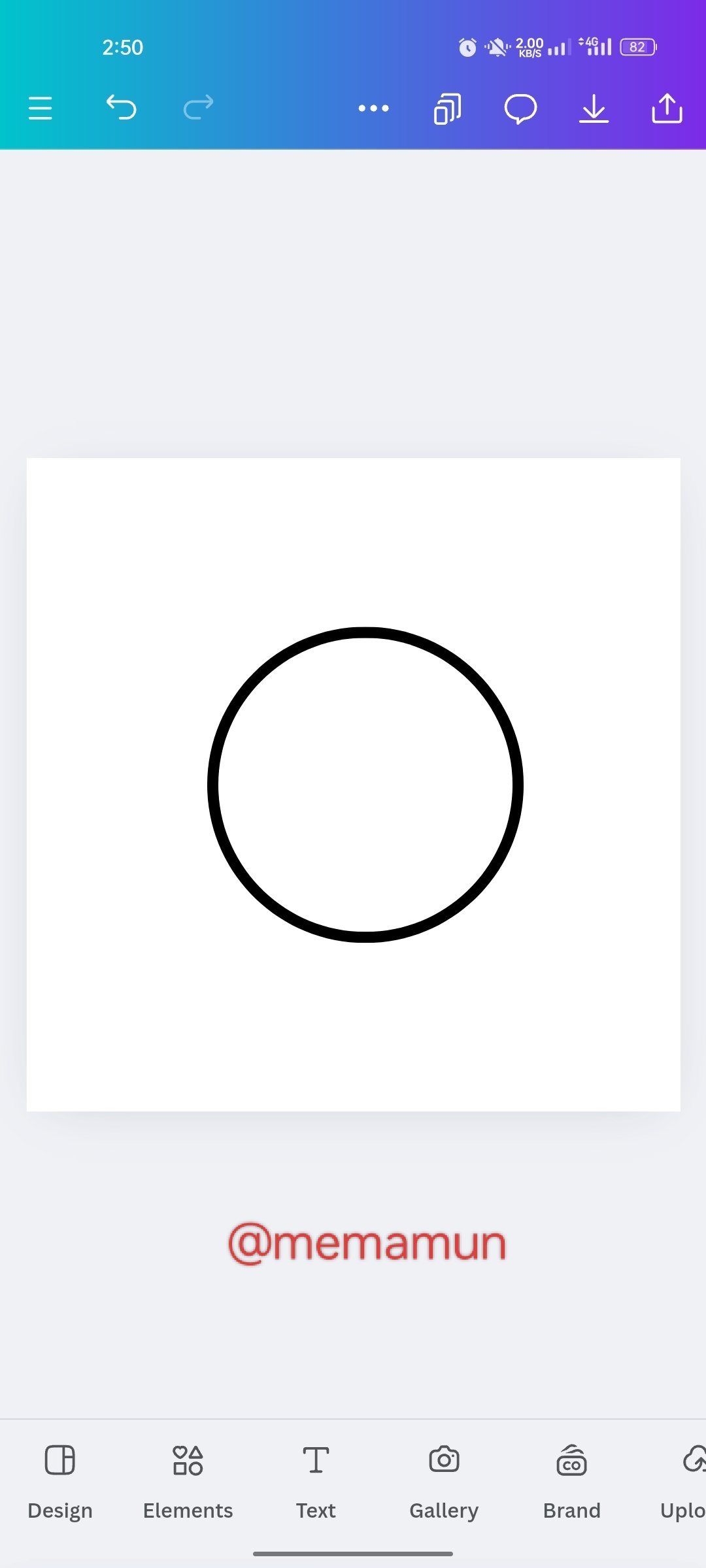
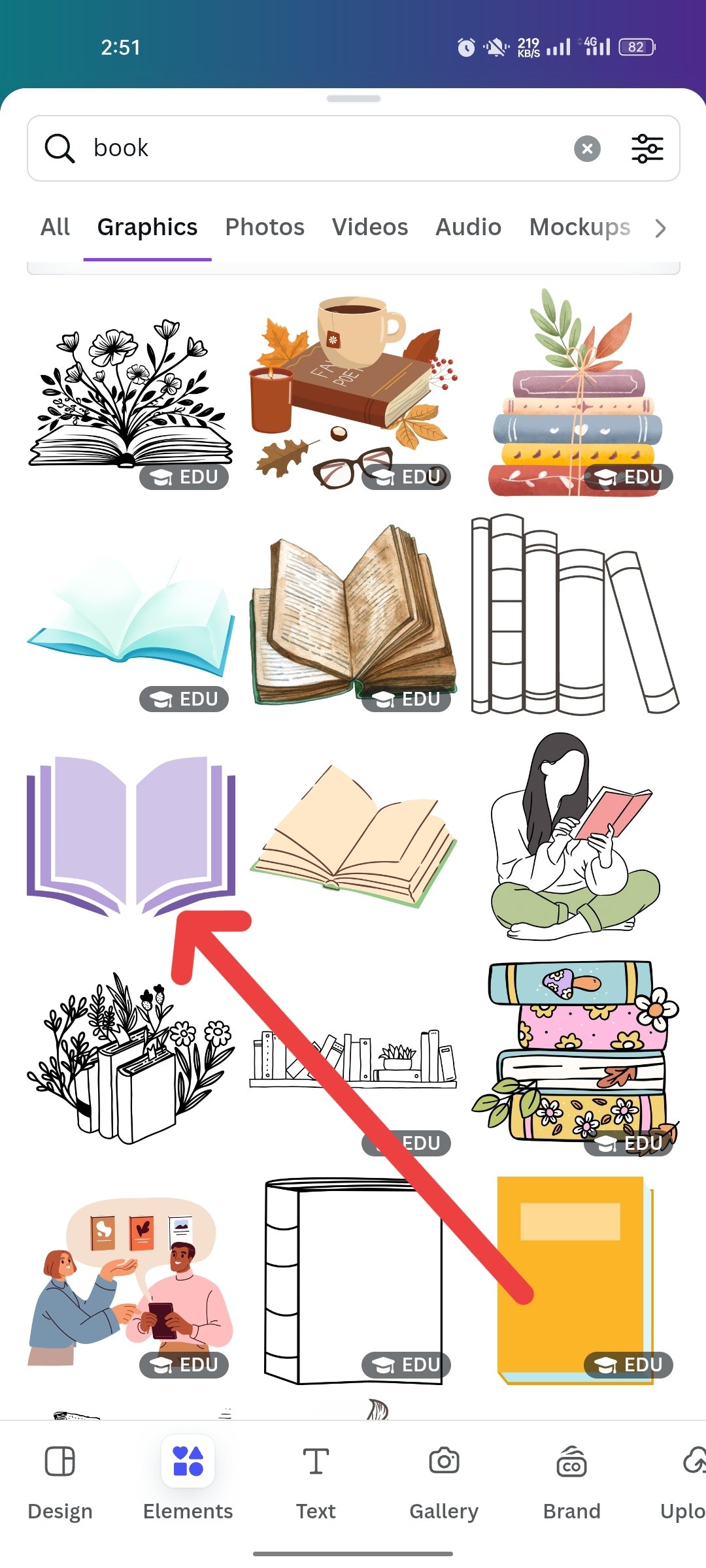
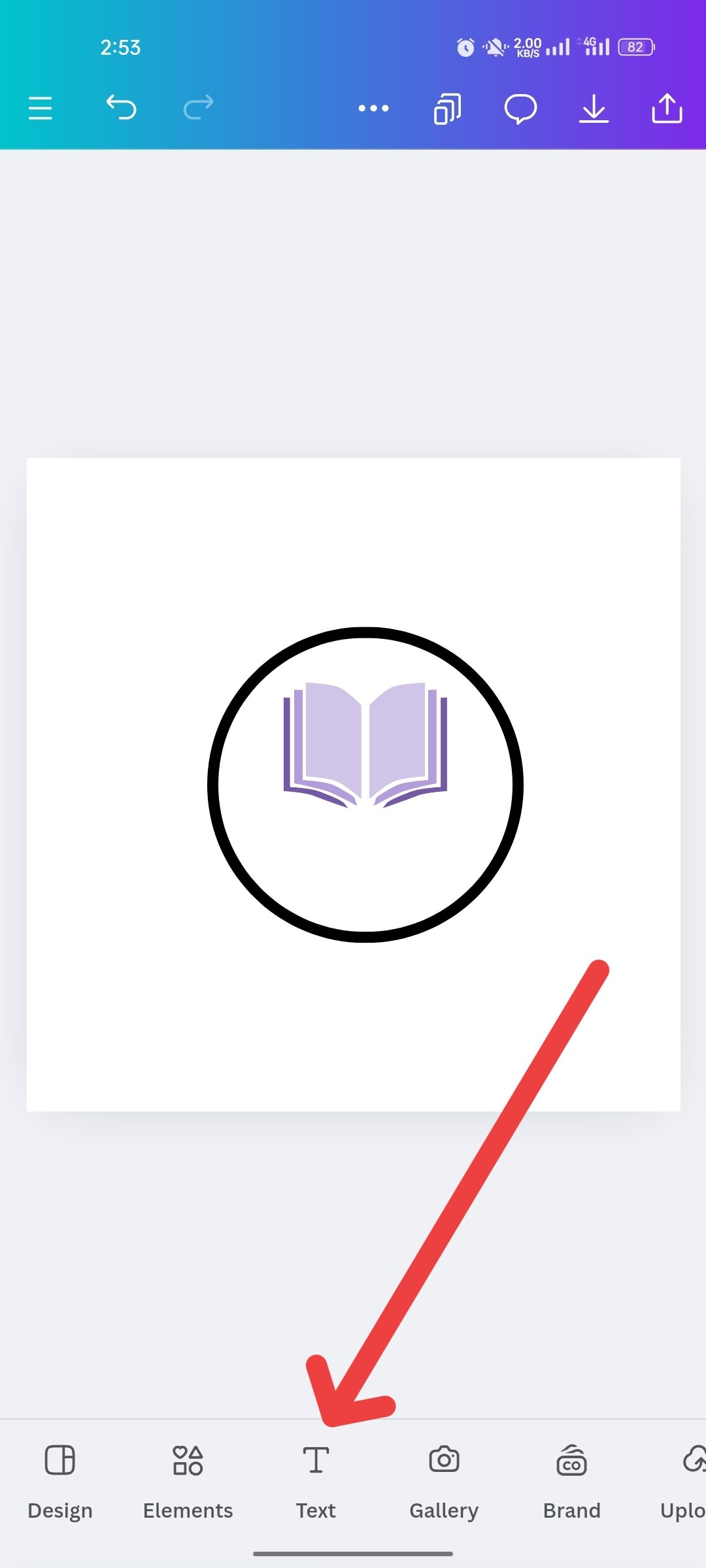
After clicking on the plus sign, it is double and I made a small one on the top and put black color marks all around. I'll put a book icon in the middle to create the logo. So I clicked on the element and took the book icon. Then I put it correctly and clicked on the text again to take the text.
3rd Step
 |  |  |
|---|
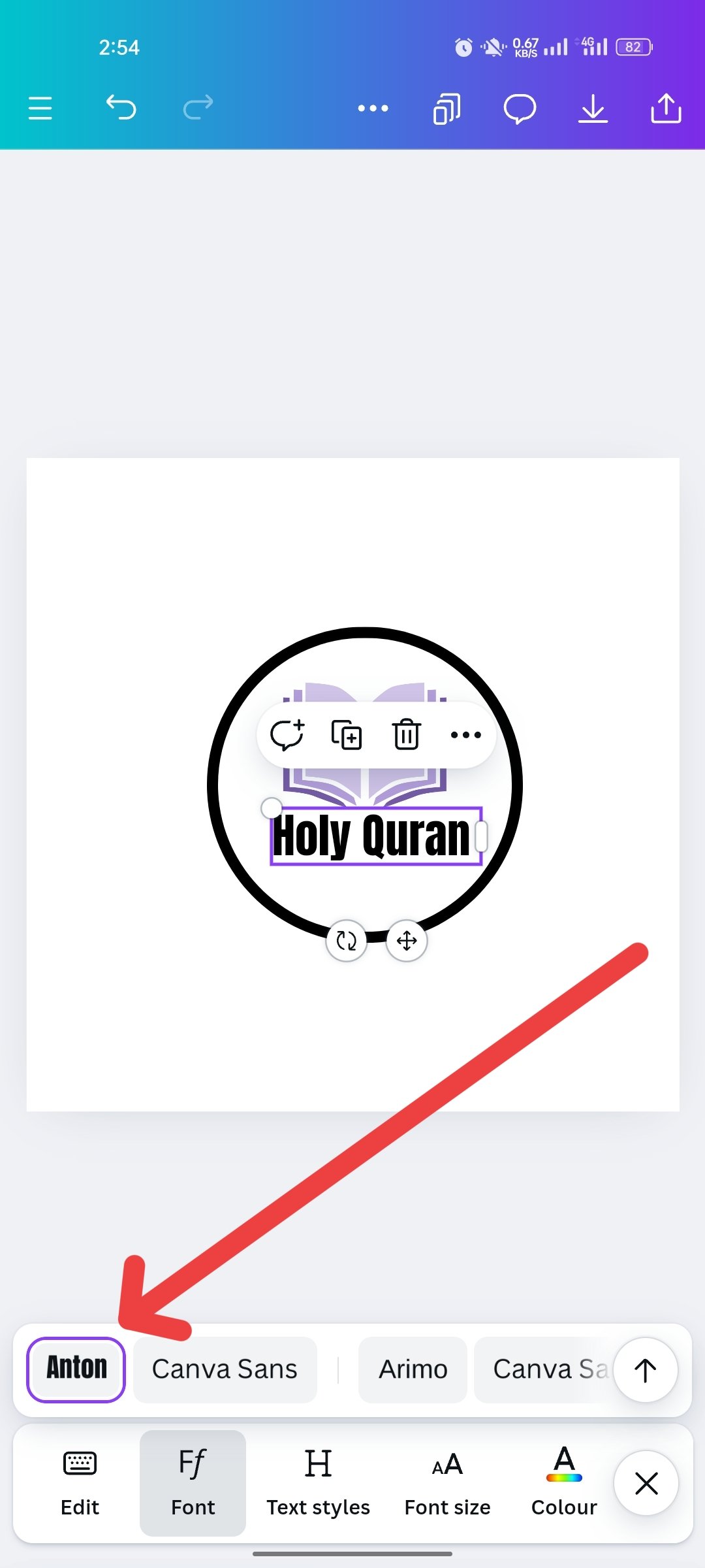
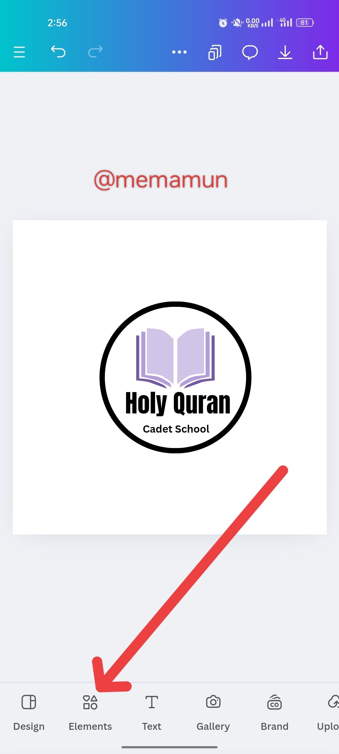
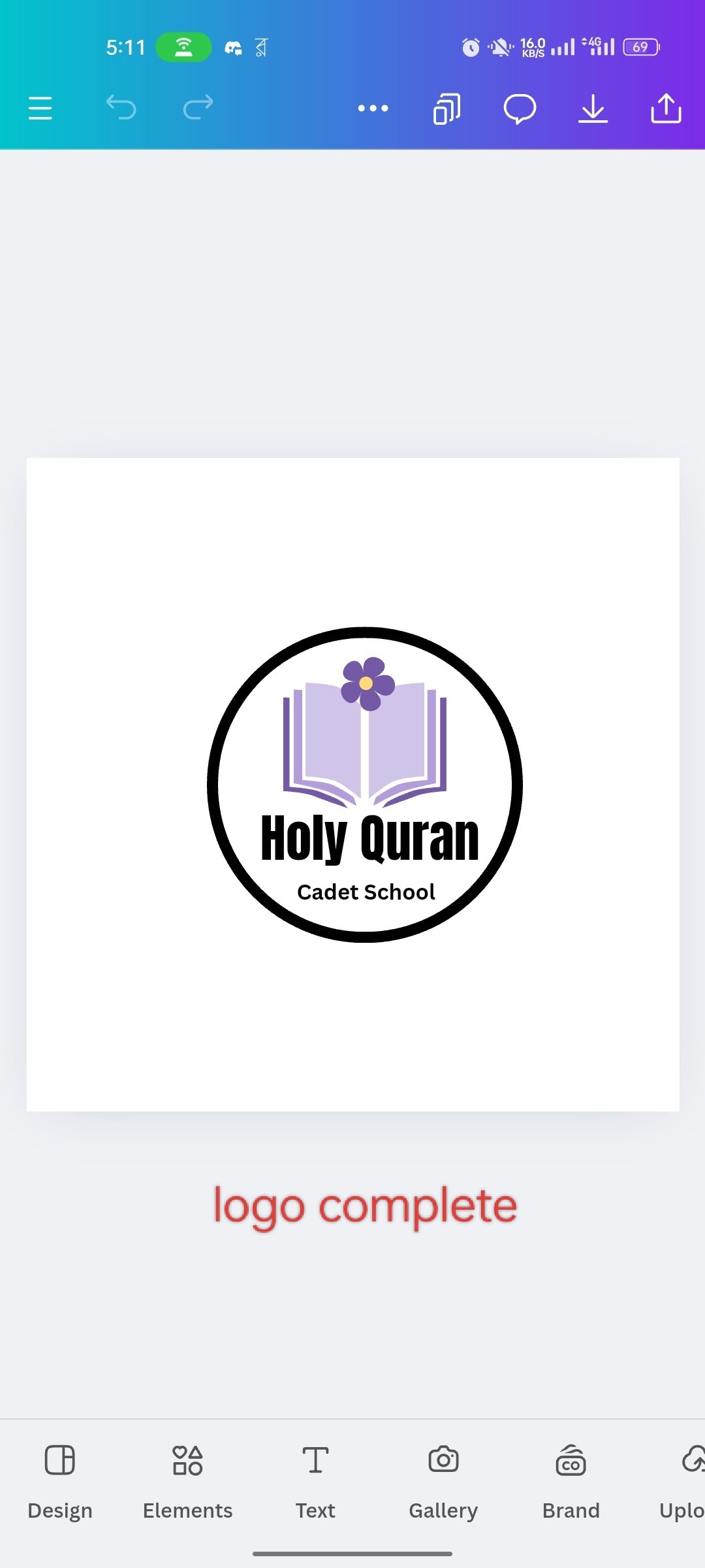
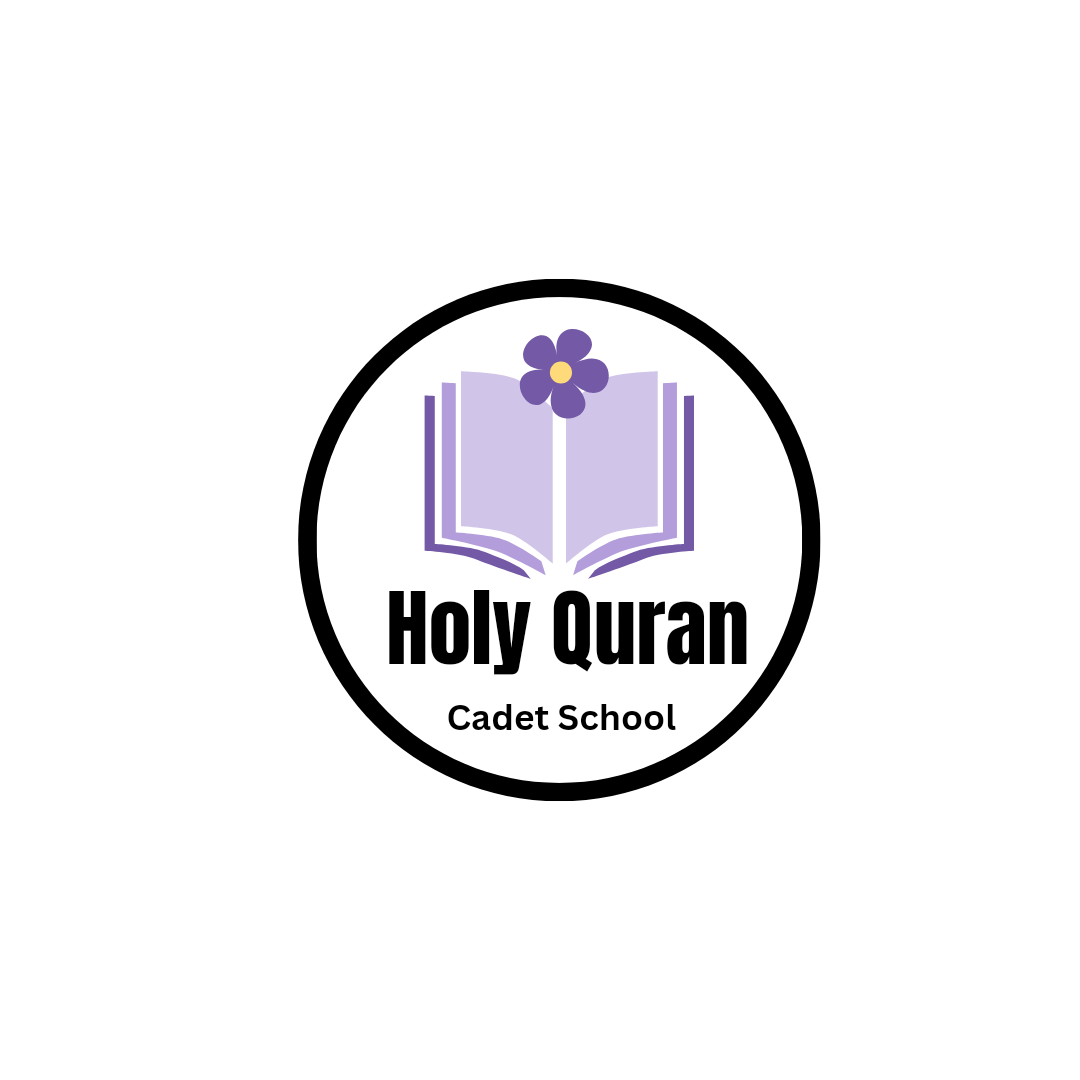
After taking the text, I arranged the font beautifully with different fonts. Then my logo was created. I set a flower in the middle and top of the book to make it a little more decorative. Which made me feel so beautiful personally. Then my logo was complete.
Complete My Emblem Logo Design
 |
|---|
I have now created the emblem logo. Personally, I like this logo. I don't know how it would feel to my dear sir. So anyway I created two logos now I will go to the next step.

Two logos beautifully after I created Lobo. Now I come to this section. Here I will make that logo in my educational center in the form of a beautifully poster. Where I am promoting educational institutions and promoting for admissions. And see how I used this logo here to promote.
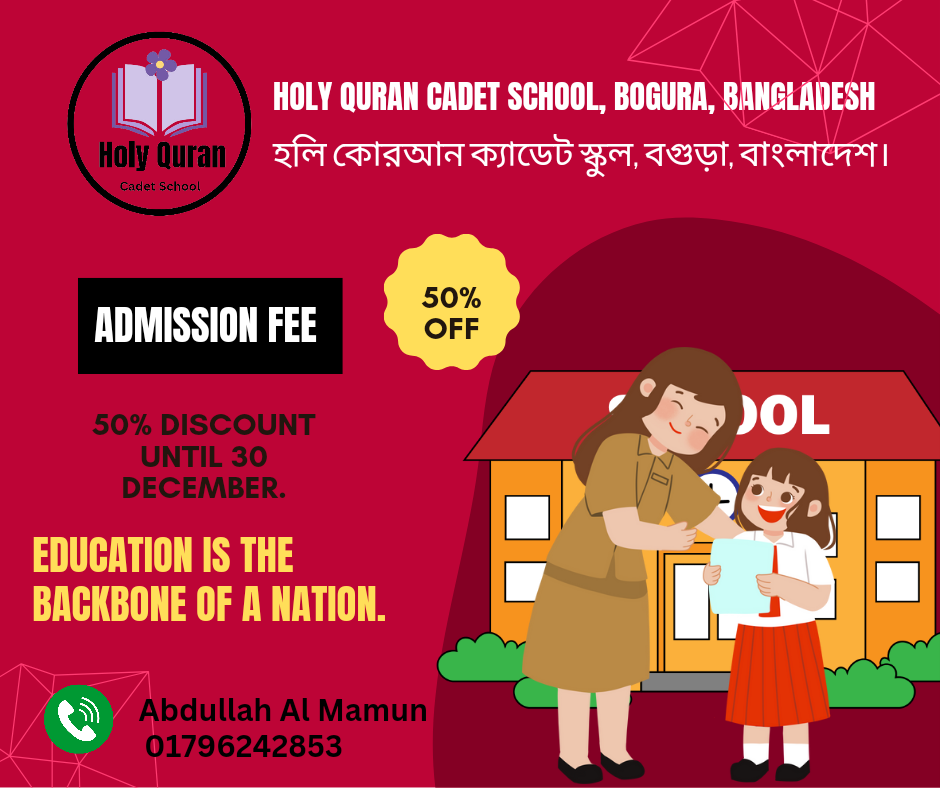
Dear friends, this was some discussion and some exercises related to my logo today. Which I have tried to present to you beautifully. Also, I would like to thank my sir who taught us so beautifully. Today I am writing goodbye to everyone, be well, be healthy, Allah Hafez.

Comments