Programming Diary #17: Activity notifications and vote suggestions
4 comments
Summary
Once again, it's time for me to deliver another fortnightly programming update. As anticipated in Programming Diary #16: Post aging and promotion totals, time has been limited due to competing activities, but I managed to accomplish both of the goals that I had set for myself in my previous post (barely). I am also fairly confident that the stability problems I had been observing two or three cycles ago are now resolved.

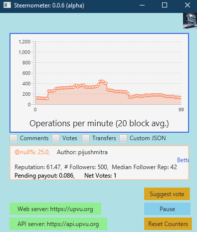
During this cycle, I made 13 commits in git, and I locked version 0.0.5a in place (which should have been done weeks ago). The main feature for version 0.0.5a was intended to be the historical graph, which appears to the right, and hasn't changed in several cycles. I'll be working on version 0.0.6a until I'm (temporarily) satisfied with vote suggestions and activity notifications.
Finally, I'm starting to think about what comes next, in terms of projects that develop the skills I'll need for a Standalone Java front end that operates without the need for intermediate web sites.
Background
Here are my goals, restated from Programming Diary #16.
In the next two weeks, my first goal will be to improve the look and feel of the "Suggest vote" pop-up window, which was my unfinished goal from the previous two weeks.
My second goal will be to add a notification icon and pop-up window with information about exceptionally large transfers, power-ups, and power downs. This is similar, in concept, to the WhaleAlert Twitter (X) account.
Again, as a stretch goal, I might make some changes/improvements to the vote suggestion algorithm.
Although there is still room for improvement, I managed to accomplish both of the first two goals. I did not make any progress on the "stretch goal".
Progress
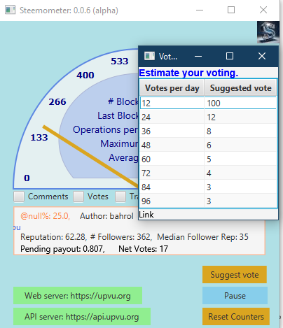
For the first goal, here is the updated "suggested vote" pop-up notification.
The changes are that (1) it now has a descriptive title above the table; and (2) it has a clickable link to the article at the bottom, in case the VAAS section of the main window changes while the suggested vote pop-up is being viewed. Also, the window is now sized to match the voting table.
You may also notice that the primary window was slightly resized, and there is an AI designed "Steemformatics Logo" at the top-right of the window. This is for the second goal.
For the second goal, I modified the program so that icon appears for any of the following activities:
- transfers between wallets ("transfer" operation)
- Power-up ("transfer_to_vesting" operation)
- Start of power-down ("withdraw_vesting" operation)
- Weekly power-down execution ("fill_vesting_withdraw" operation)
Each with minimum values specified. For testing, here are the values that I'm using:
!!! Number of blocks to display notifications
NOTIFY_LIFE_TIME=600!!! Minimum transfer sizes to receive notifications
MIN_SBD_XFER=100
MIN_STEEM_XFER=500!!! Minimum powerup, powerdown, and withdrawals
MIN_POWERUP=50
MIN_POWERDOWN=4000000.0
MIN_WITHDRAWAL=1000000.0
The Steemformatics Logo pops up whenever those minimum thresholds are observed in blockchain transactions. The first parameter, NOTIFY_LIFE_TIME, specifies how many blocks will pass before the notification icon is set to invisible again.
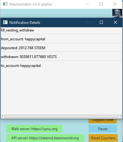
Here's what the notification pop-up looks like (for now).
As noted, this portion of the program was inspired by the Twitter account, theWhaleAlert. Eventually, when I'm done with testing, the minimum value thresholds will be much higher (or customizable). Unfortunately, due to the context where the popup happens, I am not currently able to display the transaction ID or link to it in a block explorer, but I expect to add that information.
Along the way to accomplishing this second goal, I had to resize the window to make room for the notification icon, which involved making other adjustments to the JavaFX objects in the gauge portion of the display.
As far as the stretch goal of improving the vote suggestions, I didn't even have time to look at it.
Next up
For the next few cycles, I'm going to continue focusing on the notifications. Necessary improvements are that it needs to show the transaction id, and also link to the transaction record in one of the block explorers. I'm also thinking about separating out the different transaction types, with a different icon for each type and/or putting some text above the speedometer gauge with information about the transaction. Finally, it needs to present transactions in a list or queue, in case multiple transactions of a given type (powerup, powerdown, weekly withdrawal, or transfer) happen during the same interval.
For the next fortnight, then, my goals are:
- Put some more transaction notification details across the top of the window. This could be additional icons and/or text, I'm not sure yet.
- Add the transaction id to the pop-up notification window.
Additionally, if time allows, I might work on some python coding so that my automatic voting will incorporate information about an author's followers, as discussed in Programming Diary #15: Voting suggestions and author incentives. As discussed in that post, I want to give more voting weight to authors with high-quality follower networks and less voting weight to authors who haven't yet built up a strong network of followers. The idea here is to reward authors who focus on audience-building.
Over time, then, I can (hopefully) use what I learn with the automated voting to inform the voting suggestions in the Steemometer tool.
Reflections
My immediate steps forward, to work on improving the notifications, are clear, but I feel like I'm at a crossroads for what to do after that. I could add features endlessly to this toy program, but the initial goal was just to learn about Java and Steem by creating a Speedometer style display of Steem activity levels. That goal was accomplished quite a while ago. All the rest has been "scope creep".
And I need to remember the purpose behind that goal, which was to develop the skills that I will need in order to create an open source, standalone, front-end that social-media users can use on the Windows desktop for blockchain interaction without needing to rely on any web-based intermediaries.
So, for my next goals after notifications, I need to think about goals that develop those skills. To that end, I'm thinking that it's getting near the time to freeze new features for the Steemometer, because it's not necessarily developing the right skills any more. It is certainly still far from being a polished product, but the product has always been a means to an end, and I'm not sure that more polishing right now would bring me much closer to that end-goal.
So, where do I go after I'm satisfied with the deployment of notifications? Unfortunately, one way or another, I think I have to get out of my comfort zone. Here are options I see:
- Finally work on publishing it in the Windows Store: A process which I fear because I hate bureaucracy, and I imagine it will be very bureaucratic.
- Publish it in a public git repo (github, bitbucket, gitlab?): A process which also scares me because I know the code quality and organization are -- shall we say -- suboptimal.
- Move on to something else that develops new skills with managing the various social media feeds, and start with open source from day 1. I'm thinking about maybe a Java block explorer or some sort of "feed reader" application that runs as a Standalone app on the Windows desktop. Either/both of those possibilities would also include a Visibility as a Service (VAAS) section like the one in the Steemometer.
- Rewrite Steemometer from scratch as an open source application, but make use of FXML (and maybe CSS?) this time in order to improve front-end development skills and familiarity with Open Source frameworks while also improving separation of the graphics, control, data handling, and logic in the application. This would also involve separating the VAAS portion of the app out into it's own package/library/app that can be redeployed in an infinite variety of contexts.
Not sure what I'll choose, but I do think it's nearly time to get away from the fun little incremental updates to Steemometer that have become habitual. There's definitely still lots of room to improve the app, but I no longer think that this path provides the most direct route to my desired destination.
I'd be curious to hear about peoples' experiences with publishing applications in the Windows Store. Is it as painfully bureaucratic as I imagine? I'd also be curious if anyone can recommend checklists or guidelines for open source deployments that can help inform my decision making?
As an aside, I also spent a little bit of time this week looking into some apparent discrepancies in the way that hivemind is (not) displaying vote counts.
Conclusion
In summation, progress continues despite ongoing competition from my "day job" and household/family obligations. The toy program, Steemometer, is a fun project that I could revise and extend endlessly. However, I feel like it's approaching a place where I might need to shift my focus (and leave my "comfort zone") in order to stay aligned with longer term goals.
That's it for today. I hope to see you again with another update in a couple of weeks. 😉
Thank you for your time and attention.
As a general rule, I up-vote comments that demonstrate "proof of reading".
Steve Palmer is an IT professional with three decades of professional experience in data communications and information systems. He holds a bachelor's degree in mathematics, a master's degree in computer science, and a master's degree in information systems and technology management. He has been awarded 3 US patents.

Pixabay license, source
Reminder
Visit the /promoted page and #burnsteem25 to support the inflation-fighters who are helping to enable decentralized regulation of Steem token supply growth.


Comments