SLC21/WK2: Introduction to Logo Design
3 comments
 |
|---|
Greetings friends and welcome to my participation on this week's topic, introduction to logo. Without further ado, let's get into steam, shall we?
Discuss Logo design based on your understanding about the topic |
|---|
From the lesson, I have come to learn that Logo design is all about creating a simple, recognizable image that represents a brand or company. Hence, it is all about creating a clear and memorable image that captures the essence of a brand, making it the face of the business. Therefore a good logo should be unique, easy to remember, and give people an idea of what the company does, so it should be simple, relevant, and versatile, helping people recognize and remember the business easily so when designing a logo, we need to keep certain factors in mind, and they include:
Simplicity:
A simple logo is easier for people to recognize and remember, therefore a logo should not be overly complicated or cluttered with too many details.
Relevance:
The logo should be relatable to the brand and not be misleading not to cause confusion. For example, if we are to do a logo for a company that sells organic food, the logo might include green colors or nature-related images and not fashion or computer related images.
Versatility:
A good logo is expected to look great in different sizes and on various backgrounds. Therefore it should be clearly seen no matter its size or platform, hence it should work well on a business card, a website, or a billboard.
Timelessness:
A good logo should be designed to last and not just to follow some trends as trends may quickly fade away. So when designing a logo, one should have at the back of his mind that the logo should not be looking outdated after a few years.
Color and Font:
The colors and fonts used in a logo can convey different feelings, therefore it's expected to pick the right colors and fonts that carry the message of the brand. For example, blue often represents trust, while red can signify excitement. The font should also be easy to read.
Discuss extensively the role and impact of a logo to a brand |
|---|
A logo is more than just a picture for your audience to see as it plays an important role in shaping how people see your brand. A logo as we've said earlier plays a crucial role in any brand's identity and thus has a significant impact on how or what people see that brand for. Some of the roles and impacts a logo plays are;
First Impressions:
A logo is often the first thing people see when they come across a brand. Therefore, a well-designed logo can create a positive first impression on people, making them more than likely to remember and trust the brand.
Brand Recognition:
A good logo is expected to help people recognize a brand quickly. For example just seeing logos like Nike or McDonald's can instantly bring the brand to mind, which is very important in a crowded market where many businesses compete for attention.
Conveys Values and Personality:
Logos help to communicate what a brand stands for. For example, a logo that uses bright colors and playful fonts suggests a fun and youthful brand, while a more serious font and muted colors might convey professionalism and reliability.
Differentiation:
In a world full of choices, a unique logo helps a brand stand out from its competitors, setting them apart from the rest. Hence, a logo gives a brand its own identity and make it memorable, which is very important in attracting and retaining customers.
Emotional Connection:
Logos tends to carry feelings and emotions, because when people see a logo they like or have positive experiences with, it can create a sense of loyalty. Therefore, as time goes on, customers tends to develop personal connection to the brand through its logo.
Consistency Across Platforms:
A logo provides a consistent image for a brand across various platforms, whether it’s on a website, social media, or packaging. This consistency helps reinforce the brand's identity and makes it easier for customers to recognize it everywhere.
Trust and Credibility:
A good logo can also enhance a brand's credibility, because people are more than likely to trust a brand that has a polished and well-thought-out logo compared to one that looks amateurish.
Explain and demonstrate visually the do's and don'ts when it comes to Logo design. You can do more research to be outstanding and kindly ensure not to use my specimen logo |
|---|
When it comes to logo design, there are some important do's and don'ts to keep in mind to create an effective and memorable logo. Now, let's us look at some of them.
Keep It Simple:
A simple logo is easier to recognize and remember, therefore when getting a logo, we should learn to keep it simple. Think of brands like Apple or Nike were their logos are straightforward and iconic, making it easy to recognize and remember.
Make It Versatile:
A good logo should look good in various sizes and on different backgrounds, whether it’s on a computer screen, an ad, a business card or a billboard, it should be clear and effective.
 |
|---|
Choose the Right Colors:
Choosing the right colors is a very important one as colors convey emotions and meanings. For instance blue is often taken to represents trust, purple for royalty, while red for excitement. Therefore, learn to choose colors that reflect your brand’s personality.
Use Appropriate Fonts:
The font you choose should match your brand's tone. For example, a playful brand for kids items might want to use fun, rounded fonts, while a serious minded brand like law firm might opt for a more traditional, serious font.
 |  |
|---|---|
Be Unique:
Your logo should stand out from the competition. Therefore, before you get your brand a logo, carry out research on other logos in the same industry to ensure yours is distinctive and not easily confused with others.
Consider Your Audience:
Thinking about who your target audience is very important to creating what appeals to them. For example, a logo for a children’s toy brand will look different from one for a financial services company.
Avoid Complexity:
Don’t overload your logo with too many details or elements, as a cluttered logo can be confusing and hard to recognize while also being not so visible across different backgrounds.
 |  |
|---|---|
Don’t Follow Trends Blindly:
While it’s good to be aware of design trends, don’t let them dictate your logo as trends does change quickly, and you want your logo to be timeless not something you want to change every now and then.
Steer Clear of Clichés:
Avoid using overused symbols or imagery symbols that don’t add value to the brand. For example, a light bulb for an idea or a globe for a global company feels so similar and popular that your target audience may mistake it for some other brand.
Don’t Use Too Many Colors:
Learn to limit your color palette to a few colors, as too many colors can make your logo look chaotic and unprofessional.
 |  |
|---|---|
Avoid Inconsistent Branding:
Your logo should align with your overall brand identity, because if your logo feels out of place compared to your website, business card or marketing materials, it can confuse to your customers.
Design a simple logo with the knowledge you have gotten from this lesson by assuming that a client gave you a job to design for his brand (business) |
|---|
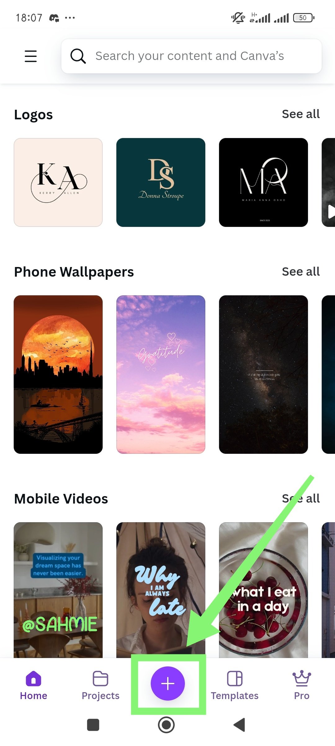
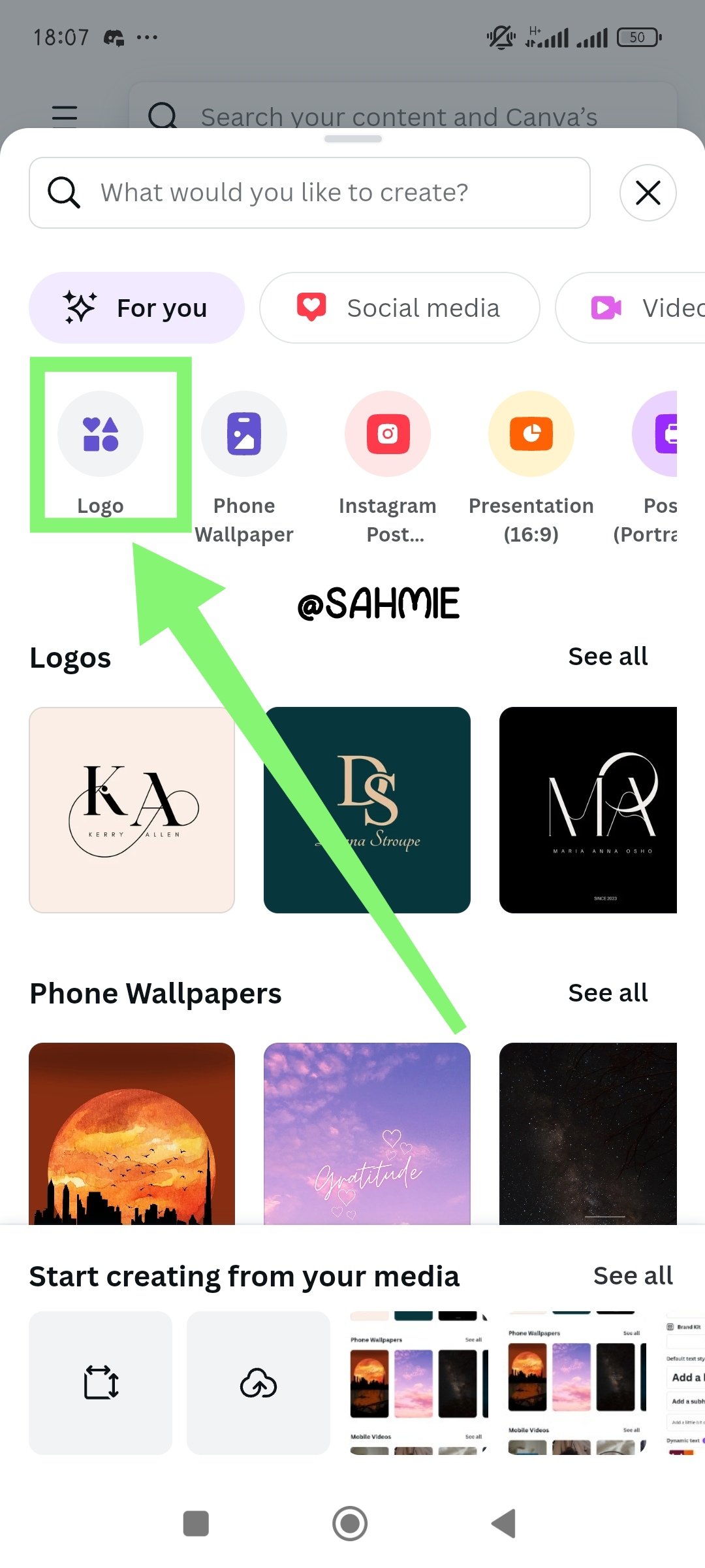
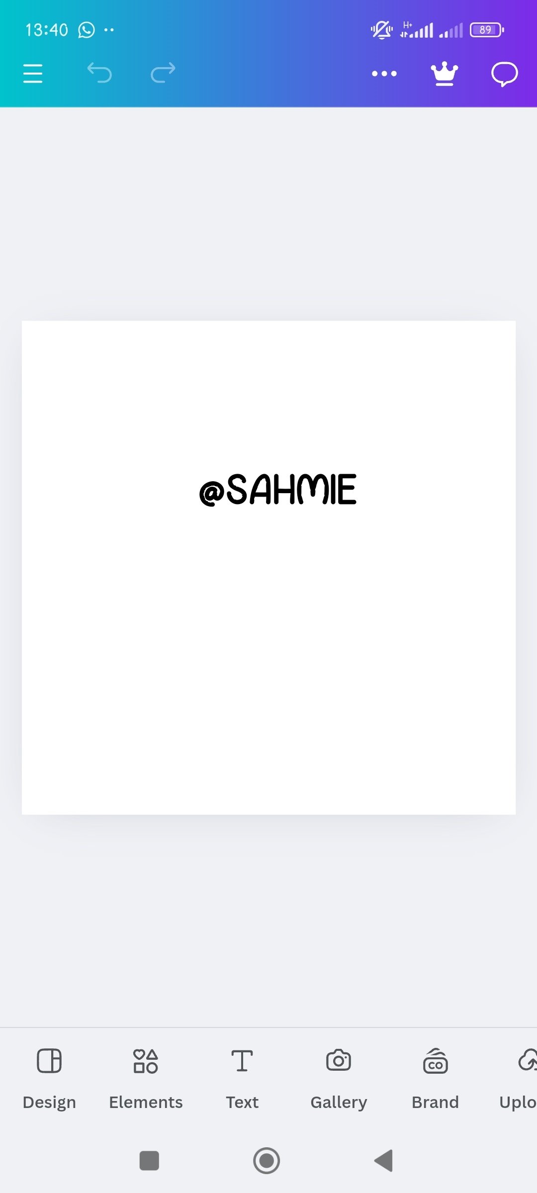
As a newcomer to the canvas space, I was a bit confused on navigating the app, but then, as I opened the app, I clicked on the "+" sign at the centre down the screen, then on the logo icon to open open up a fresh canvas.
 |  |  |
|---|
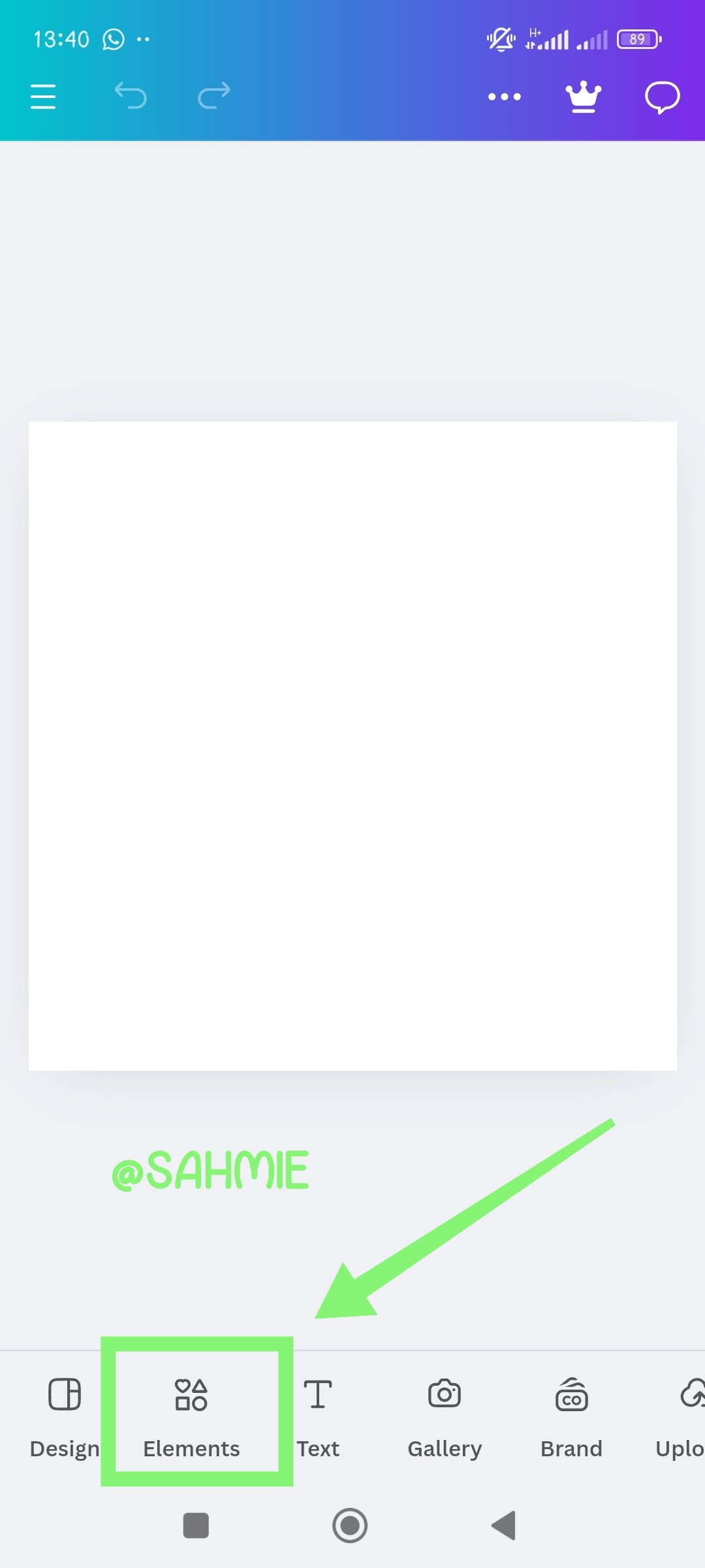
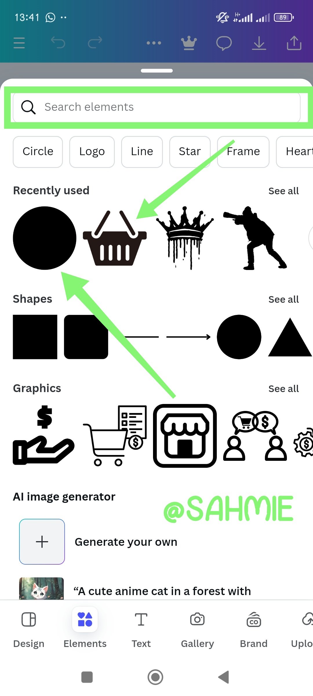
Then, I clicked on the element and searched for the elements required to bring out the logo idea I had on my mind.
 |  |  |
|---|
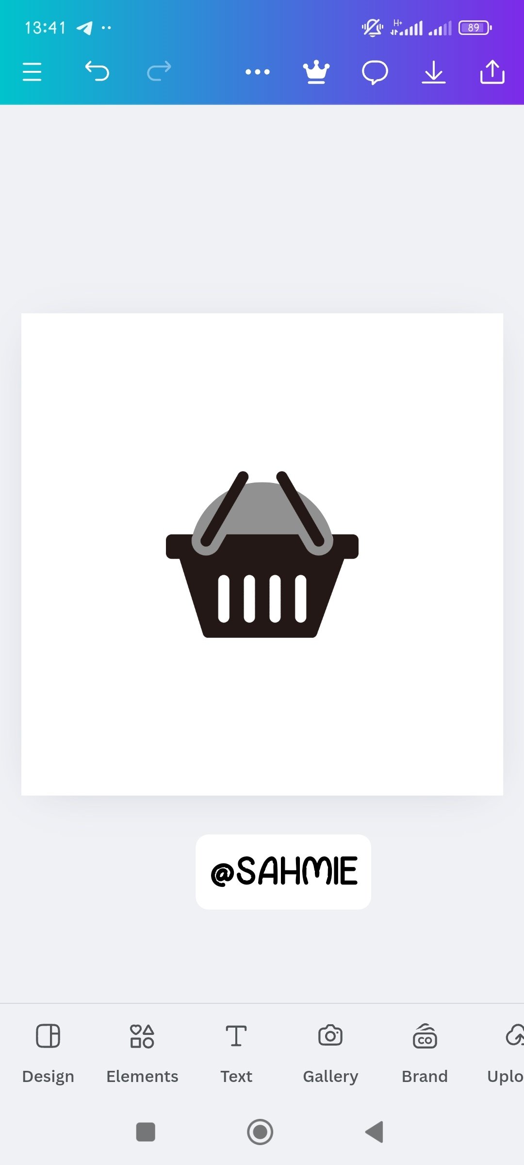
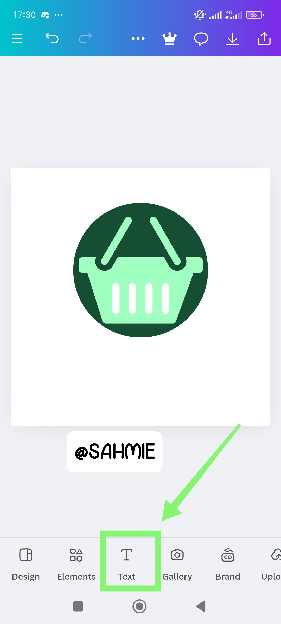
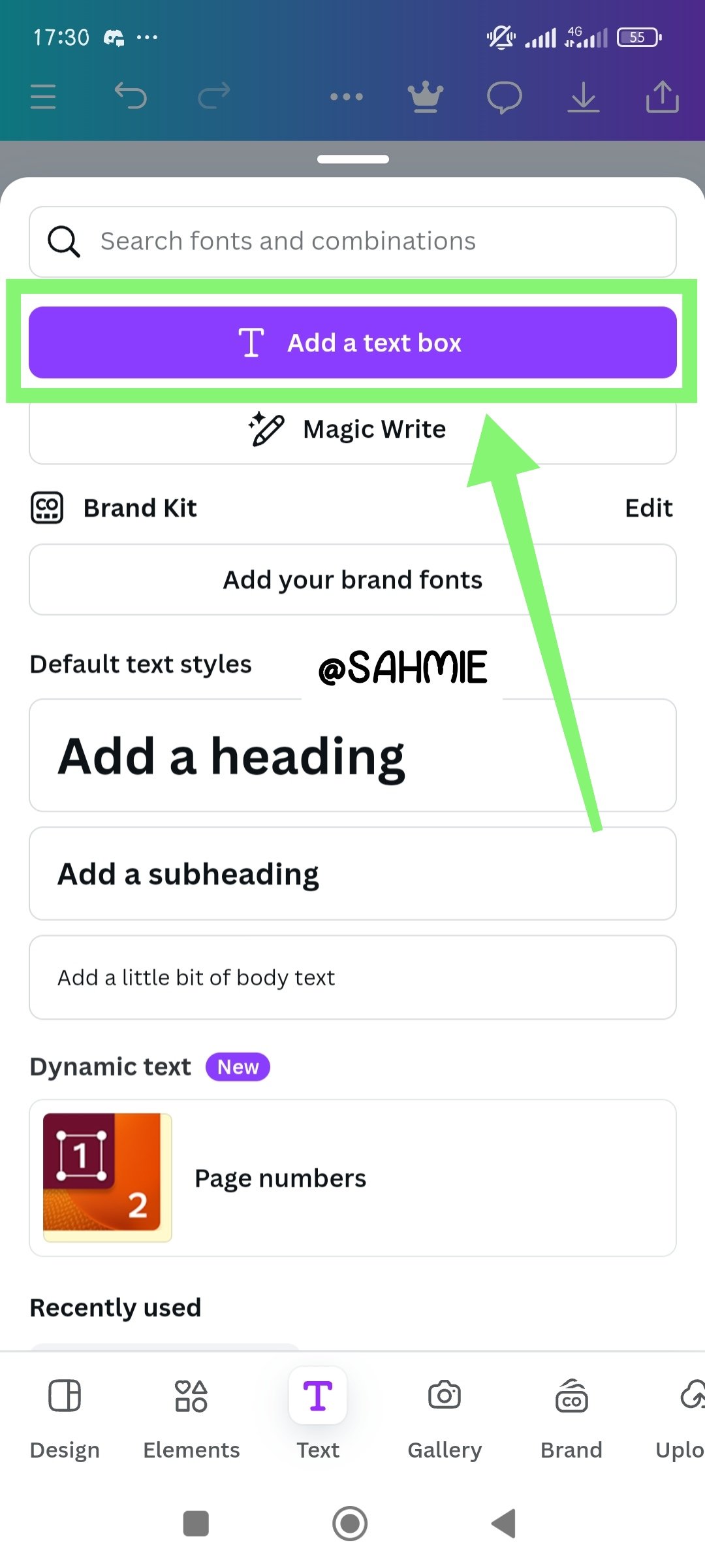
Then I rearranged to get my desired results, added color to the elements. Then I added the Brand name and the slogan as shown below;
 |  |  |
|---|
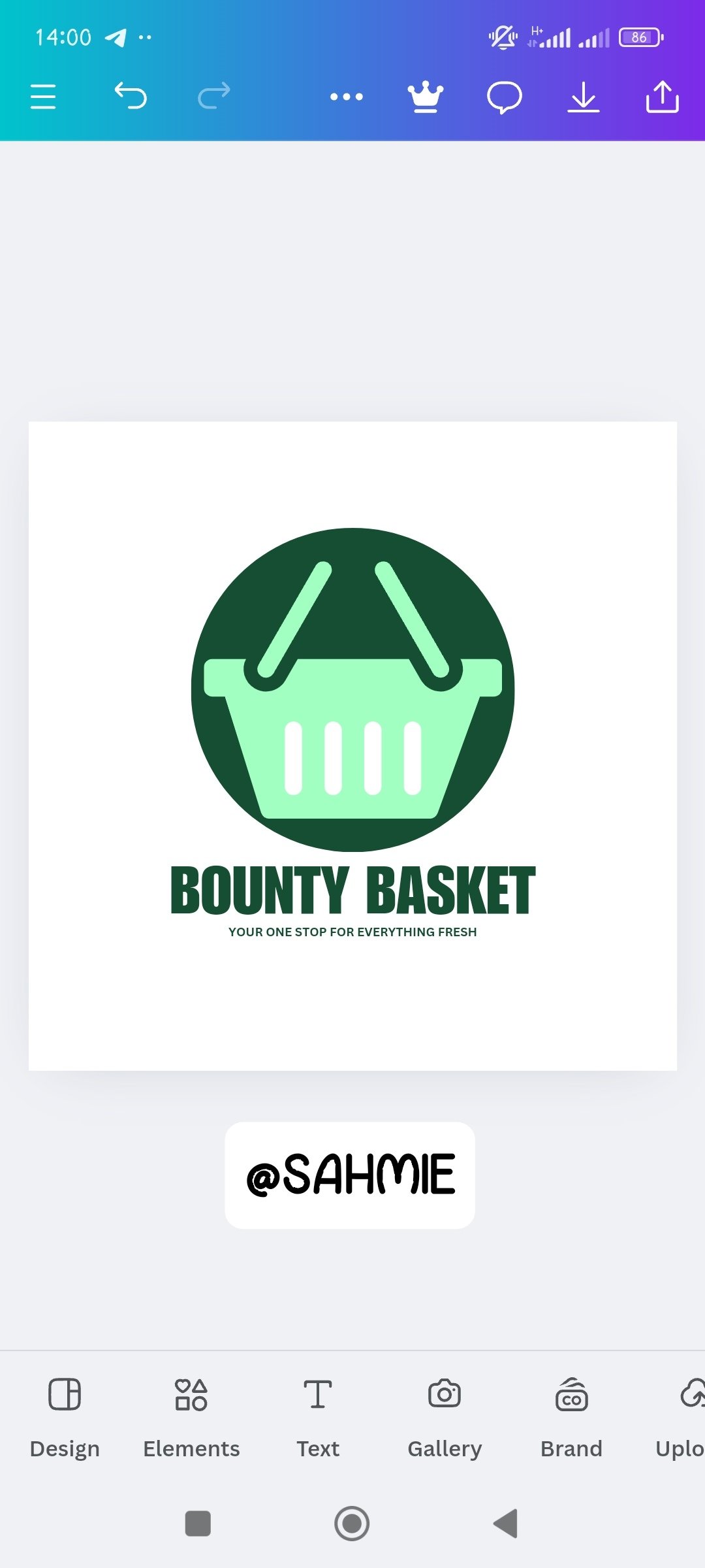
After which everything was now looking acceptable to me and I presumed it to be okay as shown below for the final logo.

Brand name:
BOUNTY BASKET
Slogan:
YOUR ONE STOP FOR EVERYTHING FRESH
Colours:
WHITE, DARK AND LEMON GREEN
Idea:
A market place for fresh fruits and vegetables.
I want to take this opportunity to invite @starrchris, @bossj23, @bonaventure24 and @ninapenda.
Cc:-
@lhorgic
Thank You for your Time
NOTE: Always have a smile on your face, as you are never fully dressed without one.

Comments