"SLC21/WK3: Logo Design - Part 2
2 comments

Discuss each of the logotypes we have and then talk about conditions when such logo should be used and when not to be used for a brand. You can do a little research to aid you.
Logos come in different types, and each logo with unique visual qualities and psychological impacts, making some logos better suited to specific branding needs than others. I have discussed each of the logotypes and their conditions when each logo should be used and when not to be used for a brand.
Wordmark Logo type
This is a logotype that solely uses typography to represent the brand name. Google, FedEx, and Coca-Cola are popular examples of wordmark logos.
 |
|---|
When to use It is ideal for brands with memorable or unique names, most especially if the name itself communicates the brand`s essence.
When not to use: Avoid using it if the brand name is too complex or long, as it may not translate visually well. Secondly, avoid using it if the brand lacks recognition and if a simple text-based design makes it hard to stand out.
Monogram (Lettermark)
A monogram which can also be called a letter mark condenses the nathe me of the brand into letters or initials. CNN, HBO, VISA, and IBM are popular example of monogram.
 |
|---|
When to use It is best used for a brand with lengthy names that would benefit from the abbreviation of the brand's name.
When not to use: Avoid using it if the initial does not endorse the brand name easily, most especially for new brands that fuller may be needed.
Pictorial Mark
This is also called a brandmark, which is a graphic symbol or icon that represents the brand. Apple, Target, and Twitter are popular example of pictorial mark.
 |
|---|
When to use It is best used for a brand that is established with strong brand quality. Furthermore, it is best used for brands wanting to visually pass emotional words or specific concepts.
When not to use: Do not use it for brands that are new when the symbol doesn't relate to the brand clearly and finally if the identity is the brand name.
Abstract Mark
This is the kind of logotype that uses shapes and designs that are not directly recognizable. Nike, Pepsi and swooshes are popular example of abstract mark.
 |
|---|
When to use: It is suitable to use for any brand that wants to convey an emotion or idea instead of just a specific object or concept. It is also suitably used for international brands because shapes are recognizable globally.
When not to use: Don't use it for a brand that needs a literal representation to clarify its offerings as abstract symbols can be ambiguous with previous recognition of the brand.
Mascot Logo
This is the kind of logo that incorporates a figure or character associated with the brand. The Pringles mascot and KFC's Colonel Sanders are popular examples of mascots.
 |
|---|
When to use: Suitable for the family-friendly brand with a relatable or playful identity or a brand that wants to create an approachable image.
When not to use: We should avoid using it for brands with sophisticated images or if we are aiming for a professional.
Combination Mark
This is the kind of logotype that combines text with a pictorial or subtraction element. Doritos, Spotify, Adidas, Target, Burger King, and Lacoste are popular examples of combination marks.
 |
|---|
When to Use: Is best used for a brand that is looking for both text elements and visual elements to get quick recognition.
When not to use: Avoid using it when simplicity is important for the brand image.
Emblem Logo
This is the kind of logotype that incorporates text within a symbol. NFL logo, BMW, Land Rover, Harley-Davidson and Starbucks are popular example of emblem logo.
 |
|---|
When to use: It is best used for a brand that is looking for a traditional, authoritative, or classic image. It is mostly used by government agencies, schools, and heritage.
When not to use: Don't use it if the logo needs to be displayed very small, as it can become too hard for people to read.
As introduced earlier, each of the logotypes we have discussed here serves specific purposes, and the choice depends on factors like industry, personality, overall message, and brand target.
• Pick any two (2) of the Logotypes discussed and then practically demonstrate how to make them, showing your detailed process.
Wordmark Logo type
As we have read before now, it is a logotype that makes use of typography to represent the brand name.
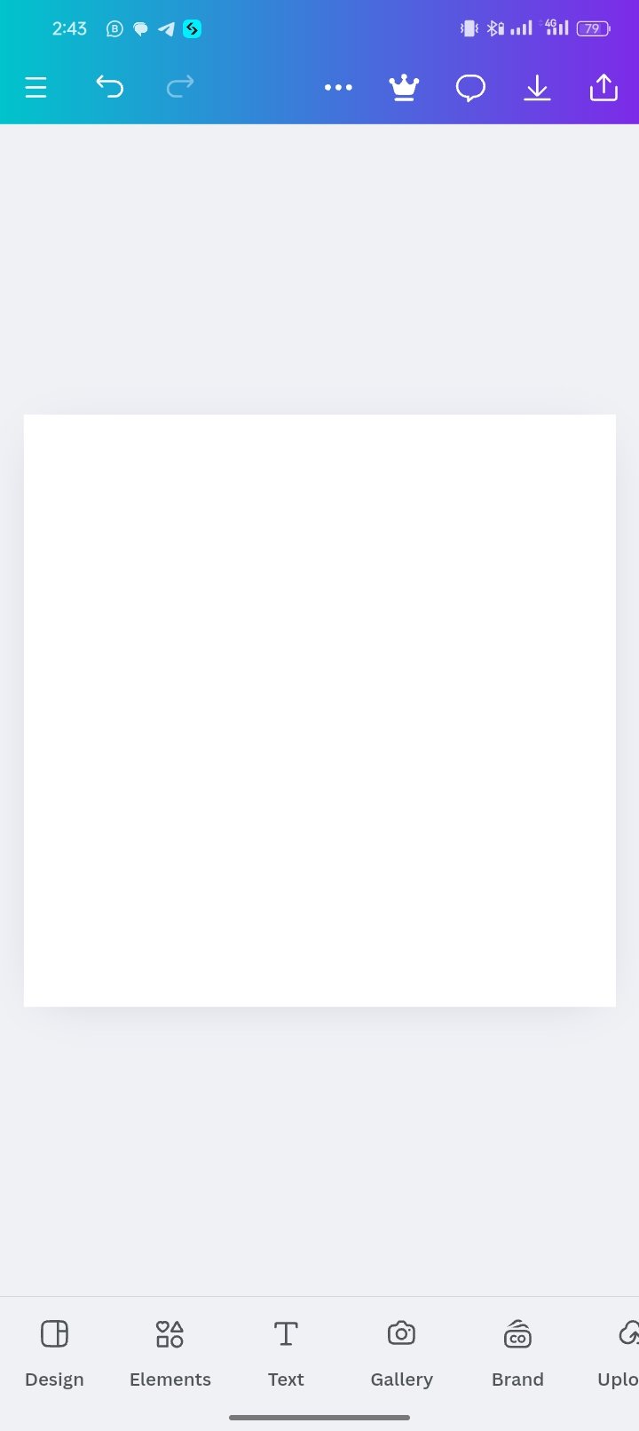
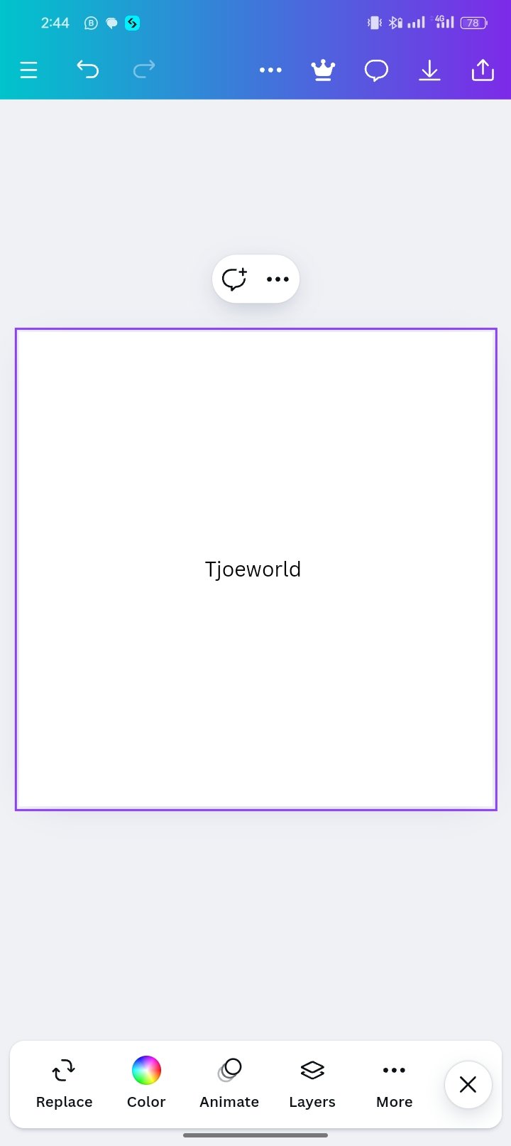
- As usual, I open my canvas app, and choose my dimension Instagram, which I then type in this word "Tjoeworld".
 |  |  |
|---|
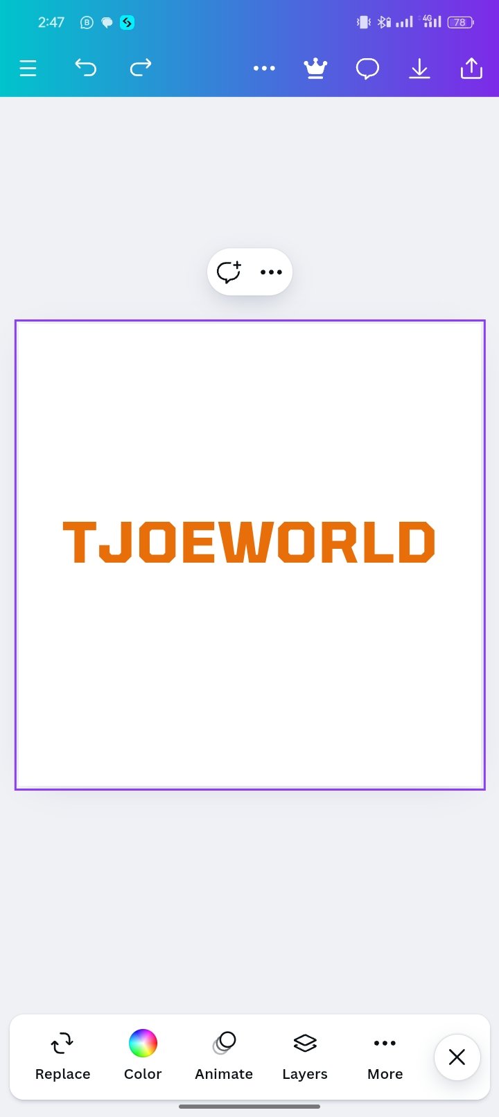
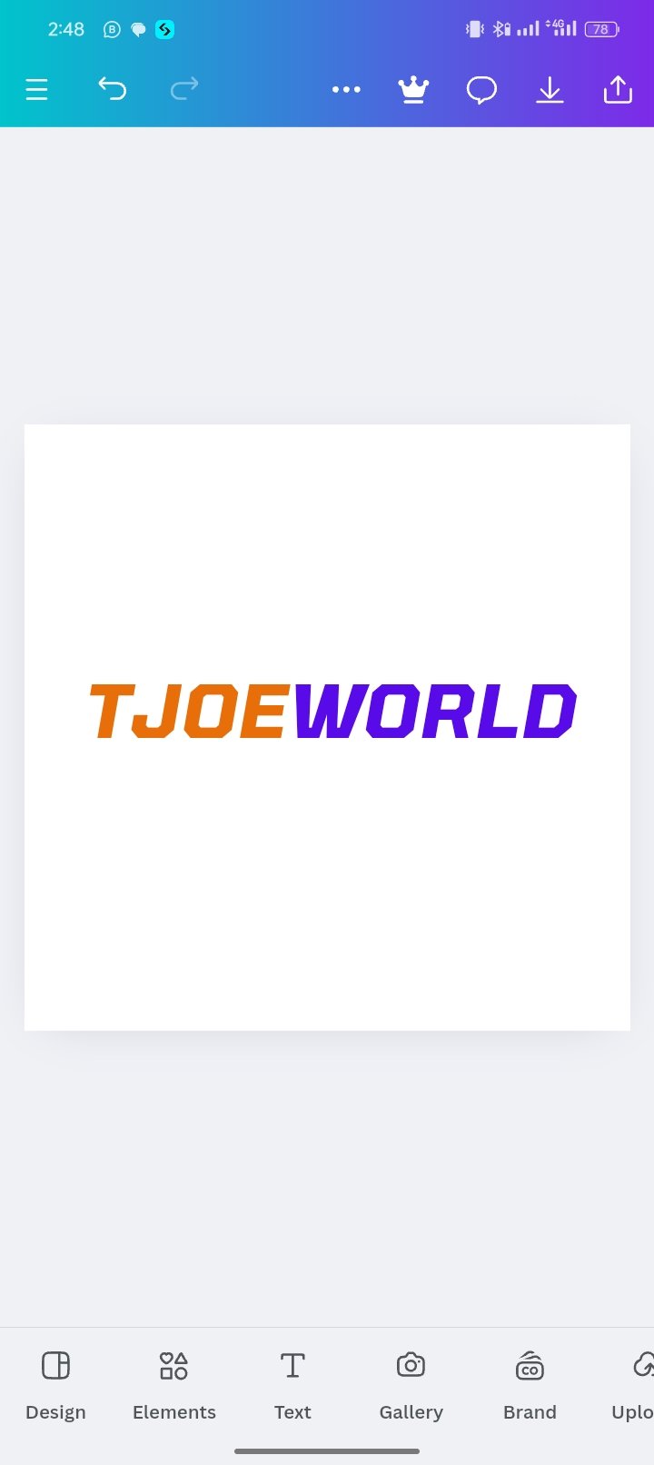
- I add font size and color to the name.
 |  |
|---|
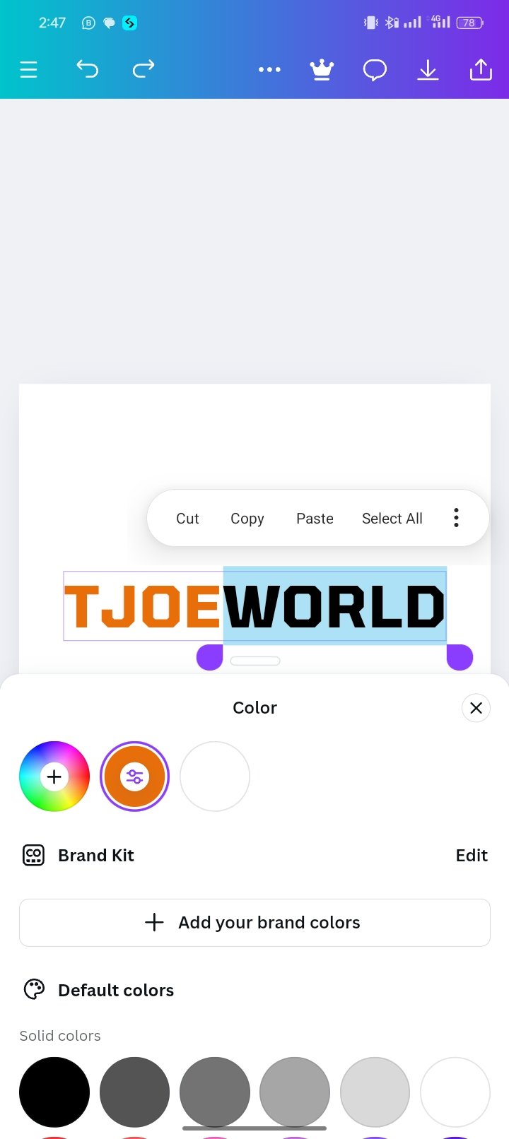
- I then give "Tjoe" a separate color and as well "World" a different colour as shown in the screenshot.
 Final Design Final Design |
|---|
Combination Mark
As introduced earlier, it is the kind of logotype that combines text with a pictorial or subtraction element.
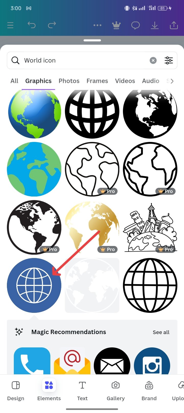
Since I had already used Wordmark to design the typography representative of my logo I clicked on the element.
 |  |
|---|
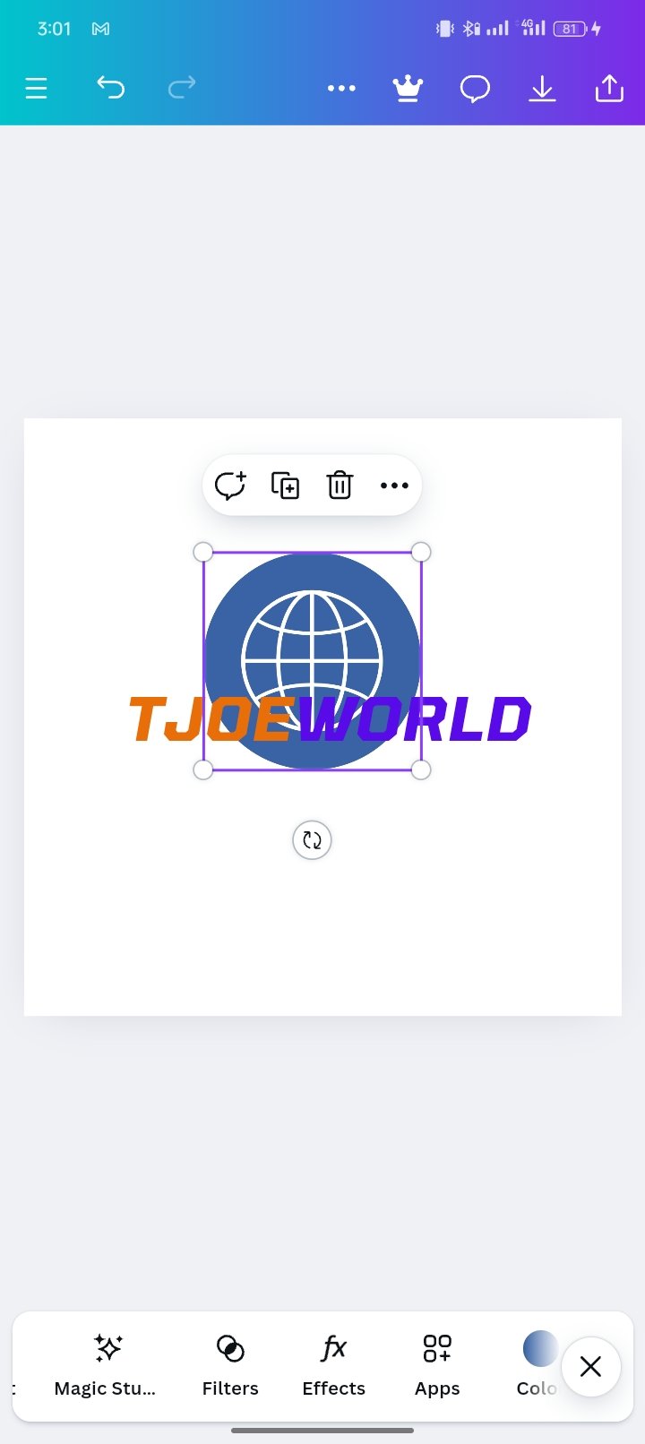
- In the search bar, I searched for world icon and selected the one pointed with an arrow in the image I have shared.
 |  |
|---|
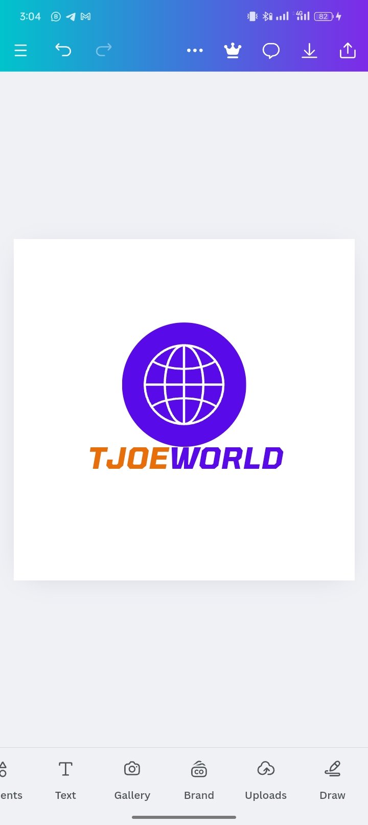
- I positioned it well and gave it color which is the same color that I used in the world.
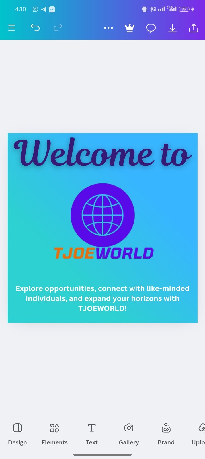
Design a simple flier for your brand and then strategically place one of the logos you made in the flier.
To create a flyer using the logo for my brand and then strategically place one of the logos that I made in the flier. The first thing I did was remove the logo background via this website.
- I open the canvas app and set up the flyer dimensions.
 |  |  |
|---|
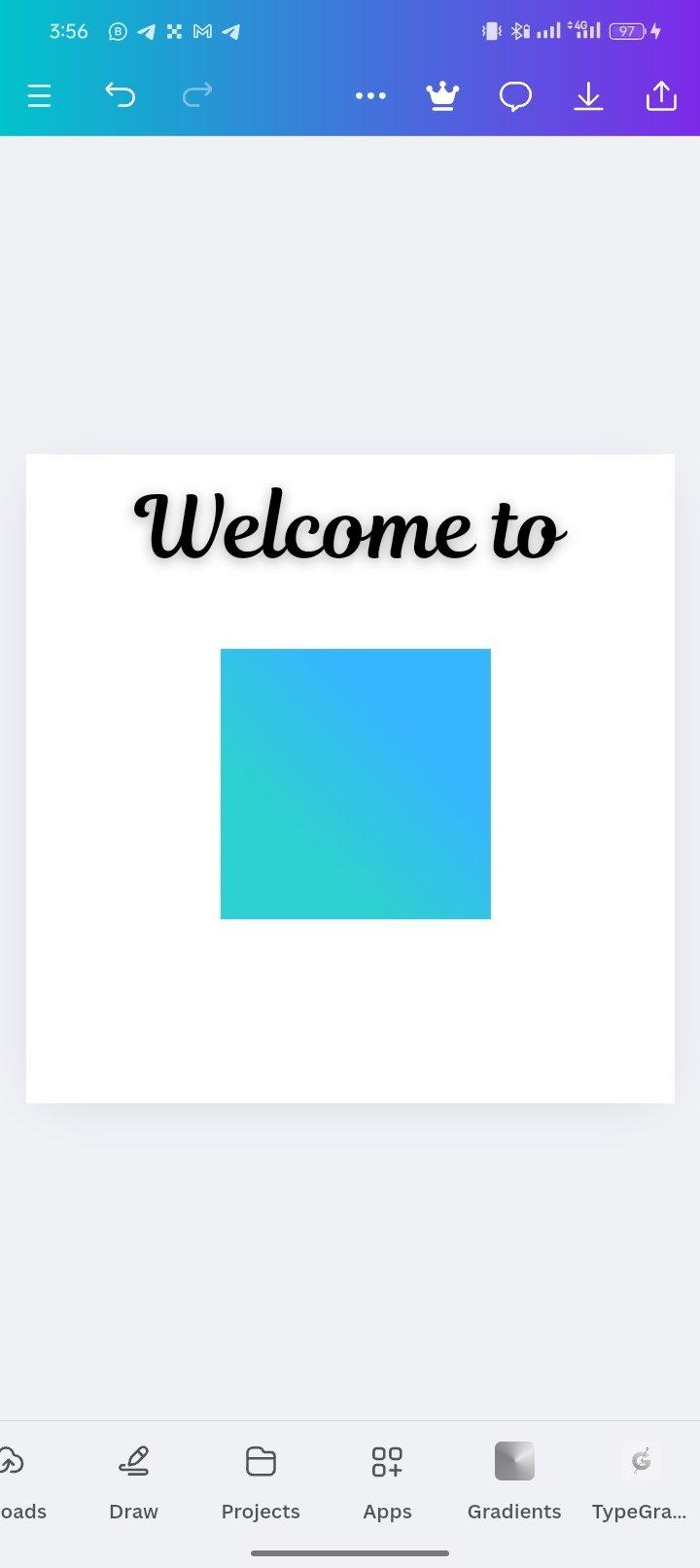
I used the text feature and wrote "Welcome to"
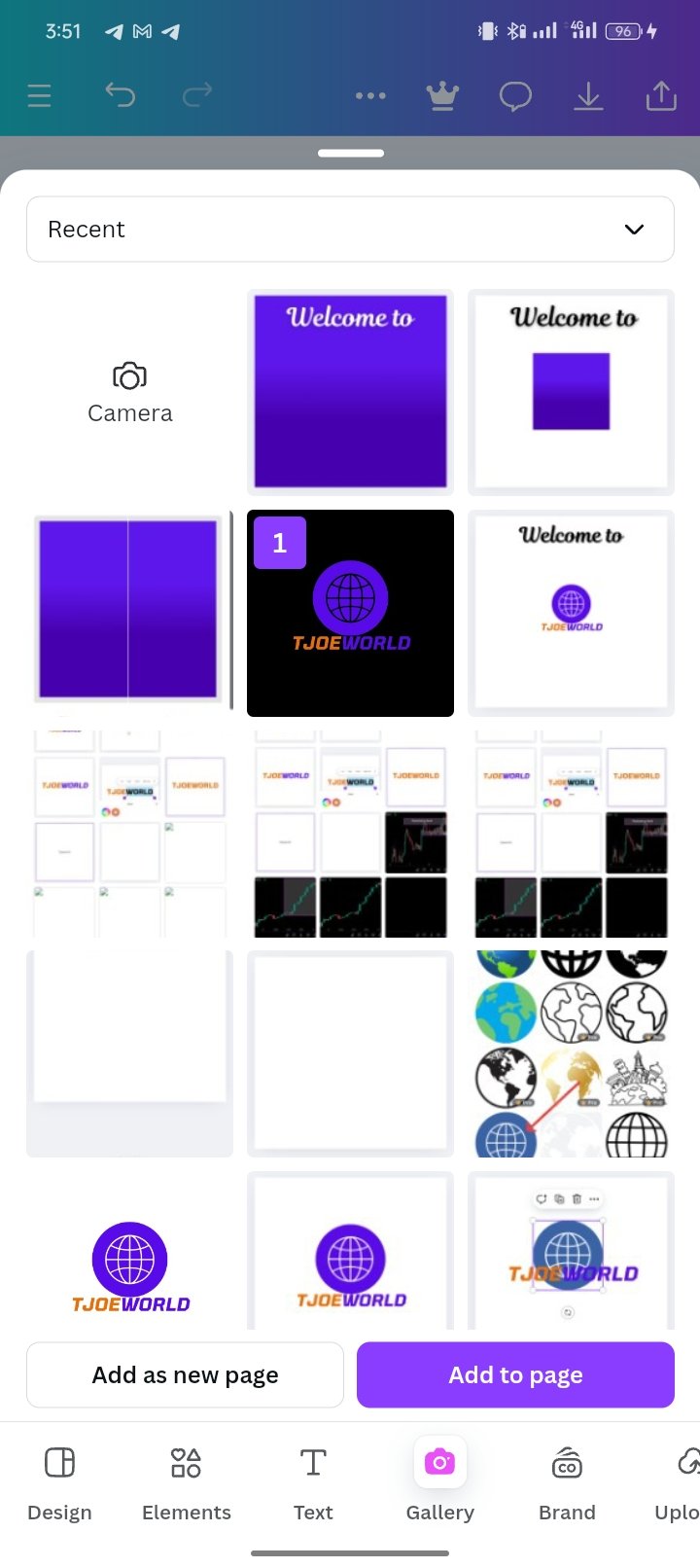
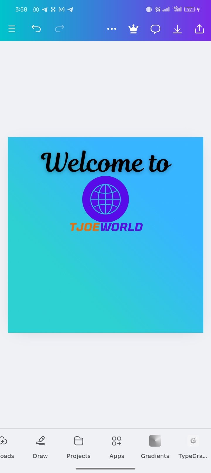
I add the logo by importing the logo which I click on the gallery.
 |  |
|---|
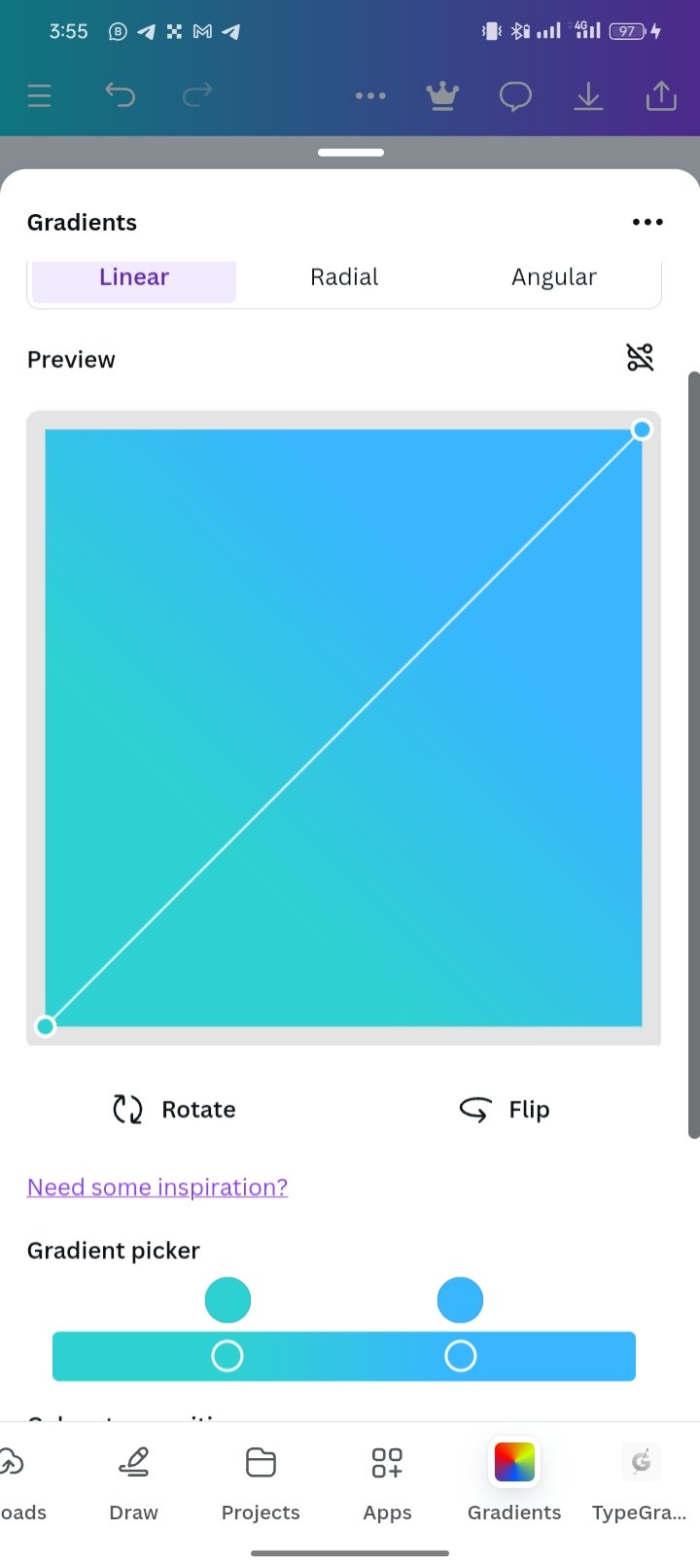
I created a background using Gradient and added it.
I then add a supportive text "Explore opportunities, connect with like-minded individuals, and expand your horizons with TJOEWORLD!" at the bottom.

I am inviting; @dove11, @simonmwigwe, and @ruthjoe
Cc:-
@lhorgic
Comments