SEC-S20W1: "Introduction to Graphic Design and Principles"
11 comments
Hello everyone! I hope you’re all doing well. Over the past few weeks, I’ve been quite busy, so I haven’t been able to give Steemit the attention it deserves. However, I’m free for the next few days, so I’ll try my best to participate in the engagement challenges.
We all know that this time, there have been some changes to the engagement challenges, and the rules have been made more flexible, which is a good thing. I hope this new experiment by the Steemit team is successful and that the platform becomes lively once again.
Today, I’ll be participating in the graphic design challenge organized by @lhorgic for this week. Although graphic design isn’t my field, I do occasionally play around with image editing on Canva. I am not very good at it, so if I have to start from the scratch then I do get a bit confused. But if I am using a ready-made template, it is much easier for me to do it.
This challenge looked quite appealing to me and I am participating in this challenge with the hope of gaining some experience which will be beneficial for me in future. Well, then let me not waste any more of your time, let’s begin!
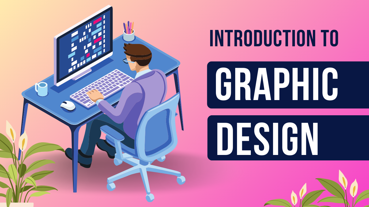
What is Graphic Design?
If I were to describe graphic designing in one line, I’d say it is the art of combining images, colors and texts into one graphic. Graphic design is the process of ensuring that any person who comes across the design would understand the intended message and at the same time be impressed by the design. To put it in a more straightforward manner, graphic design refers to the use of graphics to pass information in an effective and appealing manner. A good number of the appealing thumbnails with text that we come across particularly on YouTube are actually graphic designs.
Three Principles of Graphic Design
I’ve chosen to discuss the following three principles of graphic design based on my understanding:
- Alignment
- White space
- Hierarchy
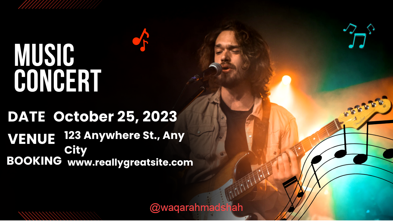
Alignment means placing all the components of a certain design in an orderly manner so that the design appears to be orderly. When things are properly aligned, the design looks neat and organized, making it easier for viewers to understand. If images and text are scattered all over the place, the design will look messy, and it’ll be difficult for the viewer to make sense of it.
 |  |
|---|
White space refers to the empty space between text, images, and other design elements. Just because it’s called “white space” doesn’t mean it has to be white—it can be any background colour. The biggest benefit of white space is that it keeps the design clean and uncluttered. If you fill every bit of space with text or images, the viewer’s mind can become overwhelmed, making it hard for them to focus. White space helps make the design more readable and visually appealing.
 |  |
|---|
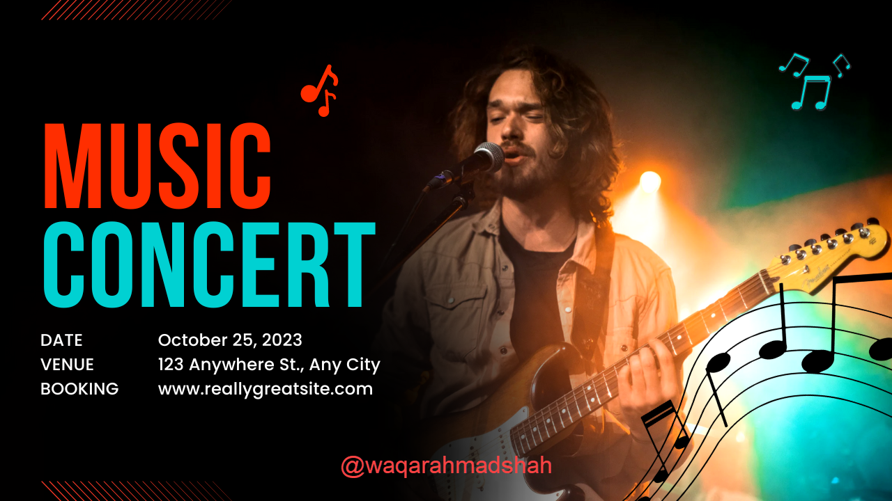
Hierarchy means organizing elements in a way that the most important things stand out first, while less important details come after. The goal is to make sure the viewer immediately knows what to focus on. For example, if the event name is the dominant feature of a poster that you are creating, then it will be the largest and in a bolder font so that it stands out first. Then, the date, time and venue would be written in small font as secondary information to the main information.
 |  |
|---|
Practical Example
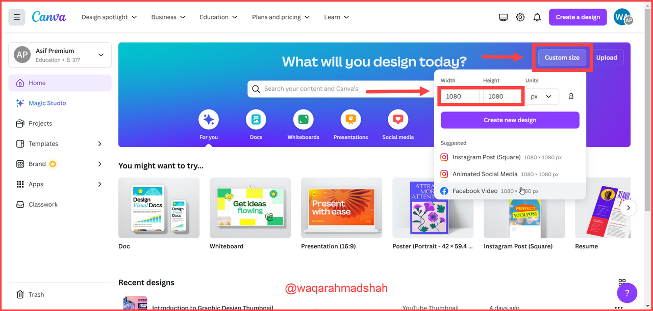
Now, I’ll walk you through the steps on how to create the assigned image design for this challenge using Canva.
- Step 1: First, open Canva’s website (If you’re using a mobile device, you can use the Canva app, but I feel more comfortable using a laptop, so that’s what I’ll go with. I have access to Canva Pro, but you don’t need it for this task—you can easily create the design using the free version). Once the website is open, click on “Custom Size” in the upper right corner and enter the dimensions for your image.
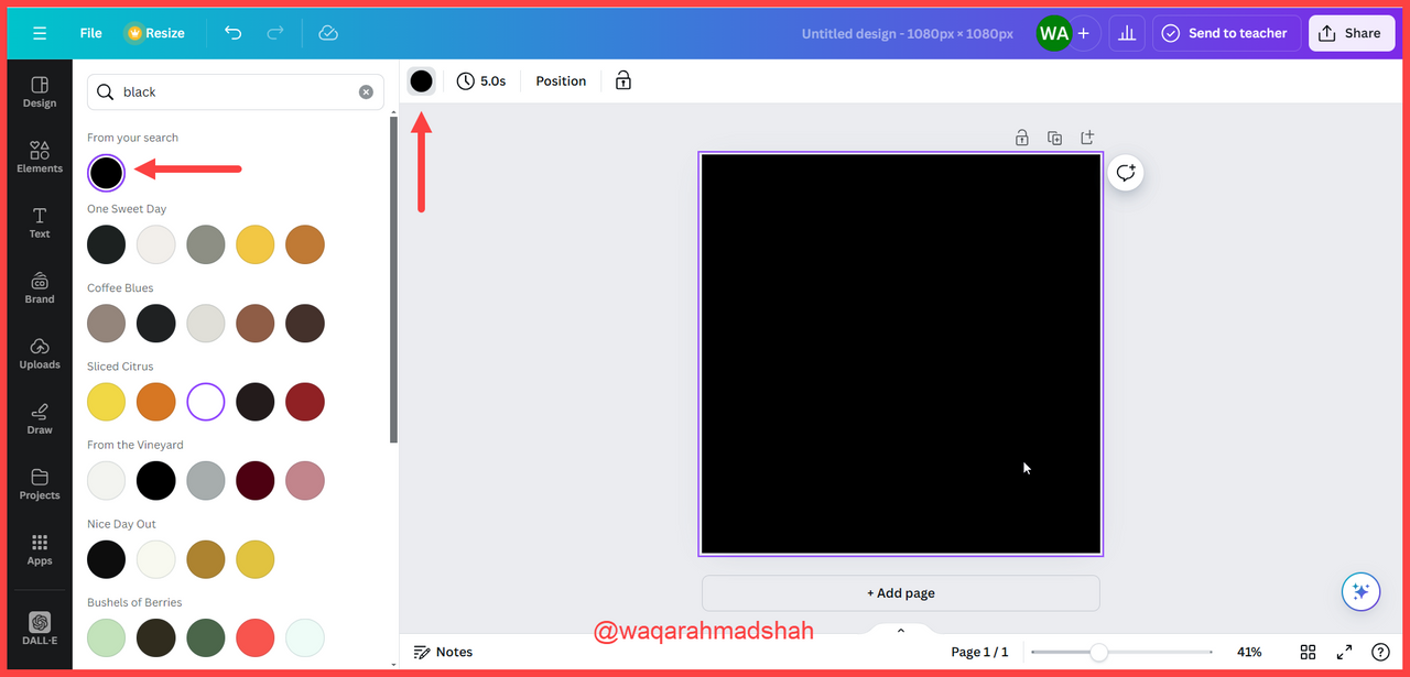
- Step 2: You’ll see a white background template by default. To change the background colour, click on the colour icon and select black, as shown in the screenshot below.
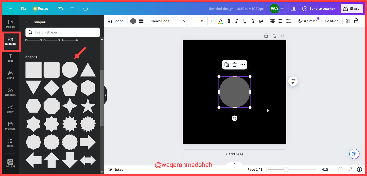
- Step 3: Next, go to the “Elements” tab and select a spherical shape.
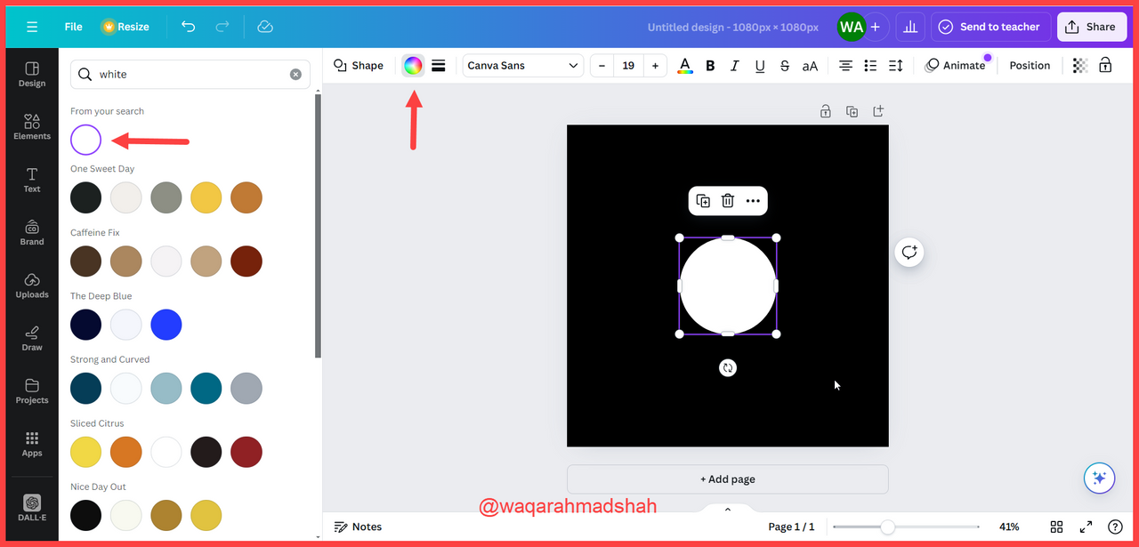
- Step 4: To change the sphere’s colour to white, select the sphere, click on the colour icon again, and choose white.
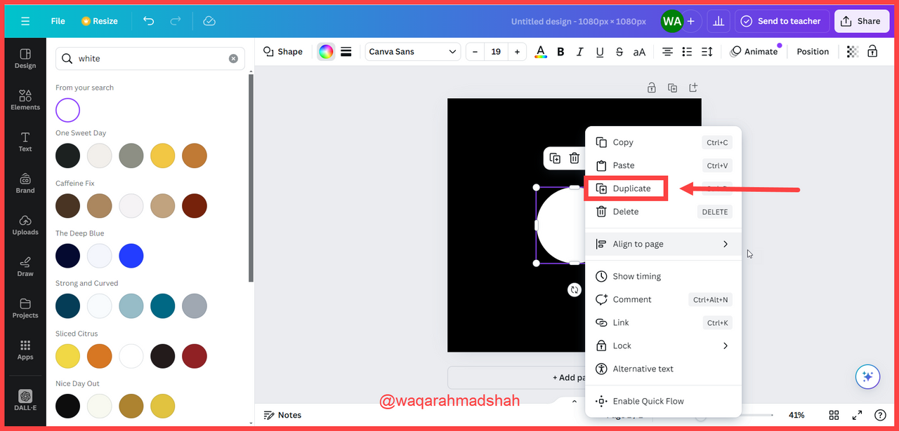
- Step 5: For the required design, you’ll need three more spherical shapes, so either click “Duplicate” or press Ctrl + D three times to create duplicates.
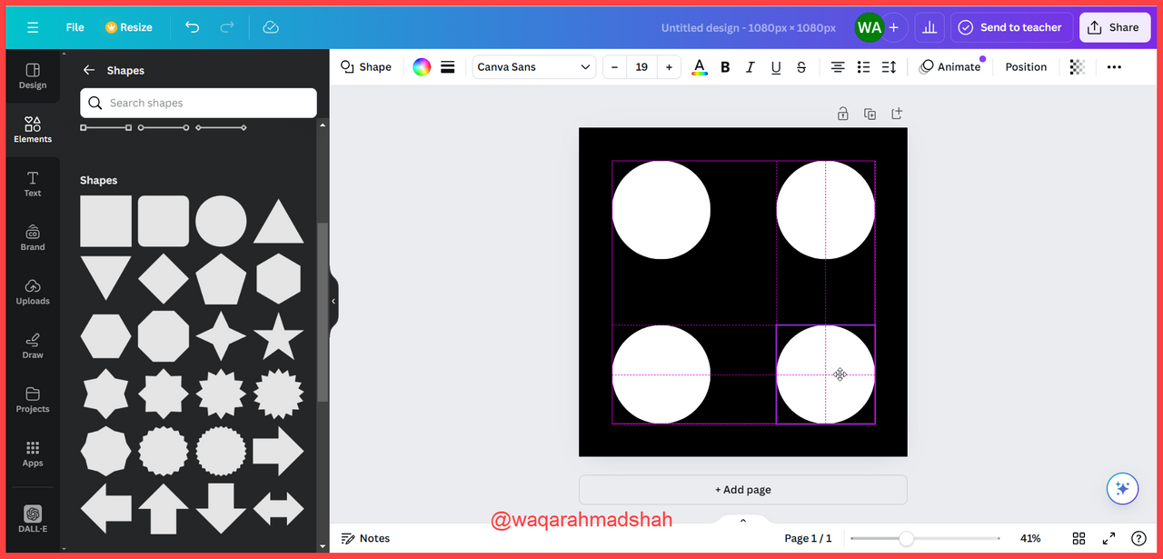
- Step 6: As you can see, there are now three duplicates, but their arrangement isn’t correct yet.
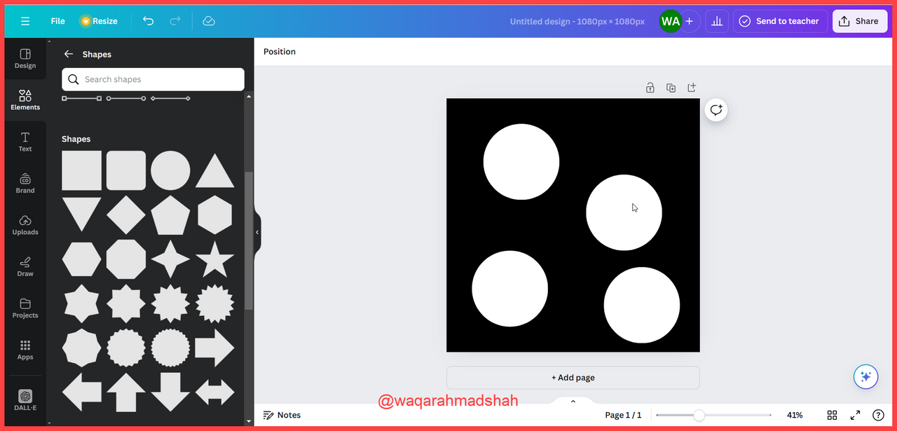
- Step 7: In this step, you’ll align the images by dragging them into position.
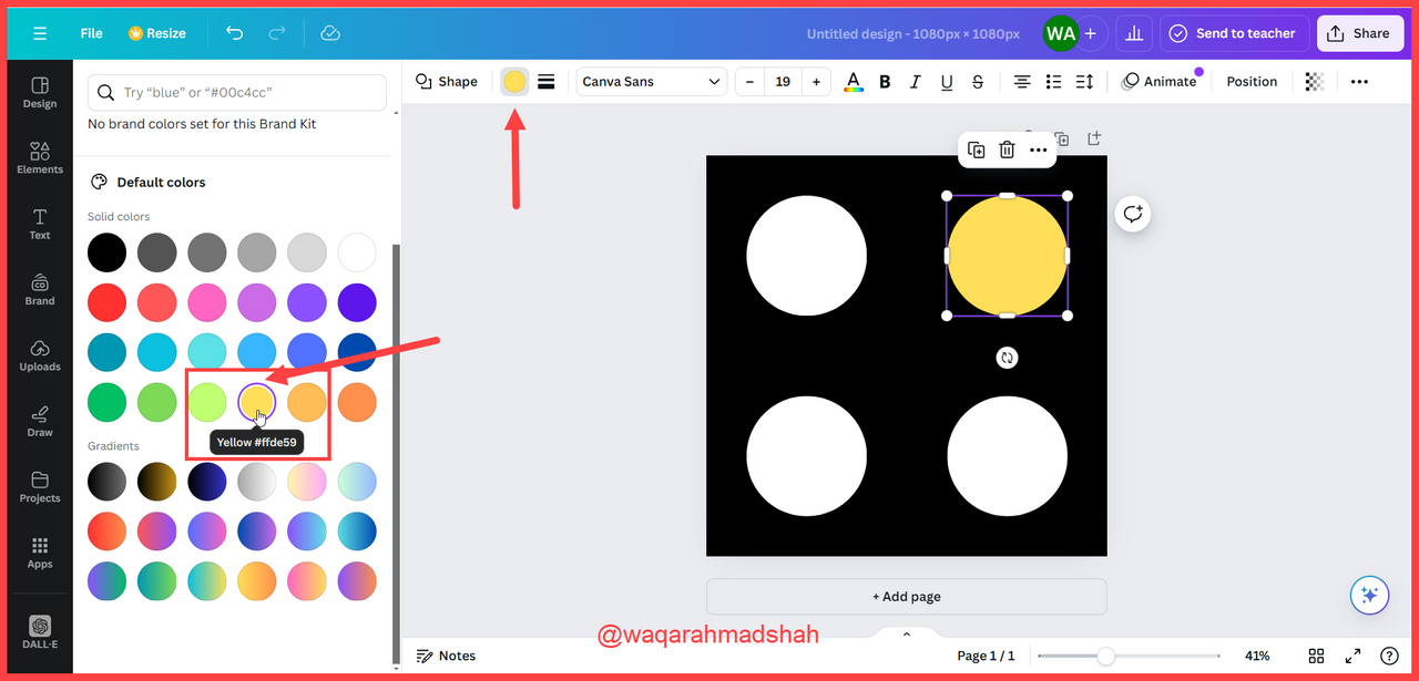
- Step 8: Finally, change the colour of second sphere to yellow.
Final Design |
|---|
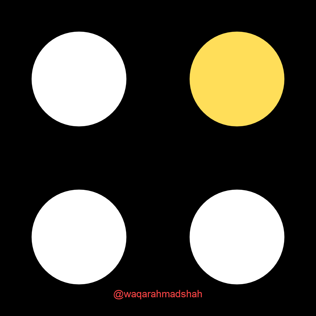 | Using 1080 x1080 size/dimension |
|---|

Comments