"SEC20/WK2: Colour Theory and Application."
7 comments

Color theory is a most charming realm in which art, psychology, and physics converge. Now this is my understanding about Color theory;
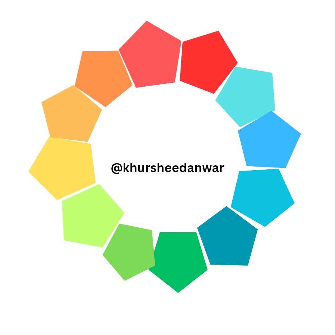
Color Wheel
Color wheel is a round presentation of variety of colors that shows their relationships.
• Primary colors used in color theory are Red, Yellow, Blue because they can't be created after mix up with other colors.
• Secondary colors include Orange (Red+Yellow combo), Green (Blue+Yellow combo), Purple (Blue+Red combo) so these are secondary as they can be created by mixing two different colors.
• Tertiary colors are Yellow-Green, Blue-Green, Red-Orange etc that can be made up by mixing some other colors.
Color Harmony
Color harmony defined as visual appealing alignment of diverse colors.
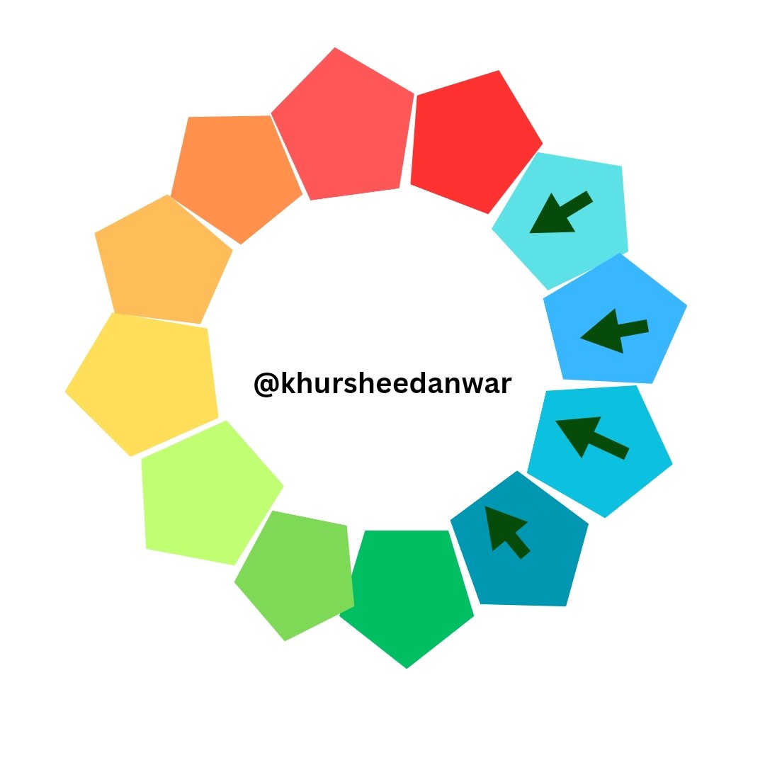
- Analogous: Almost similar colors like Blue, Green, Yellow-Green.
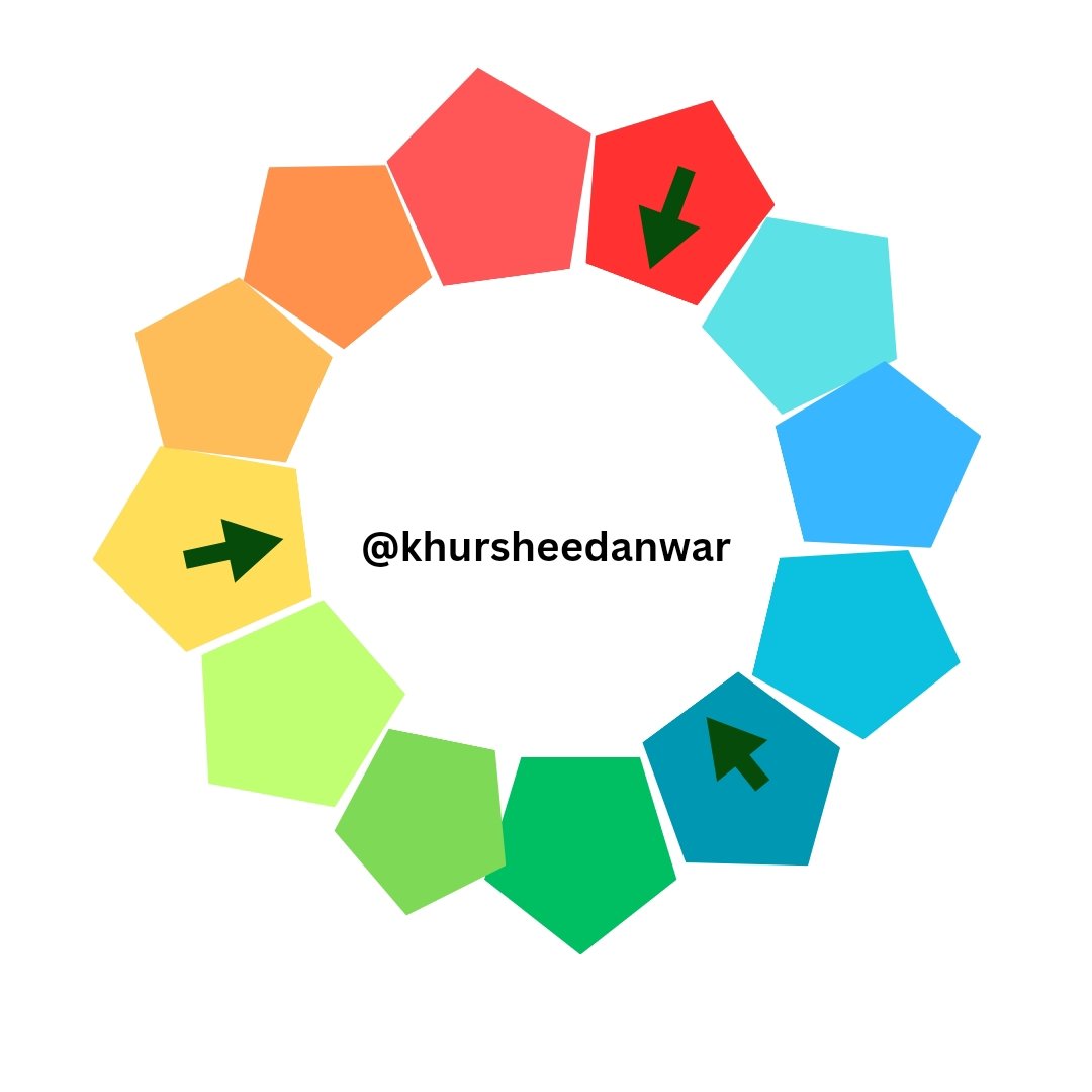
- Complementary: Directly opposite colors like Blue, Orange.
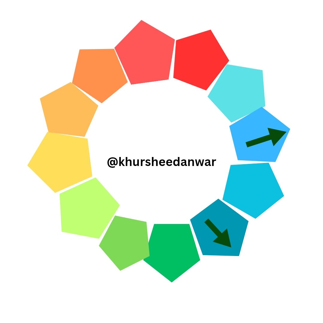
- Triadic: Colors with proper equal spacing like Blue, Yellow, Red.
Color characteristics
• Hue:Real color like Red, Blue
• Saturation:Intensity of color like bright, dull.
• Value:Lightness or darkness like light, medium, dark etc.
Color emotions
Colors may impart emotions and convey meaning:
- Red is a sign of passion, energy
- Orange is a sign of creativity, enthusiasm
- Yellow is a sign of happiness, optimism
- Green is a sign of growth, harmony
- Blue is a sign of trust, calmness
- Purple is a sign of luxury, creativity
Color Theory Application
It's applications is in different fields;
- Art and Design
- Branding and Marketing
- Interior Design
- Fashion
- Packaging
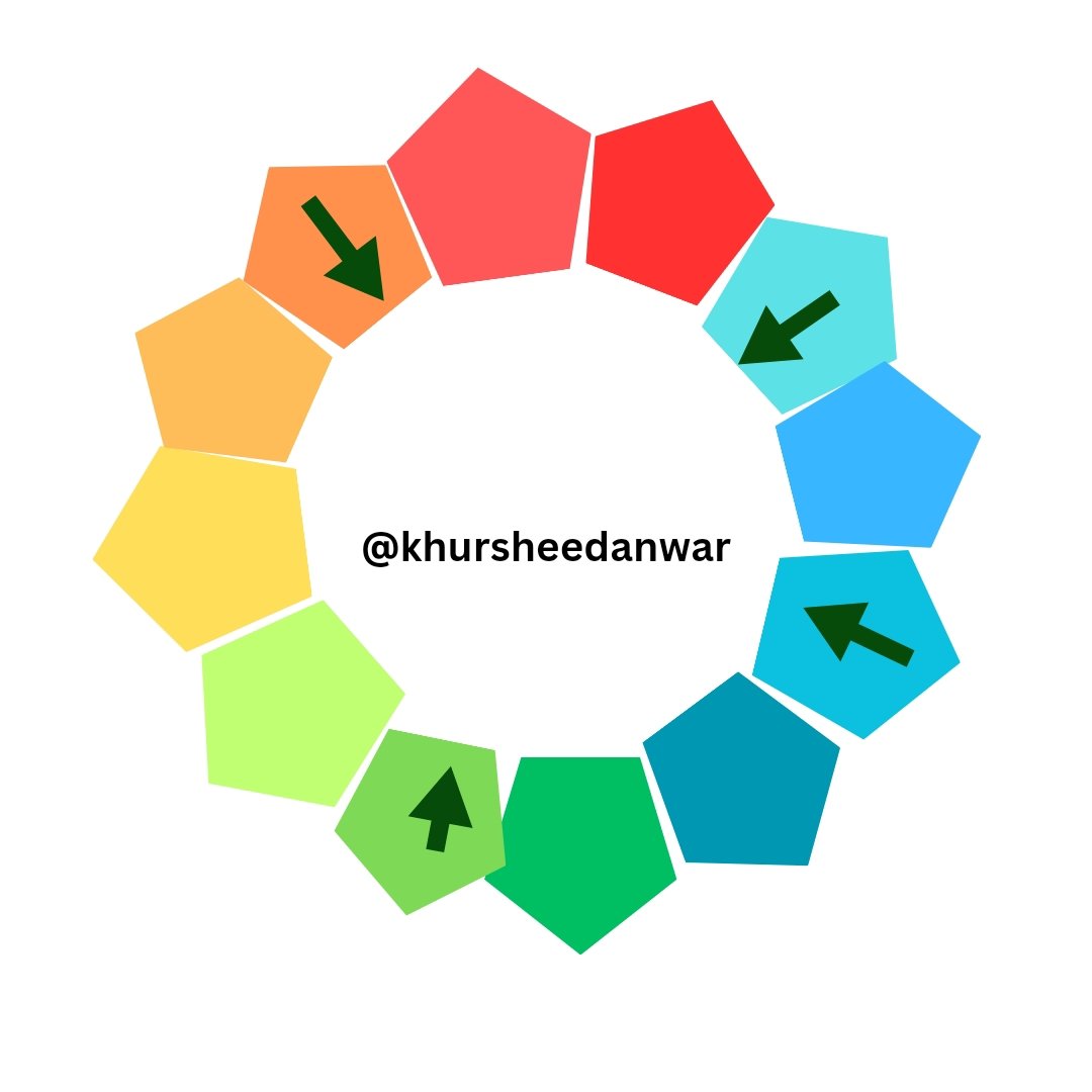
Analogous Color Scheme (Harmonious)
In this color scheme colors seems to be next to each other at color wheel like Blue, Green, Yellow-Green.It is a color scheme which gives a much cohesive look.If there are backgrounds or textures then this scheme is suitable.It involves same lightness and saturation while choosing colors.
 |  |
|---|---|
| ✅ | ❌. |
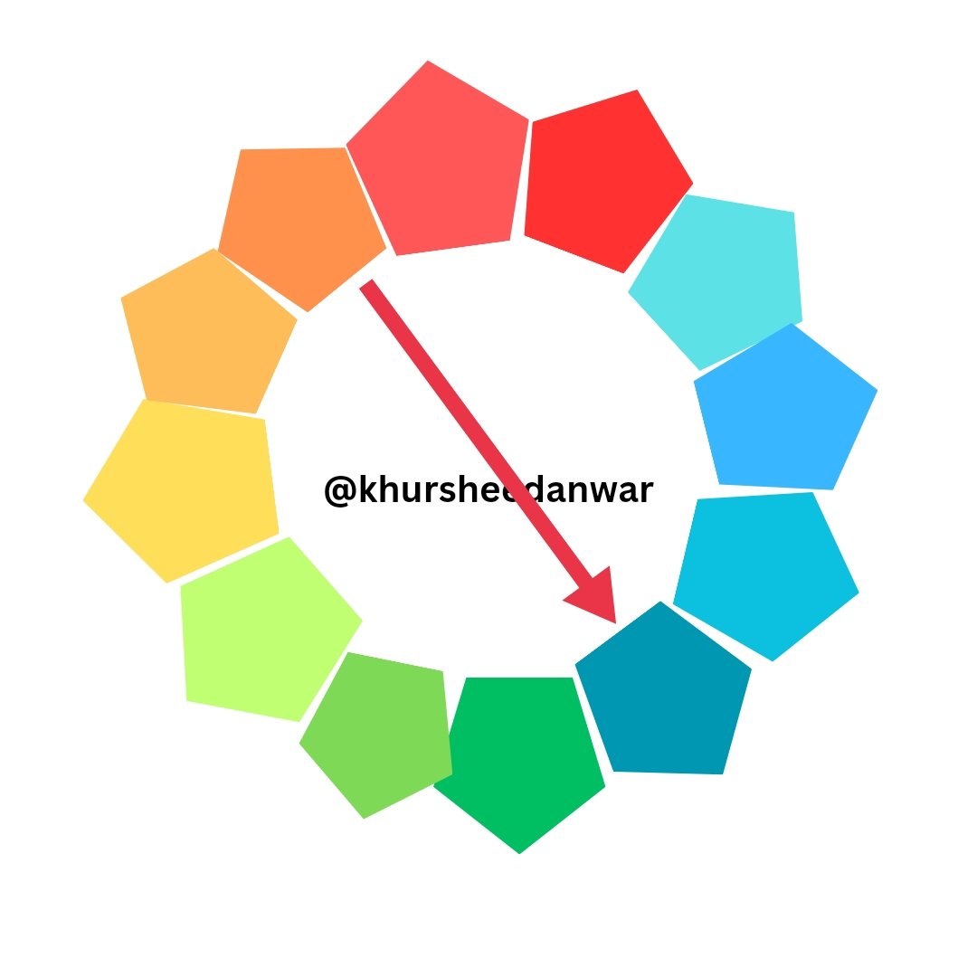
Triadic Color Scheme (Vibrant)
This is a color scheme in which color usually seems to be spaced from each other in a equivalent way at color wheel.As an example you can take Blue, Yellow, Red.It looks very balanced but vibrant also.This scheme is perfect for logos and branding etc.
 |  |
|---|---|
| ✅ | ❌ |
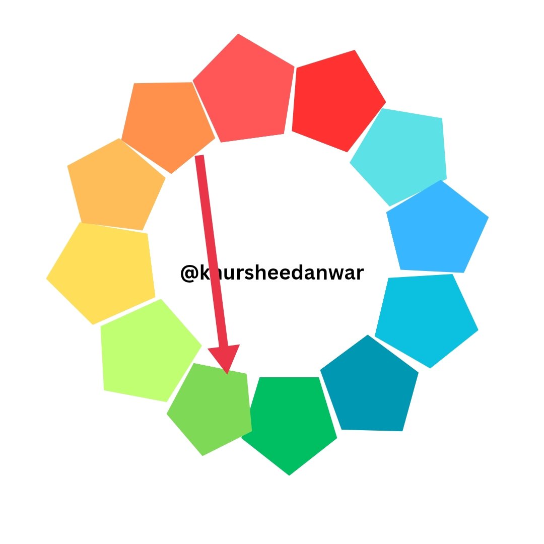
Complementary scheme
• Directly opposite colors.
 |  |
|---|---|
| ✅ | ❌ |
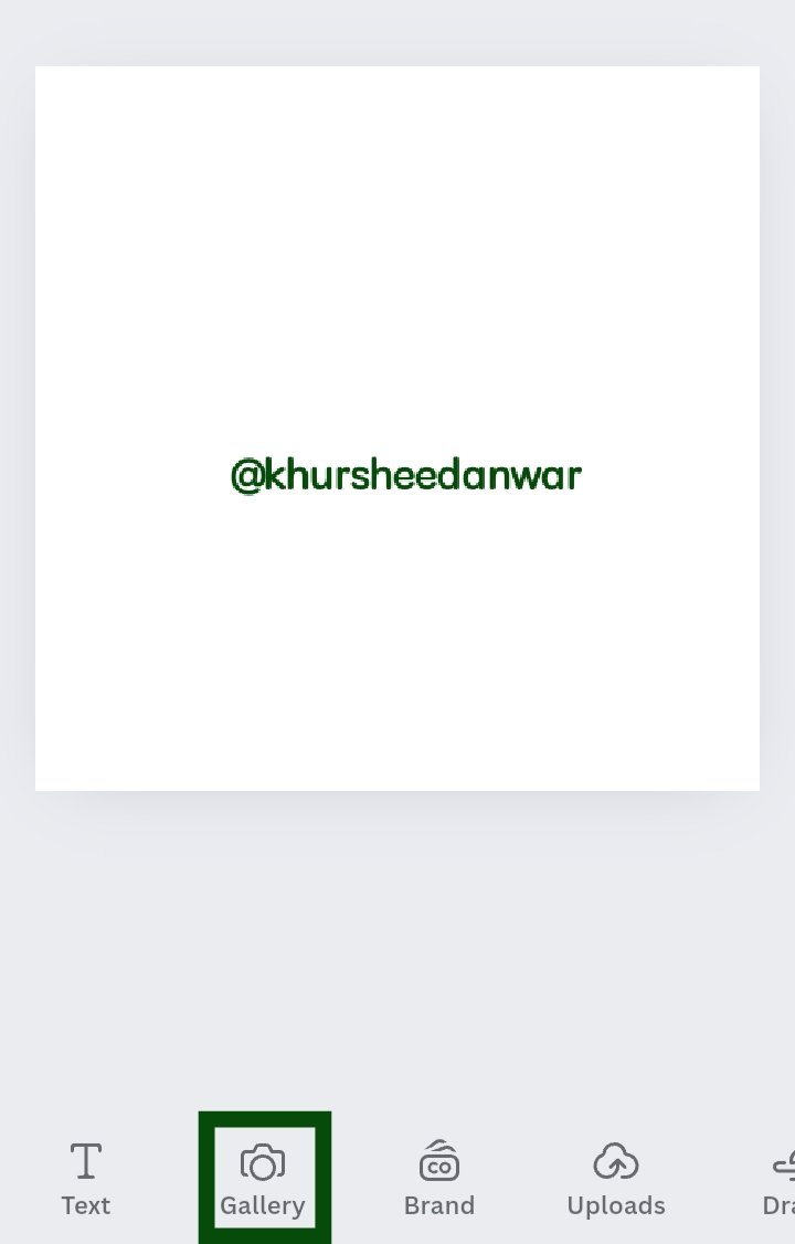
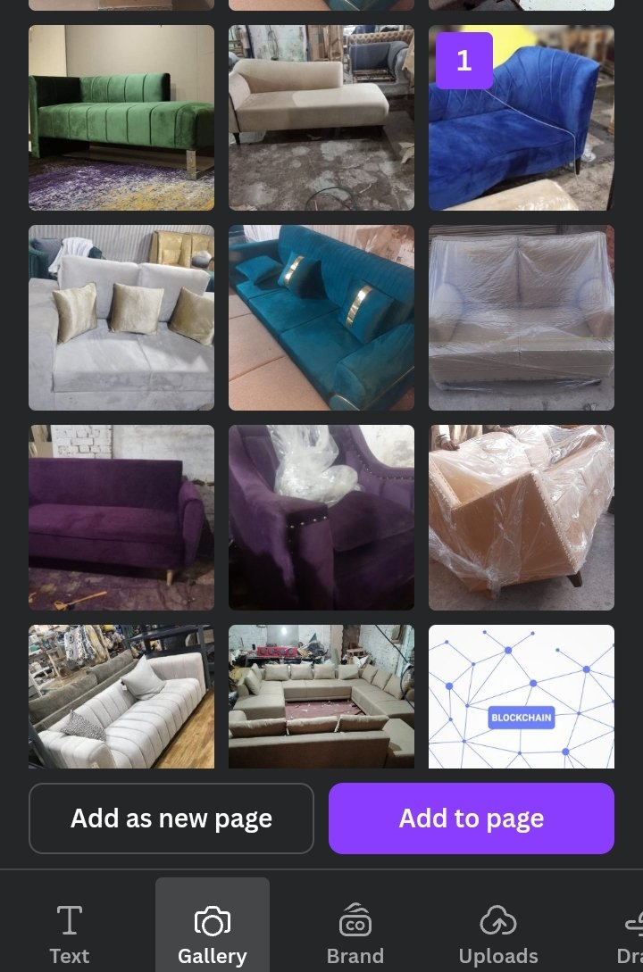
• I opened canva app and select a 1080×1080 dimension Instagram blank post.
• At bottom I locate gallery option.I click on it.
 |  |  |
|---|
• I saw different pictures of my gallery.I choosed 1 from them randomly.Then I clicked on Add to page.
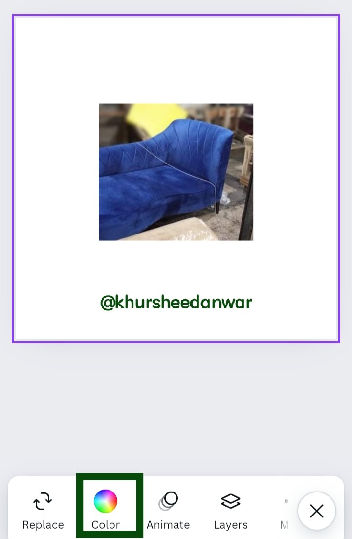
• That selected image then moved to blank post.Then I select whole post so that I may have color option.
• Finally I saw color icon and click on it.
 |  |  |
|---|
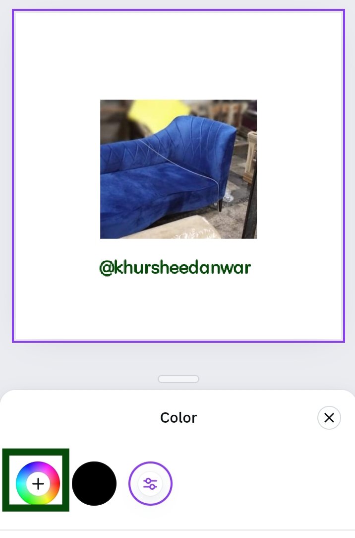
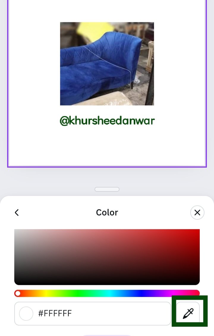
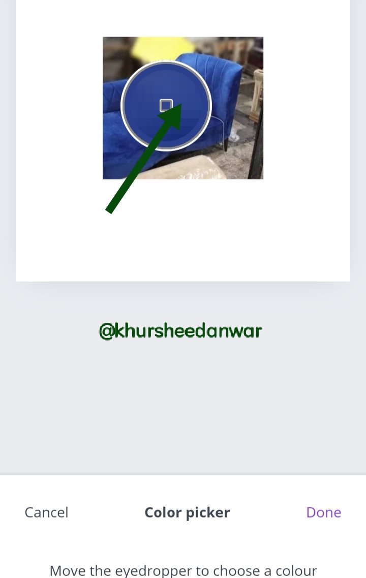
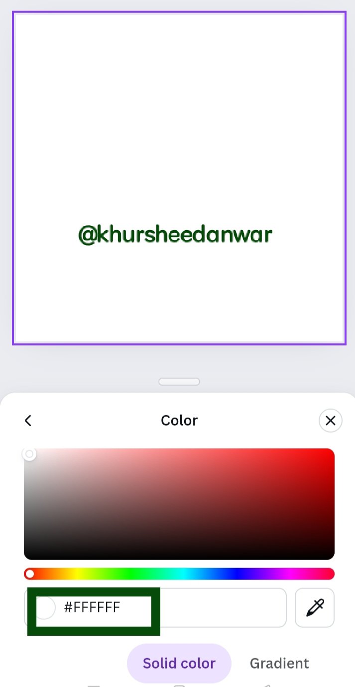
• I click on color icon and then color wheel was opened.At bottom of very next page I saw a marker like icon so I click on it for searching 🔍 🔎 hex code.
• I saw a magnifying glass like sign at my imported image so I moved that sign to dark blue color and then I click on done option as seen in image.
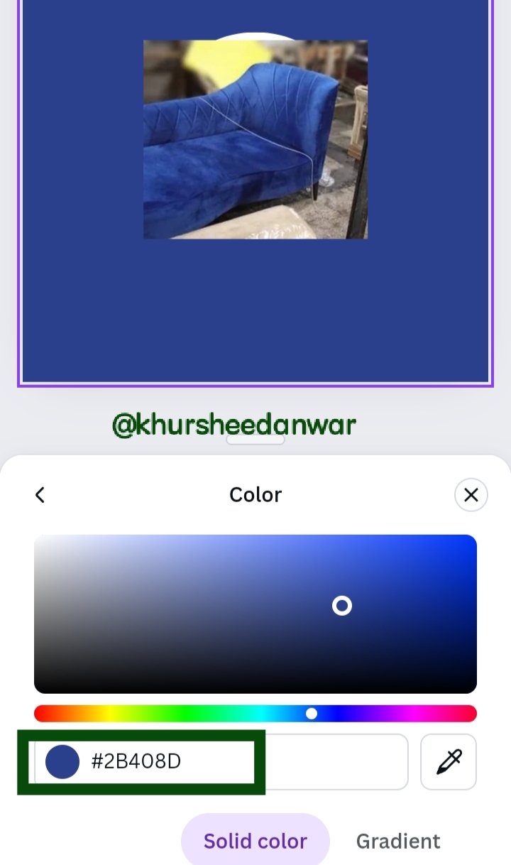 | My final hex extraction |
|---|
• After I was done with it,I finally successfully got my hex code of dark blue color which was 2B408D.
• I opened canva simply and again selected Instagram blank post.I select it and then I saw colors option.
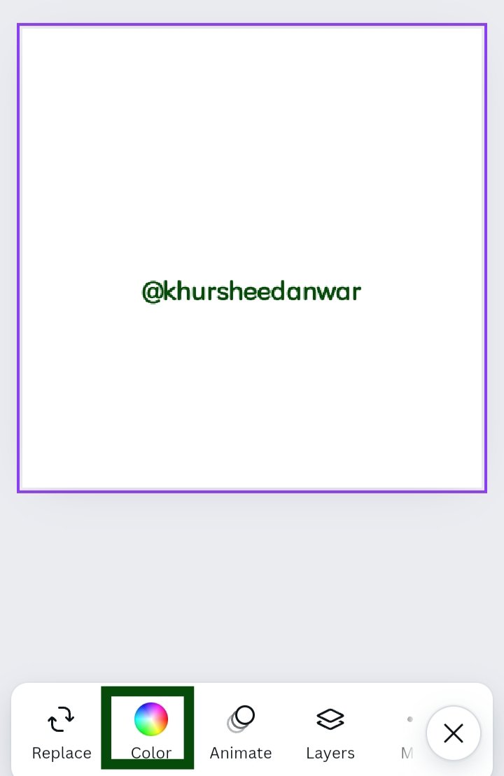 |  |  |
|---|
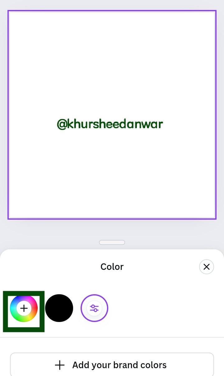
• After that I click on color icon and locate color wheel.
• After locating color wheel already there was a randomly generated hex code which I removed by erasing the text.
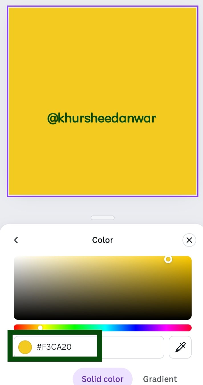 | 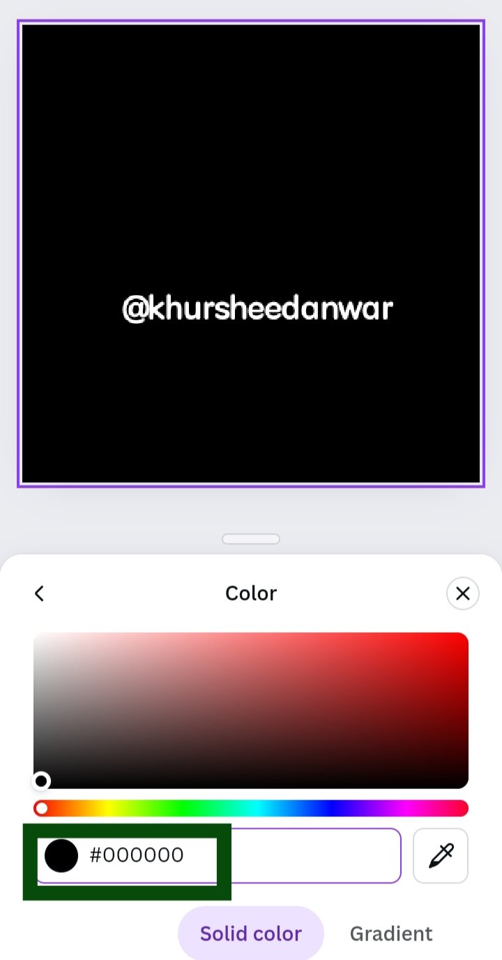 | 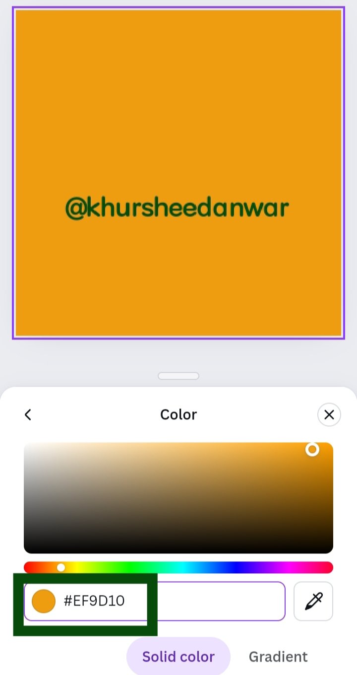 |
|---|---|---|
| #f3ca20 | #000000 | #ef9d10f |
• One by one I put hex codes and take screenshots.
• First I put there #f3ca20,then #000000and at last #ef9d10f and I got yellow,black , orange colors respectively.
I want to invite @mile17,@patjewell,@simonnwigwe to participate
Comments