SLC21/WK3: Logo Design - Part 2
2 comments
Here 👇 is my performed task

Discuss about each of the logo types we have and then talk about conditions when such logo should be used and when not to be used for a brand. You can do a little research to aid you.
Each form of logo is appropriate for specific branding objectives and audience perceptions, making them vital visual symbols that convey a brand's identity. Here is a list of the various sorts of logos, along with when they are appropriate and when they might not be.
1. Wordmark Logo - Definition: Utilising the brand's name as the primary element, a wordmark logo is text-based. FedEx, Coca-Cola, and Google are typical examples.
Best Use: Because it depends on typography to establish awareness, this type is ideal for brands with short or unique names. It's perfect for new brands trying to make a reputation for themselves or for companies who want their name to be easily remembered.
Avoid When: Long or complicated names might not work well with it because they can be difficult to stylise while still being readable.
2. Monogram Logo - Definition: Monogram logos are made up of the initials of the brand, which are frequently stylised to form a distinctive symbol. A few such are HBO, CNN, and IBM.
Best Use: Brands with long names benefit from this design, which helps condense their identity into letters that are memorable. Brands with well-established audiences, such as those in the luxury or high fashion sectors, frequently employ it.
Avoid When: Monograms might not convey enough information about a brand or its offerings for new or emerging brands.
3. Emblem Logo - Definition: Usually fashioned as crests or badges, emblem logos have text inside a symbol or image. The NFL, Harley-Davidson, and Starbucks are well-known examples.
Best Use: Because emblems communicate authority and tradition, they are appropriate for government agencies, educational institutions, and historical brands. When a legacy sense and brand trustworthiness are important, they do well.
Avoid When: Emblem logos aren't the best choice for brands that need to be adaptable across digital platforms or mobile devices because they can be complicated and lose information at small sizes.
4. Combination Logo - Definition: This kind creates a single, unified design by fusing text and symbols (icons). Adidas, Lacoste, and Doritos are well-known examples.Combination logos are very adaptable and provide a variety of methods to showcase the brand's identity. They work well for businesses that want to improve brand identification by balancing their name with a distinctive visual feature.
Avoid When: Excessively intricate patterns might be difficult to replicate or visually cluttered, especially at smaller sizes.
5. Mascot Logo - Definition: Mascot logos use a character that represents the essence of the brand, such as the Pringles mascot or the KFC Colonel. Mascots are perfect for brands that want to project an approachable or family-friendly image. They are frequently utilised in sports, entertainment, and cuisine, where a vibrant character may establish a memorable, relatable bond.
Avoid When: Mascots may not go well with formal or luxury brands because they can come across as less professional. Furthermore, this style could not be adaptable enough for a range of situations and uses.
6. Abstract Logo - Definition: Rather than using exact representations, abstract logos make use of geometric shapes or unusual icons. Consider the Nike swoosh or the Pepsi emblem.
Best Use: Brands seeking distinctiveness without particular images might benefit from abstract logos since they allow for a wide range of interpretations and adaptable brand narratives.
Avoid When: For new brands that require a clear link to their product or sector, this style may be difficult.
7. The brand's logo- description: An icon or symbol devoid of words, such as Twitter's bird or Apple's apple, is called a brandmark logo.
Optimal Use: Brands that are already well-known or have a distinctive, iconic image are the ideal candidates for this kind. Global brands that value brand awareness over overt marketing frequently employ it.
Avoid When: Brandmarks may be difficult for startups or less well-known businesses to use since they don't provide the clarity that new consumers need to comprehend the brand's products.
Choosing the Correct Logo for Your Company The target market, the brand's personality, and industry norms should all be taken into consideration while selecting a logo style. Here are some broad rules:
Wordmarks and combination logos are beneficial for new or expanding brands since they make the brand name stand out and are simple for consumers to recall.
For Established Brands: Abstract logos, brandmarks, and monograms enable well-known businesses to streamline their visual identities without sacrificing recognition.
When Attempting to Establish Tradition or Authority: Emblems work well for institutions, luxury, and heritage firms because they provide a sense of history or dependability.
Mascots are a great way to create a brand that is approachable and personable, which appeals to younger audiences and families.
Take into account the goals of the company and the intended use of the logo, as each style has pros and downsides. The ideal basis for continuous and successful branding will be a simple, adaptable design that embodies the brand's essential principles.
2. Pick any two (2) of the Logo types discussed and then practically demonstrate how to make them, showing your detailed process.
I choose Worldmark Logo and Monogram Logo
A wordmark logo is one that has no additional symbols, icons, or visuals and is made entirely of text. It is a logo composed of letters or words that is usually altered to reflect a company or brand using a special font, colour, and arrangement.
Important features of wordmark logos include:
- Only text; no icons, pictures, or symbols.
- Custom typography: Distinct font configurations, sizes, and styles.
- Brand recognition: The identification is the text itself.
- Easy to use and adaptable: Easily expandable for a range of uses.
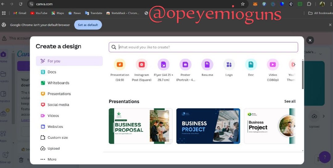
On canva.com, I clicked on create a new design and I choose logo
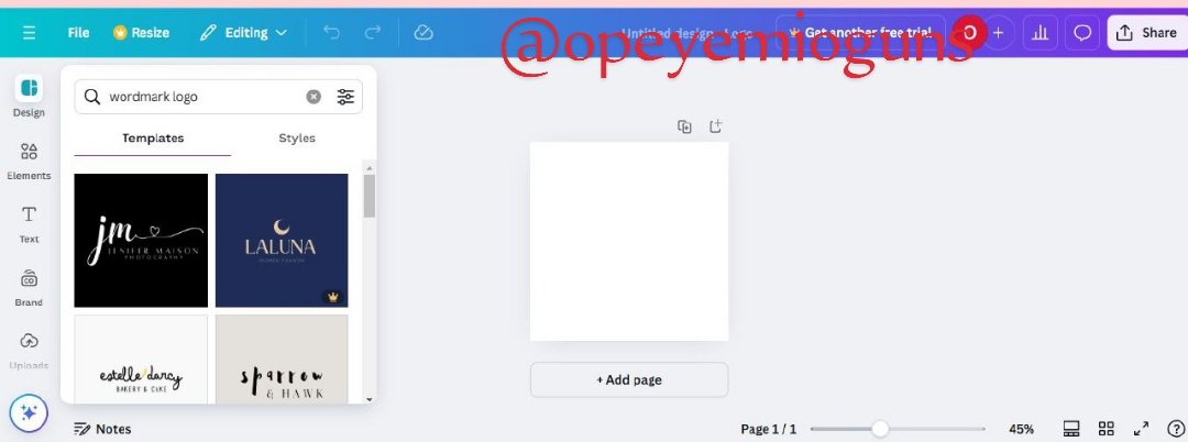
I searched for Worldmark logo
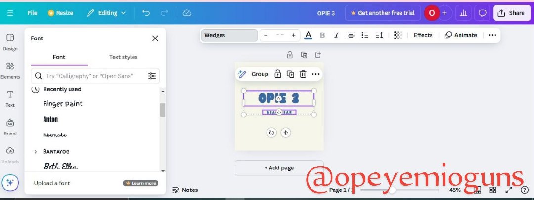
I made my choice and I changed the font to the one that fit most
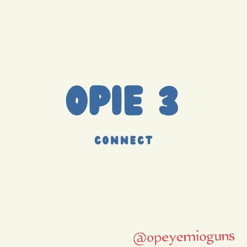
Then I made this Wordmark logo
Monogram
A monogram is a kind of logo that creates a distinctive symbol by combining initials or characters, usually overlapping or entwining. Monograms are frequently employed to symbolise people, companies, or products.
Features of logos with monograms:
- Initials-based: Makes use of the brand's or individual's initials.
- Combined letters: Letters that overlap, entwine, or combine.
- Unique symbol: Creates a recognisable, distinctive emblem.
- Elegant and simple: Frequently has simple design and clean lines.
Monograms work well for the following:
- Luxury brands: Express exclusivity and sophistication;
- Personal branding: Perfect for individuals, business owners, or coaches;
- Heritage brands: Involves tradition and history;
- High-end services: Law firms, financial institutions, or consulting;
Types of Monogram:
- Interlocking monogram: Letters fit together like a puzzle;
- Overlapping monogram: Letters overlap or intersect; 3. Stacked monogram: Letters are stacked vertically; 4. Integrated monogram: Letters combine to form a single symbol.
When creating a monogram logo, we are to take into account the following factors:
- Legibility: Make sure the logo is recognisable;
- Balance: Make sure the visual elements are balanced for harmony;
- Scalability: Make sure the logo works in different sizes;
- Uniqueness: Steer clear of logos that are similar to existing ones.
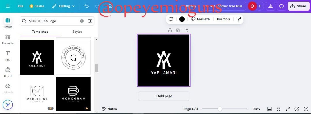
I Searched for monogram and made my choice of the designs
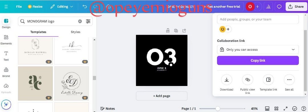
I edited it to my own brand logo
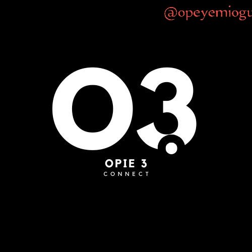
This is the monogram logo i made
3. Design a simple flier for your brand and then strategically place one of the logo you made in the flier.
All that I needed to do is just to upload the logo I made and add it to the flyer I want to create for my brand
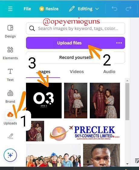
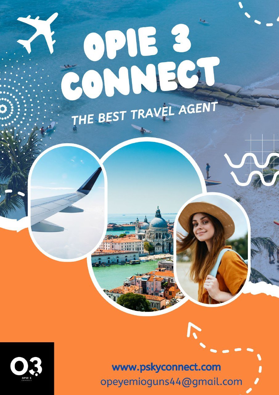
My brand logo
To sum up, logo design is an essential component of branding that combines strategy, creativity, and aesthetics to provide a visually striking and memorable identity. A strong logo expresses a company's principles, embodies its essence, and appeals to its target market. To ensure that each logo not only stands out but also stays throughout time, mastery of logo design necessitates an understanding of both the science of branding and the art of symbolism.
Hey teacher @lhorgic Thanks, it's a well detailed and explanatory course.
@sors @cassar @tojukaka how about you try this as well?
All images are created by me with canva.com
Comments