SLC21/WK2: Introduction to Logo Design
5 comments
Hello dear reader, today's post is about the homework for the Introduction to Logo Design by @lhorgic!
Let's get started!

Discuss Logo design based on your understanding about the topic.
So where do I start this, from my point of view when we are talking about a logo we are talking about a branding item, something visual like a symbol that sends a message to the viewer. One of it's main purposes is to store somewhere in the viewer's mind/brain it's brand, once the viewer sees it it should act like a "flashback" where he thinks of it instantly, knows if he saw it before and what/who is behind that logo. Another purpose of a logo is to create that trust feeling, if it is a brand where the buyer/viewer has been before it surely brings things to his mind like, trust or quality for example.
As for the design part, the design of a logo can set tone for that business, the viewer can get an idea about the business simply by judging it's design, a modern logo will surely bring different vibes compared to a traditional one.

Discuss extensively the role and impact of logo to a brand.
The impact of a logo brand comes from the first impression the logo creates while seeing it, it's the first thing people notice at a brand and it's also one of the things that will create (or not) an emotional bond and trust with the brand. Having a high quality and polished logo will also bring a professional look to the brand, there are higher chances for people to trust the brand. A poorly designed one could even go unnoticed.
The role of a logo is to stand out the brand, we live times where the "market" is full of brands and it's hard to make yourself visible in such a crowded place. The style, colors, typography, simplicity, all are used to reinforce the brand's image and help it move to the "front row".
A good combination of the above mentioned in a polished logo can easily bring "loyalty" to the brand, customers can feel a connection with the brand and the chances of remaining loyal to the brand are significantly higher.
Forgot to mention that a logo should also have adaptability/flexibility and by these I mean that once done a logo should be visible in various sizes and should not lose it's message just because it got smaller as an example. It needs to be visible on lighter and darker backgrounds, the typography needs to be visible and readable in all the combinations. Taking care of these aspects will create an impression of professionalism.

Explain and demonstrate visually the do's and don't when it comes to Logo design. You can do more research to be outstanding and kindly ensure not to use my specimen logo.
I've done some research for the do's and don'ts and I will explain them below and try to draw some examples.
Let's start with the Simplicity/Clarity of the logo, the design of the logo should be pretty simple and clean at any sizes, the customer must recognize the shape and color easily. Small details or elements can easily be lost when you reduce the size of the logo.
On a short description, keep it simple and clean, minimal number of colors, avoid many complex shapes with too many details!
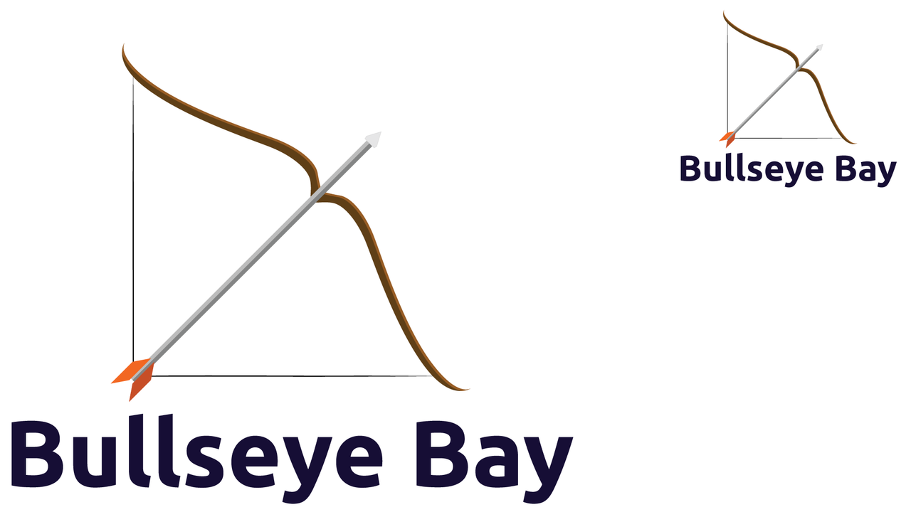
Logo is still easy to recognize in both upper and lower size, even if we make it smaller the customer could easily understand based on the shape and the text what the brand is working with!
For the typography you should use a font that fits with the brands identity, it should be like a personality of the brand. The customer could recognize the brand by it's unique type text, making it distinctive. Even though at some points using different fonts could be beneficial those cases are extremely rare, you should avoid using multiple fonts and fonts that are hard to read.
On a short description, use fonts that represent your brands identity/personality, keep a balance between fonts and graphical part. Avoid hard to read fonts and unbalanced elements!
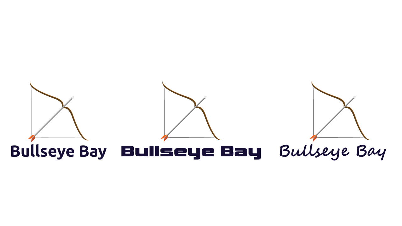
Even though there could be multiple fonts that work with the logo, you need to pick the right one that will fit in any size and location where the logo could be placed!
For the color palette you should have 2-3-4 colors that should align with the brand, usually these colors need to look good on both light and dark backgrounds but for some cases you could adjust the logo for the different light/dark backgrounds.
On a short description, use colors that fit well together and avoid excessive color use!
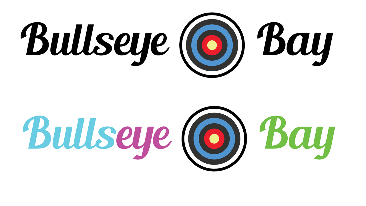
A comparison between those two examples, see how the second one makes your eyes feel like something is not where it should be? It's the number of colors used and their combination!
Create a logo that is unique and specific to the brand, it should be enough to send a message, even though it is market with millions of logos around try to avoid generic templates.
On a short description, keep it unique and original, make it relevant to the brand, avoid copied and common designs as much as possible!
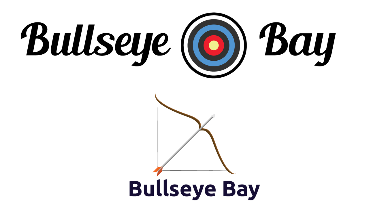
Even though it's a market with thousands of logos specific to archery, the logos are still simple and suggestive!

Design a simple logo with the knowledge you have gotten from this lesson by assuming that a client gave you a job to design for his brand (business).
I have created two simple logos for this part of the homework, I will show you a GIF with some simple steps used to create the design and explain below how I did it.
So the main idea was to create a logo for an archery range where people could come and use a bow and arrows to hit a target. To create the designs below I used Adobe Illustrator for the Logo design and Adobe Photoshop for the GIFs.
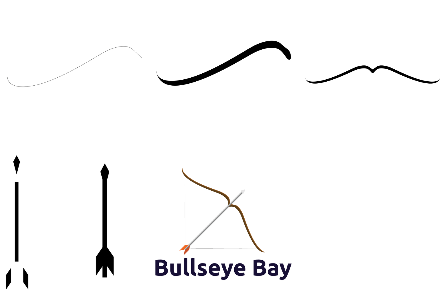
I started the main line using the pen tool, I wanted to create half of a bow and just duplicate it and "reflect" it to create the other half of the bow.
Once I created the first line I duplicated it and moved it down a little to create a thicker shape for the bow, once that was done and filled with color I copied it near and used the reflect effect to rotate it. The reflect tool allows you to rotate an object horizontally/vertically like having it in a mirror.
Now that I had something close to a bow, I used simple shapes to create the arrow, used rectangles where I moved the corners to fit my needs, the sharp tip is a square with the corners extended to make it pointy, the body of the arrow is a rectangle where one side of it was dragged down to stretch it and make it longer. The back of the arrow is made with one square that had two points moved down a little to create the parallelogram shape. Once the arrow has been done it was time to tune the design a little, add some color, create the illusion of shadows in some places and add some text. The final result looks like this.
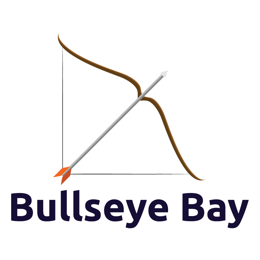
If I were to spend more time on it I would probably look for a nicer font, but the ones that are free for commercial use aren't that cool and I feel like moving around fonts on 1001fonts.com until you find the right one could be painful.
Also I would probably make another version with a lighter color on the text so it would be visible on both dark and light backgrounds.
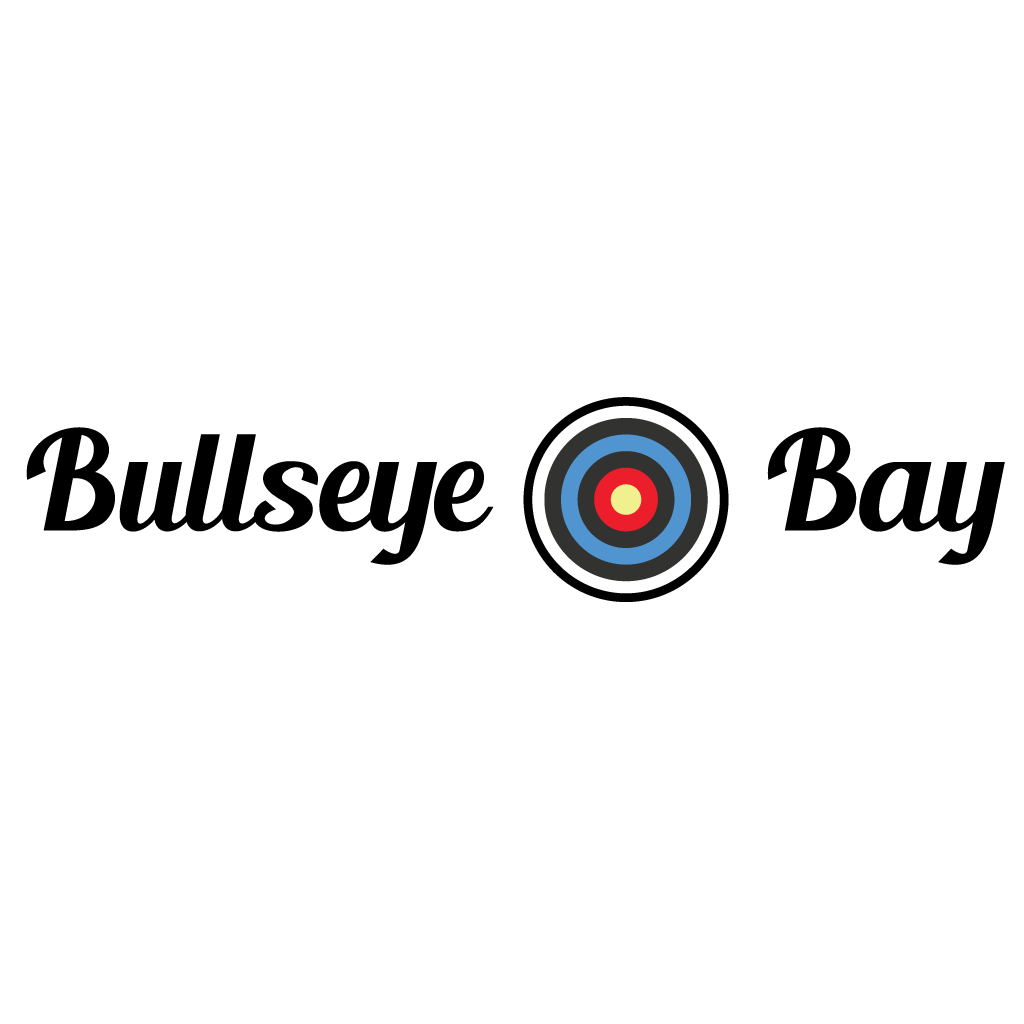
As for the second design, it is much simpler to create, it looks like this:

The main idea was to create a target for arrows, to do this we start with a circle that has another smaller circle inside, and so on until we have the right number of circles to fit all the colors of a target. Added some stroke on the external line to increase it's thickness, as an accent on the design and added the right colors (looked over the internet for target examples). Found the right font (had this pre-installed, probably used it before) and added everything together to get this:
That was it for this homework, thank you @lhorgic for this awesome class. In the end I would like to invite @mojociocio @titans and @r0ssi to join this!
Comments