"SEC20/WK1: Introduction to Graphic Design and Principles."
4 comments
 designed using canva app designed using canva app |
|---|
Hello Teacher,
I am excited to join this class. For a while now, I have been wanting to start up this course online, but I've not gotten the opportunity to. Well, Steemit finally brought it to me through you. I hope my stay here would benefit me a lot.
Having learned the introduction class, let me present my assignments below by answering the questions...
Question 1: What is Graphic Design? Briefly Share with me your understanding about graphic design |
|---|
When I look at graphic designers, I see them as creative and fashionable people, or should I say artists, because graphics is all about creativity. Many times we take some of these designs around us for granted, not knowing the level of work that has been put in to make them that beautiful.
However, graphic design is simply a form of communication where the designer uses colors, images, and shapes to create meaningful, useful, and functional visuals.
Graphic design has so much to do with art; although creativity is a big part of graphic design, one who understands and practices the art of graphic design is proudly a graphic designer.
Generally, graphic design is fun, exciting, and interesting. You get to explore, play with colors, and create beautiful pieces that would leave you smiling.
Question 2: Pick any three of the principles of Graphic design and talk about them based on your level of understanding |
|---|
• Unity
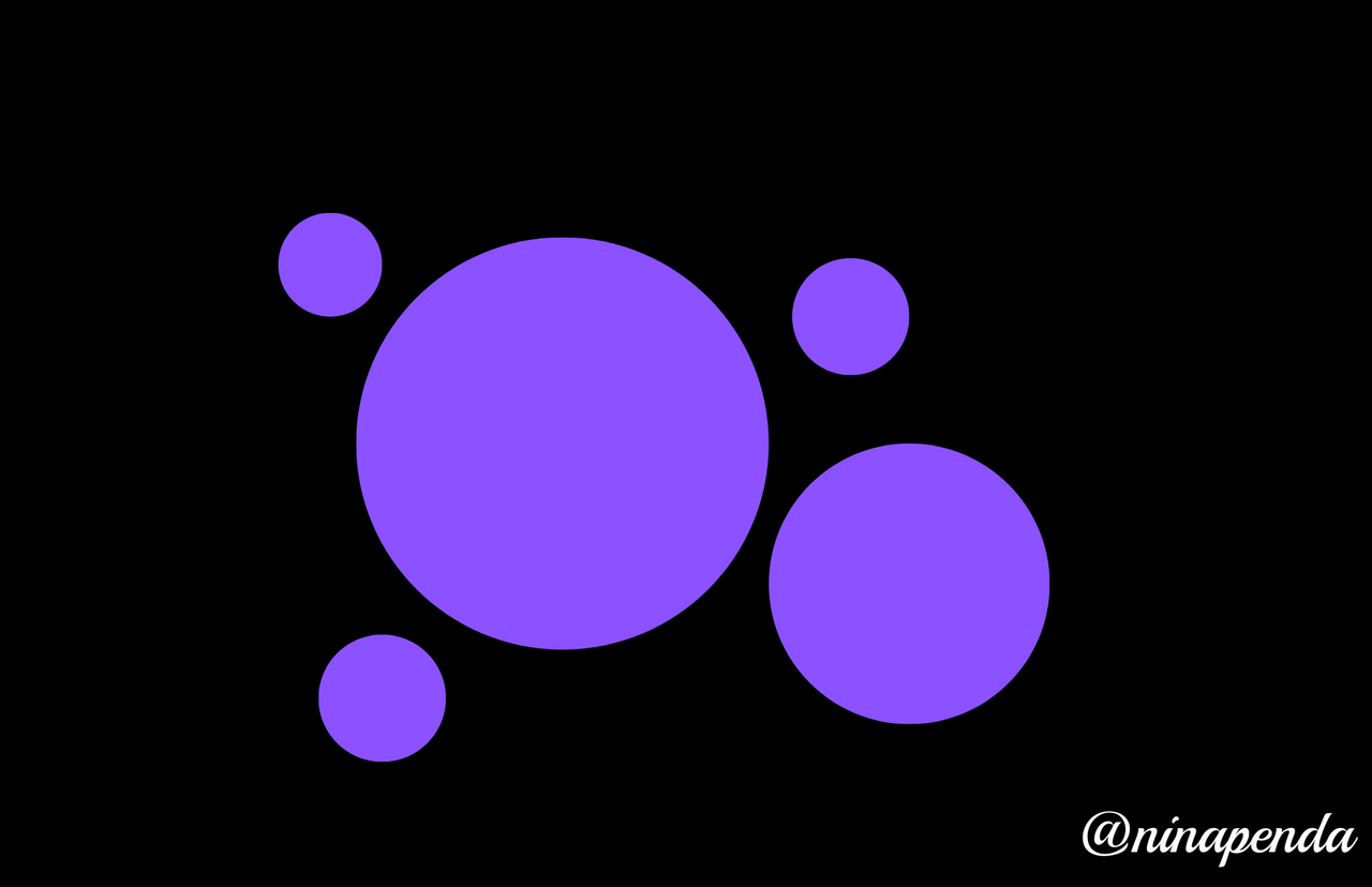
Unity is same as togetherness and this principle refers to the well usage of all the elements that are present in my design project work together.
Each one should have a clear relationship and communicate the same concepts with each other, this will make your design look more organized leaving every element on to be related to each other.
• Rhythm
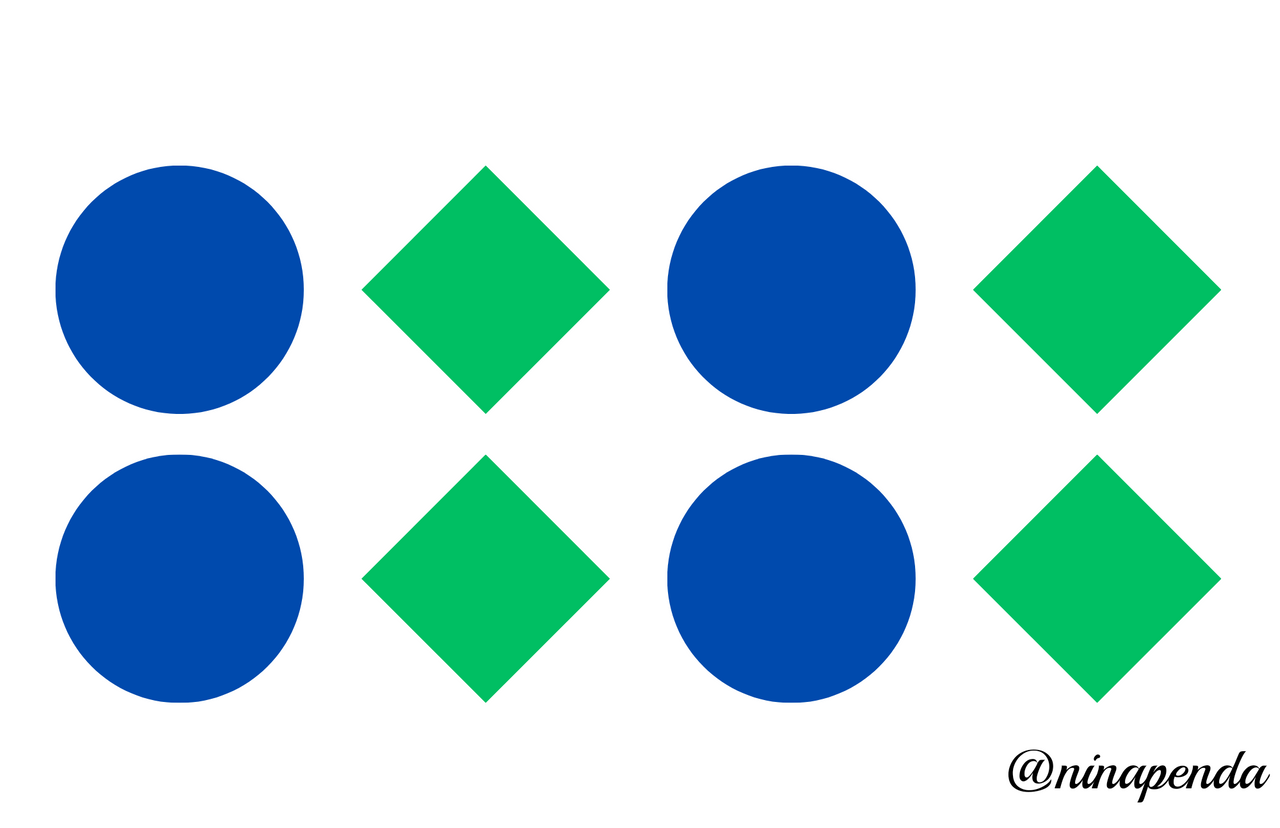
The rhythm principle is one of the easiest principles to understand and just by using the music for instance, when repeating elements are used in designs, there should be spaces created between these elements.
A visual rhythm is created just as it happens in musical compositions.
• White space
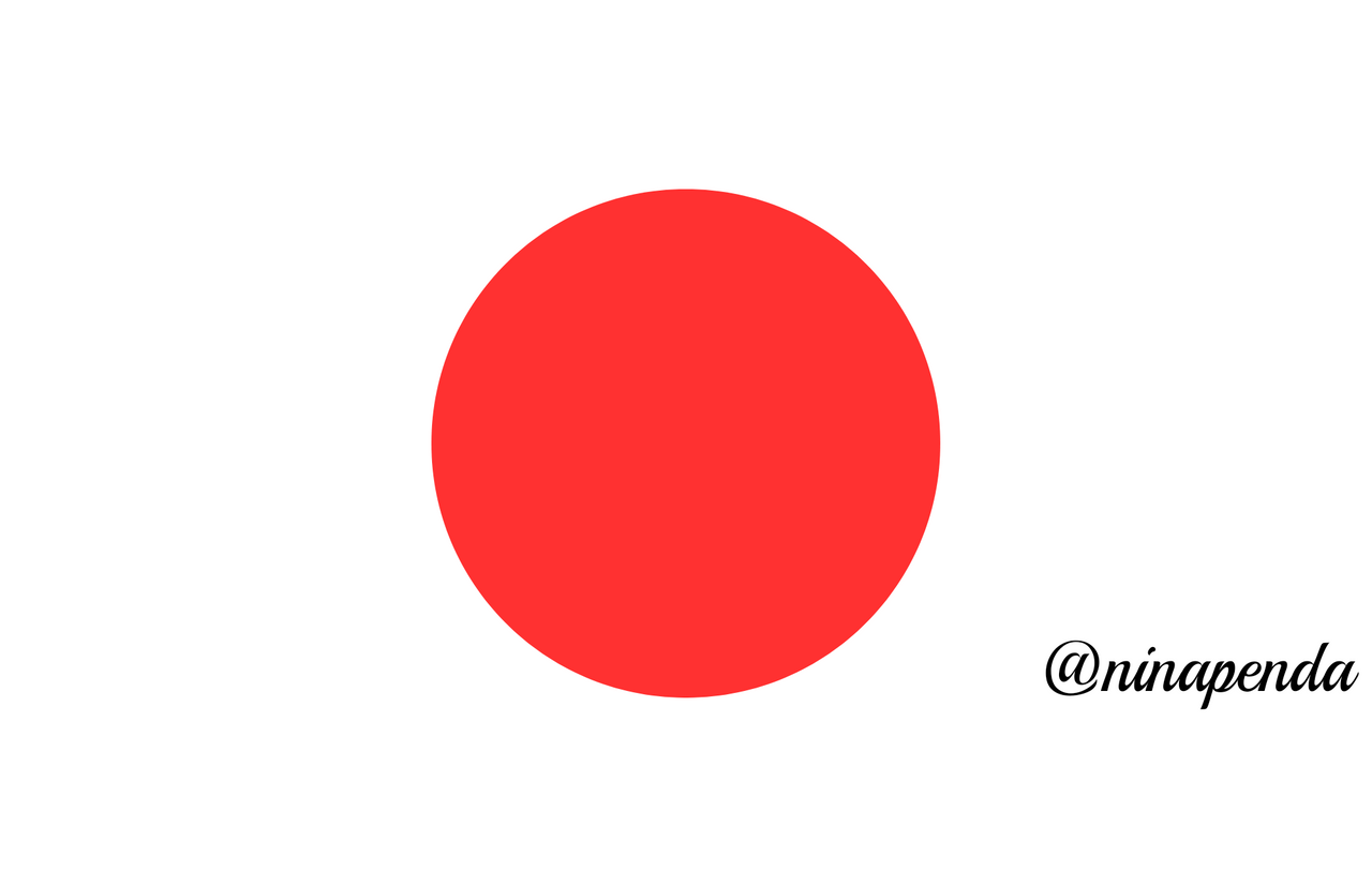
White space here is also known as negative space and it is not necessarily white, it can also be your background color, and it refers to that area of a design that is empty and not included in the design elements.
Actually white space is an important design element when it comes to graphic design. These design elements deserve some breathing space to easily differentiate them from other elements.
Question 3: Practically show us how to make the graphical image below |
|---|
• Step one: Open up the canva app and click on the + circle below.
• Step two: Since I was working with 1080×1080px, I used the search button to locate the size and then click on the bill board square.
• Step three: Highlighting the desired size for use.
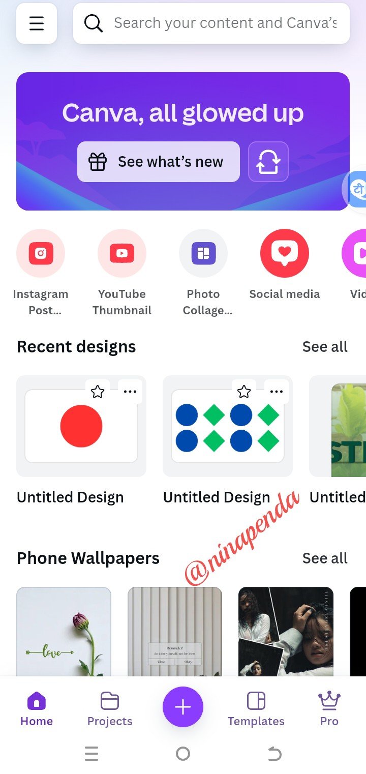 | 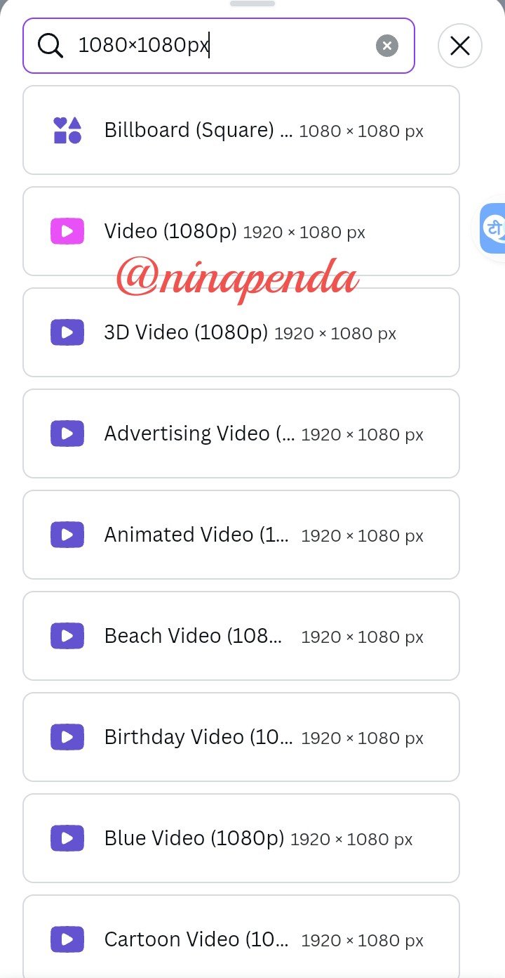 | 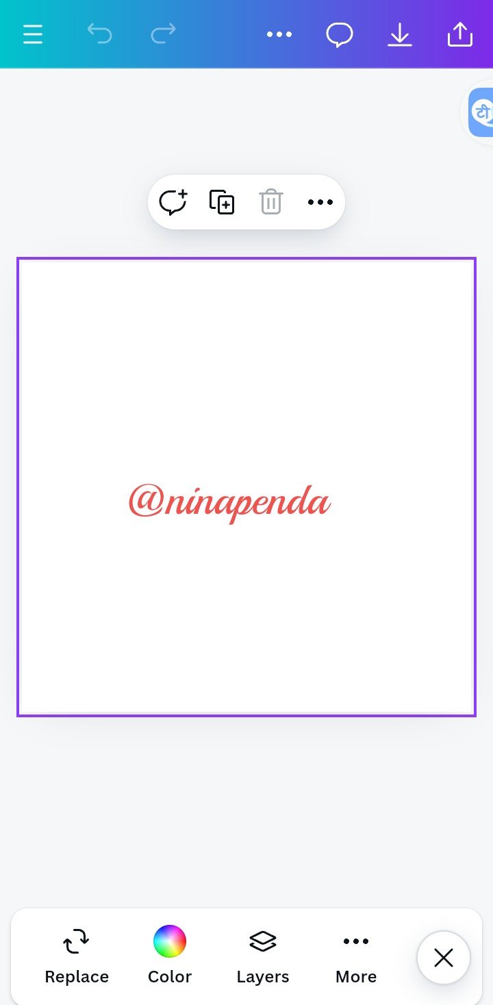 |
|---|
• Step four: Locate the color icon and choose your desired color.
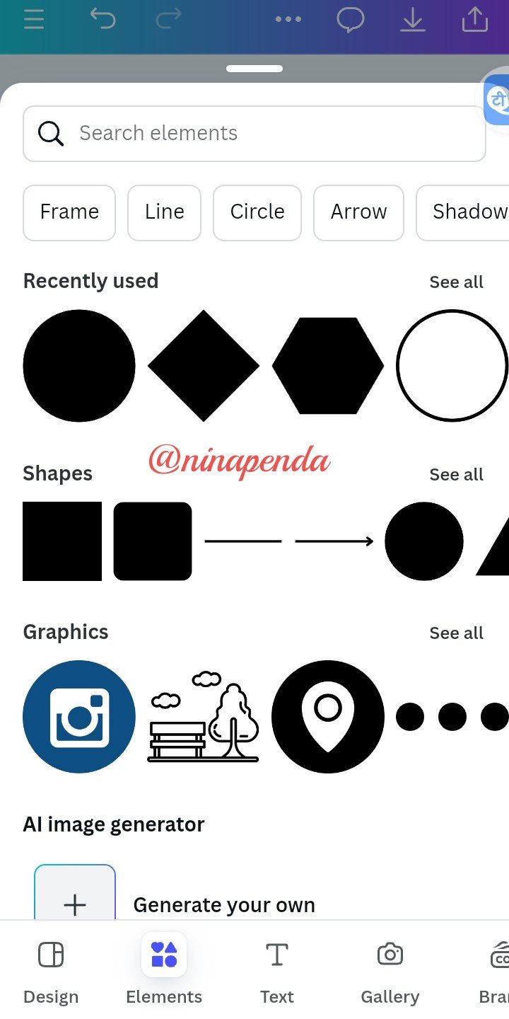
• Step five: After selecting the color, select element to choose your shape.
• Step six: After selecting your shape, it brings you back to the previous phase.
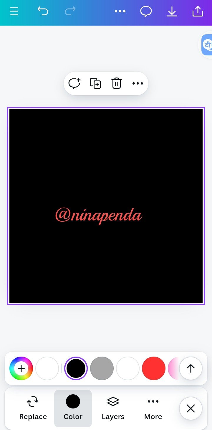 |  |  |
|---|
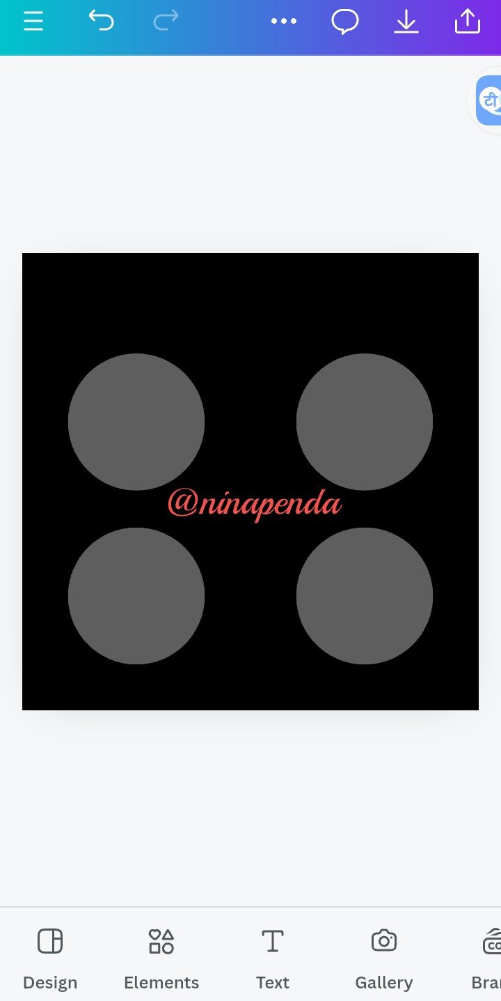
• Step seven: Clicking on the + sign to add more of the shapes to the phase.
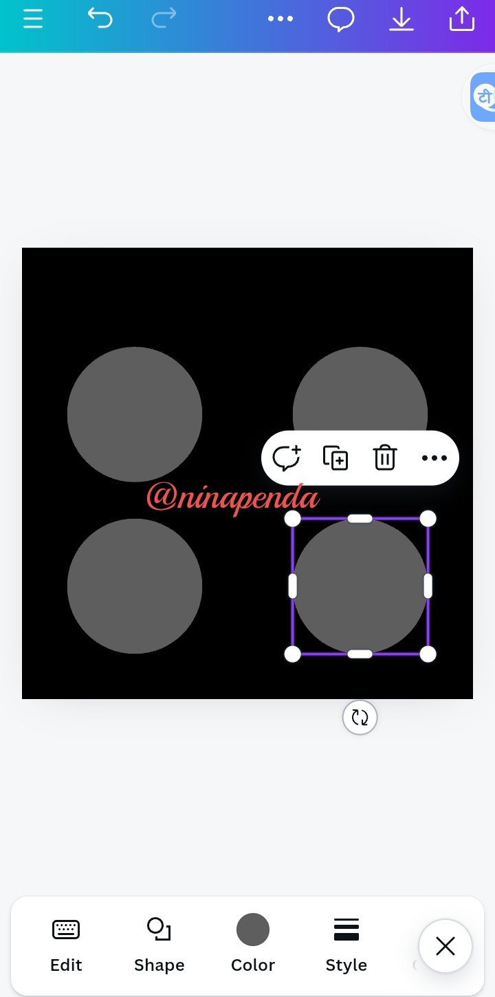
• Step eight: You can now highlight and click on color to select your preferred color
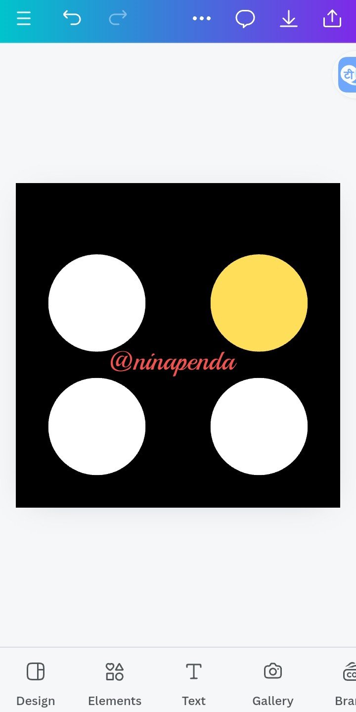
• Step nine: You have your final results ready!
 |  |  |
|---|
I wish to invite some friends @chima09 @eliany @nancy0 to participate in this contest

Comments