SEC20/WK1: Introduction to Graphic Design and Principles.
9 comments
Hello.
I invite @jen0revision @esthersanchez and @xpilar to try this lesson :D
- Question 1: What is graphic design?
Graphic design is creating images that can communicate a message to others, it is often used in advertising like product labels. The main elements of graphic design are the colours, shapes, images used, and the style. Ideally, the design looks appealing and is clear so people understand what the purpose of whatever it is (like a poster or thumbnail).
There are many forms of graphic design, like in illustration, advertising products on posters or billboards.
The field of graphic design that interests me the most is illustration, which could be for book covers, poster designs and social media posts.
- Question 2: Any 3 principles of graphic design I want to talk about:
Contrast
Contrast is used to differentiate between two objects that are similar but opposites in design, so it's easy for you to notice the differences between them.
| Description | Image |
|---|---|
| Example with contrast | 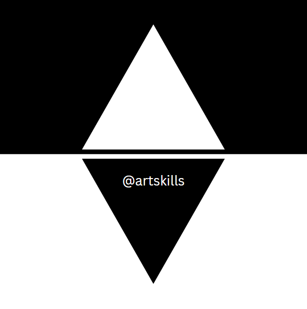 |
| Example of no contrast |  |
Balance
To balance in graphics design is to help make it organised and harmonise the design's layout, while eliminating disproportions. So this can be ensuring elements like shapes, images or text are symmetrical in an organised layout, but at times if done correctly, asymmetrical designs can be aesthetically pleasing.
| Description | Image |
|---|---|
| Example with balance |  |
| Example of no balance |  |
Emphasis
To emphasise an element in a design would be to ensure that it stands out by using a different eye-catching colour. Doing this will help navigate viewer's attention to a singular part of the design. This creates a focal point.
| Description | Image |
|---|---|
| Example with emphasis |  |
| Example of no emphasis | 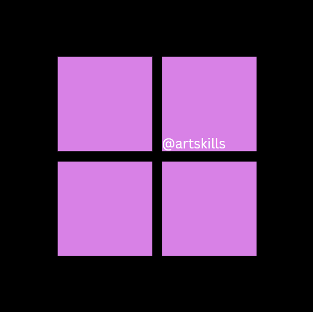 |
- Question 3: Practically show how to create image in the post.
I don't use Canva on my phone so I always use it on my laptop, so this is what I used for this lesson.
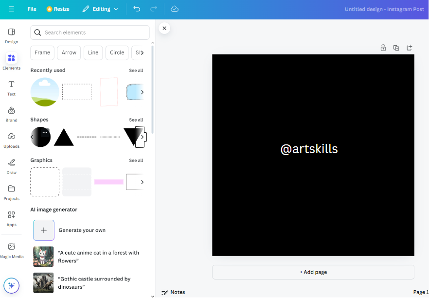
Step 1:
I first opened canva and clicked 'create a design'.
Then, I used the 'Instagram Post (Square)' as it was the 1080 x 1080 dimension specified for the task.
Step 2:
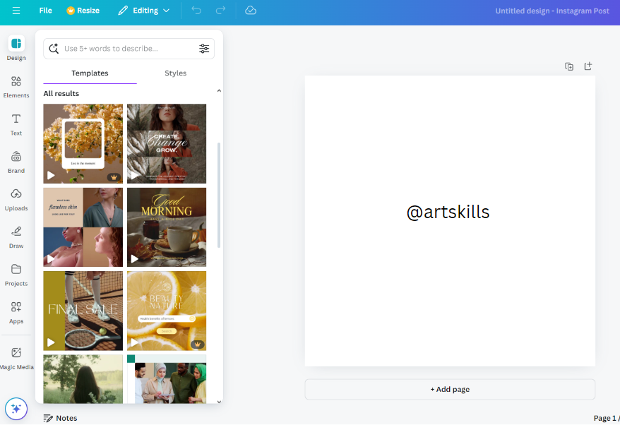
From step 1, this is my plain white square. In it, I put my name as suggested by the teacher.
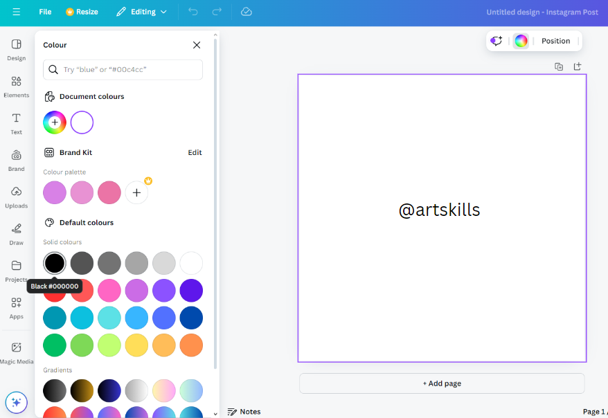
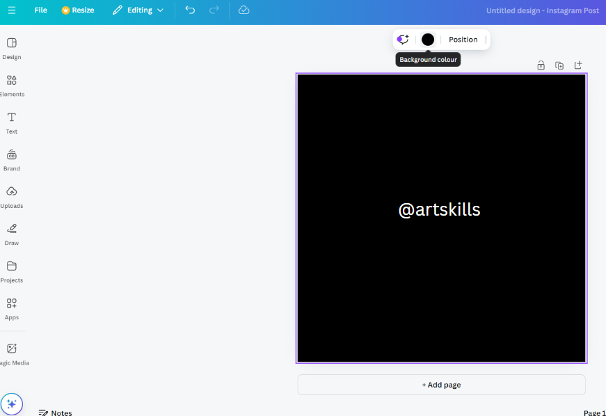
Step 3:
Next, I went to the left hand side, and selected the colour Black for my background.
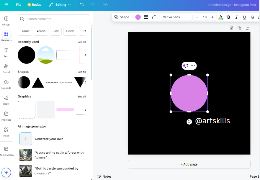
Step 4:
I selected the 'elements' section, and I looked for the circle on the shape section, if the circle does not show up, there was a search bar to search for the shape at the top.
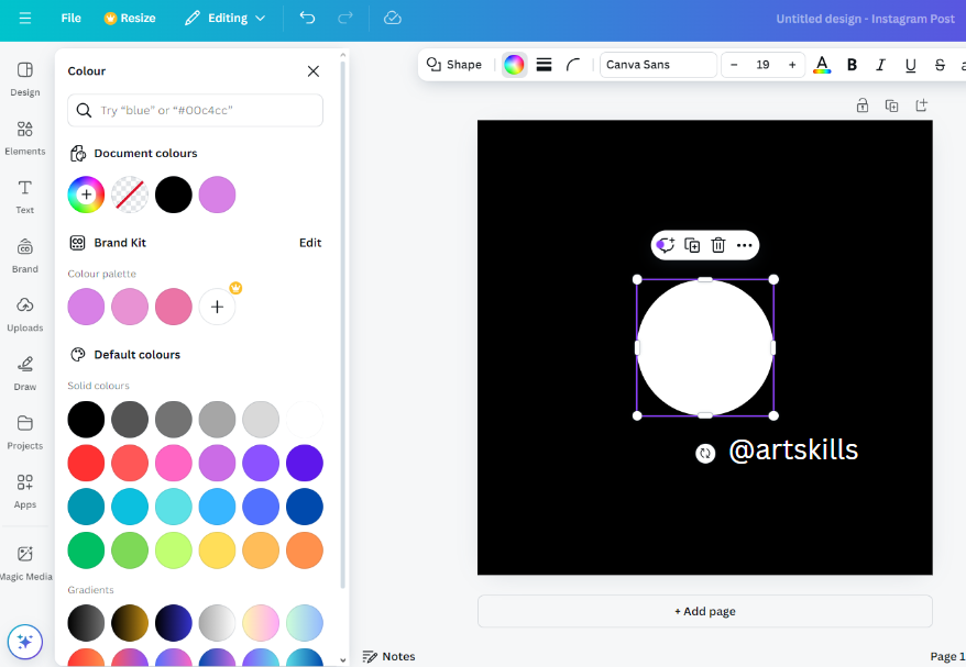
Step 5:
I changed the colour of the circle to white, and then I clicked the duplicate button 3 times, to create 3 other circles of the same size for the next step.
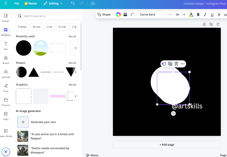
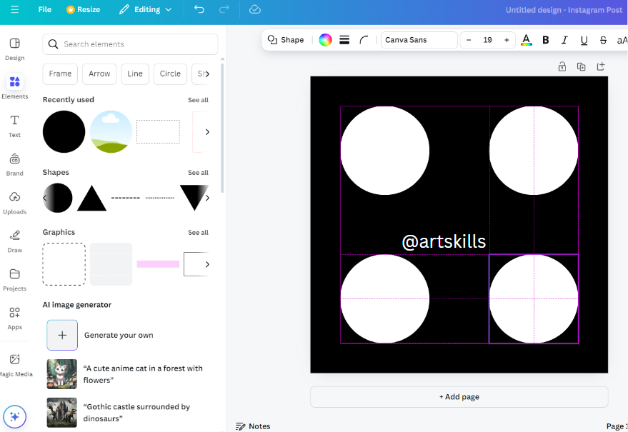
Step 6:
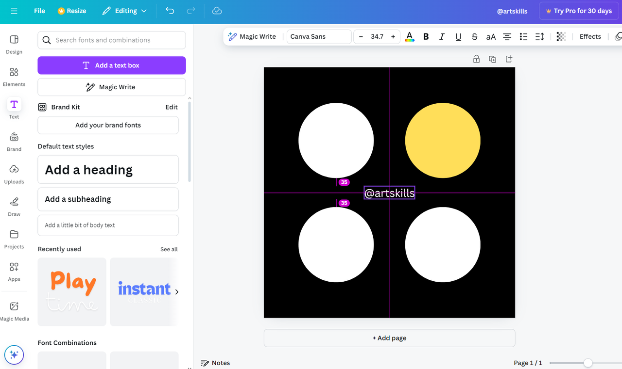
With the 3 other circles from the duplicate button, I tried to arrange them in a balanced manner using the guide lines Canva provides (the faint purple lines in the image). As you can see, I created a balanced layout I was happy with.
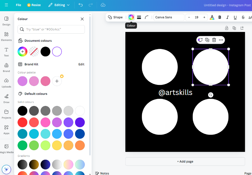
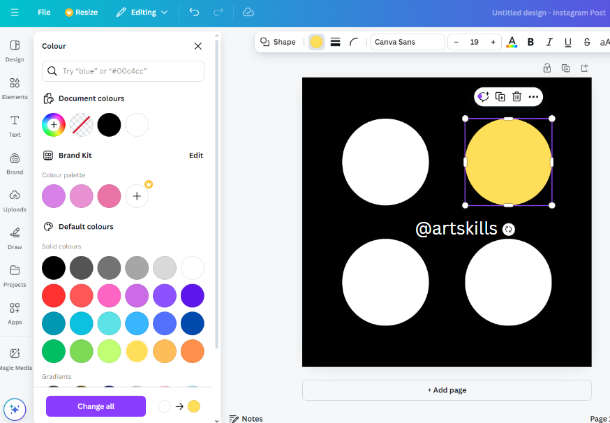
Step 7:
To emphasise one of the circles, I selected the top left circle, and changed its colour to yellow. In order for it to be like the teacher's.
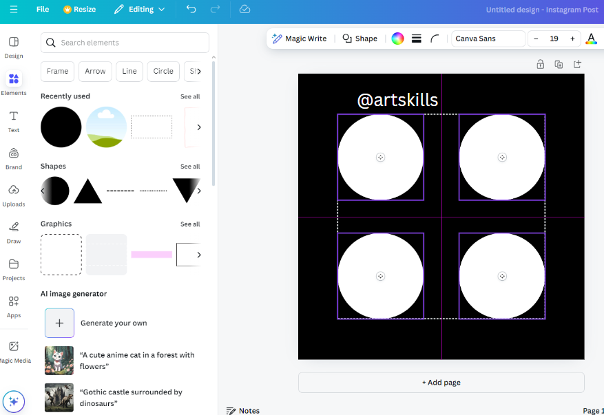
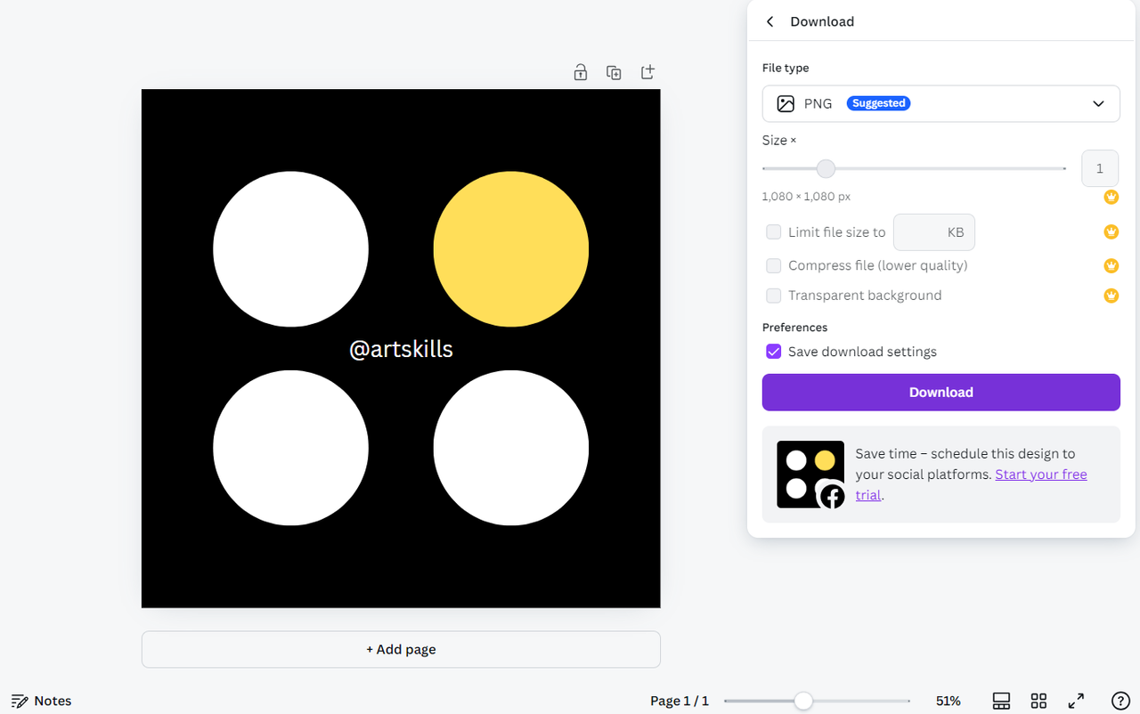
Step 8:
This is the result of step 7. Here, I centered my username.
Step 9:
This wasn't necessary, but I wanted to show how I saved and downloaded my finished piece.
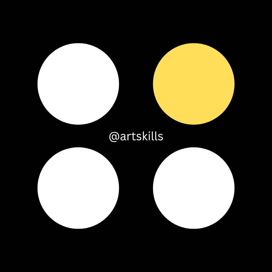
Finished:
I found this lesson interesting! I hadn't learnt about the principles of graphics design before. Looking forward to more lessons!
Disclaimer: ALL of the pictures used in this post were created by me, @artskills.
Comments