Amigurumi Steem Superhero
4 comments
I wanted to try doing some color-changes and other cosmetic details with the character pattern I've been designing. I thought a superhero character would be a good idea for that. Since I've been posting about my crochet experiments here I thought it would be fun to use that as inspiration for the character, I figured I could use the Steemit color scheme as the basis for the costume, with the Steem logo on his chest.
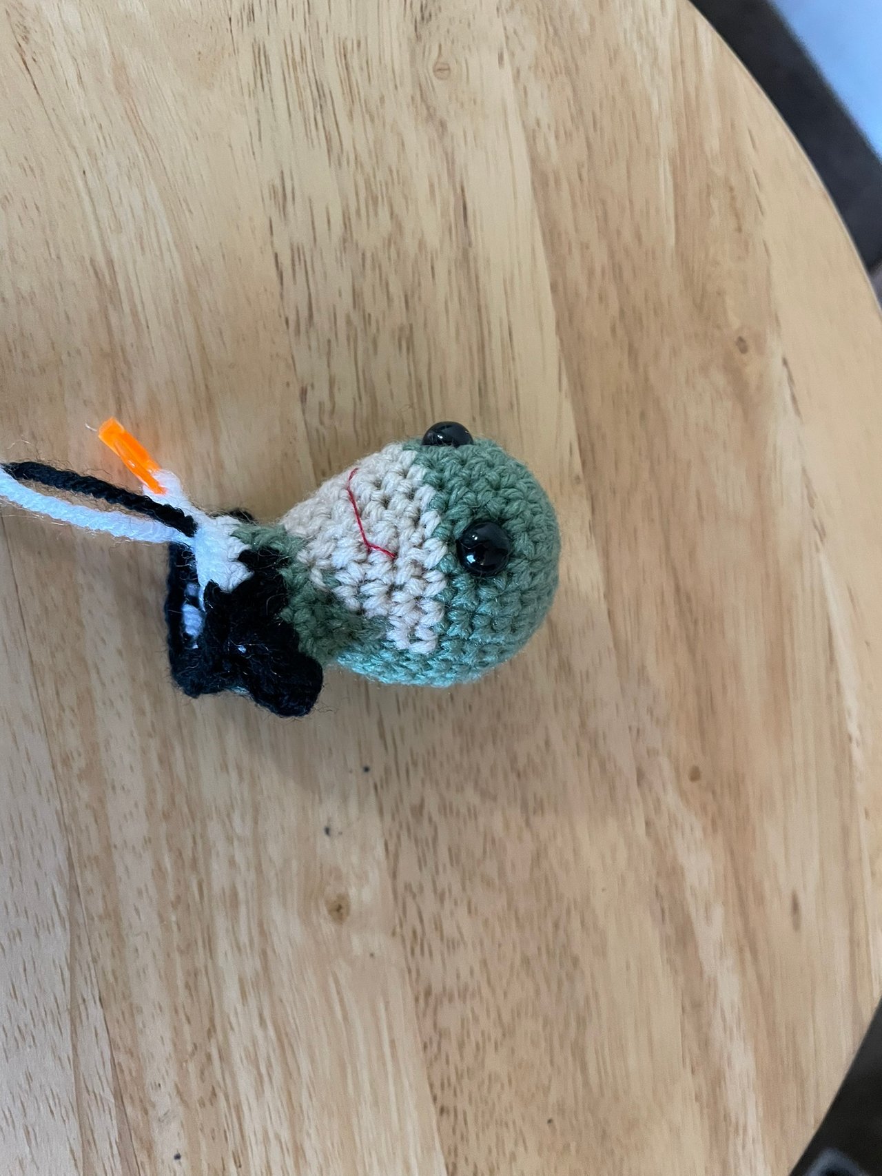
I had some sage-colored yarn that I thought was close enough to the greenish color of the website to work and I thought I would use that as the color for the mask, cape, gloves, belt, and boots, and I originally planned to use white as the contrast color for the other parts of the costume. But the background of the steem logo is also white, so I wasn't sure if I wanted to reverse the color choices -- I didn't think a white mask and cape would look good. Then I had the idea that Steemit also has a night mode, so I could use black as the other color. I started working on that, but the combination of the big plastic eyes I was using, the way I gave him a big wide mouth, the shape of the unstuffed head, and the way the light green was working with the light tan I'm using for a fleshtone was reading very "frog" to me. Plus I was having a really hard time seeing the black stitches with the lighting in the place I was working, so I figured I should go back to the drawing board.
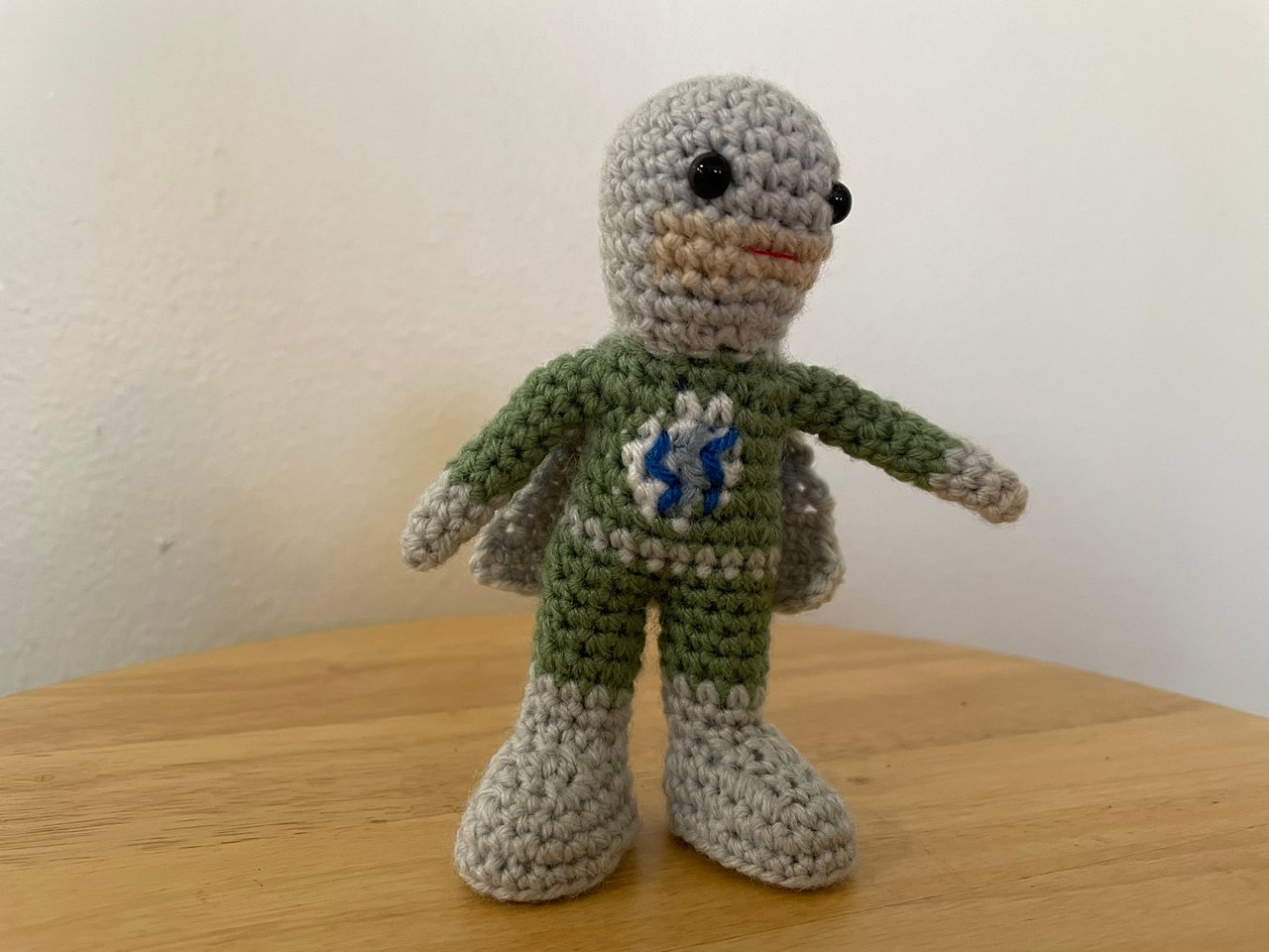
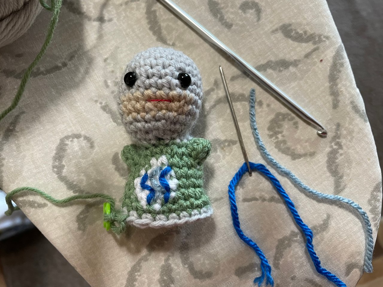
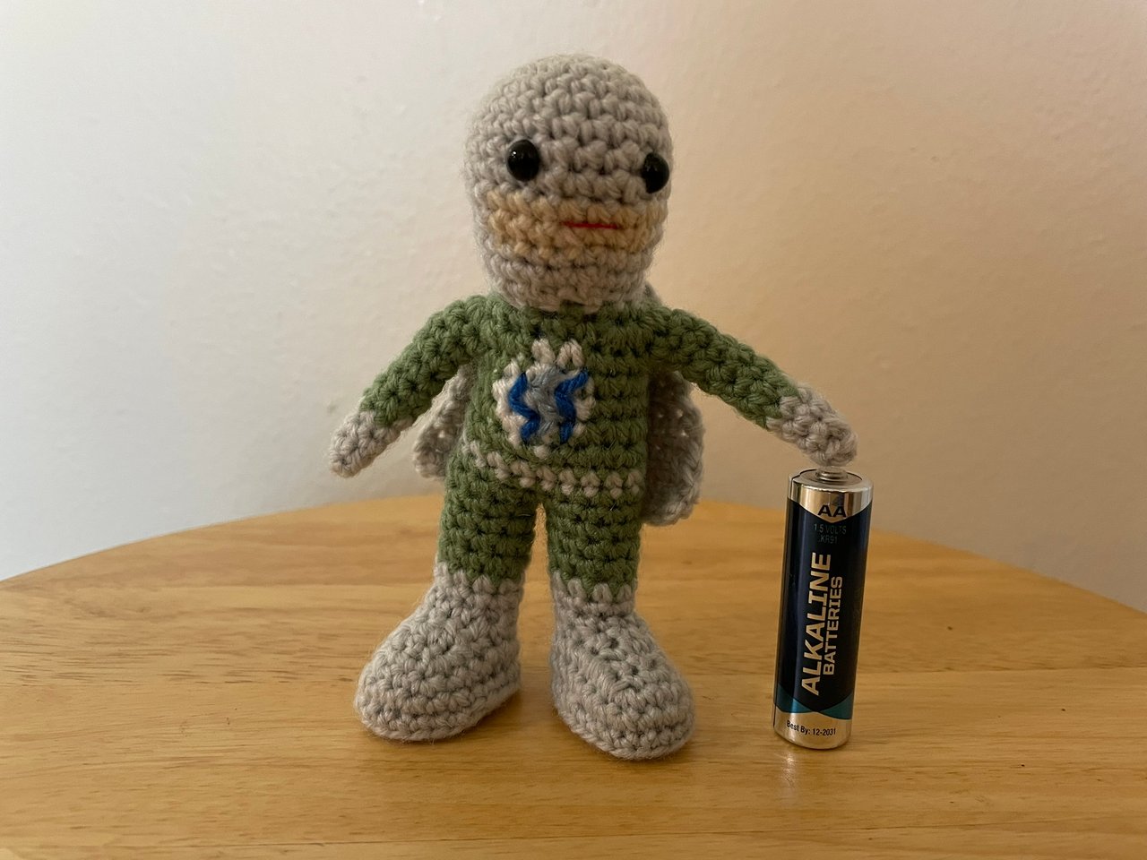
Instead of either black or white I decided to use a light gray as the secondary color, and I figured I'd do the mask and cape out of that so the white circle for the logo could contrast with a green "shirt" part of the costume. One of the updates I made from the "frog" experiment was that I thought I could get away with less fleshtone rounds on the lower face, but I think I went a little far, and I don't think it really reads like skin on an unmasked part of the face, more like a weird smudge around his mouth. Because the scale I'm working at is so small, I only have a few rows of "pixels" (i.e. crochet stitches in different colors) to work with for the blocks of color, so it was hard to get a row both above and below the white circle, I added a row of height to the torso relative to my basic pattern to accommodate that. I definitely didn't have enough room to incorporate the details of the logo structurally, so I planned to do it by sewing on lines of yarn. Even then it was pretty tough to get the logo to read properly since the yarn is so thick relative to the space, I probably should have separated out some strands so I had finer lines to work with. So on the one hand this part was kind of tough, but on the other hand part of the point of doing this was to gain more experience with cosmetic details, so I think it was valuable for that.
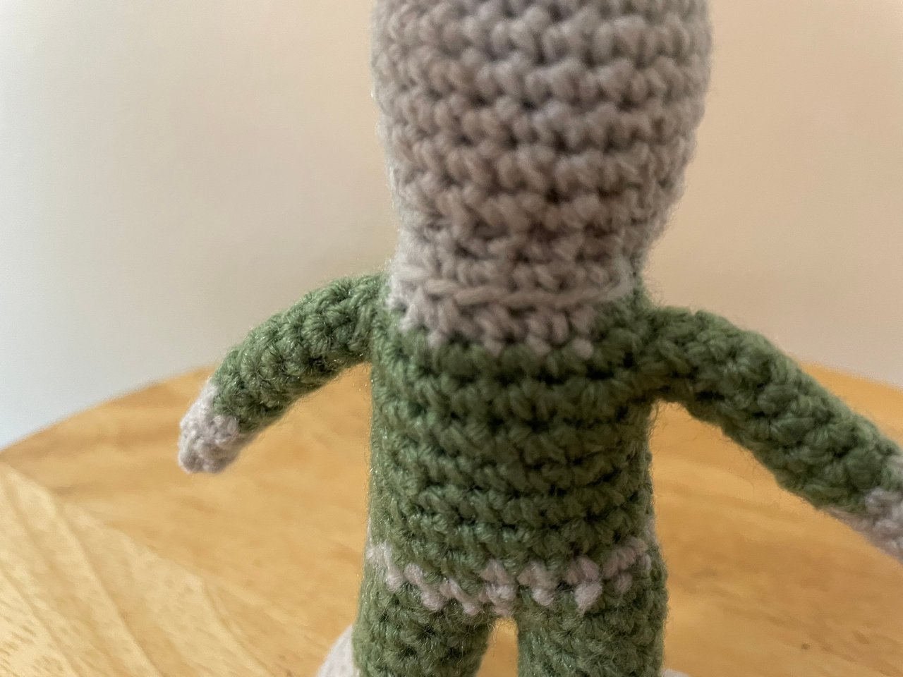
When I was working on the "neck" section of the pattern I left some exposed front loops to use for attaching a cape. I still find it tricky to do "normal" back-and-forth crochet since I'm so used to working in rounds, so doing the cape was a chance to get a little more experience doing that.
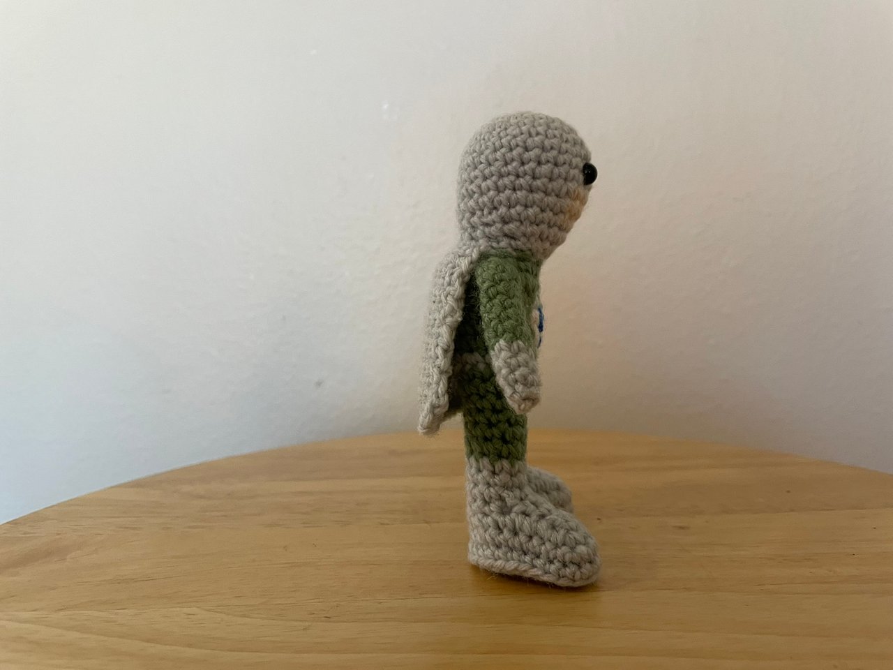
And here are some shots of the completed figure (AA battery included for scale).
And an animated gif I made of him rotating:
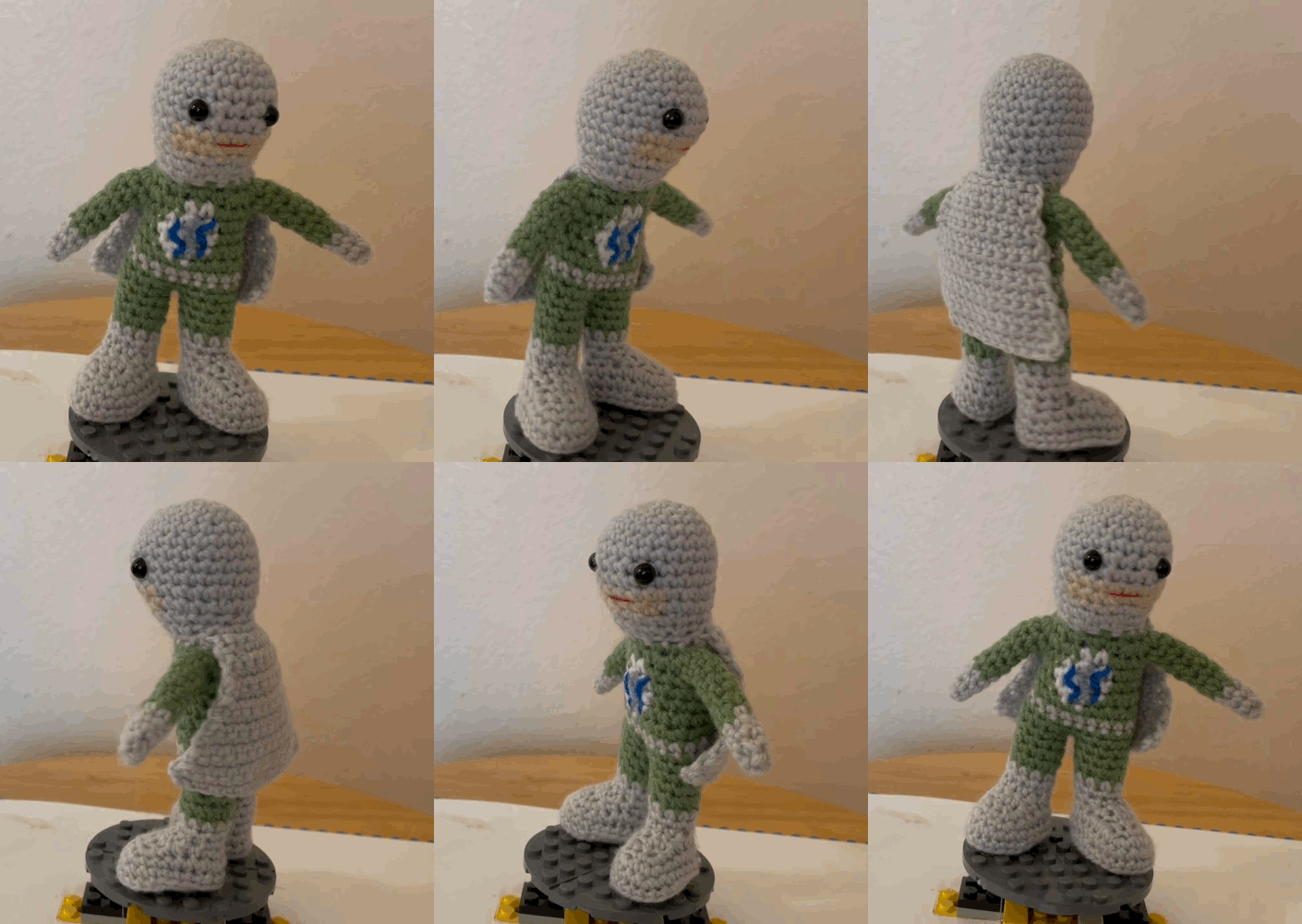
Overall I think it went OK. In addition to the color changes on the face not seeming like they read like mask and skin, I think the head-shape is reading more "otter" than "superhero" to me -- with the way I carry the yarn behind when doing color changes there's less stretch to the completed "fabric", and that can end up affecting the geometry. I also misaligned the feet to point out at angles instead of straight ahead -- I think it looks fine but I suspect he'd be more stable with straight-ahead feet. But, despite some of the details not working out exactly as I'd hoped, I think this was a good learning experience for me.
Comments