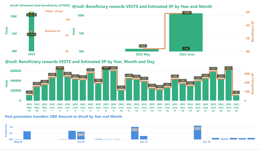
Burned tokens, rewards, and inflation summary June 25, 2022 - Estimated beneficiary burn since May 29: 12,412 STEEM
6 comments
Steemit launched the #burnsteem25 initiative on May 22, and the corresponding rewards started being delivered to @null on May 29. Since then, I have been playing around with PowerBI and steemdb.io to put together some visualizations of some related blockchain numbers. Here is a third weekly update..
Slide 1: Burn amounts in beneficiary rewards and transfers to @null.
I removed the STEEM transfers this week, and made the SBD transfers graph larger..

Top-left: This image shows the number of VESTS along with the estimated numbers of SP and ( SP + STEEM ) beneficiary rewards that have been burned since May 29. This is where the headline number comes from.
Top-right: This shows the VESTS and the estimated SP beneficiary rewards burned per month.
Middle: This shows the daily VESTS and the estimated SP beneficiary rewards that have been burned.
Worth noting: At 347 SP burned, yesterday was the 3rd highest day since the program began.
In all three of the above charts, VESTS are shown against the left axis, SP and STEEM are shown against the right.
Bottom: SBD transfers to @null. As readers are likely aware, SBD transfers to @null can get a post added to the /promoted page.
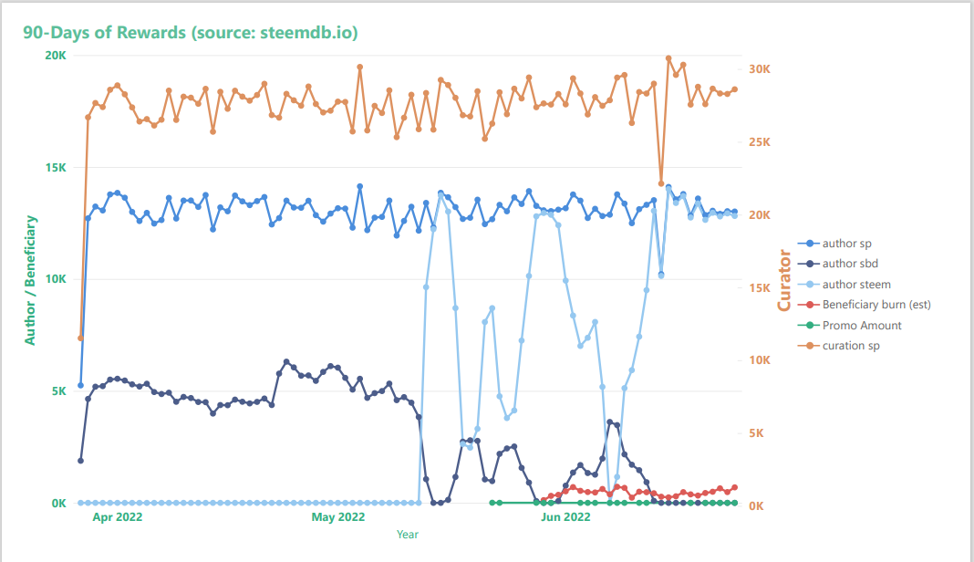
Slide 2: Rewards summary
Curator rewards use the scale on the right, author and beneficiary rewards use the scale on the left. Beneficiary rewards in this chart (red) have been adjusted in order to account for both SP and liquid rewards.

Noteworthy: Author reward payouts have been 100% STEEM all week long.
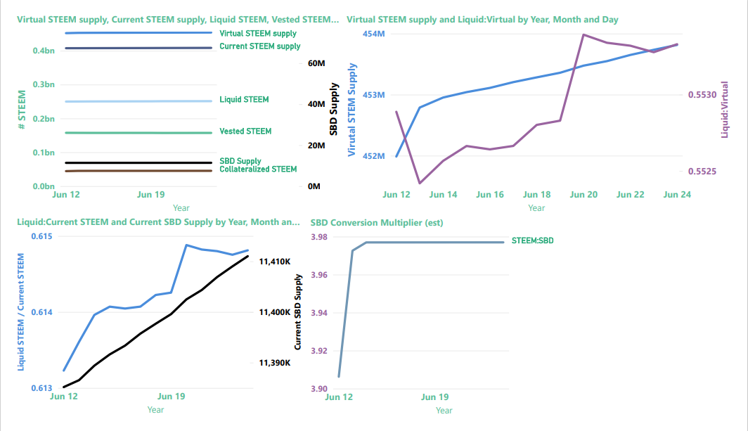
Slide 3: STEEM & SBD Supply as well as vested (i.e. staked or "powered up") STEEM

The top-left image provides a summary view of current and virtual STEEM supply, current SBD supply, liquid and vested STEEM, and the amount of STEEM reserved as collateral for paying off SBDs.
| Note |
|---|
Collateralized STEEM and current SBD supply actually represent the same value expressed in terms of STEEM or SBDs, respectively. They're aligned differently on the graph because they use different axes. |
The top-right graphic now contains a zoom-in on "virtual STEEM Supply" (left axis) and the ratio of liquid STEEM / virutal STEEM supply (right axis). As we learned, here, virtual STEEM supply is heavily influenced by price, so with STEEM prices down, it's not surprising to find the virtual STEEM supply increasing. The up-side of this is that it's now possible to burn more collateralized STEEM per SBD with post promotion.
The bottom-left visualization now contains the ratio of liquid STEEM / current STEEM supply (left axis) and a zoom-in on Current SBD supply (right axis)
The chart on the bottom right shows the value of SBDs in terms of STEEM, according to the blockchain conversion rate, not external markets. This is the inverse of the blockchain's: internal price (which is different from the actual feed median, for reasons that I don't currently understand).
Now, here are some more details about each of the values
| Parameter | Axis (left/right) | Meaning | Comments |
|---|---|---|---|
| SBD Supply | right | Number of SBDs in circulation | Equivalent in value to collateralized STEEM |
| Collateralized STEEM | left | Number of STEEM needed to pay off all SBD debt | Equivalent in value to SBD Supply |
| Vested STEEM | left | Number of STEEM staked as STEEMPOWER | |
| Liquid STEEM | left | Number of STEEM that's not staked or needed for SBD collateral | Calculated as (Current STEEM supply - Vested STEEM) |
| Current STEEM supply | left | Number of STEEM in circulation | |
| Virtual STEEM supply | left | Number of STEEM in existence |
Thanks for reading!
For previous updates, see:
Comments