"SLC21/WK3: Logo Design - Part 2
1 comment
There are multiple types of logos, each have its own unique characteristics and usage so here's a discussion at each type, along with situations that when and how to use them and when not to use them;
1. Wordmark Logo
- Word mark logo is defined as a logo which is just made up of text.
- You can consider Google, Facebook, Coca-Cola or MineWoods as an example.
When there's a need to use wordmark logo?
- If you want to keep your brand name simple and easy to remember.
- If you want to have a strong typography.
- If there is a flexibility for multiple applications.
When wordmark logo should not be used?
- If brand name is long and complex.
- If there's any lack in distinctiveness.
.png)
2. Letterform Logo
- If I talk about letterform logo then this is a logo defined as in which there is just single letter or initials which represents a particular brand.
- If I give an example then McDonald's (M), H&M (H) is using letterform logo.
When there's a need to use letterform logo?
- If brand recognition is well known and strong.
- If there's simplicity and distinctiveness in typography.
- If initials or single letter are able to represent a brand properly.
When there's a need to use letterform logo?
- If letterform is not easy to remember or somehow unclear.
- If letterforms are in overuse in overall industry because your brand recognition can mix up due to a lot of letterform logos.
.png)
3. Iconic Logo
- Iconic logo is a type of logo in which we see a particular symbol or icon solely.
- If I give an example then 🍎 for Iphone.
When there's a need to use iconic logo?
- If icon is as strong as able to reflect actual brand identification.
- If icon shows brand actual identification that what a particular brand is about.
- If icon can have a lot of uniqueness that can differentiate it with other brand icons.
When there's a need to use iconic logo?
- If icon is made with a lot of complexity means by adding a lot of elements.
- If there's any element which is not related to brand actual identity.
.png)
4. Combination Mark Logo
- Combination mark logo is a logo which combines text as well as icon.
- If I give an example then Burger King, Adidas can be a consideration.
When there's a need to use combination mark logo?
- If there's a maintainence of balance in between text and icon.
- If message of a brand is clear and there's no unclearity anywhere.
- If there's flexibility in different applications.
When there's not a need to use combination mark logo?
- In case of clutter or overcrowd combination mark logo should be avoided.
- In case of loss of balance in between text, symbol and icon it should not be used.
.png)
5. Emblem Logo
- Emblem logo is a type of logo in which we see a respresentation of text covered or surrounded by an icon or symbol.
- If I give an example then Starbucks is a good example.
When there's a need to use emblem logo?
- When there is a strong brand heritage.
- If your brand have some classic or vintage feeling.
- If both of your text and icon are balanced.
When there's a need to use emblem logo?
- If design is overly complex.
- If there's any kind of difficulty in scaling.
.png)
6. Abstract Logo
- Abstract logo is a type of logo in which there are designs which are non representational.
- If I give an example then Reebok is best example to understand.
When there's a need to use abstract logo?
- If your brand have most unique identification than all other brands almost which you have in your mind.
- If your design is readable and easy to remember.
When there's not a need to use abstract logo?
- If there's any kind of symbolism which is unrelated or irrelevant.
- If symbolism is  hinderence in recognizing brand because of lack of clearance in symbol.
.png)
Best Practices:
• Design should be easy to read and memorable.
• Design should have scalability for multiple applications.
• There should be a continuity across branding.
• Design should have uniqueness and distinctiveness.
• Design should have a clear brand identification which brand actually wants to convey.
Common Mistakes:
• More intricate and complicated.
• Loss of distinctiveness.
• Less scalability.
• Lack of balance in design.
• Irrelevant icon or symbolism.
.png)
When you are going to design a logo then there's always a need to consider brand's values,audience you want to target as well as industry. Researching and testing could be helpful in giving surety of chosen logo in effective way which is representing a particular brand.
Combination mark logo
• I have already told about this type of logo that it is made up of an icon as well as text that's why it is called a combination mark logo.
• I would like to explain it step by step that how I reach to the final outcome.
 |  |
|---|
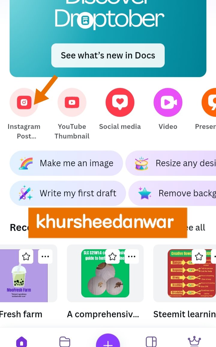
• This is basically a very basic step for making all design in which I need to open my Canva app.
• After that I opened my Instagram size post because I selected this post for making my logo design which was specifically combination mark logo.
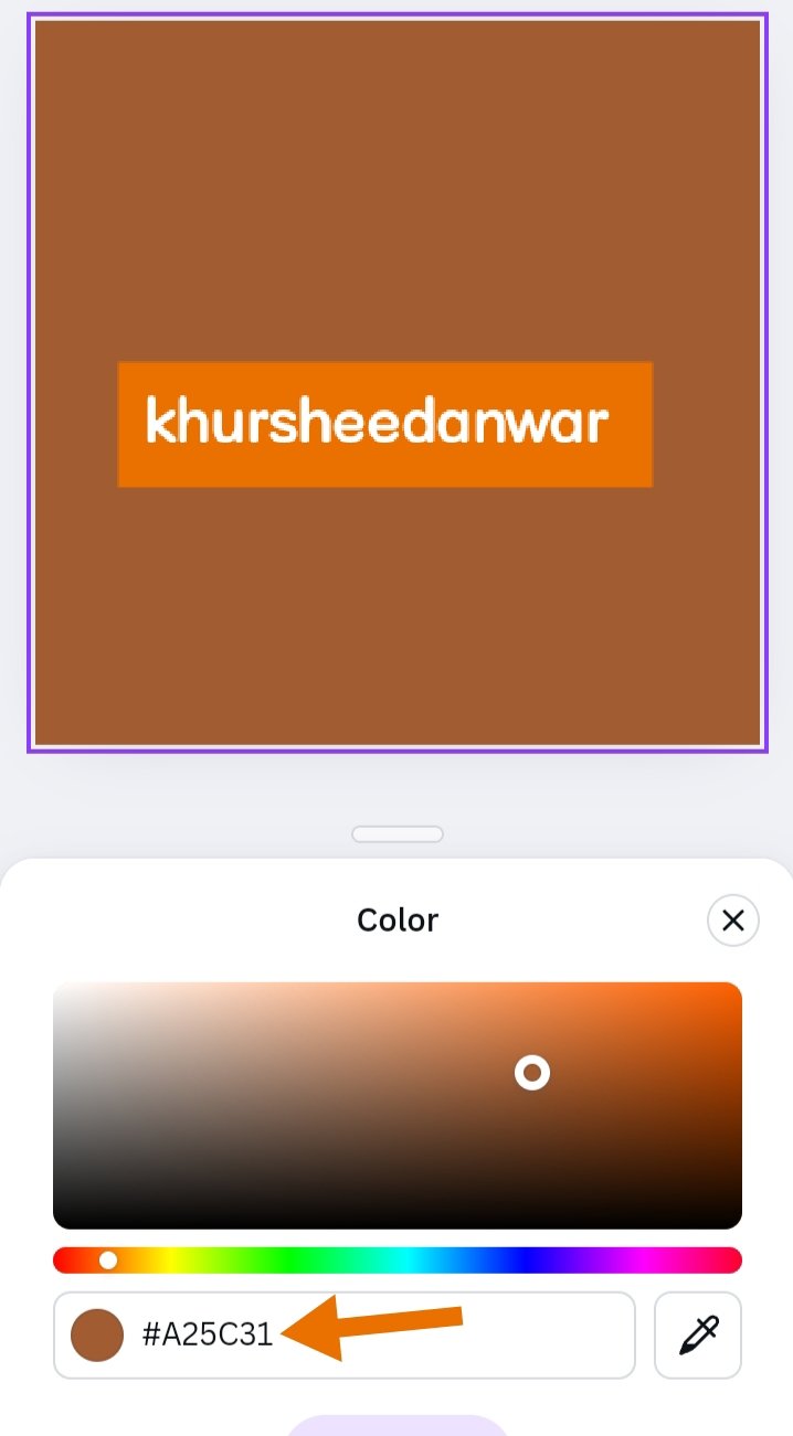
• #A25C31 was basically hex code of my post because as I was making a furniture brand logo so I like to give it a brown colour.
 |  |
|---|
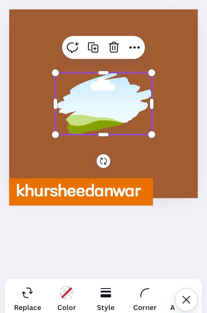
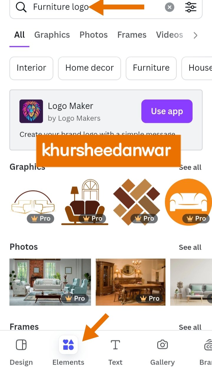
• After that I locate elements option that was just in bottom as you can also seen the screenshot and I selected and element just like the shape of amoeba.
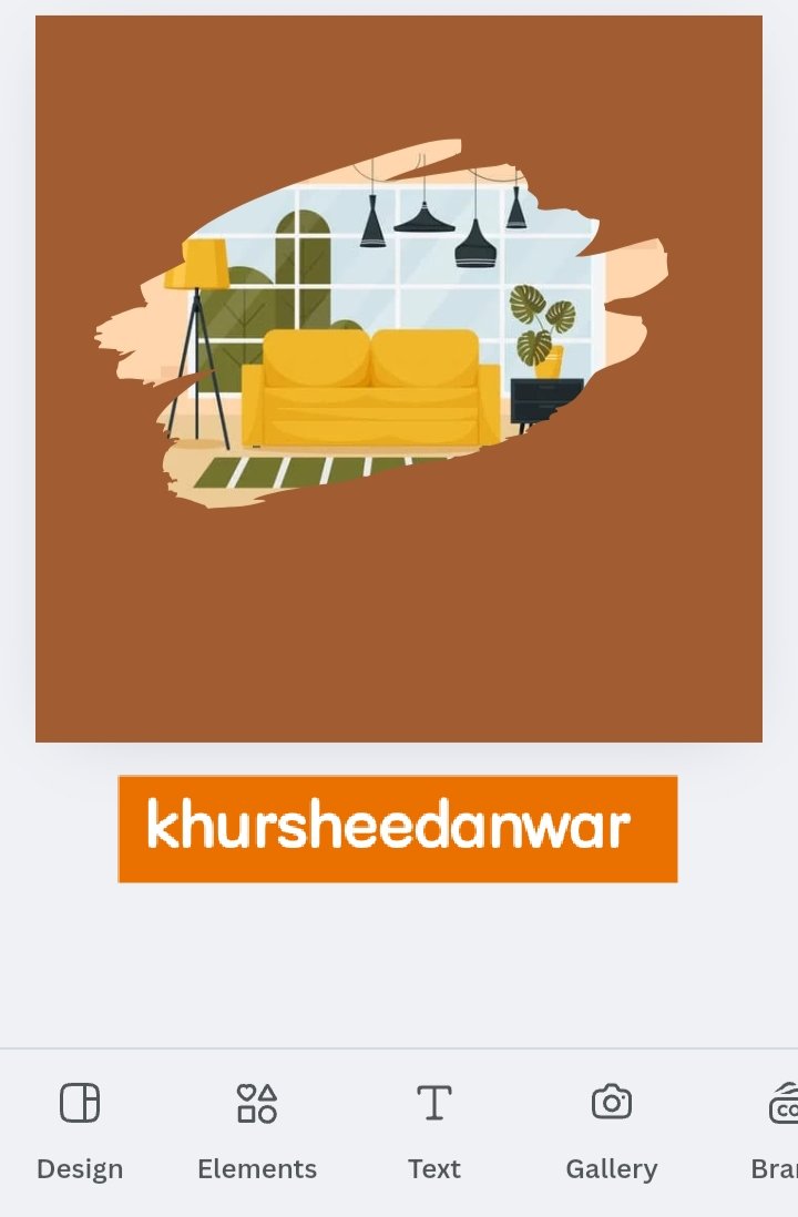
• After that I again locate elements option and then search about furniture through search icon and then I selected an image and insert into the frame.
• This is clear that how much this image with this same is suitable for making a logo for furniture.
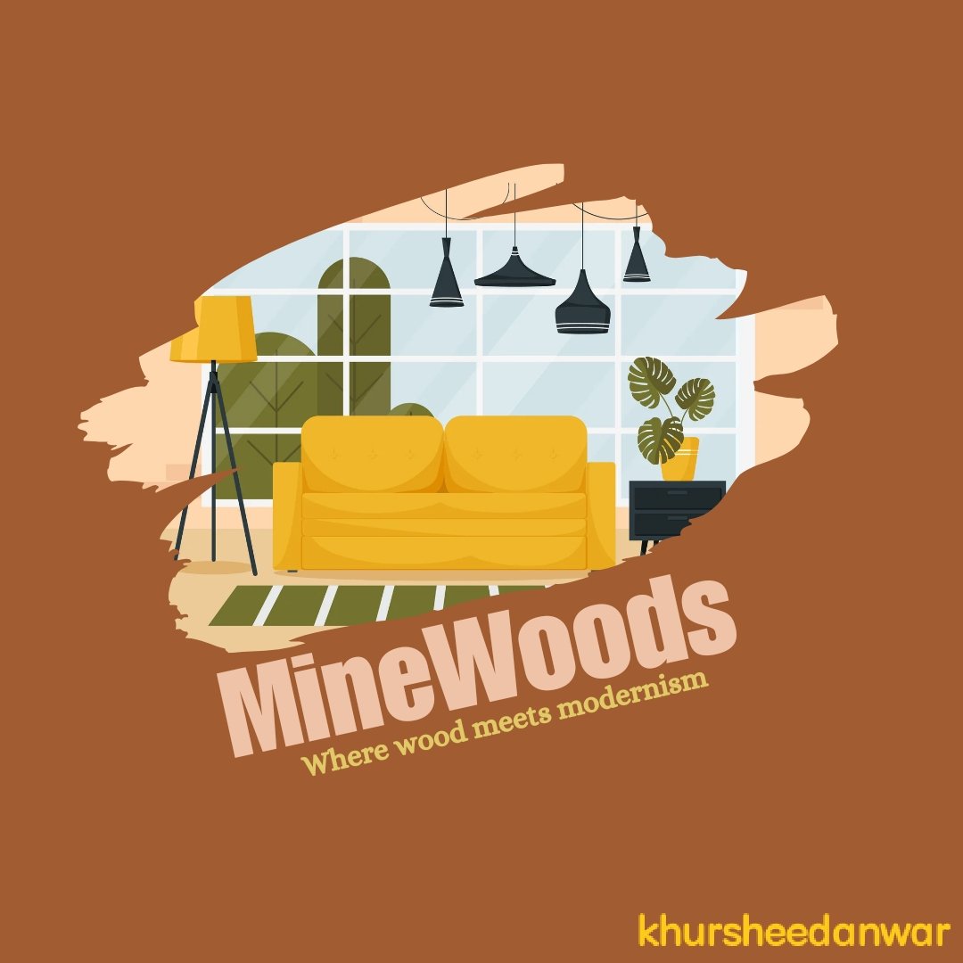
• So finally icon has been completed and now this is a time to write text properly about brand identification and little description.
 |  |
|---|
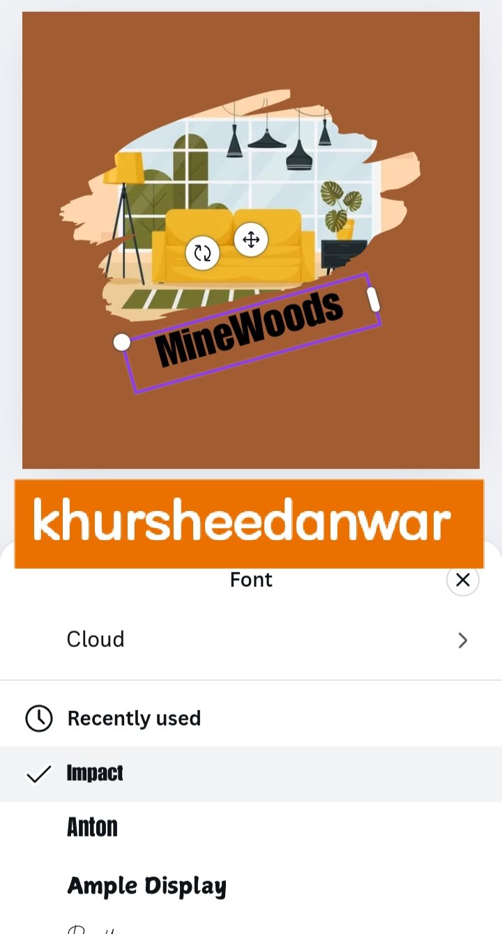
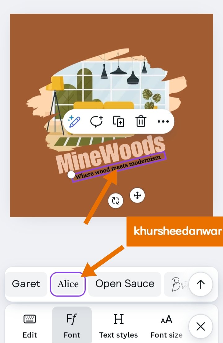
• "MineWoods" is basically my brand name for my furnitures as in my real life I am running this business so as it was brand name so it should be in bold letter as it can see that I have choose a bold "IMPACT" font style for writing it.
 |  |
|---|
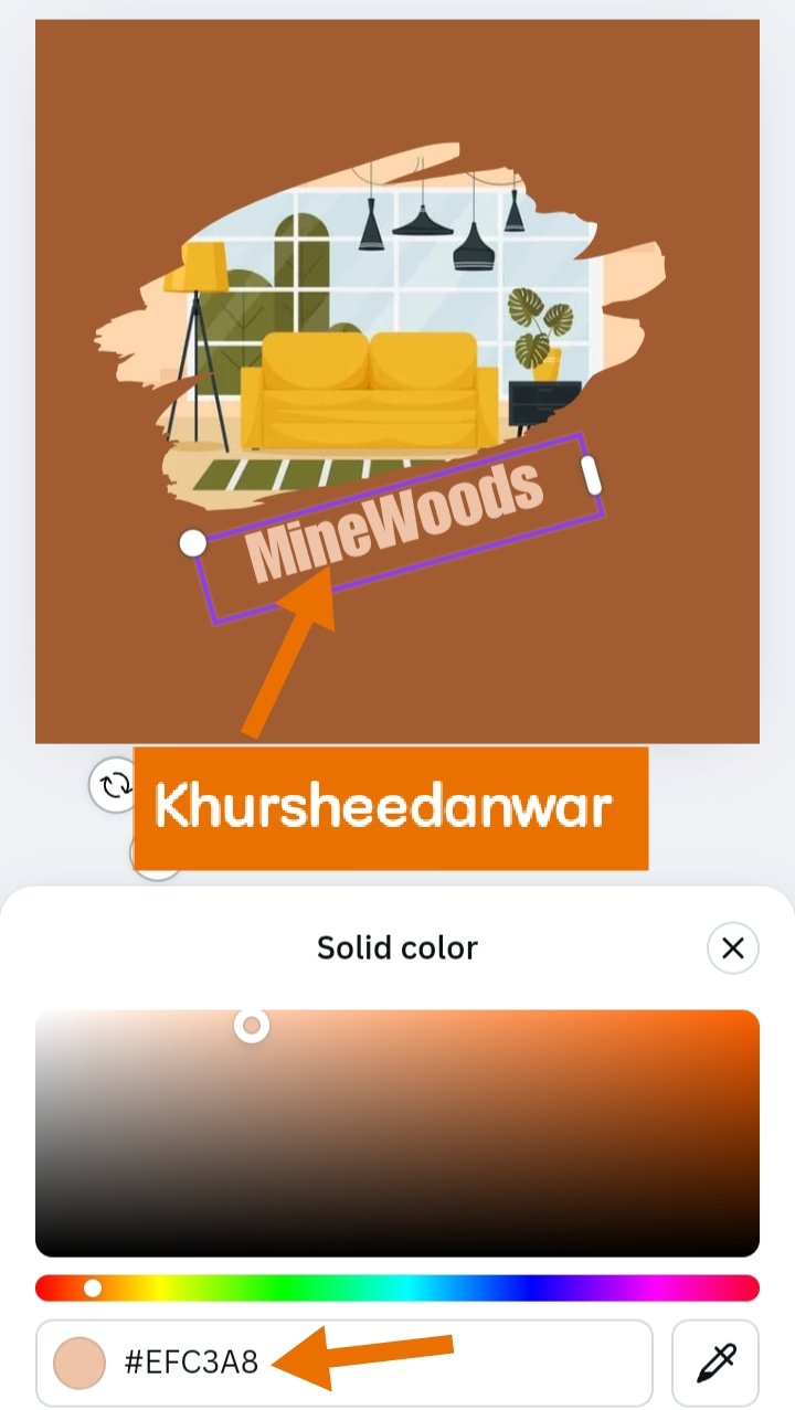
• #EFC3A8 was hex code of my brand name because it was skin colour in appearance which was looking much suitable with Brown background.
 |  |
|---|
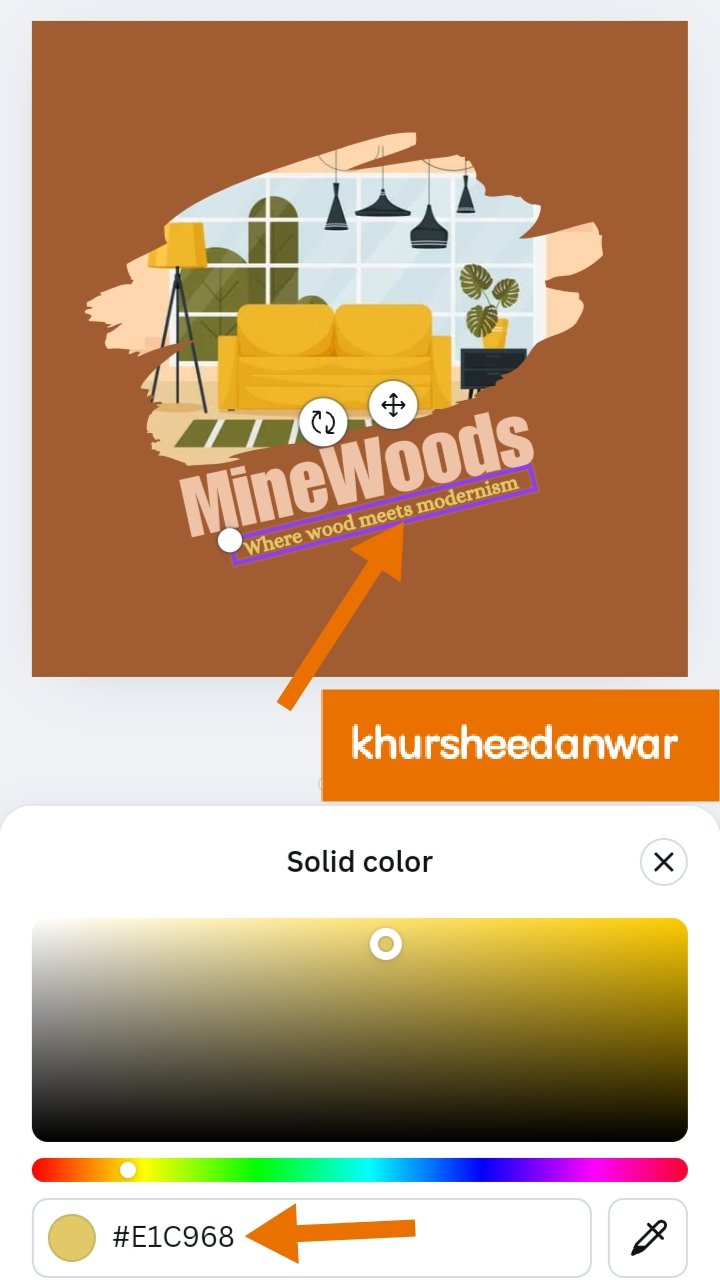
• After that I wrote little description about my brand which was quite relevant with my brand and it was "Where wood meets modernism"
• #E1C968 was hex code of description that was in dim shade then skin colours because brand name should have more prominence but it was also looking good with brand name ,according to colour theory it was perfect.
 |
|---|
• This is final design watermarked with my username.
.png)
Letterform logo
• I have already talked about letter form logo that here single letter or initials represents identification of a particular brand.
• I would like to give a step by step explanation about making a letter from logo that how I came to my final outcome.
 |  |
|---|
• This is again a very basic step for making my letterform logo design in which I need to open my Canva app.
• After that I opened my Instagram size post because I selected this post for making my logo design which was letterform logo and again I choosed brown colour.
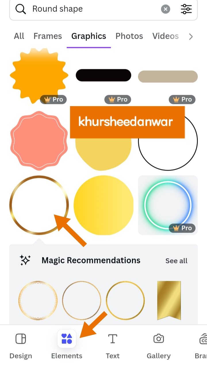
• After that I locate elements and through search icon searched for round shape. You can also see in the screenshot that which one I selected.
 |  |
|---|
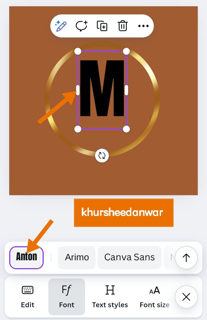
• I add it to my Instagram post which I already selected and then it was the time to write my letters or initial in bold so for this I choosed "ANTON" font style.
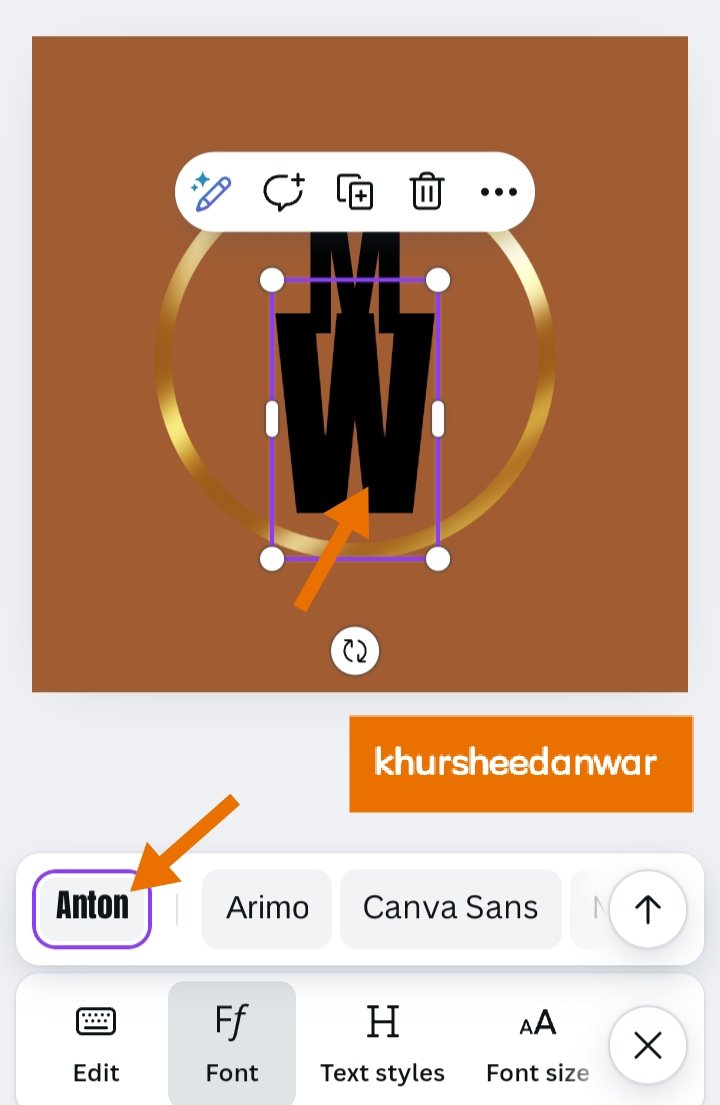
• This is you can see that MineWoods brand initials that are most suitable can be M and W as the can also adjust with each other just like a cross pattern so I thought to make it in this way because it will give it more uniqueness.
 |  |
|---|
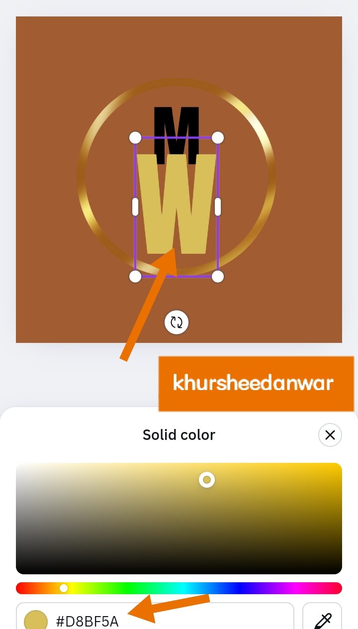
• #D8BF5A was hex code of W letter and I give some brighter colour to M of same shade.
• After that first I adjust my frames or element and then I adjust both of the initials properly in the frame.
 |
|---|
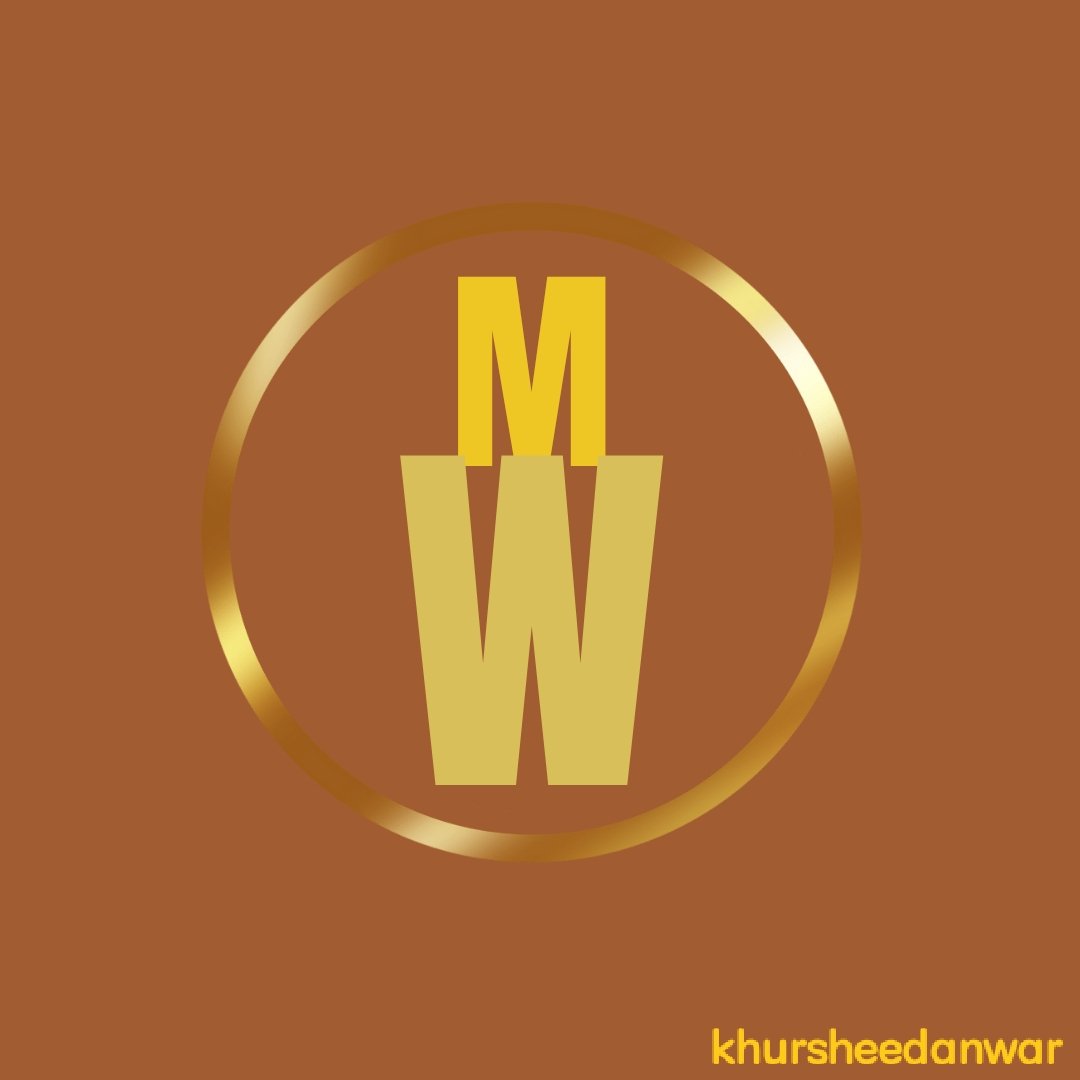
• This is I am with my final outcome which is looking very unique as well as beautiful for my brand as a letterform logo
• This is quite attractive as well as easy to read and remember due to its uniqueness which is always goodness seen in a logo design.
.png)
Flier is basically a promotional material used as a representative of a particular brand or project so it's a kind of advertisment for particular project,brand or good.
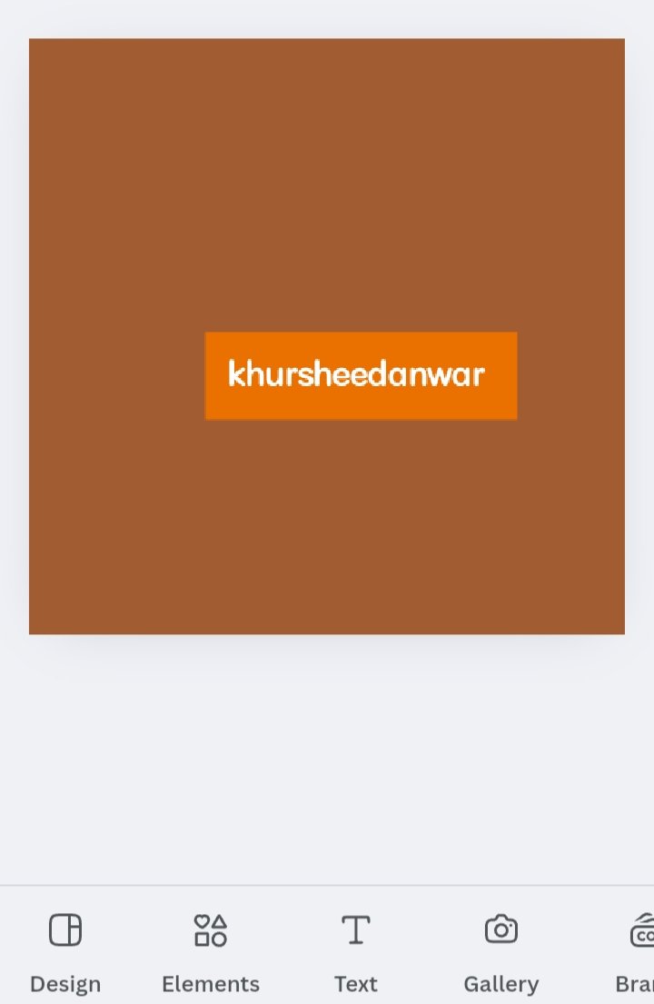
• For making flier again I opened my Canva app.
• After that I opened my Instagram size post and give it a dark brown color again.
 |  |
|---|
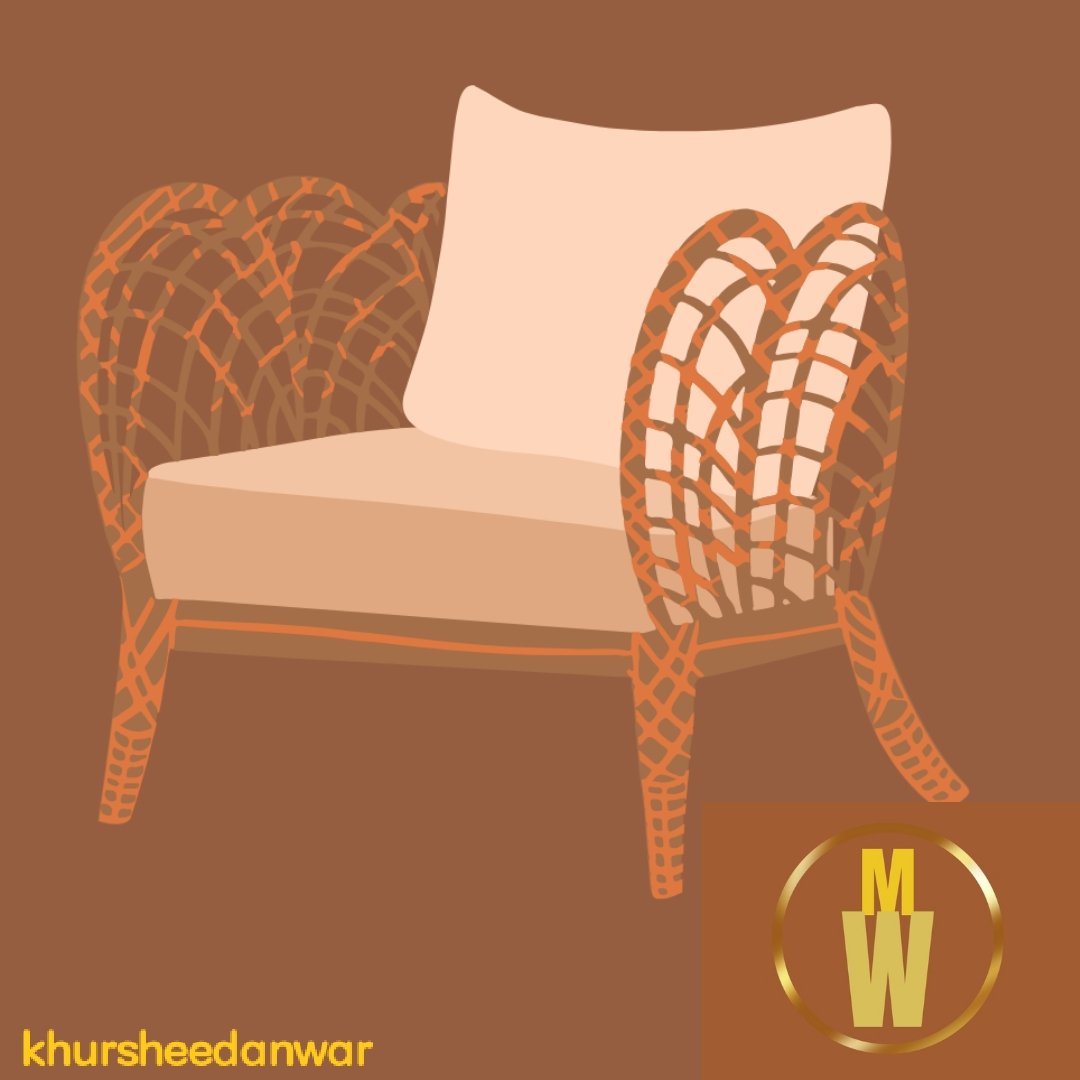
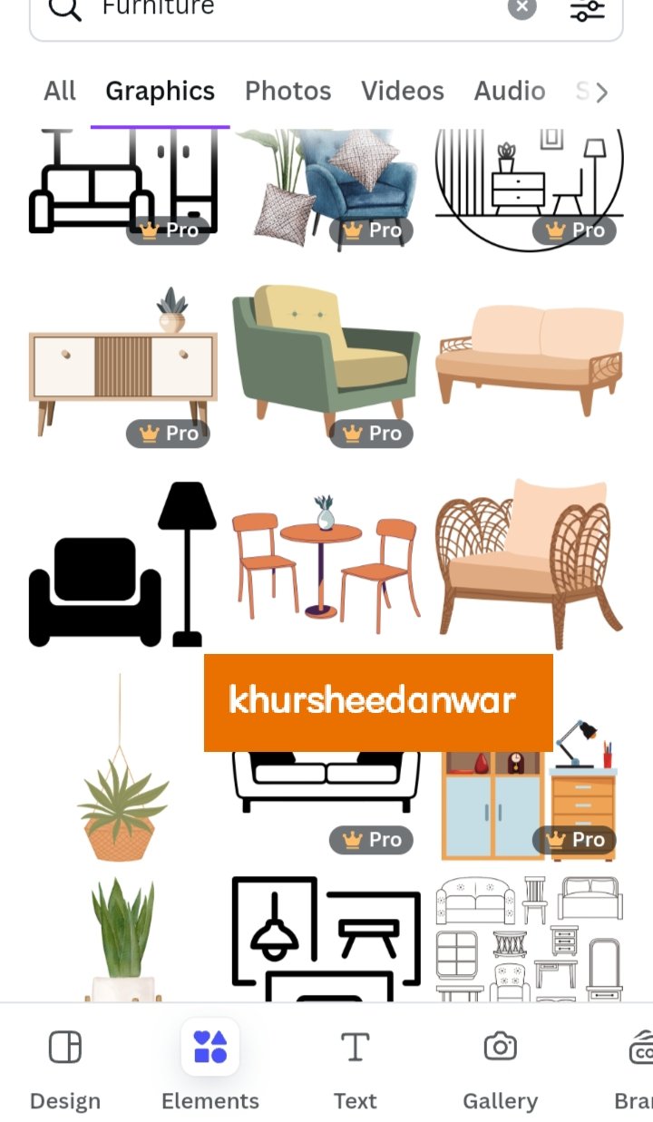
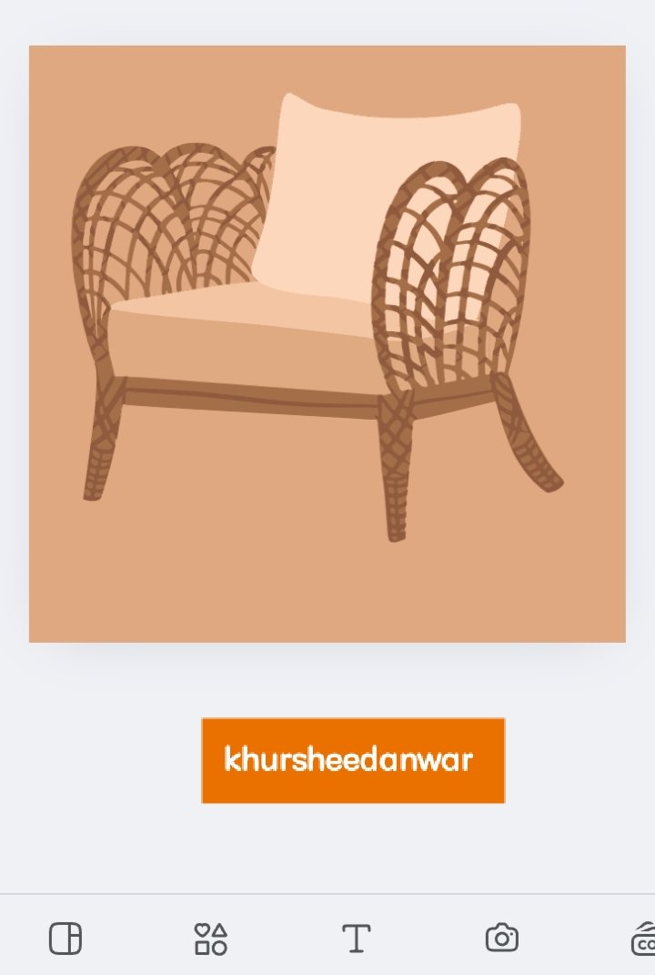
• I locate elements and searched for furniture so there were many free graphics available to use but I simply choosed any one attractive furniture goods which was chair for making a simple and attractive design.
 |  |
|---|
• For making proper alignment of element at page or post I need to give it a light color for that time as chair wood was brown in color so it can't be visible at brown page.
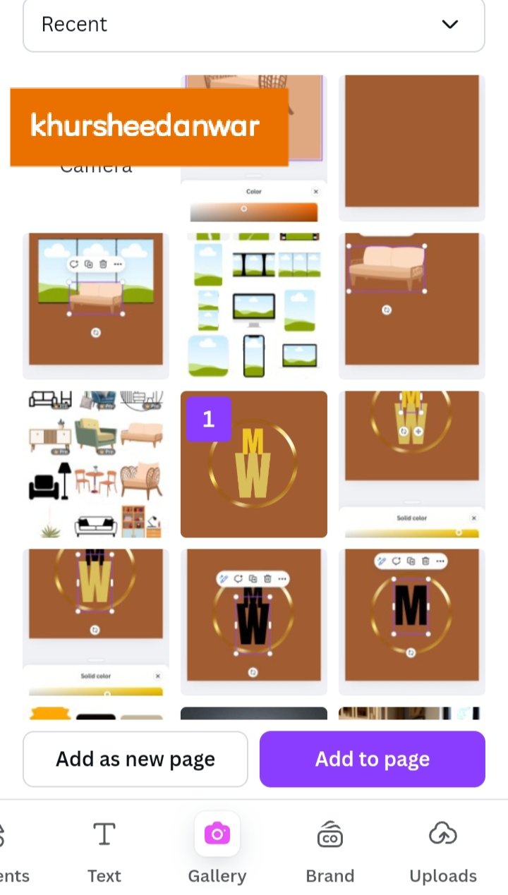
• After that I need to place one of my logo design suitably into my flier design that I have already made.
• At bottom right corner I strategically placed my logo design which was basically letterform logo design.
 |  |
|---|
• After that again I gave dark brown color to my post so that it match with my logo design.
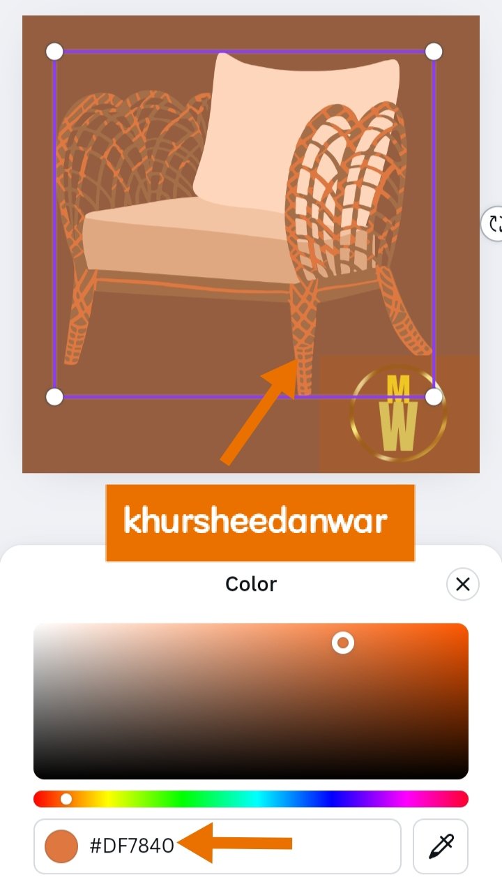
• I changed colors of wood for my chair because it was not visible at brown post so I give an orange shade to it with a hex code of #DF7840.
• At flier design logo should not be much visible because flier design is already representating my brand of furniture so that's why I adjusted letterform logo in small size at bottom.
.png)
I want to invite @ngoenyi,@suboohi,@pandora2010
Comments