SLC21/WK2: Introduction to Logo Design
4 comments
Assalam-o-Alaikum |
|---|
First of all I want to thank the Steemit team who have selected the best teachers who are giving us the best kind of lectures and from whose lectures we are learning new things day by day and many great personalities have taught us. But talking about the best teacher, @lhorgic is the best teacher who is explaining us in the best way and we are following his method and I want to thank the teacher who gave us the season. Others of 21 Providing the topic of the 2nd week
canva editing

Q.1 - Discuss Logo design based on your understanding about the topic.
Brand identity specifically refers to logo design which represents a business, an organization or a product. It is a cliché to argue that a logo is the representation of a brand – of its face, its soul, and its mission statement. Being the primary touchpoint for clients, it must create an unforgettable first impression of a brand. The general definition of a logo is the ability to make a work of art to be easily recognizable and have a specific use in serving the purpose of the brand. colours code #a41245B
Ideally, a logo must be easy to remember but complex enough so that it will not look out of place even in the most embarrassing positions, for instance on a business card and at the same time versatile enough to be used on bill boards. Another reason is that the logo should not be too complicated and if it is, it will be very difficult for a person to grasp or even tell the name of the company. Apparently, some of the most recognized logos, such as Apple or Nike, testify that it is possible to achieve a strong and memorable effect using a simple image with a special details. In addition, sustaining its visual appeal, a good logo should also be scalable, with the potential to read well regardless of the size, color and location so as to be suitable for either online or offline use.
The basic design parameters in logo are colour, form-shape and typography. Each color has psychological connotations: the blue brings out the factor of professionalism and trust, red symbolizes passion and energy and green symbolizes growth and harmony. Sometimes, shapes and lines used in the logo can also have a symbolic meaning: circles denote togetherness, angular – stability. Font should reflect the overall vibe of the brand — times new Roman for a software designing company and Calibri for a lifestyle firm.
Logo design is all about the target demographic, several iconic trends, and about the story behind the logo. This strategic approach seals the deal that the logo does not only attract the attention of the audience but also elicits a respond from them and gradually becomes an invaluable tool when creating a brand over time.

Q.2 - Discuss extensively the role and impact of logo to a brand.
A logo is actually one of the most important visual components of the brand, as it exemplifies its identity and creates a reference to the brand’s values with the use of a graphic symbol. Logos assist brands in the competitive marketplace because logos are unique signifiers that potential customers can conveniently recall. A logo is usually a small image reflecting the company or brand; its colors, shapes or fonts can easily be remembered. This non-verbal clue remains a brand’s signature mark, over time, creating brand recognition with the viewers.
Er,you know that a logo goes way beyond the need to be recognized, the logo plays a massive role in brand perception. A powerful picture symbolizes and distinguishes professionalism, quality, and uniformity all of which are important in gaining credibility. It summarises the concept of the brand in picture form reminding of the values that the brand promotes. For instance, the shape of the Apple’s symbol is as simple as a simple line, and it is well understood that the company pays a lot of attention to innovation and the design of products; The text of the Coca-Cola’s brand emblem looks like a beautiful handwriting; people associate it with the tastefulness and the prolongation of time. All these associations enhance customer loyalty and help customers to better develop an emotional bond with the brand.
Promotion strategies are also driven by logos since they ensure branding elements are placed uniformly, on products, packages, websites, social media, and many other areas. They act as reference points in advertisements to refer to whenever to ensure the brand is well associated with the different groups of people. This is why the use of logos is so critical; original logos need to be scalable, in-line with their function, logo designs required to be read equally well whether the concept is shrunk or rubber-stamped in black-and-white.
In sum, it can be affirmed that a logo is a key asset in a brand’s communication, thereby enhancing familiarity, allegiance, and uniformity. First, it summarizes the brand positioning that is generally memorable and credible The second shows the personality expressions of the brand, which in turn affects consumers’ decision making and purchasing choices, positively.

Q.3 - Explain and demonstrate visually the do's and don't when it comes to Logo design. You can do more research to be outstanding and kindly ensure not to use my specimen logo.
I’ve also included a list of Do’s and Don’ts of Logo Design along with pictures to help demonstrate what each of them is about. It will assist in bringing into focus the areas that people get it wrong as well as the things that need to be embraced while designing and manufacturing logos.
1. Simplicity is Key
Do:
Less is best: the design should be quite minimalistic – yet inspiring. Speaking of the logo design, the simpler it is, the easier it is to recall.
Less is more, but more iteratively, and simpler elements that combine into shapes and fonts to express itself as the brand.
Don't:
Do not use a large amount of shapes and lines, gradients or other details, as it makes the interface look messy and it is harder to scale.
2. Prioritize Versatility
Do:
strcasecmp is used for finding the number of characters of a string irrespective of their case This ‘Steganography’ LOGO should be designed in such a manner that it is easily visible to the naked eye, as well as in small or large sizes on various platforms. Try it on a business card, and a website, large banners to make sure it is legible at any scale.
Stay with the flat designs because they are easier to manage and print in different choices.
Don't:
It is better not to use too much detail in designs and bright contrasting ones because when the logos are shrunk they may look distorted.
3. Focus on Originality
Do:
Add an element which can make the brand recognizable and stand out from the others. Find out about shapes, typography and other elements which are similar to logos but not the same.
Don't:
Also, don’t try to imitate other famous logos. If they do not stand out, their work is confusing and may result in legal problems.
4. Color Choice Matters
Do:
Choose which color appropriates the brand characteristics (for instance, blue is associated with trust, while green stands for the environmentally friendly). Also, make sure the logo will look good on a black background, or with the background being the only colour on the image.
Don't:
False colors should also be discouraged since they can be random or excessive and cause a very busy feeling. To too many colours would look blunt and unpolished and would not give the logo a professional appeal.
5. Choose Fonts Carefully
Do:
For better readability and brand persona relative to its Comfort level, it is proper to use certain type of fonts. The fonts have to be adaptable and usable on any media platform.
Don't:
Do not use flashy and gimmicky fonts that may look silly now or just plain blunt in the near future. As much as is possible, never combine many typefaces in one logo.
6. Balance Text and Icons
Do:
If you want to write some text and symbols in the logo, do it in a balanced manner. Ideally, these should compensate each other, and should blend well.
Don't:
Do not overcrowd your compositions with excessive text or with the icon while having little text.
7. Avoid Using Trendy Effects
Do:
Stick with timeless designs. It is still worth navigating to the fact that logos are long-lasting where minimization and clarity rule.
Don't:
Columns like drop shadows such as the popular beveled, inverted and shadows like the perspective, sphere and cylinder as well as gradients boldness that are sophisticated and ideal can be overused and make your logo seem unreal.
8. Test Across Multiple Backgrounds
Do:
Your logo should look good when placed on any of the three backgrounds: light, dark, or in-between. That will ensure flexibility in this and the other contexts.
Don't:
Stay away from designs that are optimal on a given color background hence limiting its application.
By adhering to these recommendations, the required logo that is catchy, universal and neutral will be developed. To this, one needs to avoid the mentioned pitfalls and aim at a timelessness, minimization, and distinctiveness of the design that would capture the essence of the brand.


Q.4 - Design a simple logo with the knowledge you have gotten from this lesson by assuming that a client gave you a job to design for his brand (business).
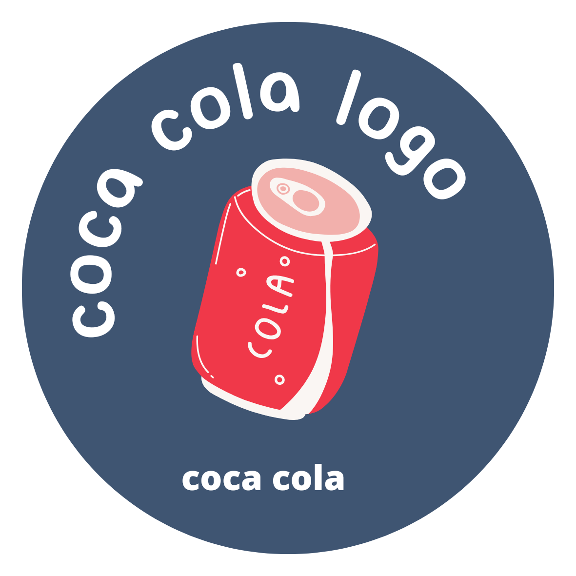
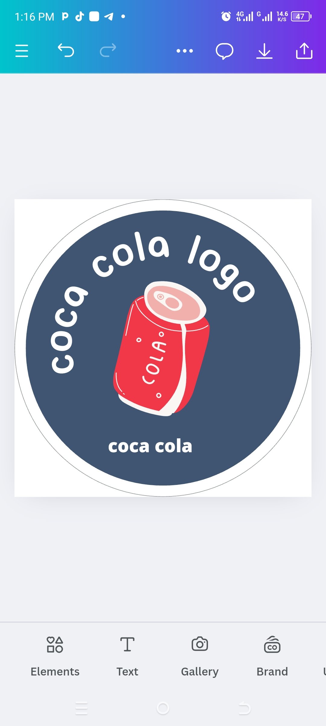
Creating a logo for anything is a very difficult task. I wanted to associate Coca-Cola with my business, that's why I wanted to create it through my Canva design. Designing thought how to choose the design of it after that I chose light color as you can see in front it was really a hard work but I can talk easily after seeing all these things. and detailing it step-by-step below
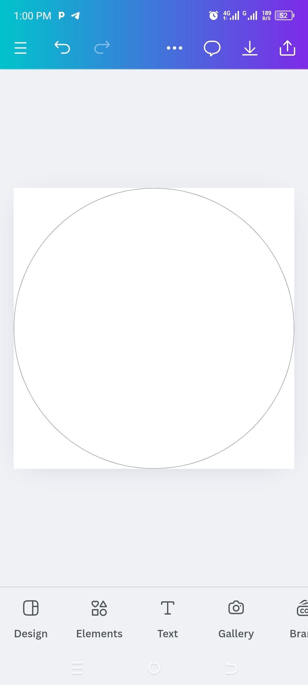
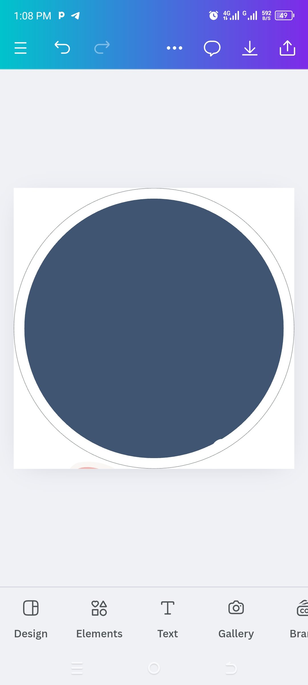
I have decorated the pictures from different angles, you can see that first I opened a completely clean page, then I wrote the logo that you see above in my own words and Other then I have prepared its bottom color which is round circle other step by step up all the activities I have explained in different ways its size which is as I wanted it equally has chosen


Here you can see the complete procedure as I prepared it and below you can see the entire procedure.

Final Design Is Ready

i like to invite @kouba01 @patjewell @stef1 to take part in this contest
Link is Here

Thanks for reading |
|---|
Comments