Version 2 for scoring the strength of a follower network
11 comments
Back in Programming Diary #19, I showed a visualization of the follower network score that I had implemented in my autovoter. I also mentioned that I still wanted to improve it.
Well, I've been chatting with ChatGPT about how to improve it, and I think we came up with a better way.
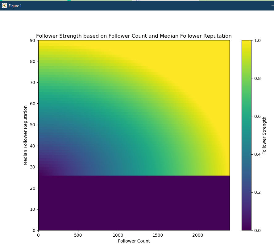
Here's the new visualization as a "heat map" (constructed using numpy and pyplot):

Basically, with ChatGPT's help, I realized that it's just a geometry problem, so I was able to make the visual look more reasonable by thinking of concentric circles (or ovals) and following some simple steps:
- Place the origin at 25 median follower reputation with 0 followers.
- Normalize the number of followers to a fraction of the value between 0 and 2400 (2400 is an arbitrary number and can change as needed).
- Normalize the median follower reputation to a fraction of the value between 25 and 90 (90 is also arbitrary and modifiable).
- Calculate the distance from the origin using the normalized values (the radius of a circle is the square root of ( X2 + Y2)).
Thus,
- If the median follower reputation is 25 or below, the follower network score is 0.01 (not 0 to avoid dividing by zero later)
- If the median follower reputation is above 25, then the follower network score lies along an arc that's determined by the median follower reputation and the number of followers.
- Low scores (near 0) are in the lower-left of the quadrant, close to the origin.
- High scores (near 1) are reached by moving upwards and/or rightwards.
- It can always be adjusted if common reputation values or follower counts grow to new levels.
- Adding large numbers of accounts as followers doesn't help the score unless those accounts have managed to raise their reputation above 25 - the default value. (In fact, it probably hurts the score by lowering the median)
Sorry if this was rushed, but that needs to be it for tonight. I'm low on time now and out of pocket this weekend, so I'm not sure when I'll be posting again. However, I wanted to get this up while it was fresh in my mind.
Despite the fact that I haven't made time for programming diary posts, I'm still plugging away at getting the Steemometer ready to release as Open Source, and I'm still thinking about how to measure the strength of someone's follower network. Hopefully, this is a solid step forward on the second item.
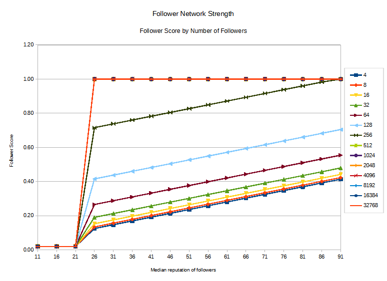
Finally, just for reference, here was the previous visualization:
The two would be easier to compare if I had done it as a heatmap, but it didn't cross my mind at the time. I definitely think the new values are more reasonable, though.
Thank you for your time and attention.
As a general rule, I up-vote comments that demonstrate "proof of reading".
Steve Palmer is an IT professional with three decades of professional experience in data communications and information systems. He holds a bachelor's degree in mathematics, a master's degree in computer science, and a master's degree in information systems and technology management. He has been awarded 3 US patents.

Pixabay license, source
Reminder
Visit the /promoted page and #burnsteem25 to support the inflation-fighters who are helping to enable decentralized regulation of Steem token supply growth.


Comments