"SEC20/WK2: Colour Theory and Application."
11 comments
Learning is fun! Joining this graphic design class has really thought me a lot. It has revealed all that I have been doing without knowing the meaning and has also thought me new things. Last week's class was just a begining.
I am set to keep learning. I have studied and carried out all assignments for this week #2. I present them below as requested by @lhorgic. If you missed it, here is the lesson post
Discuss Colour Theory according to the way you understand it.
My people say that when food is presented, the eye will always be the first to taste the food before the mouth.
Yes, when the eye sees anything first, it is either attracted to us or detracts. And that is the more reason why colour comes in. In the days of black and white television, we knew how we struggled to differentiate the objects displayed. Everything seems the same and because we didn't have options, we had to watch them that way whether we enjoyed them or not.
But with the advent of colours and then colour television, viewing became interesting as we can easily distinguish the objects.
The same is true with graphic designs made. Colour adds to the beauty of designs and the message that is intended to get to the viewers are easily communicated when the right colours are combined. We want our audience to easily see through our designs and get the message we are trying to pass across. Having the basic knowledge of colour theory becomes very important if we are to succeed.
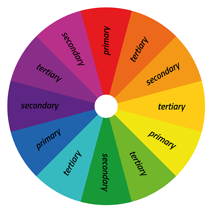
Hence, colour theory or traditional colour theory is a set of principles that are applied when trying to combine colours in a design so as to achieve a homogeneous combination of colours that will be appealing and pleasing to the eye and at the same time pass on the intended message to the target audience by keeping their eyes glued to it. Out of the 3 primary colours which are red, yellow and blue, we can form 3 secondary colours which are purple, green and orange. And when you talk of the tertiary colours, it becomes a little complicated because, it is the combination of the right primary colours and the right secondary colours that gives rise to the tertiary colours. Keeping in mind the colours you want to achieve determines the colours to combine of the primary secondary colours.
For example, when you want to get violet, you will combine blue (primary colour) and purple (secondary colour) and that will be blue-purple. And so on.
We also need to keep in mind what we are trying to communicate to the audience. I mean what our design is meant to represent.
When trying to make a design for love, white and red easily comes to the mind and becomes the predominant colour ls in your design because that is what is known to be used in representing it. And same goes for any other ceremonies. For instance, when my country is celebrating her national ceremonies, the colour that easily comes to the mind is green and white, and the same goes for other countries. Imagine representing Nigeria with other colours other than what is she is known for. It will certainly be absurd.
Hence, it is proper to understand colour theory and make practise of it when combining colours.
Colour Scheme
Helps to know the relationship between colours in the colour wheel, this making it easier for one to know the colour to choose and combine with the other to give one what colour he or she needs.
The colour wheel is in circular form which places each colours side to the one it relates.
Colour scheme therefore is a group of colours that are combined in a practical design to achieve a purpose. The colour wheel places these colours in a way that picking from them becomes very easy following the scheme.
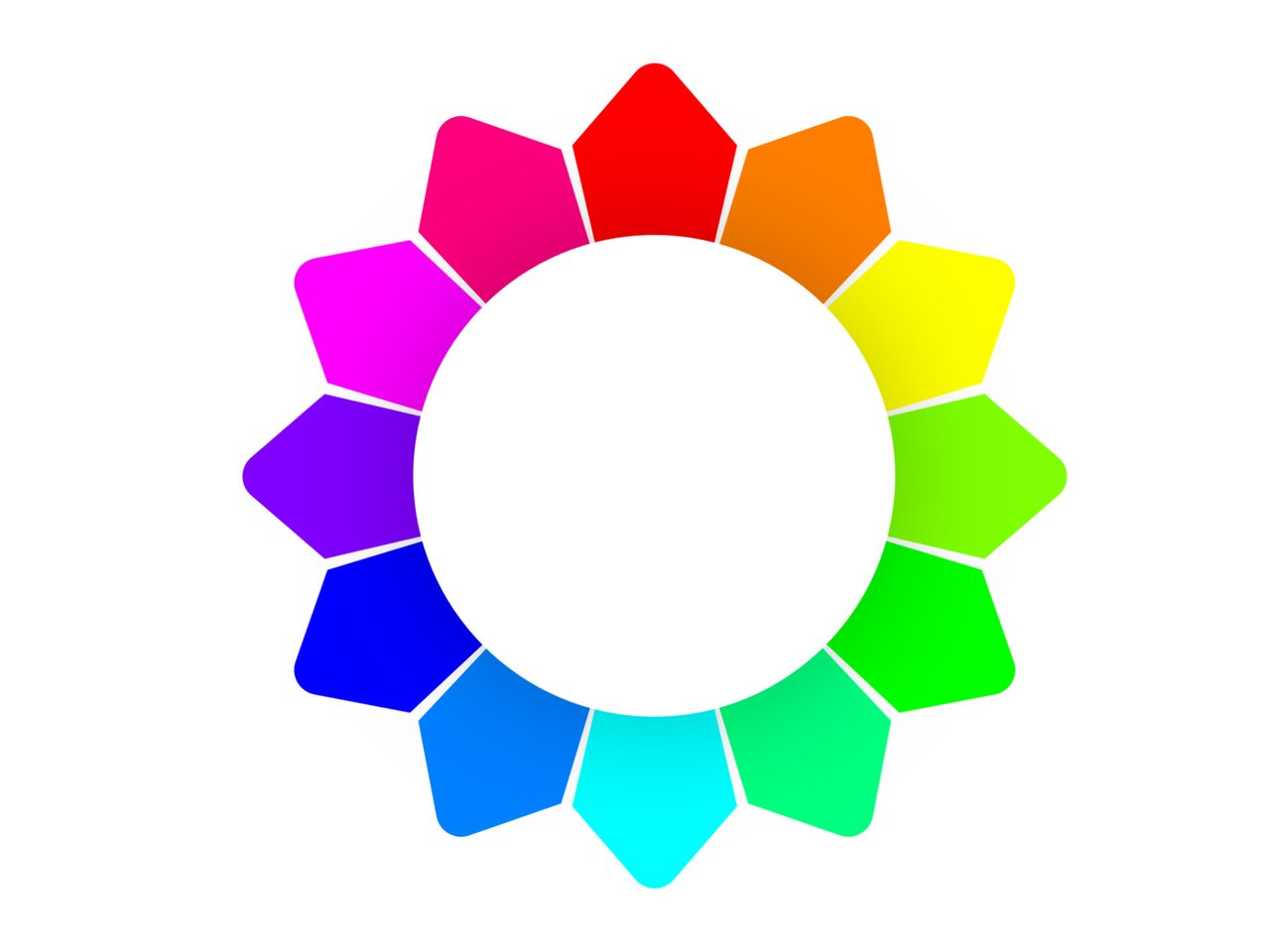
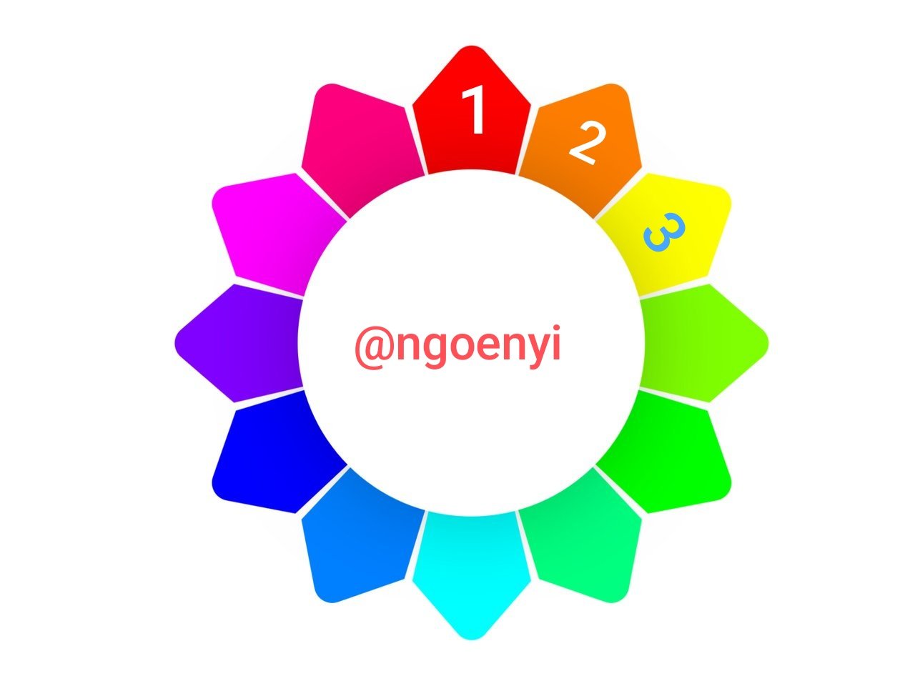
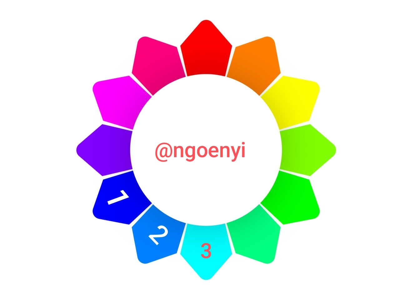
When looking for colours to combine, analogous colour scheme comes in handy as you don't need to look far to get it from the colour wheel. Look at the colour wheel below and see that there are 3 colours that are closely related. When you combine the 3 in your design, you will achieve something great that will be eye catching. I have indicated them on the image below
 |  |
|---|
From the colour wheel above, you will see how I have indicated the 3 colours one can combine using the analogous color scheme. 1, 2, 3 has been used to indicate them. Combining the 3 of your choice as indicated will give you a wonderful result.
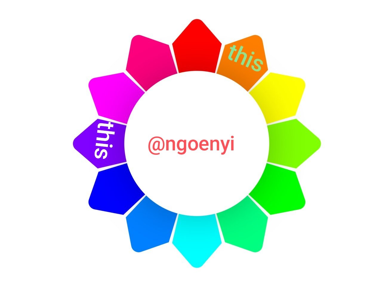
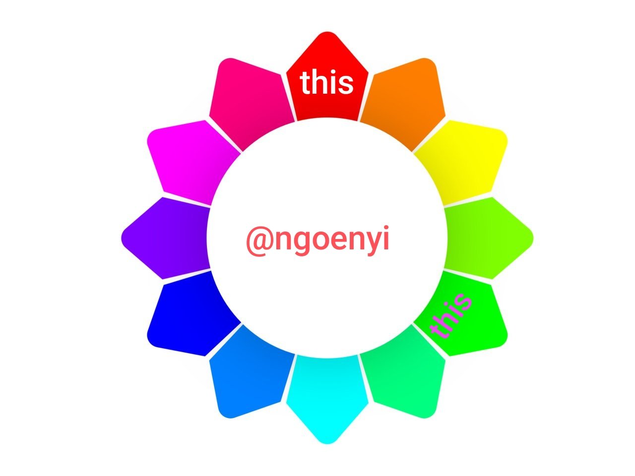
This scheme is gotten from the combination of colours that are 3 colours apart. This is to say that when you choose one particular colour, count 3 colours apart from that one you have chosen and then choose the next colour to combine with the first one. These colours are equilateral apart and can forms an equilateral triangle. The image below will explain it better
 |  |
|---|
I have indicated the colours that fall under the triadic color scheme. Combining them will also give a wonderful result.
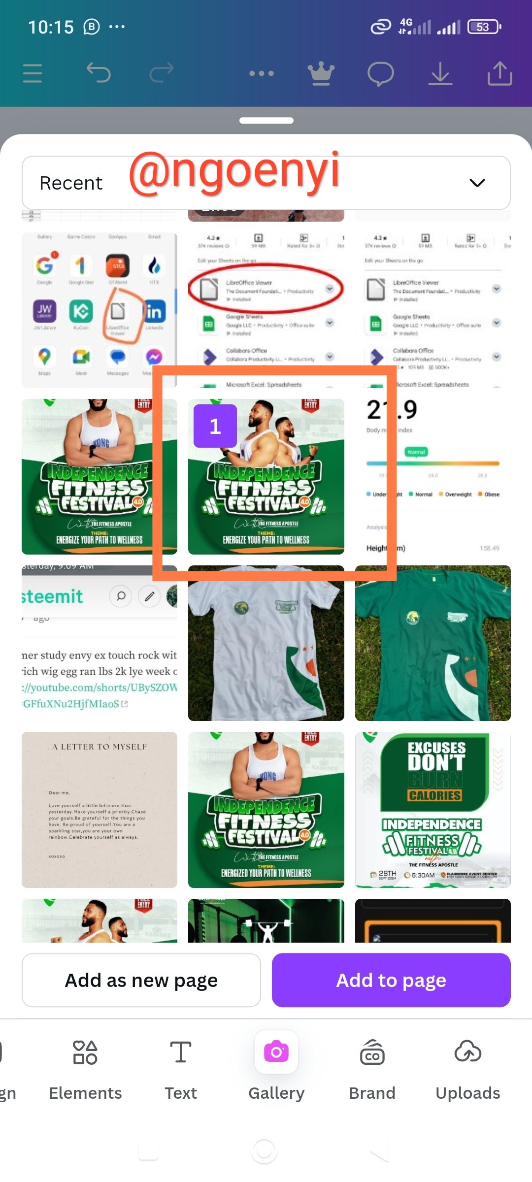
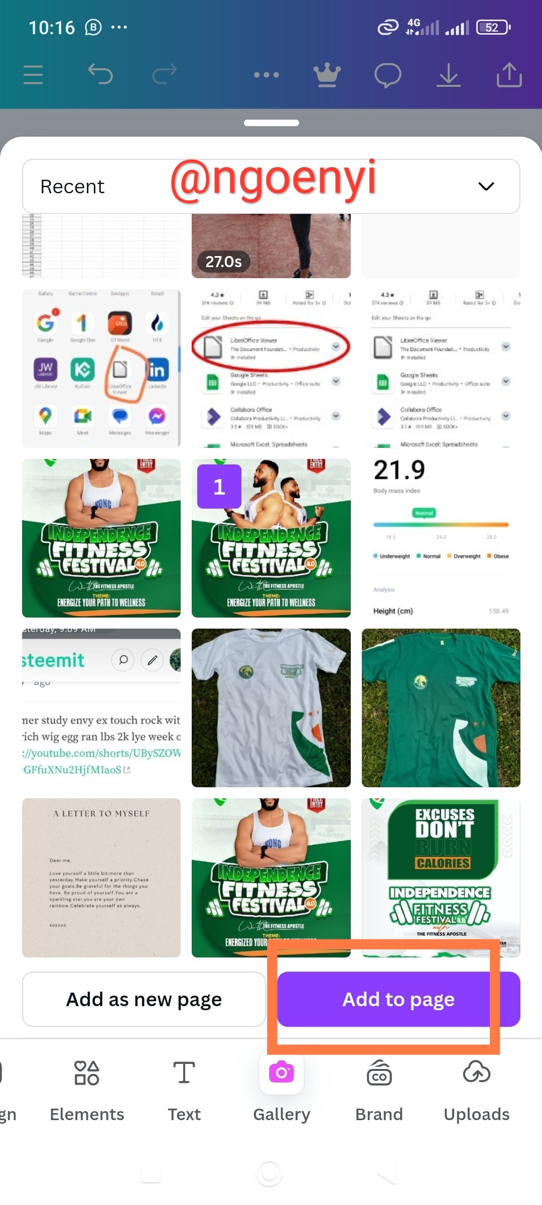
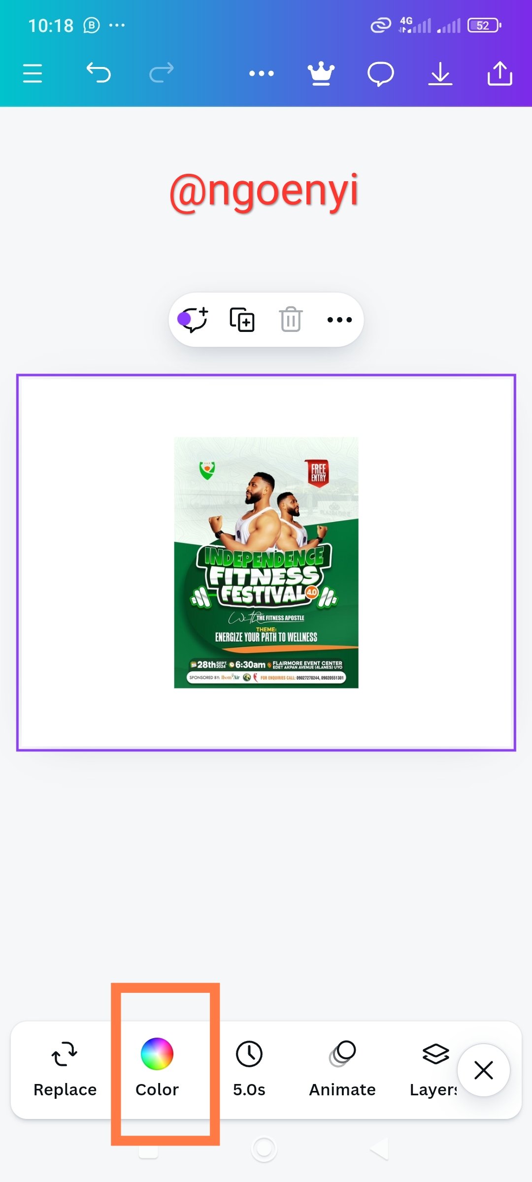
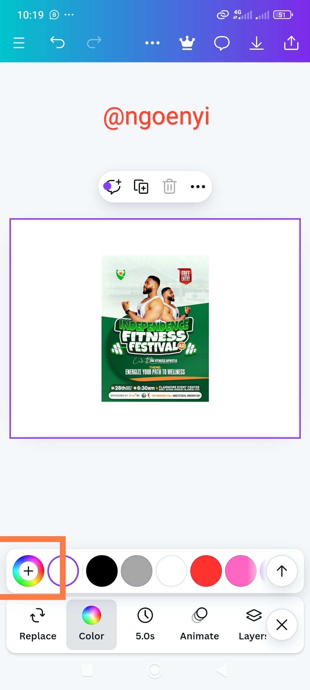
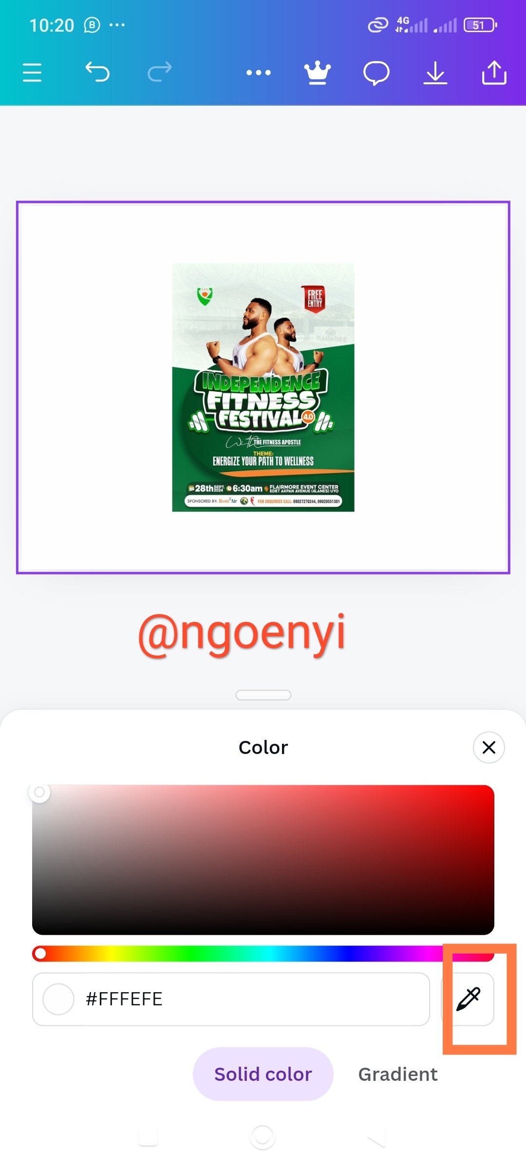
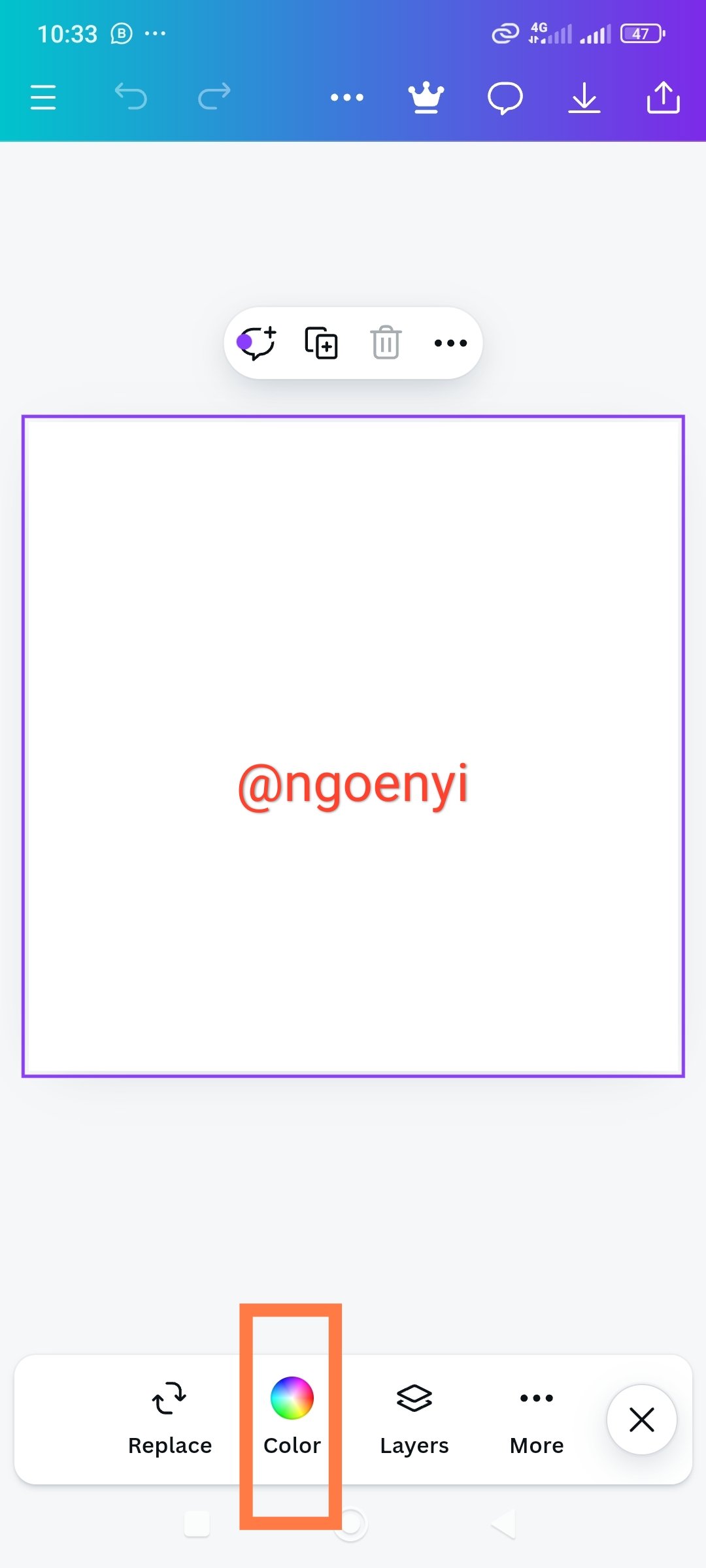
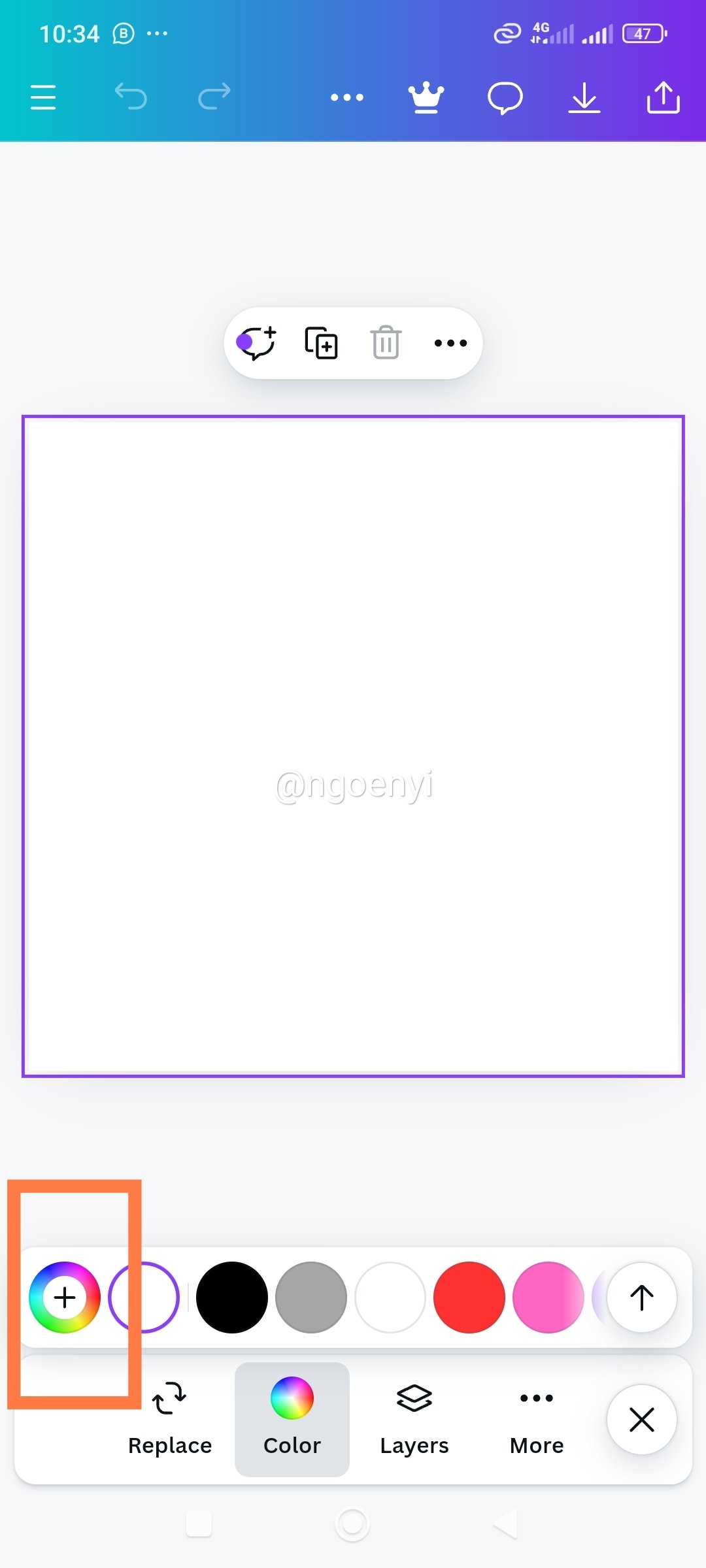
Demonstration of how to get my colour Hex from an external object using canva design app
 |  |  |
|---|---|---|
| Launched my canva design app and clicked gallery | I chose the upcoming fitness event design sent to me by the host | I clicked add to page |
 |  |  |
|---|---|---|
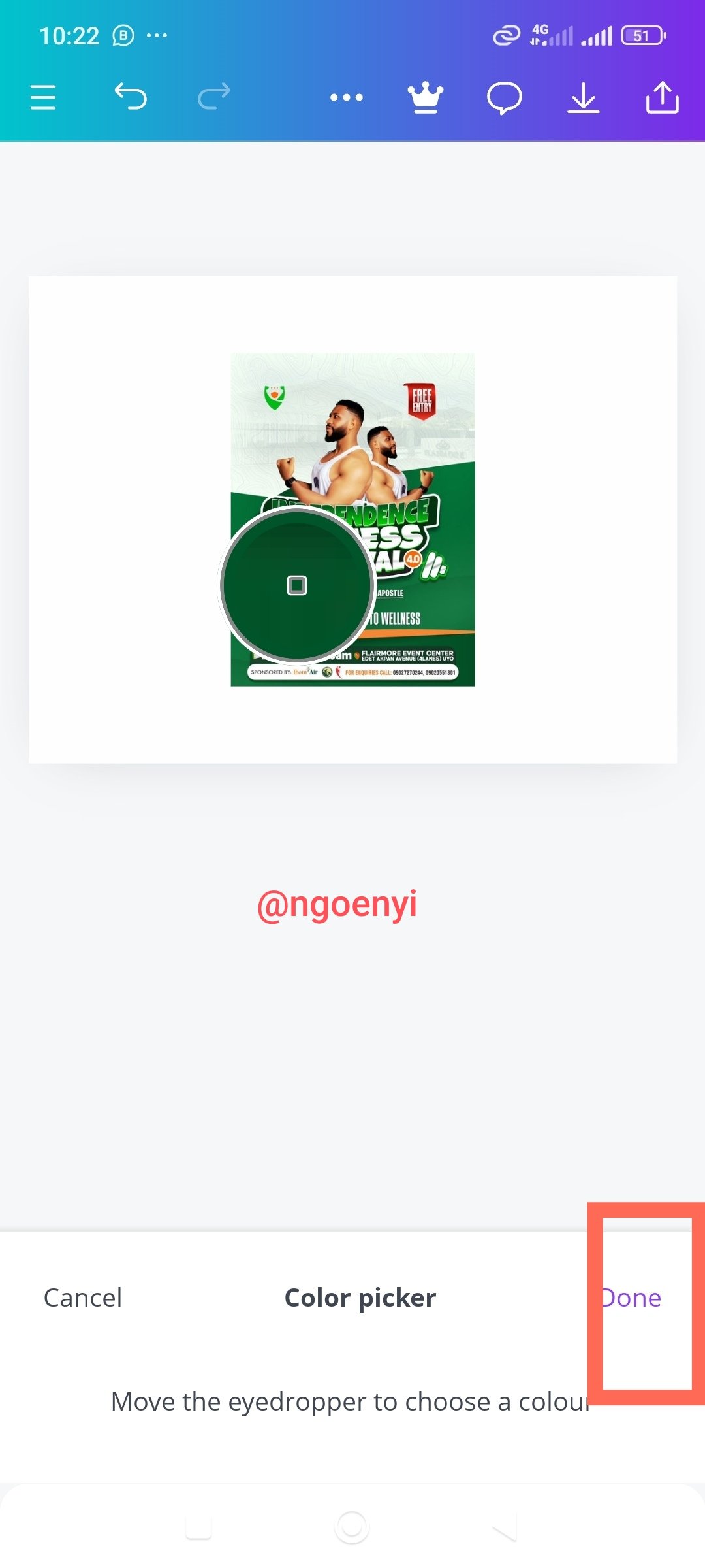
| I clicked on colour | then on colour wheel | and on colour picker |
 |  |  |
|---|---|---|
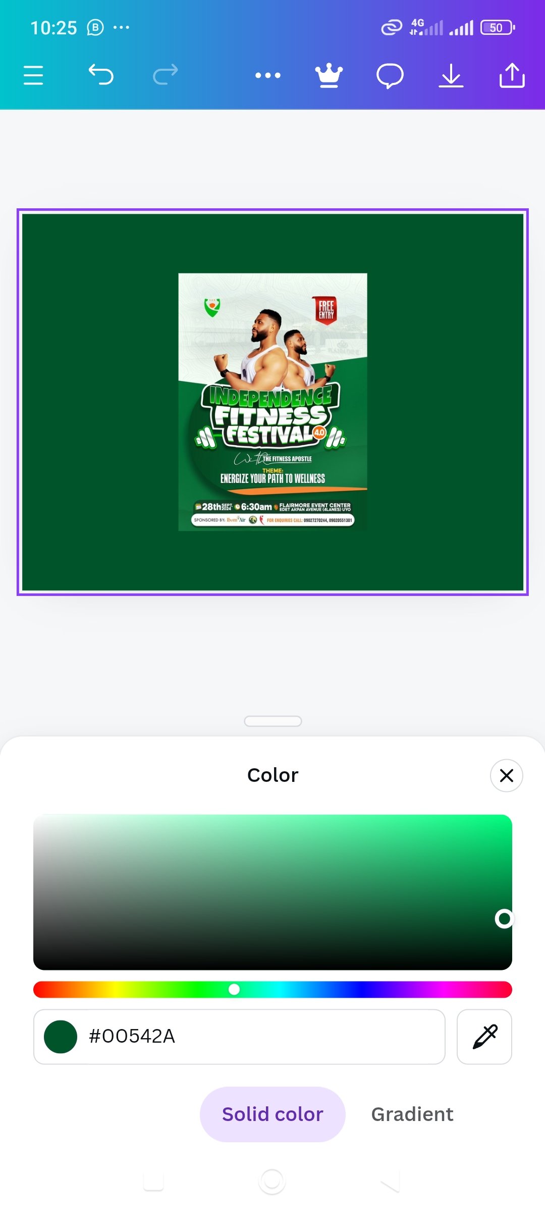
| I clicked on done to apply | here the colour is applied | here is the Hex code |
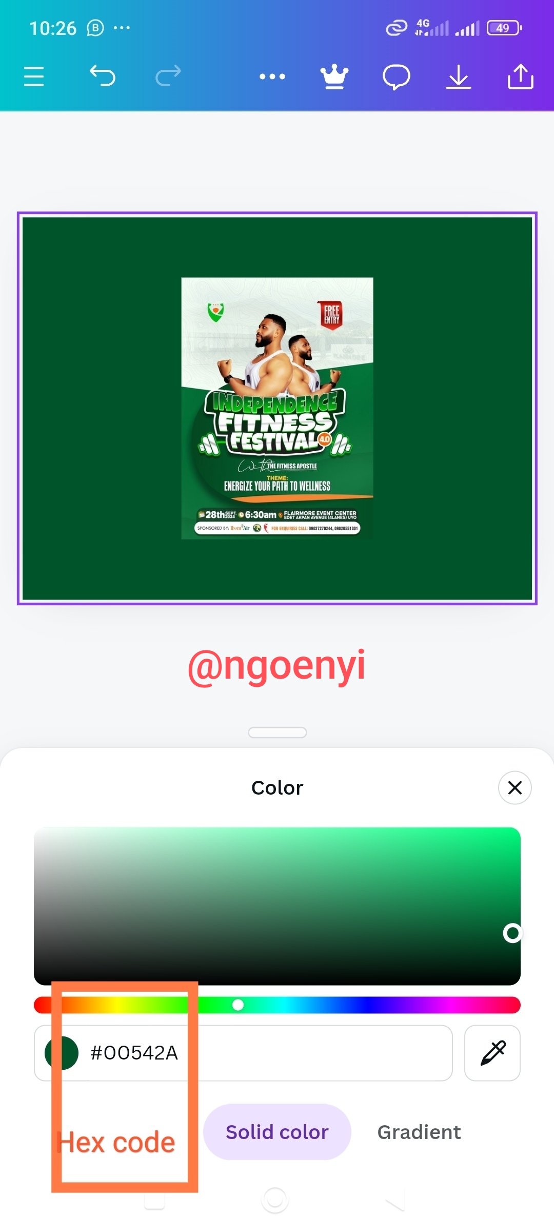
 | here is the background colour which I can then use to make a design |
|---|
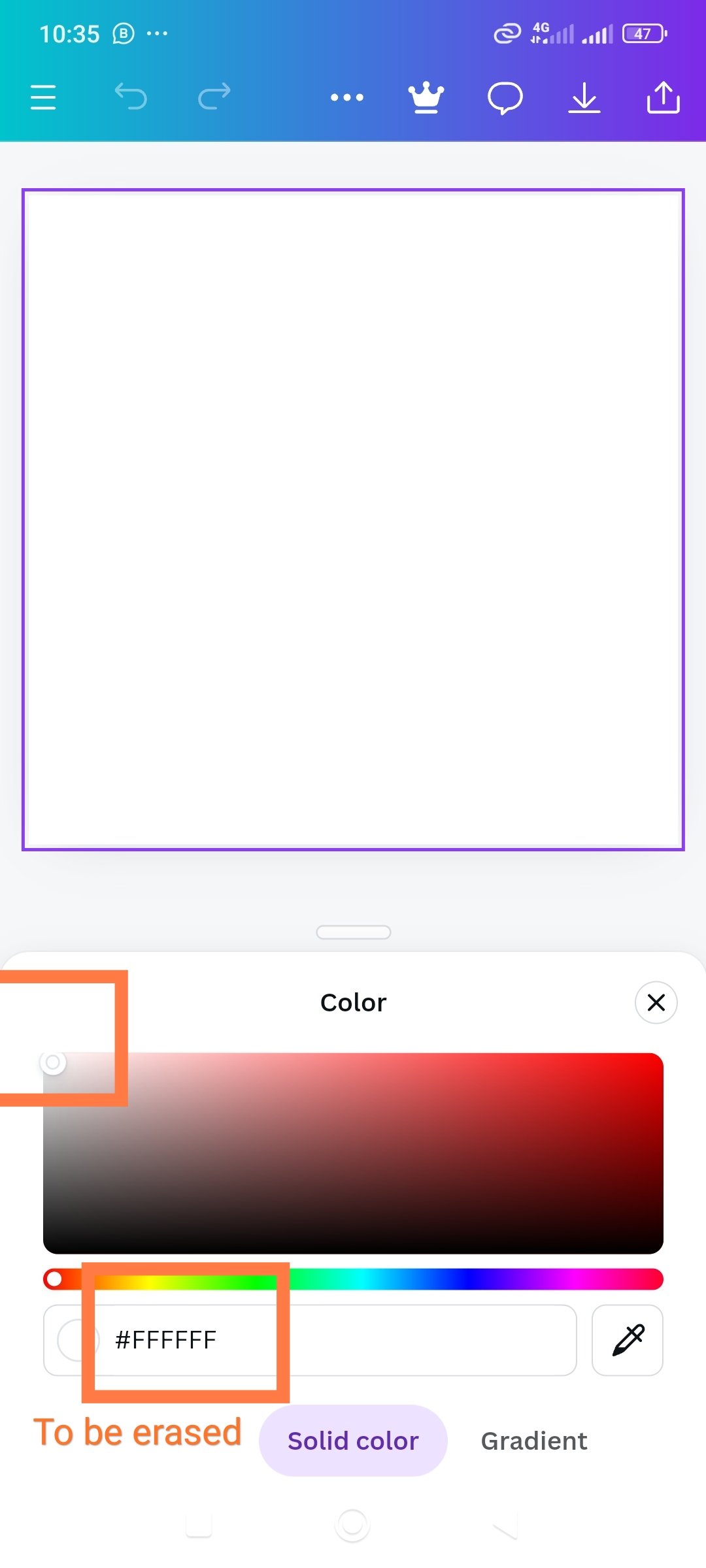
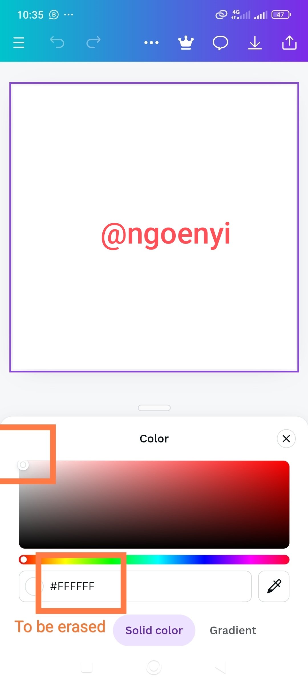
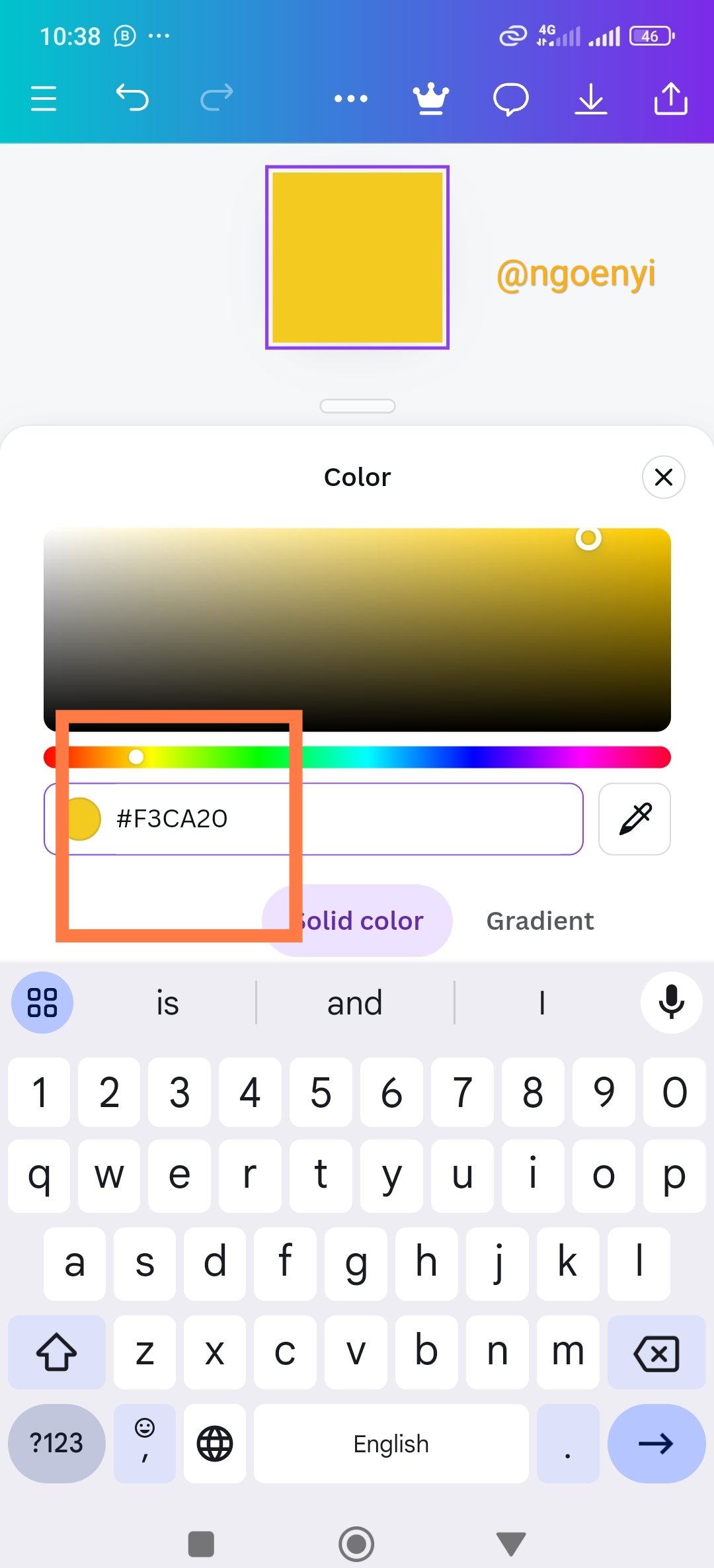
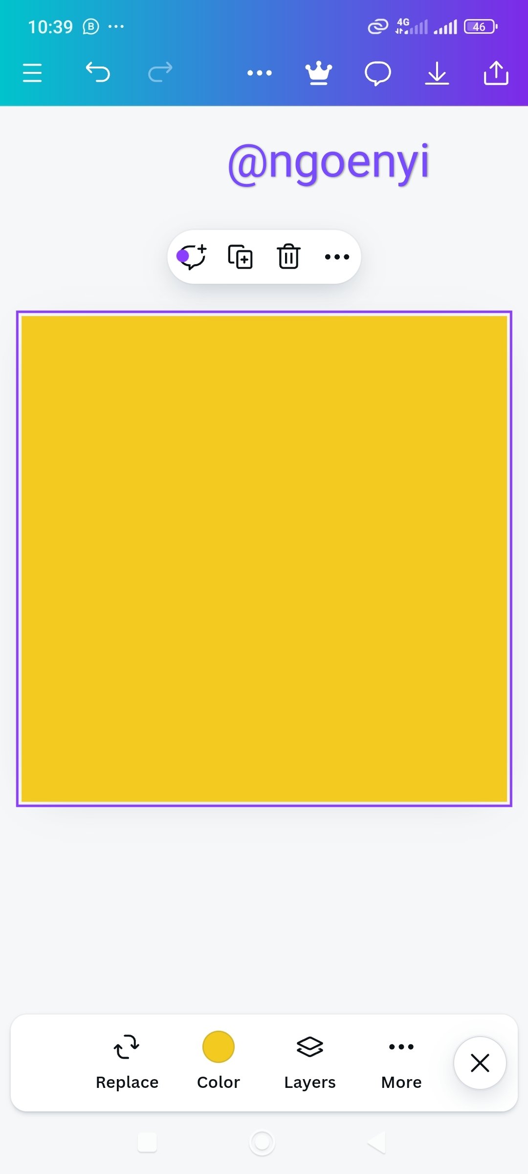
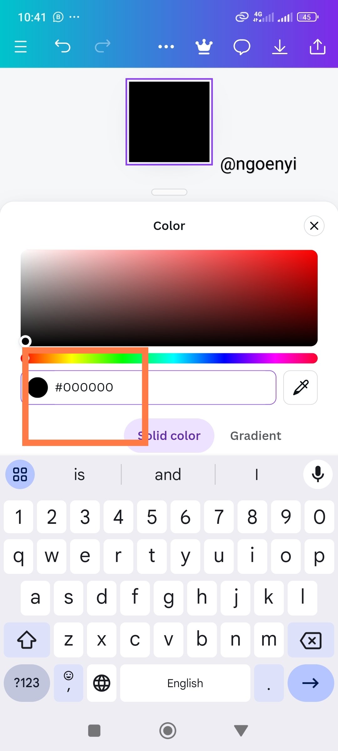
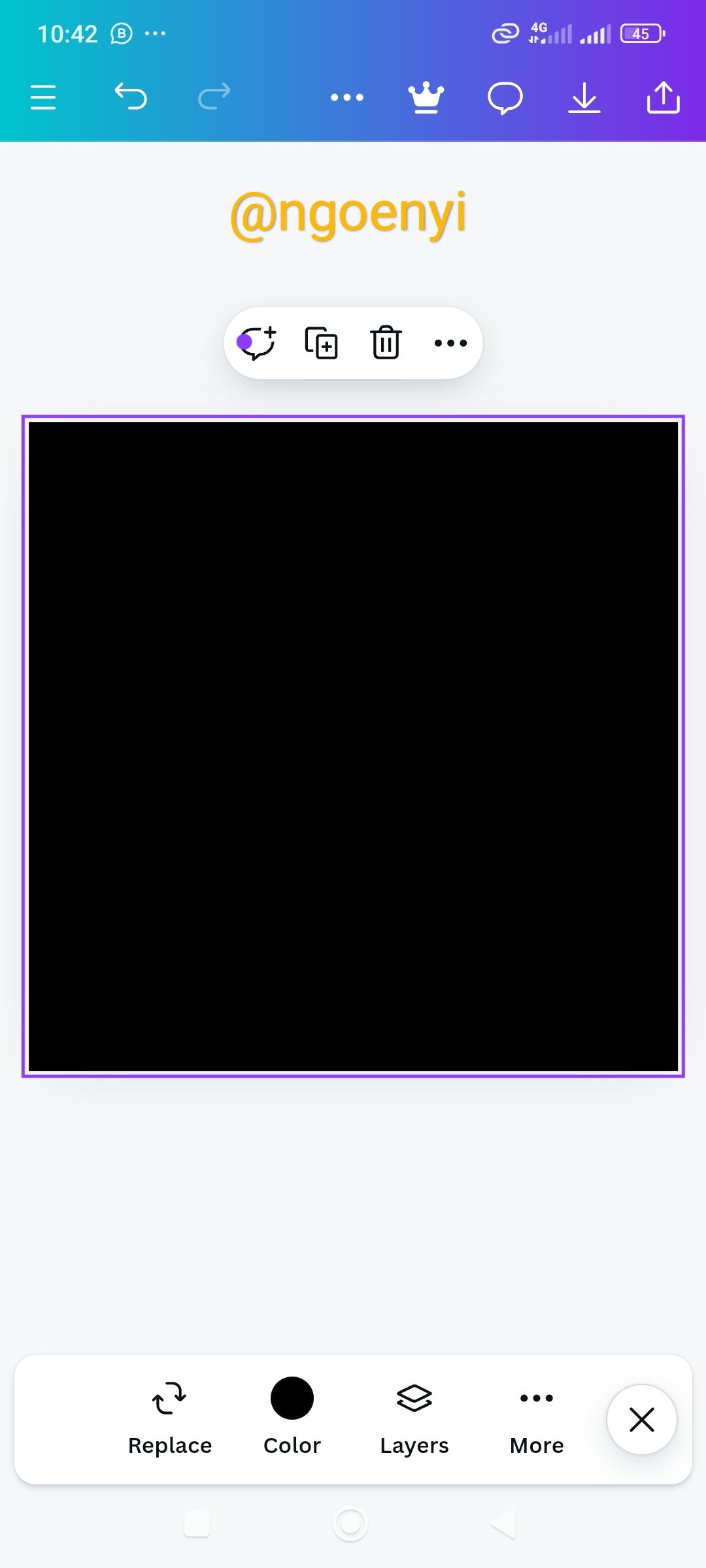
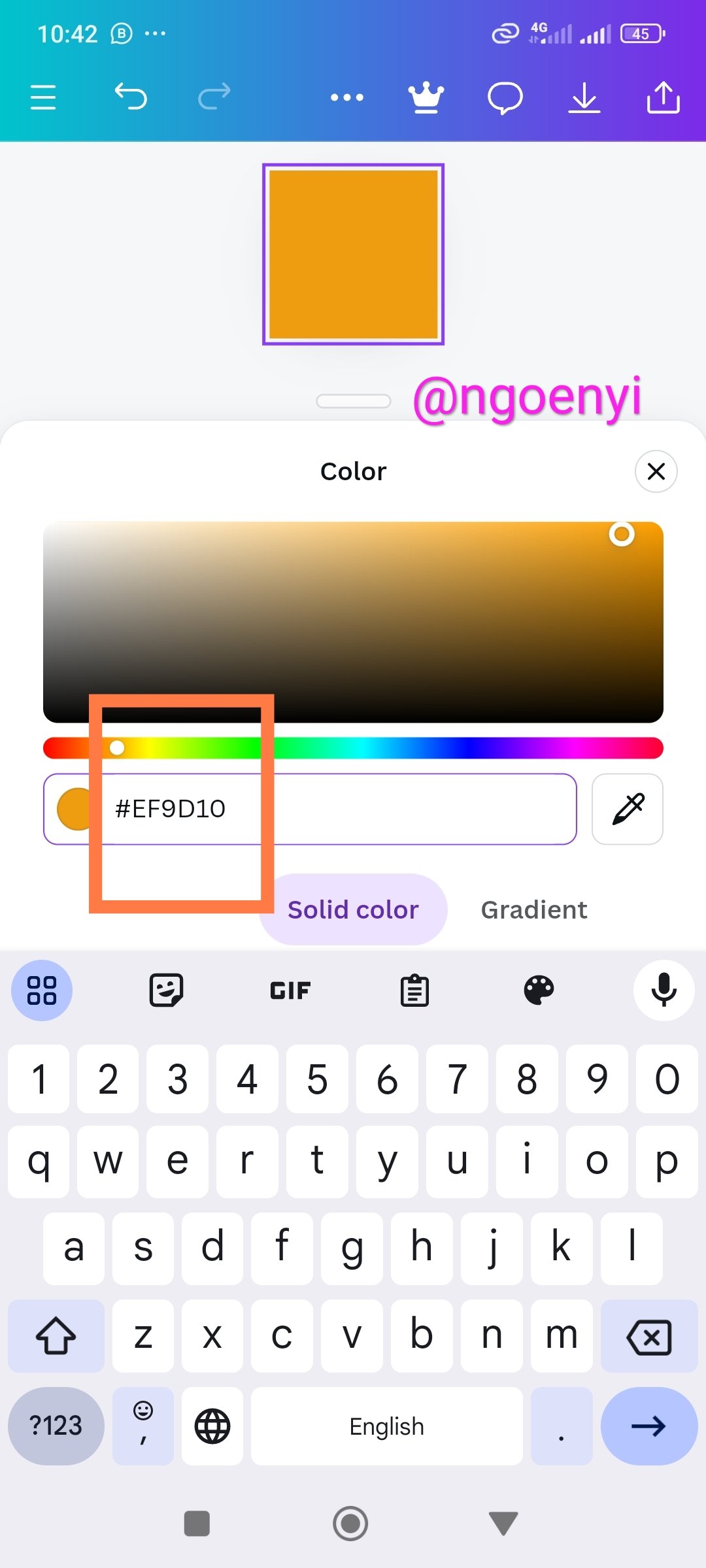
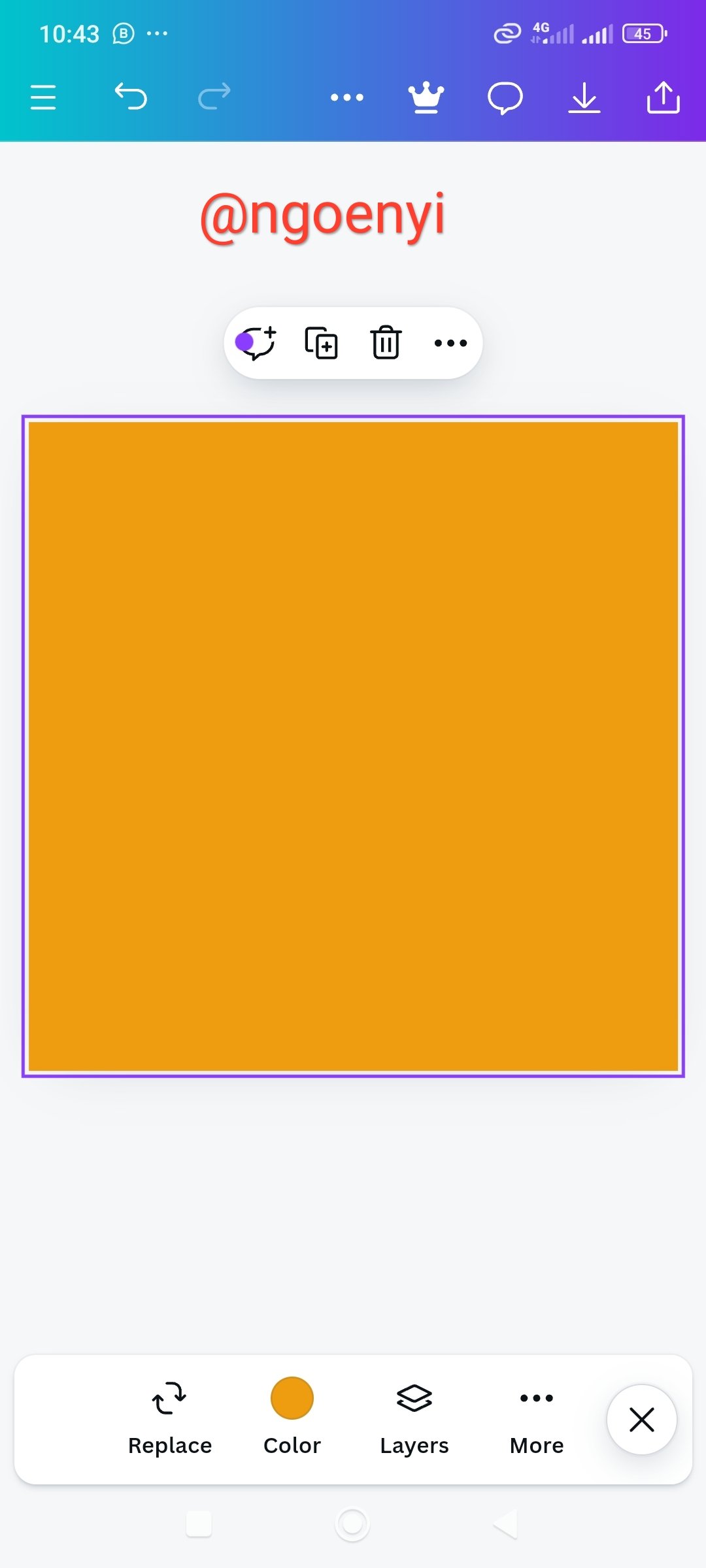
Getting the colours behind the hex colours : #f3ca20, #000000 and #ef9d10f
 |  |  |
|---|---|---|
| Here, I launched my canva design app and clicked on the colour | I headed straight to the colour wheel | here I have indicated the default colour and the Hex code |
 |  |  |
|---|---|---|
| Here, I erased the default colour code | I copied and pasted the hex code to find the colour behind it | here is the result |
| | |
|---|---|---|
| Here, I also laughed my canva design app and clicked on colour | I clicked on colour wheel | the default colour appeared and I erased it |
 |  |
|---|---|
| Here, I copied the hex code that I and seeking to find the colour and pasted | then the colour appeared as shown |
| | |
|---|---|---|
| Here, I launched my canva design app as before and went to the colour | I clicked on the colour wheel | the default colour Hex code appeared which I deleted |
 |  |
|---|---|
| Here, I pasted the hex code that I am seeking to reveal the colour behind it | the colour appeared as shown |
Conclusion
Thank you lhorgic for this amazing lesson. You have made it very simple for someone like me to understand. I have been able to carry out the assigned tasks
I have discussed the colour theory the way I understood it.
I have chosen two of the colour schemes, talked about it briefly and demonstrated how to combine the colours with examples as requested.
I have as well demonstrated how to find the colour Hex code of an external image using canva design app.
And I have finally been able to show how to find out the colour behind the hex codes you gave us to find.
It was a wonderful experience for me. Thank you so much. I invite @ruthjoe @inspiracion and @mile16 to take part. Success to everyone!

This is my introductory post here
Comments