Introduction to Types of Logo

Now that we've hade a detailed discussion of the importance of logos in the previous lesson, let's take a closer look at the different types of logos that exist. This will help us to better understand how to create an effective logo for our brand.
Here are some common types of logos:
- Wordmark
- Letterform
- Iconic
- Combination Mark
- Emblem
- Abstract
- Mascot
- Dynamic
- Ambigram
- Kinetic
| Discuss about each of the logo types we have and then talk about conditions when such logo should be used and when not to be used for a brand. You can do a little research to aid you. |
|---|
WordMark Logos:
Logotypes or Wordmark logos are text based logo designed entirely with text without the introduction of graphical elements.
Due to its over simplicity, more attention is placed on the fontface used and the logo often carries the brand name. Below is the Coca-Cola logo which is a good example of the Wordmark logo.
 The Coca-Cola logo
When to use
It is advisable to go for a Wordmark logo when you have a simple and short brand name that is easily recognizable. A Wordmark logo will serve you better if your brand is already well established.
When not to use
Do not use a Wordmark logo if your brand name is a long name. It will not be a good idea if you do not have a fontface that is unique
Monogram Logo:
A Monogram logo also called Lettermark Logo is a derivative of the WordMark Logos. In a monogram logo only the initial or selected letters from the brand name is used in creating the logo.
A good example of a brand that uses a Monogram Logo is the Internet Flicks brand. In its logo, it makes use of the NET from internet and the FLIX from flicks (a slang for movies). We know it as NETFLIX
If your brand had a name that is very long, like the National Aeronautics and Space Administration. It is good to use only the first letters of this long name and we know tham as NASA, short and better.
Do not use a monogram as logo if the resulting letters is spelling something offensive, which will attract misinterpretations because of its unintended conotation. People today are too sensitive with words.
A brandmark logo:
Also known as an icon based logo is a logo made with only an icon, no accompanying text, just the icon and nothing else. This applies to the previous Twitter logo and its current logo.
 The Apple and Twitter logo
Use such when yout brand is already known, the icon alone will speak volums for itself. Long standing brands and those who have made a name for themselves can use it.
It is not good for a new brand that has not yet made a name in the market. Twitter can afford to remove all text and the blue bird alone can pass the message, same with the letter X. A new company can't just come up with the letter y and expect to be recognised.
Abstract logo:
Such a brand logo makes use of a none representational design that dosen't depict any real-life object. An abstract logo makes use of colour-mix, shapes and other forms for their logo.
The Abstract logo is good for a longstanding company or brand because the icon itself doesn't communicate anything about the brand. The toyota brand is old enough to use this.
On the other hand, a new company should not go for this abstract logo.
Combination logos:
This logo collects the good part of diffrent logo styles, a combination of icon or mascot and WordMark.
The BMW logo makes use of Monogram Logo design and a spinning propeller blade.
The nasa logo is another good example of the combination logos as it uses an acronym form for National Aeronautics and Space Administration and some icons
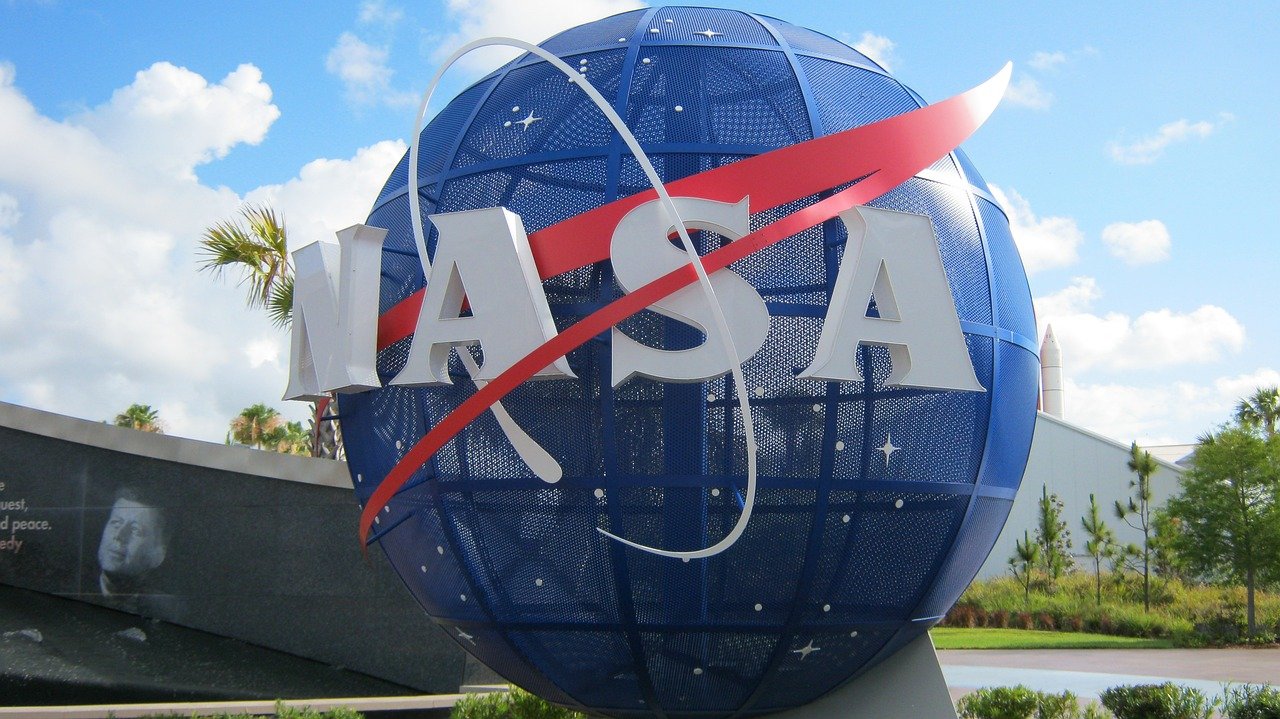 https://pixabay.com/es/photos/nasa-florida-espacio-planeta-2313267/
| Pick any two (2) of the Logo types discussed and then practically demonstrate how to make them, showing your detailed process. |
|---|
[Logo 1]
Assuming I am to create a logo branding Maindset ICT Academy. its a new ICT company.
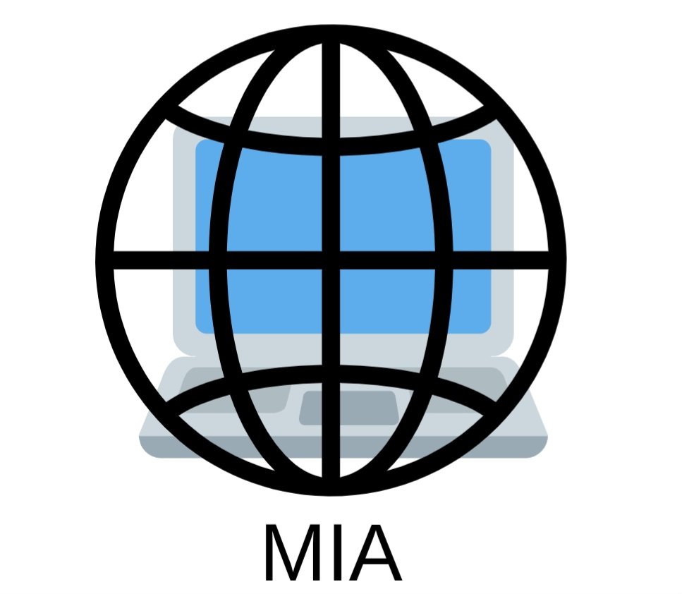
Because the name is long, i will pick only the first letters
I will create a combination logo for it.
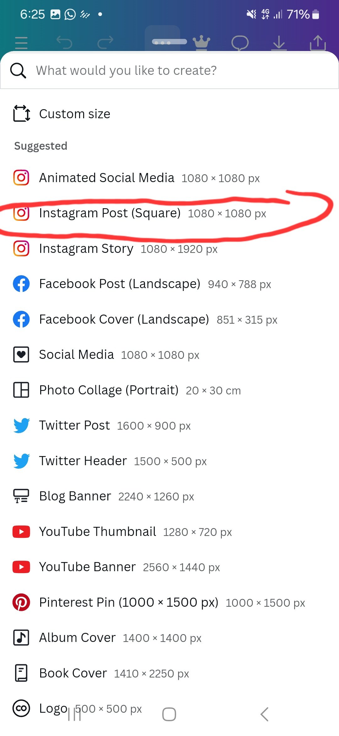
- Load the canva application.
- Select the canvas size for the graphics.
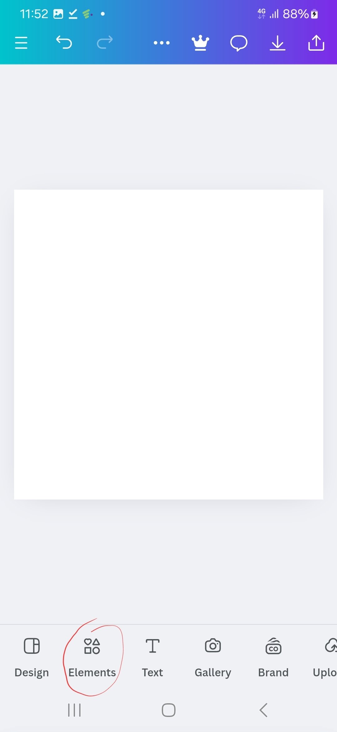
- Select element.
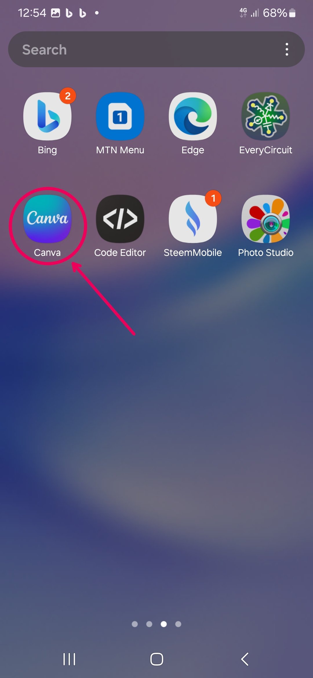 |  |  |
|---|
| Loading Canva | select size | select element |
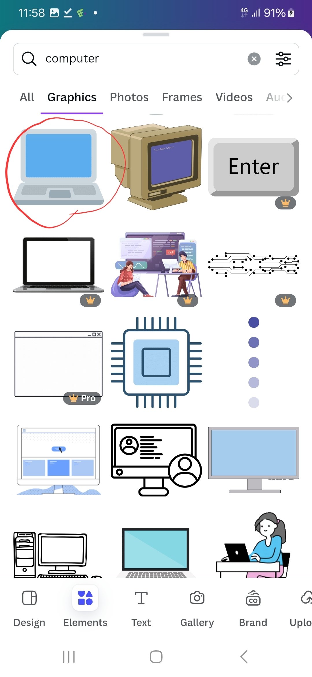
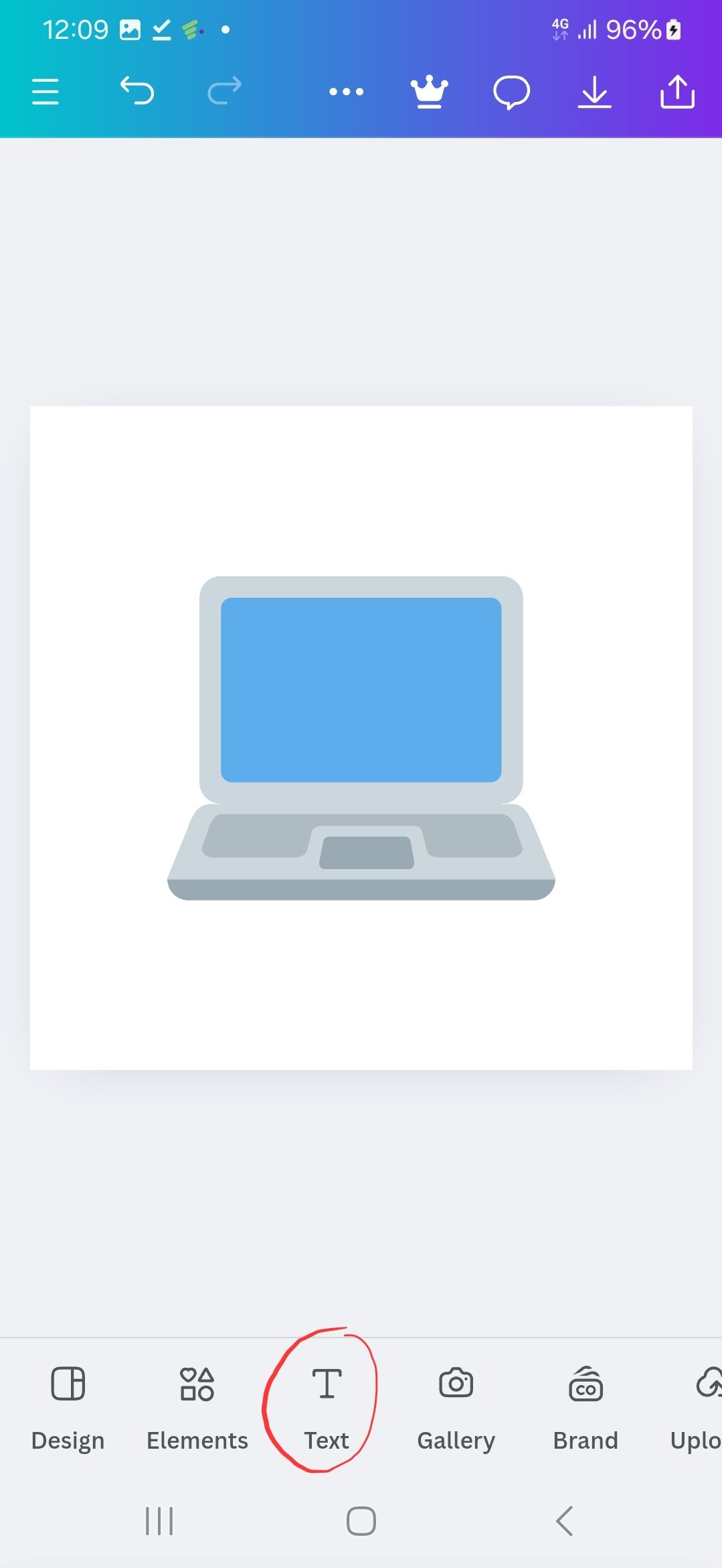
- type in computer
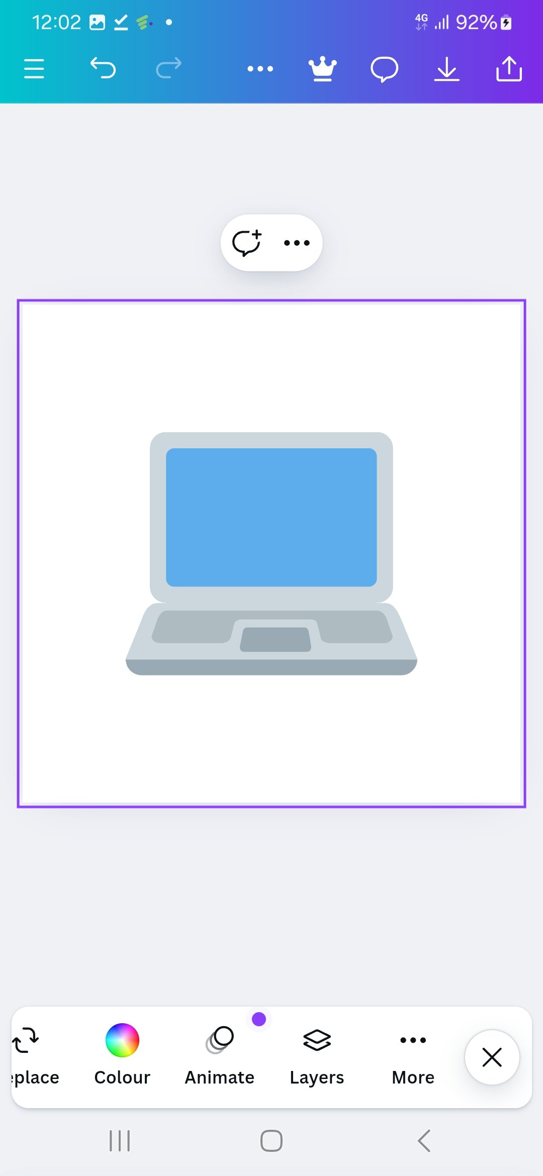
- Select the computer
- Select text
 |  |  |
|---|
| type computer | select a computer | select text |
- type in MIA
- go to element
- select a glob
- position the items
[Logo 2]

Aptech is a brand that has already gained recognition in my area. But it is still using a composit logo as its brand.
Aptech would do well with a WordMark logo.
- Load the canva application.
- Select the canvas size for the graphics.
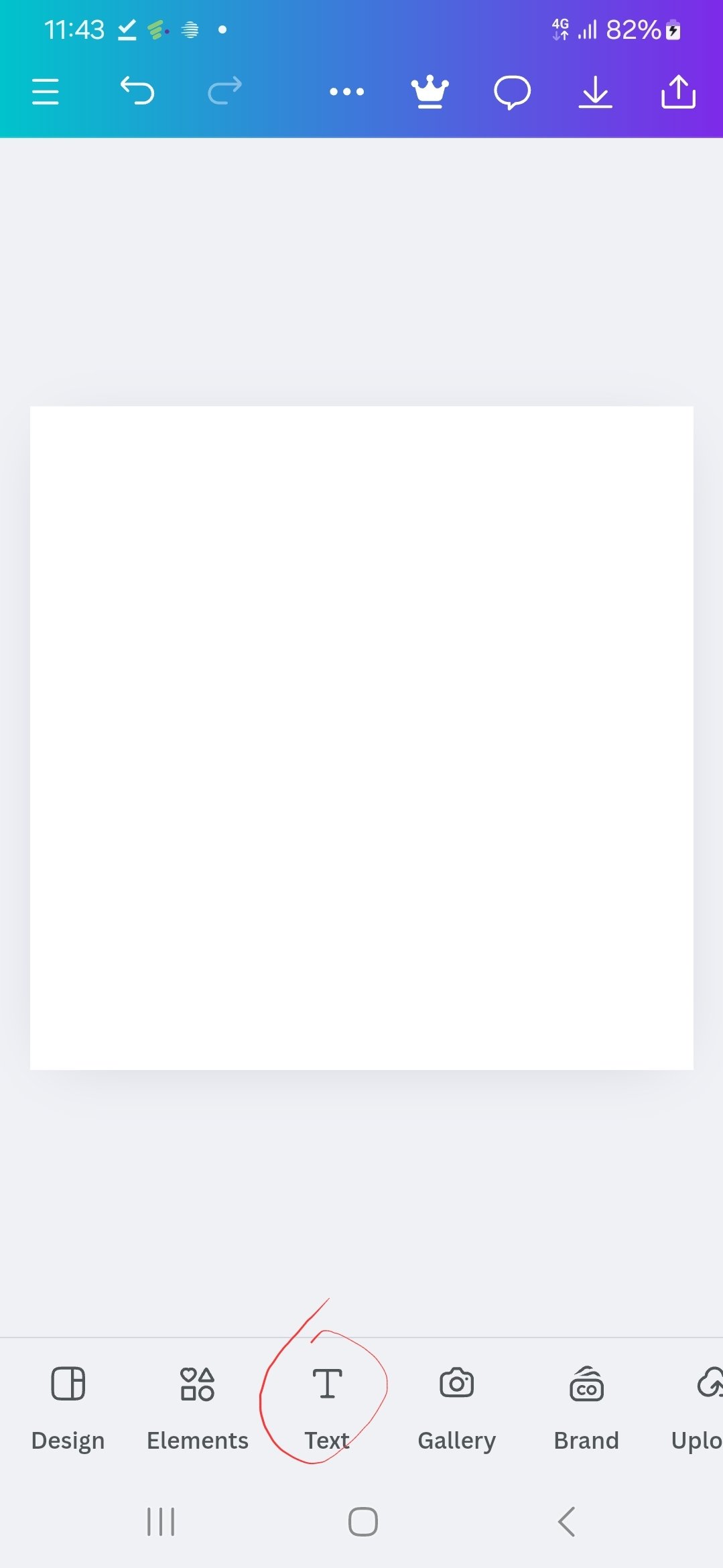
- Select element.
 |  |  |
|---|
| Loading Canva | select size | select text |
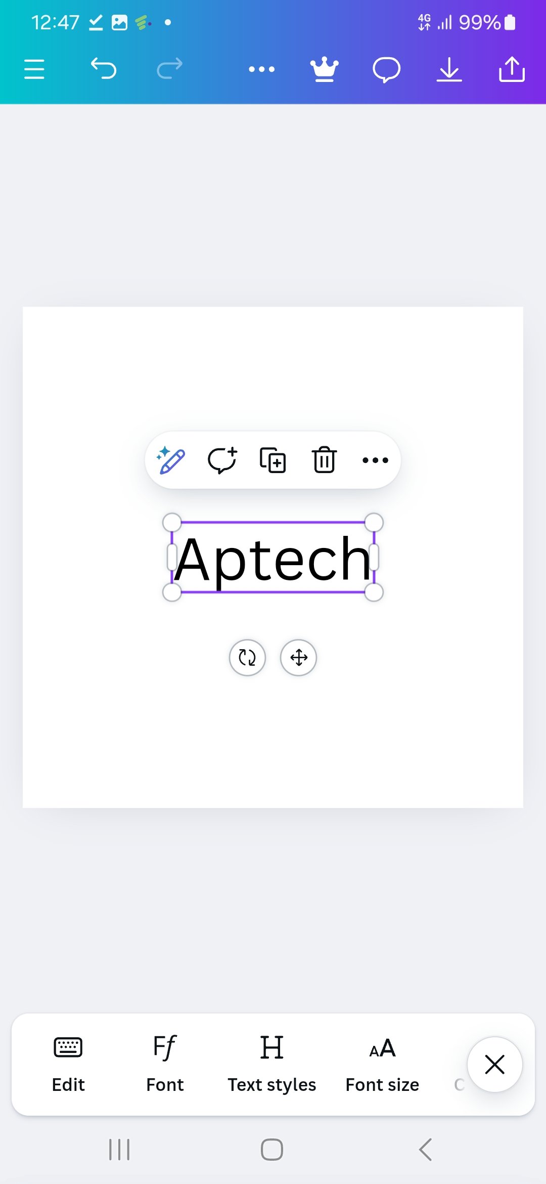
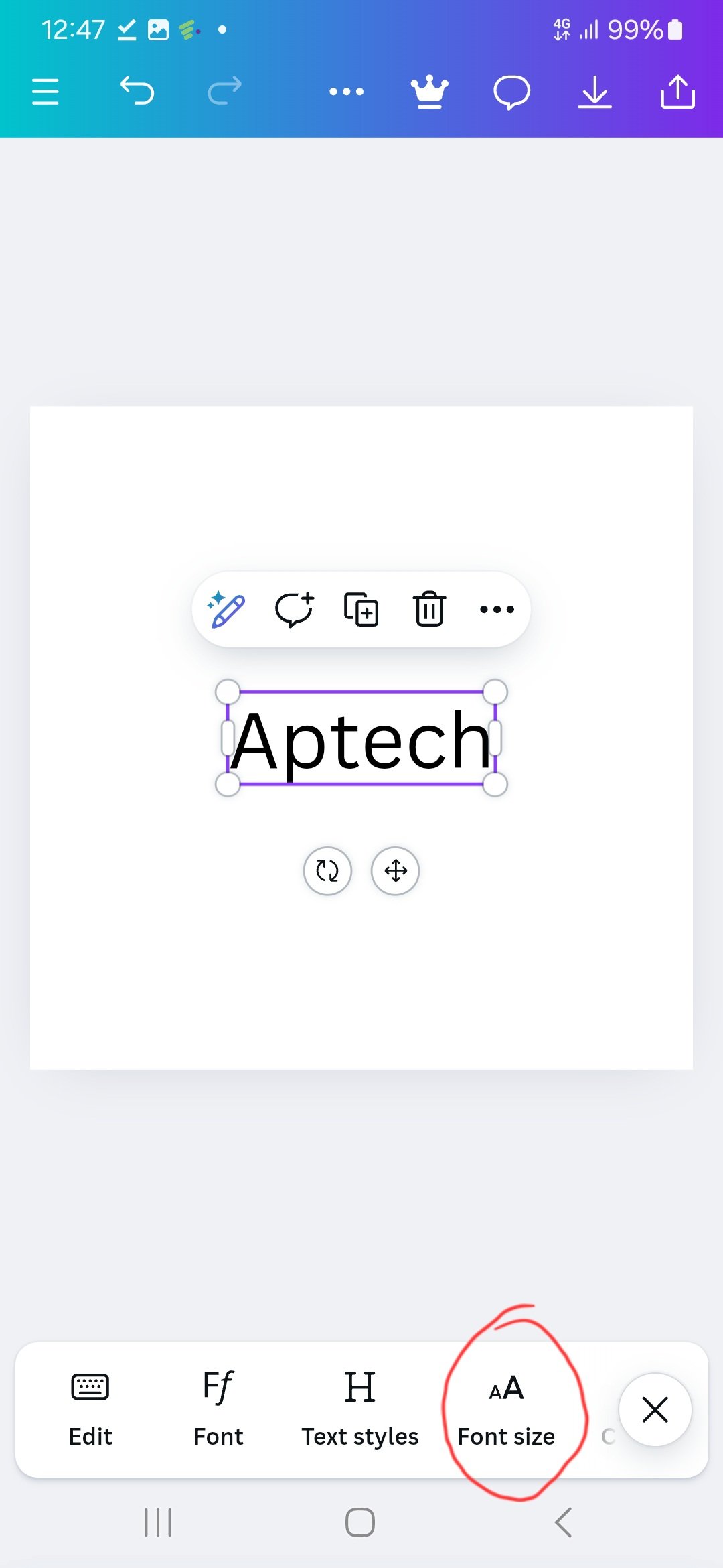
- type Aptech.
- Select font size.
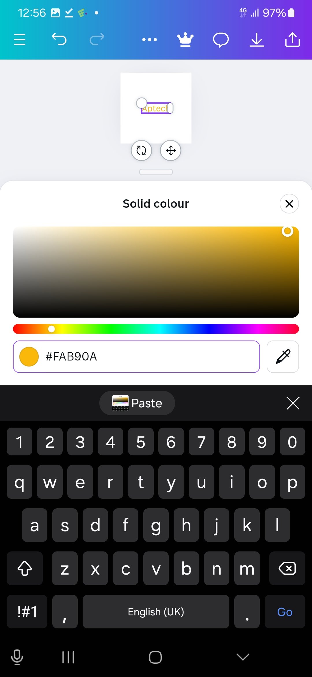
- Select element.
 |  |  |
|---|
| type Aptech | select font size | select colour |
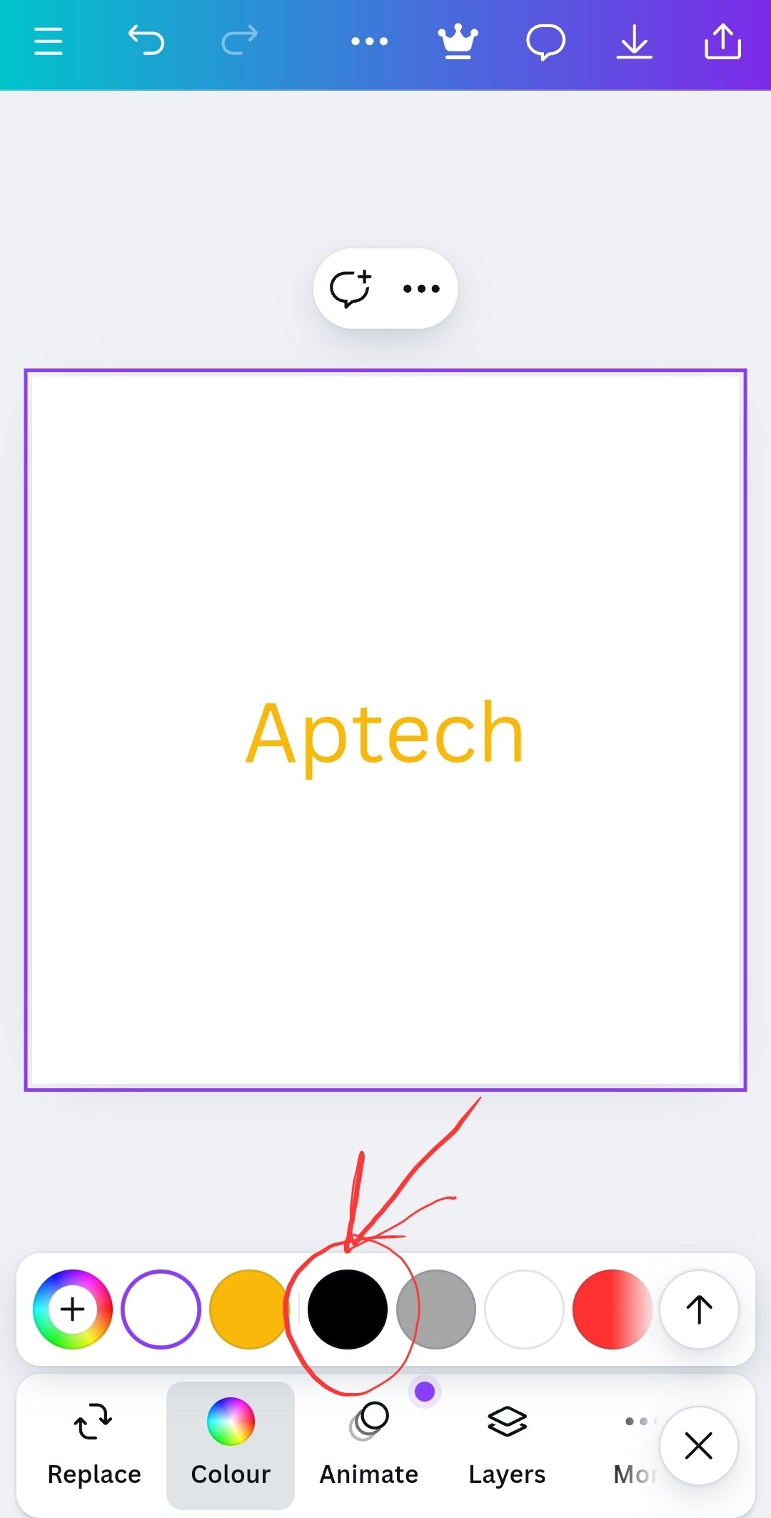
- change cavas colour.
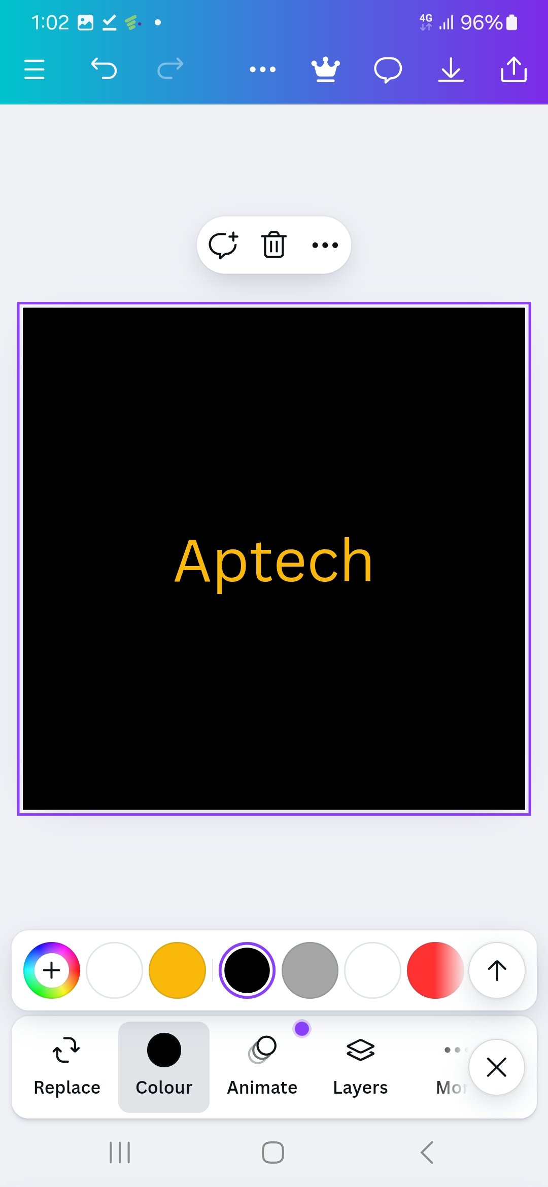
- Adjuste font size.
- adjust font.
 |  | 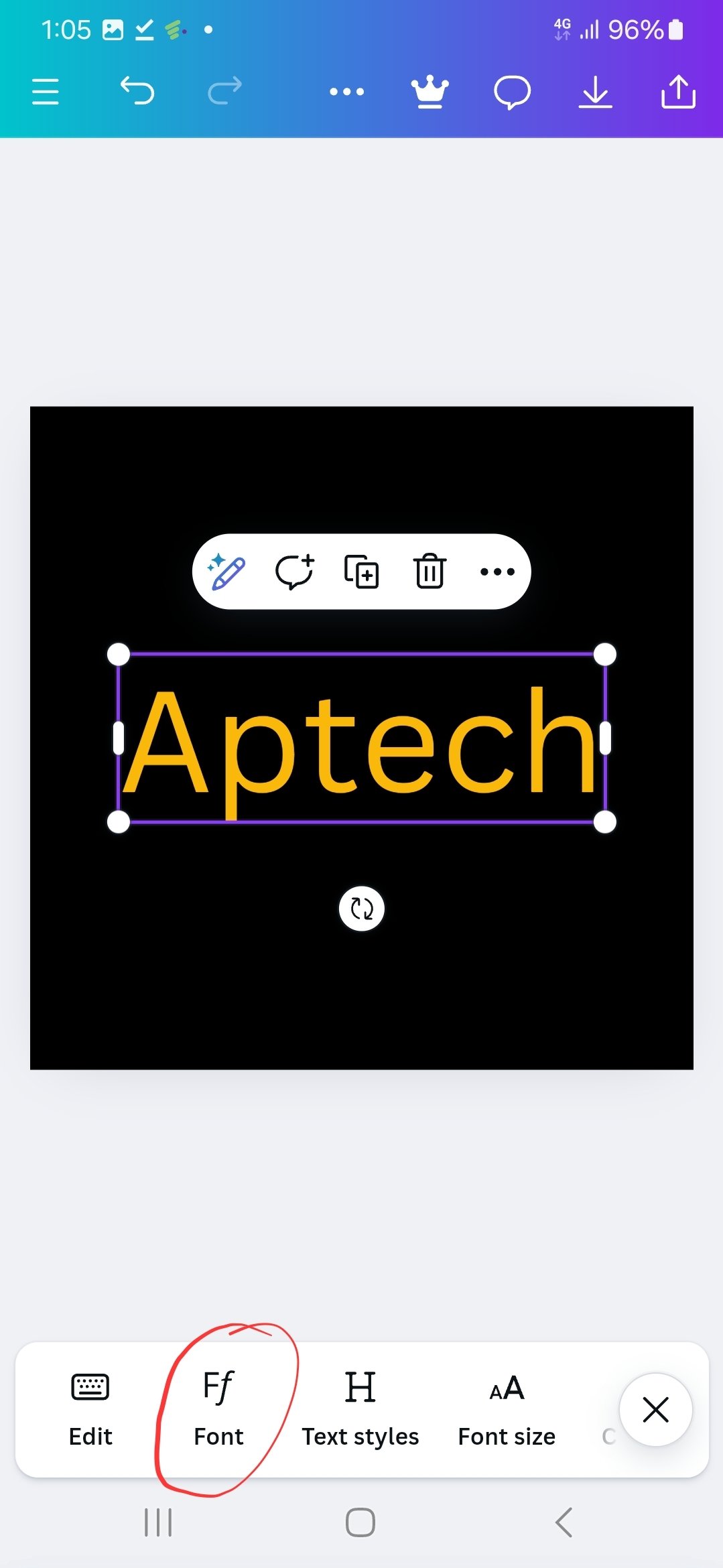 |
|---|
| background colour | select text | select font |
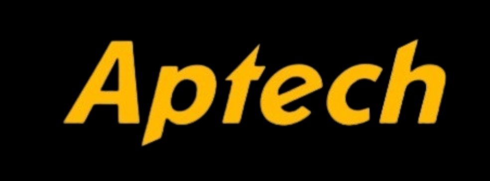
In this design, the foot print icon is removed, the computer education is remove and the motto that says unleash your potential is removed.
Resulting in a clasic Wordmark logo for Aptech
| Design a simple flier for your brand and then strategically place one of the logo you made in the flier. |
|---|
- Load the canva application
- Select the canvas size for the graphics
- Select gallery
 |  | 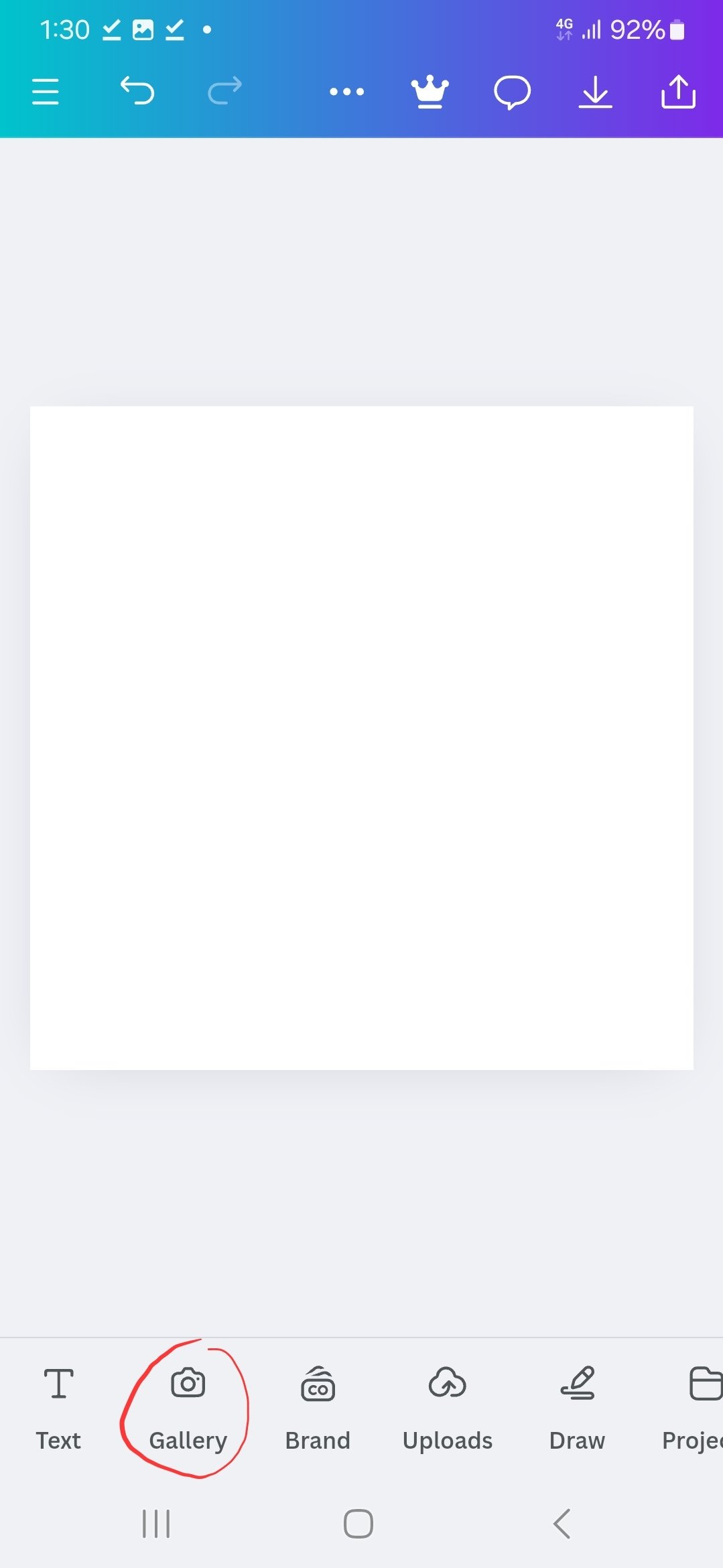 |
|---|
| Loading Canva | cavas size | select gallery |
- Get background image from gallery
- Get the new Aptech logo
- Select text
- Type in Hairspital ( hair hospital )
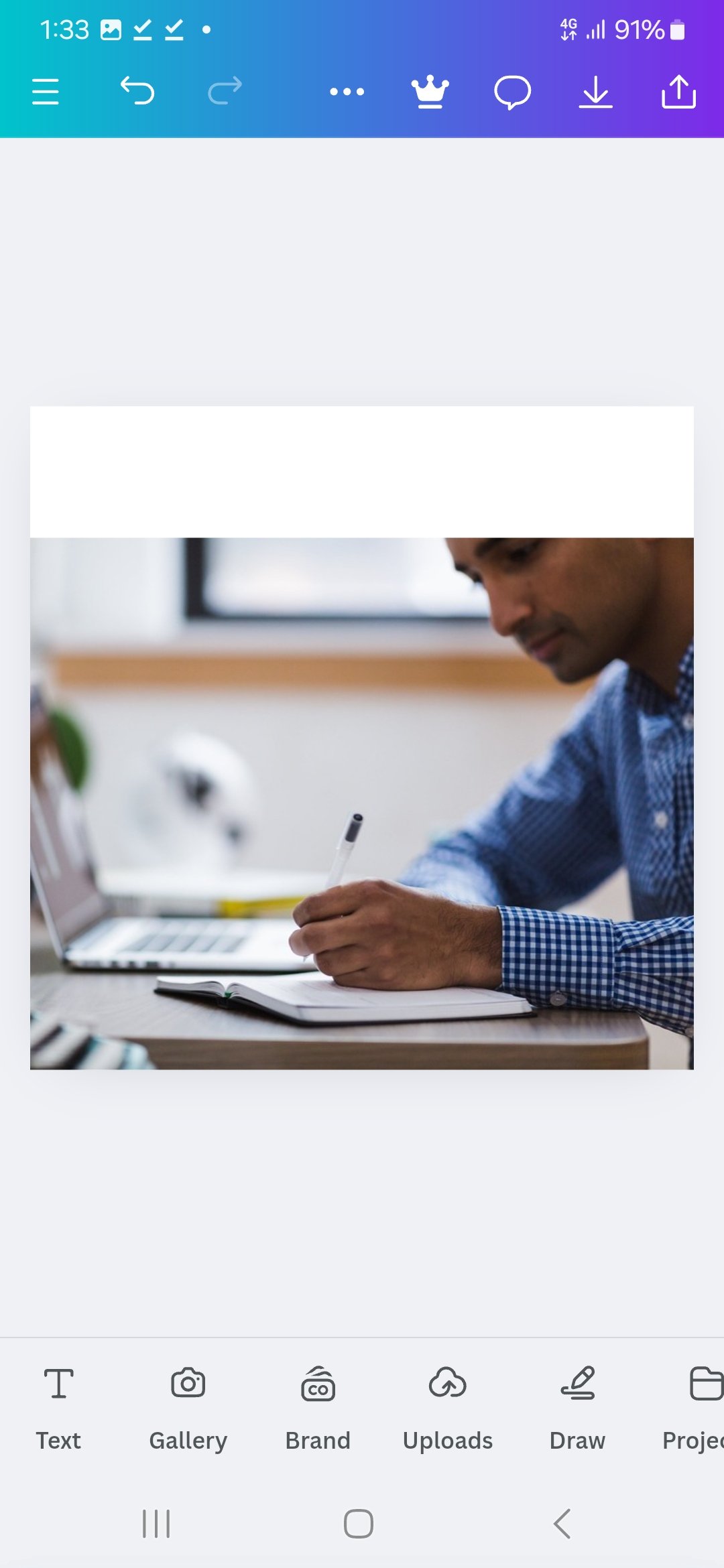 | 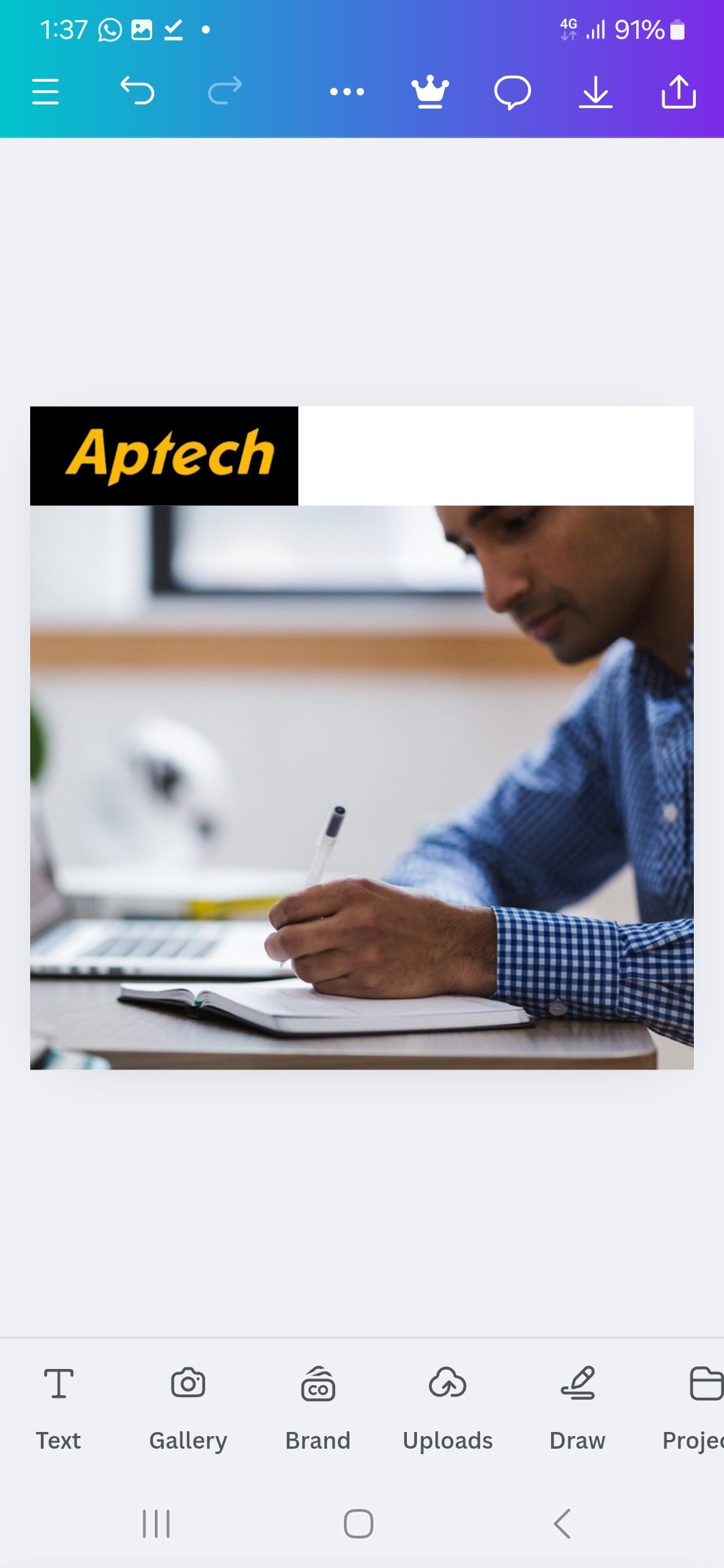 | 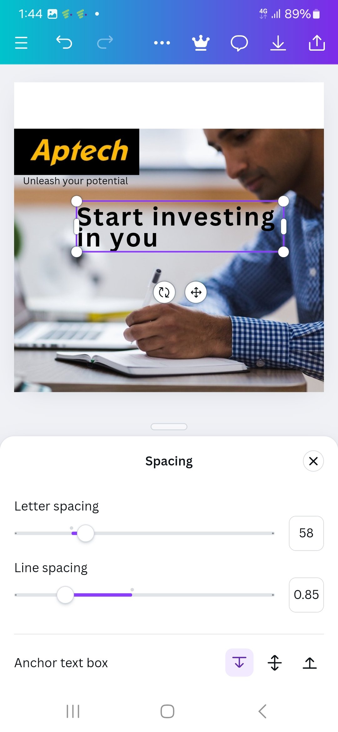 |
|---|
| background | select hair | Enter text |

Conclusion
Stepping into a new chapter with part 2 of logo design and being ever more determined to follow this up and get the best out of it. @bela90, @udyliciouz and @okere-blessing are invited to join us in exploring the exciting features of the canva app.
 Saturday, November 14. 2024

 The Coca-Cola logo
 the NETFLIX monogram
 the hp brand
 the Mitsubishi logo
 the Toyota brand
 https://pixabay.com/es/photos/nasa-florida-espacio-planeta-2313267/


Comments