Graphic Design lesson [My skill]
7 comments
Hello friends, I am delighted to have you here once again, welcome to my blog.... I am preparing this post to showcase my Graphic Design skill and also to prepare the minds of all Steemians who might have interest in learning graphic design.
I want to start sharing my knowledge as a way of contributing my little quarter to the steemit blog. I will be taking interested steemians on lessons in how to get both simple and complex designs, logo design inclusive.
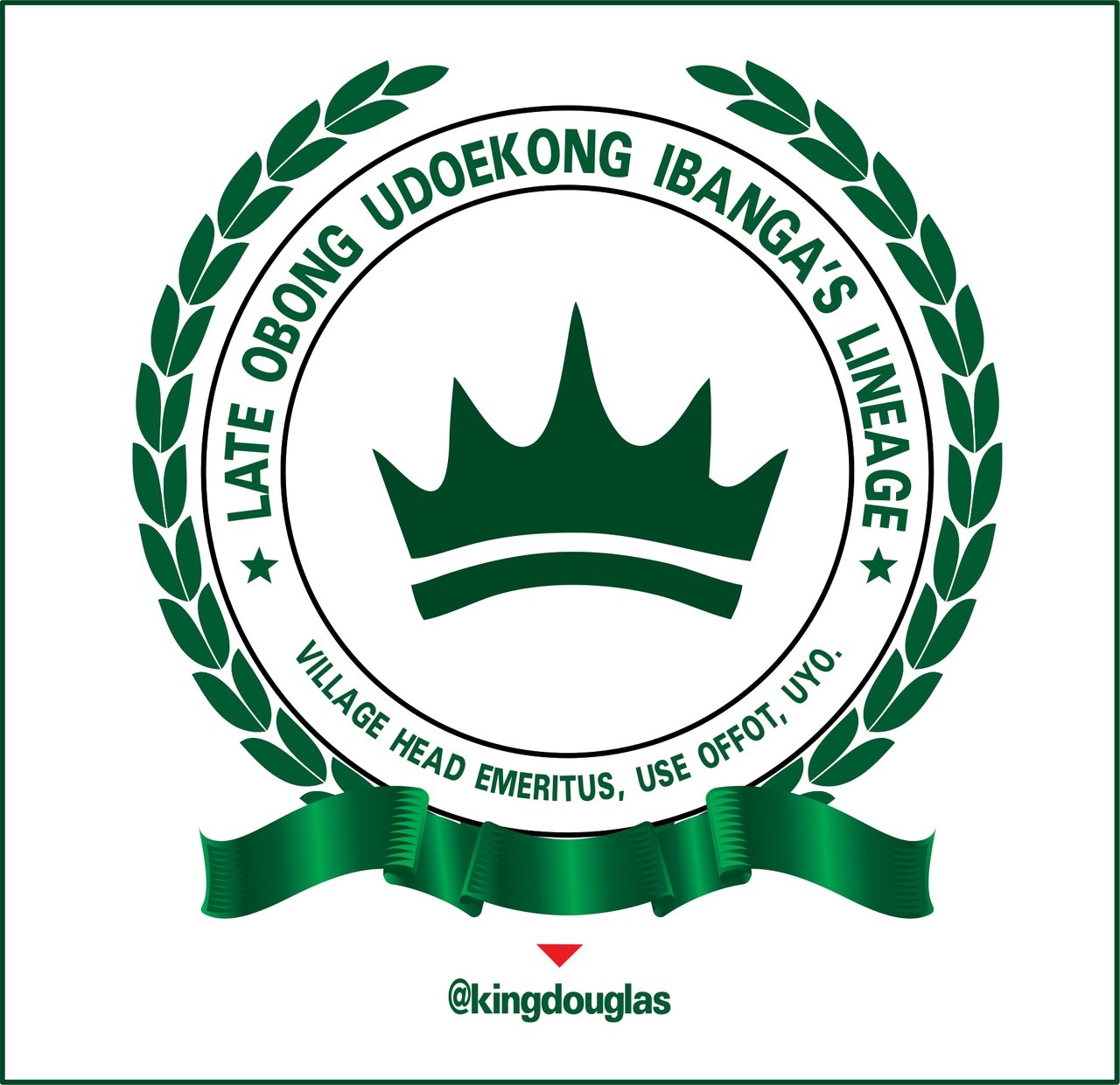
I'm going to prepare a lesson plan to start from basic, just to carry interested students along, but before I do that, let me use how I got the crest (logo) below to prepare our minds for the interesting design that will be dropping on my blog.
 Logo design Logo design |
|---|
The family of LATE OBONG UDOBONG IBANGA (Village Head Emeritus) of Use Offot in Uyo, Nigeria contracted me to create this crest where they will be stamping on the caps, T-shirts and other materials that will be used in the up coming burial of their beloved King.
EQUIPMENT USED
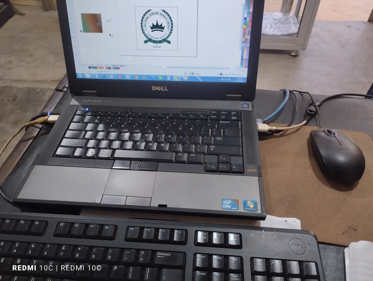
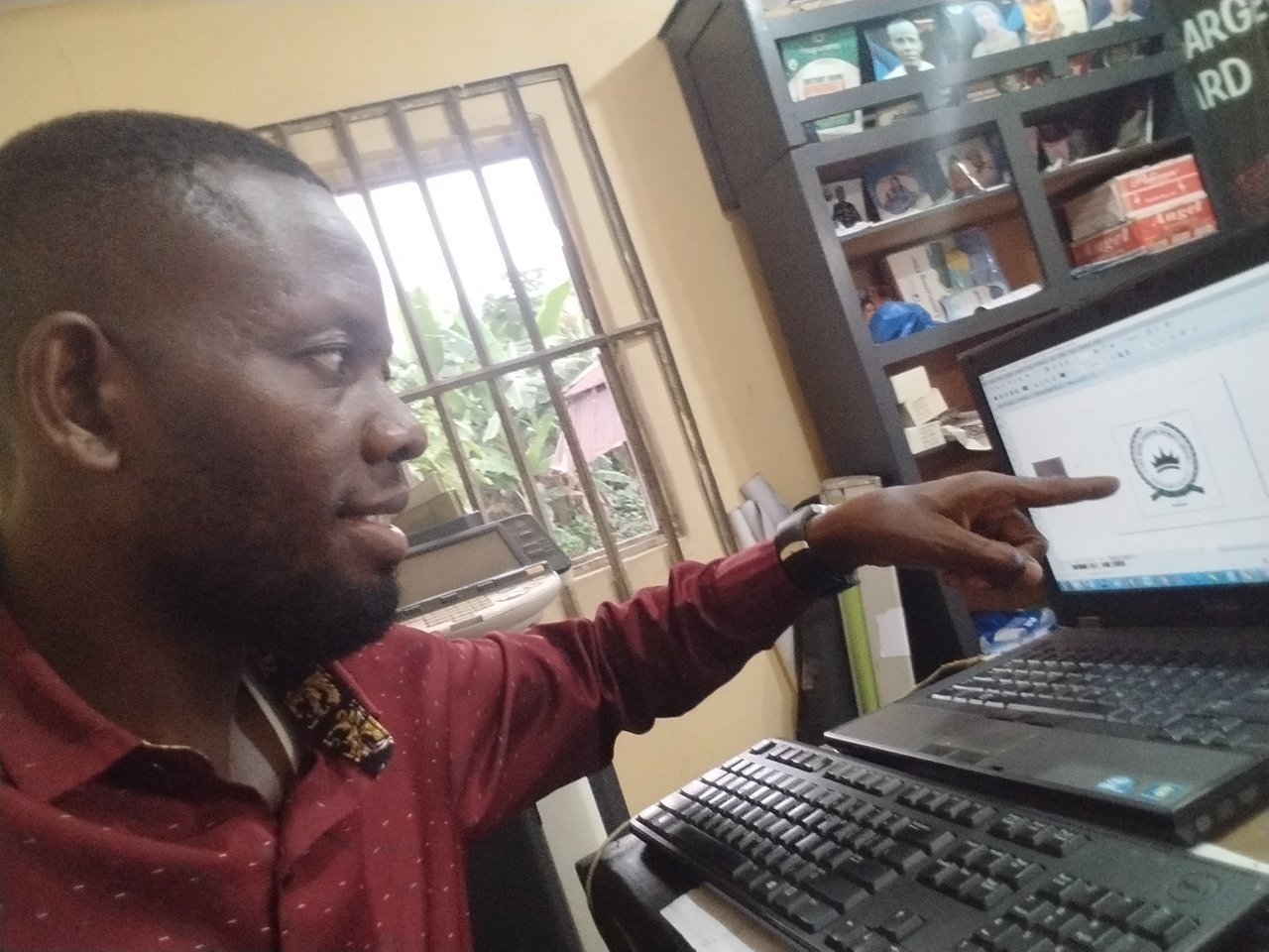
I used DELL (LATITUDE | E5410 with intel CORE i3 processor laptop), Windows 7, COREL DRAW X7 64-Bit software, External keyboard and mouse for fast design. Location is my office in Uyo - Nigeria.
 |  |
|---|
STEP 1
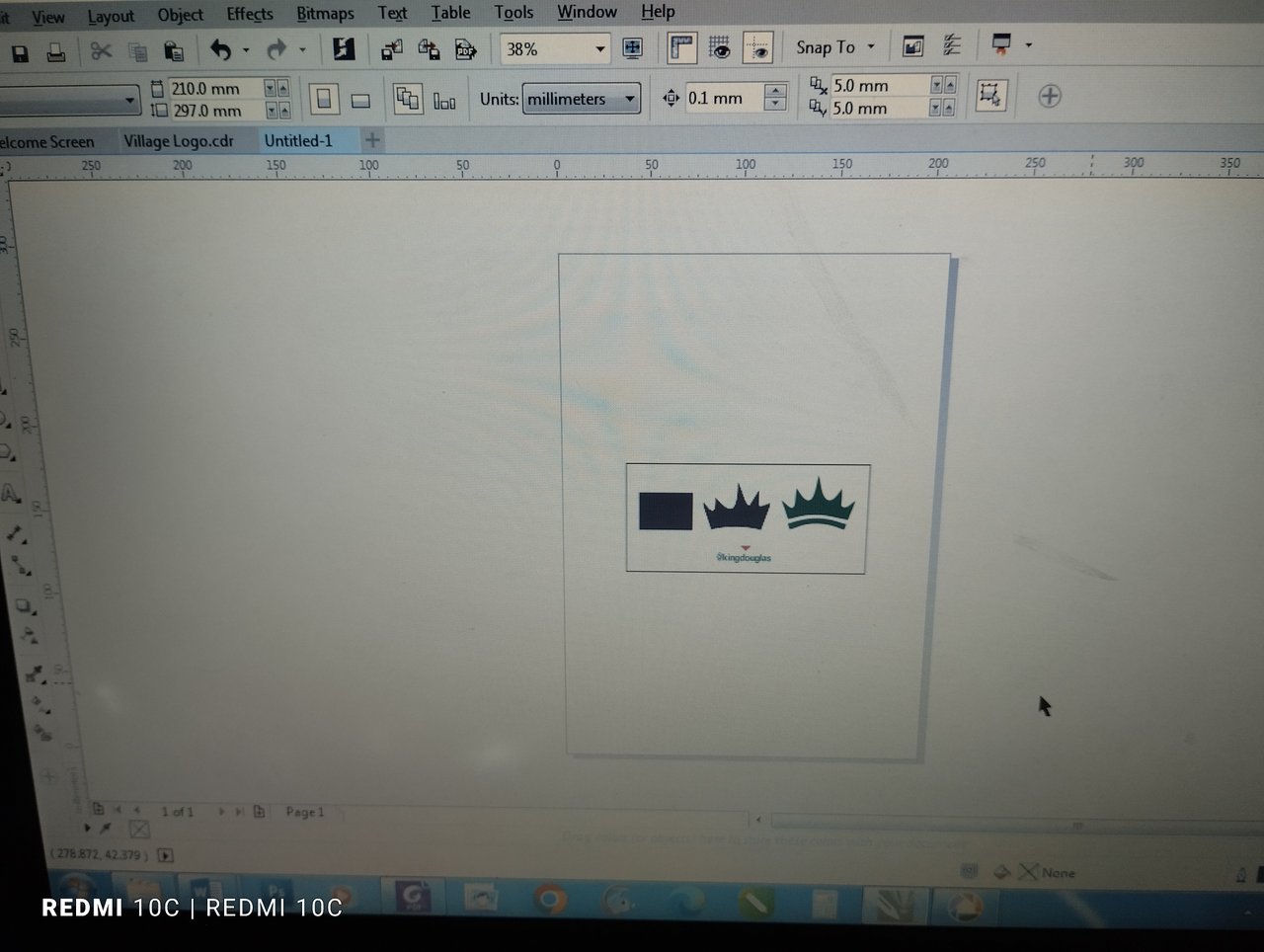
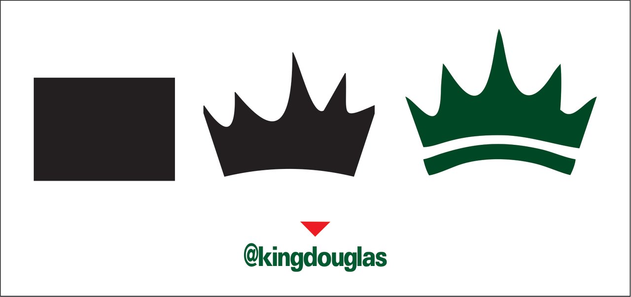
Since the design is all about the royalty (The late king), I found it necessary to include a Crown in the design, and I chosed green colour which they liked it so much. So I started with the crown using the shape tool. First of all I created a rectangular box, then I used the shape tool to curve the edges in curve and straight line to get the crown.
 |  |
|---|
STEP 2
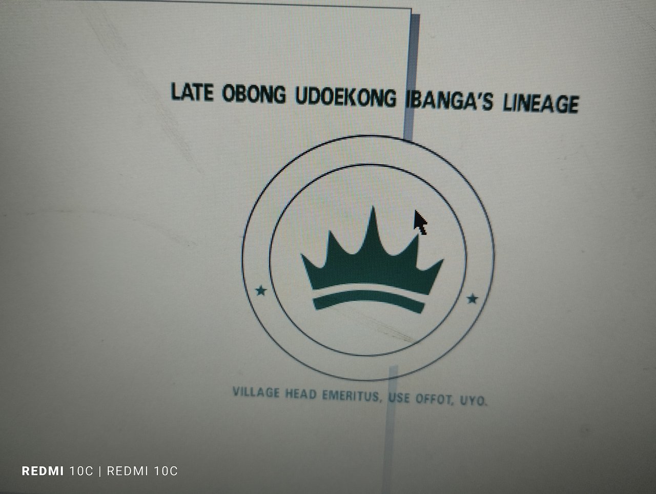
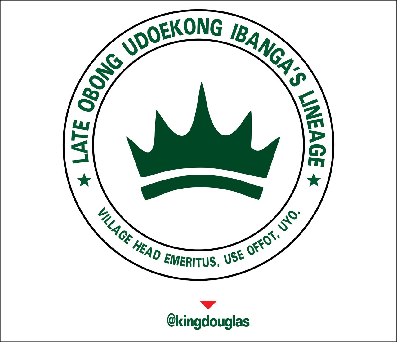
After I got the crown, the next thing I did was creating a circle shape to round the crown making the crown to be at the centre. Then I duplicated the circle so that I can fit the texts in between the two circles.
I achieved that by typing the text, press and hold shift key and click on the inner circle, then I pressed enter key to centralised the text with the circle, after which click on text on the tool bar, on the options I clicked on Fit Text to Path.
 |  |
|---|
STEP 3
I could've stopped my design at that point, after all the information they gave me was fitted in the design so far, but I like giving out the best when it comes to design. I took time to create the best design to gain more clients.
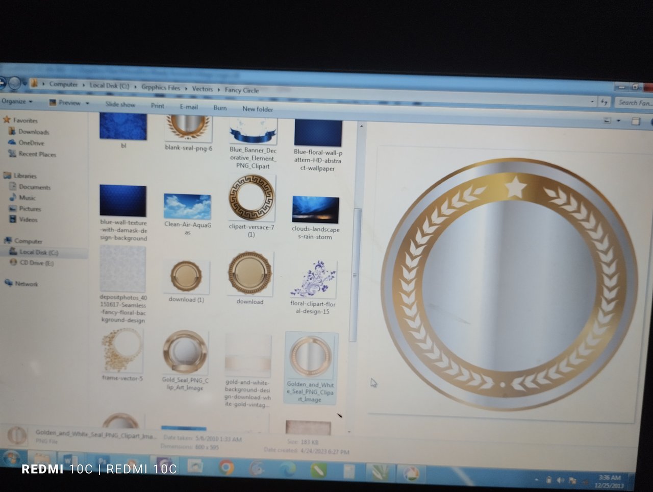
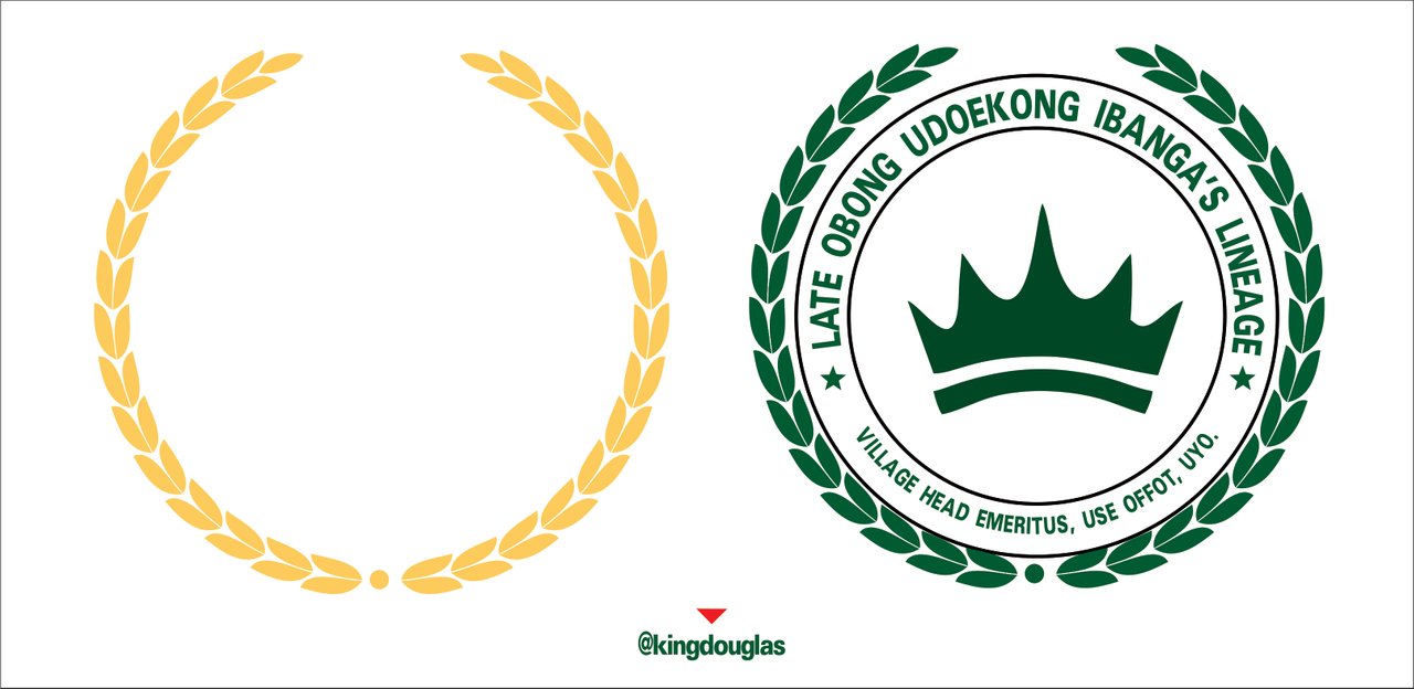
The next thing I did was opening the folders where I save some vectors and copied one of the fancy circular vector and used in the design to add more beauty to it. Initially, the vector was gold colour. I had to change the colour to green since my design was green.
In the course of my lessons, it's pertinent for me to talk about colour combinations as it is one of the vital needs in graphic design. I then centralised the vector with the design.
 |  |
|---|
STEP 4
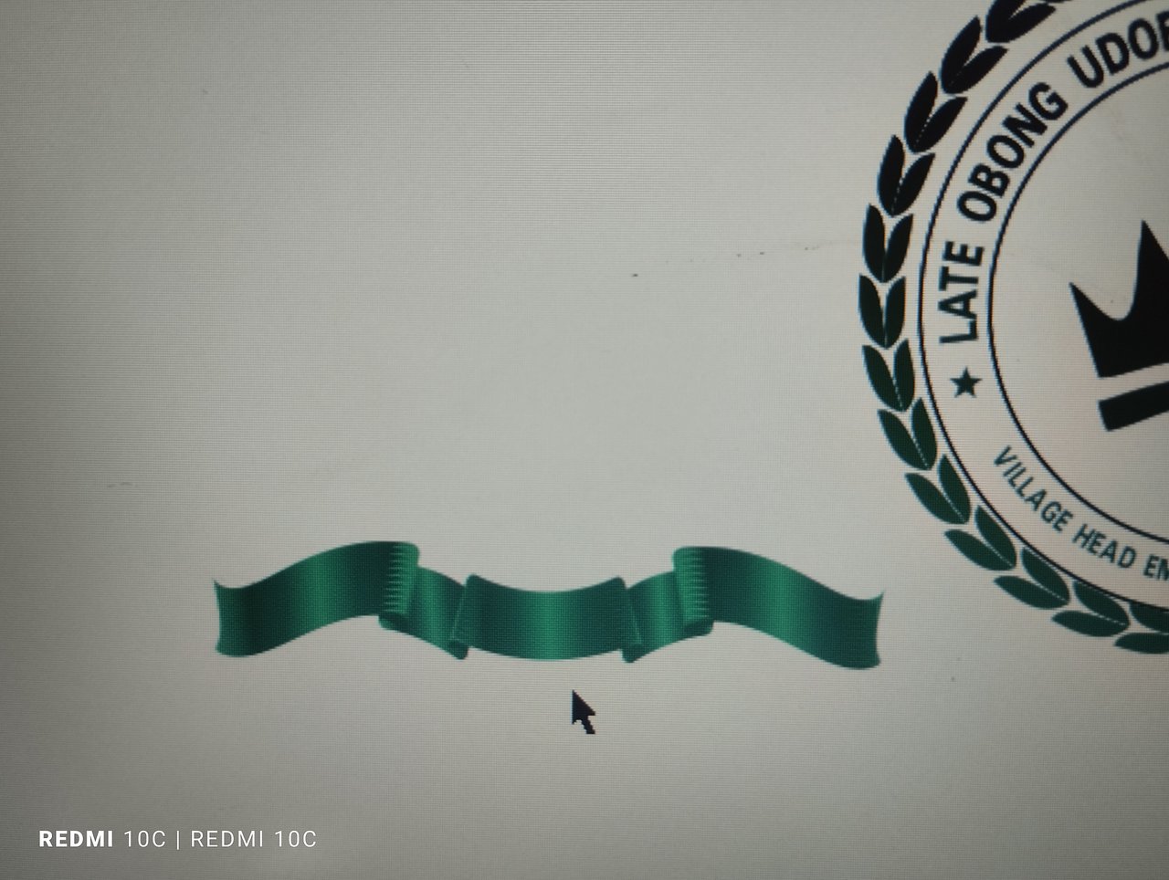
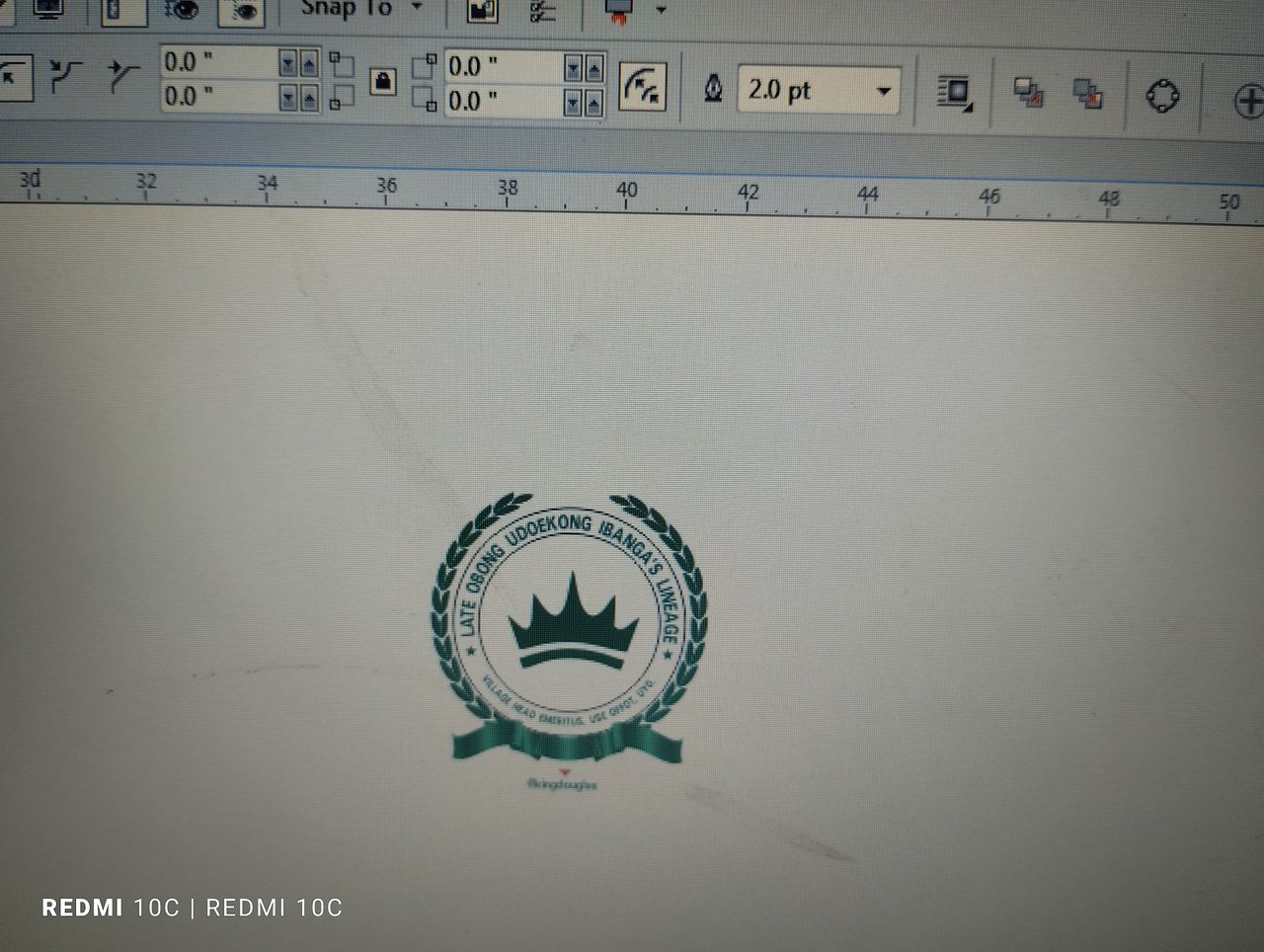
To further add beauty to my design, I created the base by drawing the rectangular shapes, then I curved the shapes to get what I wanted. Then I later used Interactive Fill tool on the tool bar to get linear gradient to achieve the green and light green colours.
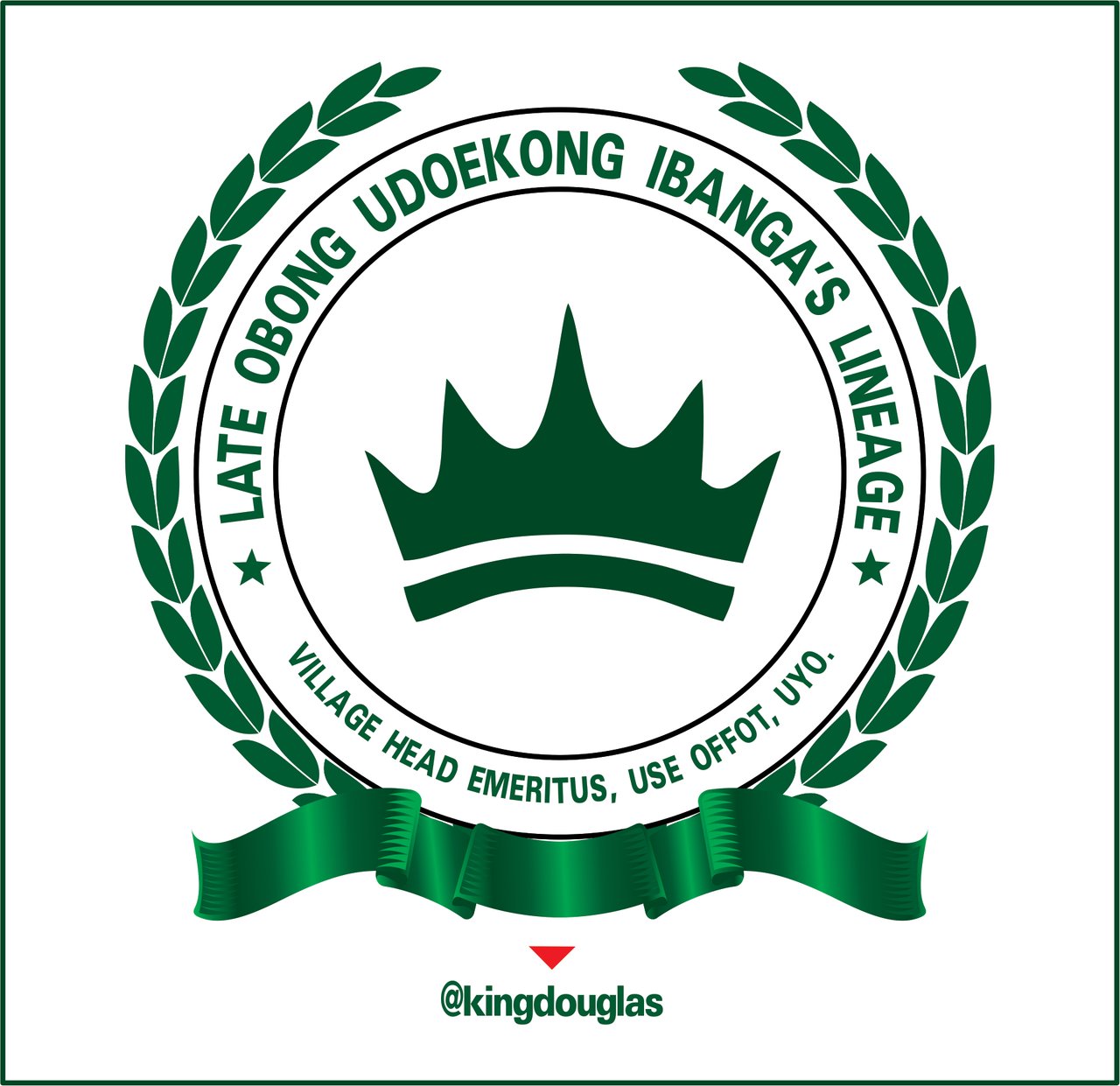
That was the final step I took to get my finished design. I spend 1 hour and 30 minutes in the process of creating this logo.
 |  |
|---|
HERE COMES MY FINISHED LOGO DESIGN WORK
 Finished Design Finished Design |
|---|
Comments