Mastering Steem Market Volatility Using Bollinger Bands
3 comments
INTRODUCTION
It is an honour to be among the participants of the season 21 week 1 Steemit crypto academy learning challenge.
And this week, we will be learning extensively on how to trade using the bollinger band indicator, and I have shared my expertise in my entry shown below.
QUESTION 1: EXPLAIN THE COMPONENTS OF BOLLINGER BANDS
- SIMPLE MOVING AVERAGE (SMA)
SMA or Simple Moving Average is the foundation of the structure of the Bollinger Bands in that it is used in estimating from where the upper and lower bands will be plotted on the graph. The common calculation of the SMA is done over a 20-day period, though this may be altered by a trader depending on the time frame being used. To be concerned with the SMA, it is computed as the mean average of the dollar volume of assets over a specified timeframe by the number of days within that time frame.
This averaging is helpful since it reduces the impact of sudden price variations and allows investors to pay attention to the general trend of the market rather than day to day price fluctuations. A simple moving average, or SMA, is the average price of past closing prices and therefore is always a moving line as the average updates with the closing price every time.
Hence, the SMA is useful in an analysis as it smooths out price fluctuations of the asset security over a designated period. This assists in determining the market structure of a specified time whether it is paramount bullish, bearish or range bound.
The middle line, which is the Simple Moving Average (SMA), is the main reference from which the upper and lower bands are created. Where the SMA is placed as the middle line, the current prices go above the average in Bollinger Bands and when the market is now flat or lower average this price above indicates overbought or oversold conditions.
But the SMA has a role further than just the direction – it also indicates the position of the price in its historical perspective. High prices relative to the SMA show strong bullish momentum; low prices show strong bearish sentiment.
This discrepancy allows traders to disentangle the dominant trend, how strong it is and how much buying or selling pressure exists in the market. Therefore, the SMA is an important minimal baseline and the parameters for the current price movements as well as give traders perspective of the trend direction of an asset, either bullish or bearish.
An additional important function of the SMA is assisting the traders in discerning between normal fluctuations in price and possible movements in price trends. Since SMA evolves from the averaging of prices, there are less erratic swings, leaving only the direction of the overall market, thus permitting the traders to filter out noise. This might be useful particularly in volatile situations like when prices tend to be quite erratic.
The SMA assists in clearing up the mess while traders patiently seek the crux of the action with the assistance of a fixed line. There is a trend that can be viewed when the prices pass over the SMA line more often — that a trend change is possible or the market is undergoing consolidation. But on the contrary, if the prices hover around or settle around the SMA and do not cross it, then it becomes a strong reinforcement for that particular trend.
Therefore, it can be explained that the function of the SMA is not only to assist in finding the direction of market movement but the ability to determine the level of the trend and the stability of the market enabling the traders to decide whether they are in a trending or in a ranging market.
The SMA’s application to the Bollinger Bands should not only be treated as and interpreted as a trend indicator. It acts as a guiding principle for traders by combining past price actions with the present situation. The SMA Sanders the middle line of the Bollinger Bands that provides room for its upper and lower bands to expand or contract as price volatility rises or goes down the scale.
This equilibrium is important because it allows the prices to be viewed in relation to the average price and allows easy assessment of how people are viewing the market, either as too bullish or too bearish. By retaining SMA as its center and structural integrity in the sense of monotonous usage, Bollinger Bands equip the traders with an agile yet strong instrument for evaluation of price trend, range and reversals making the attributes of the SMA as the main component of the Bollinger Bands.
- UPPER BAND
The Upper Band in Bollinger Bands informs us of the upper boundary in prices, which is placed two standard deviations above the SMA. This is done by determining how far prices deviate from the SMA and placing the Upper Band at two standard deviations, and this implies that 95% of prices would be retained under normal settings.
This has a benefit in that it enables the Upper Band to move in response to the changes in volatility in the market, in that high volatility in the first place means the band would move outwards in anticipation of greater swings in price and lower volatility means the band becomes narrower. This illustration causes the Upper Band to identify the upper price limit visually where chances are high that an asset has been overbought.
In practice, the Upper Band is definitely a form of a fluctuating ceiling a.k.a. one of the resistance points for the buyers as it indicates the price level that is likely to be difficult for the market to push further. When an asset's price is in touch with or moving towards the Upper Band, it could suggest that the buying power have surged well and may become unsustainable.
To traders, this Upper Band interaction could act as a warning sign which may suggest that the asset has been overbought on average and these may indicate that the market is in wait for a few dips or corrections. However, it needs to be noted that there are no guarantees for a reversal at the Upper Band, only an indication that traders should observe price action closely for any signs of weak buying activity. In case the prices change direction breaking off and staying above the Upper Band, it could mean the presence of strong bullish forces. If however the prices return quickly after touching the Upper Band, it is likely that the market does not have enough strength to push the price further.
The function of the Upper Band is not only to signal an overbought territory but to provide a sense of the strength of an uptrend as well. When the prices are retained at or close to the Upper Band for a long time, it usually suggests that the market might be entering into a phase where there is intense buying activity. This sort of behavior can be used by traders to reinforce trends and boost long positions as it means the asset is always worth more than its recent average price.
On the other hand, if prices barely register on the Upper Band and then retreat, it suggests a weakening trend and possible reversal as it shows buyers are weak in pushing the market higher. In this regard, the Upper Band becomes an effective tool in ascertaining the mood of the market and the trend’s vitality. It becomes a key indicator that assists in pinpointing levels of resistance and the struggle between bulls and bears.
Consequently, for those traders who are oriented toward risk management, the Upper Band becomes one of the most useful indicators of the most favorable entry and exit points. They typically instruct traders to sell or put a tight stop order whenever the prices are around the Upper Band with the expectation that prices are likely to move towards the past-moving average.
In this regard, the Upper Band acts as a ceiling that indicates expected strength of price so that traders may take profits or stop loss. This, in turn, facilitates the traders in making trade decisions as regards when the trend is likely to proceed further or when it is ready for a pull back. This makes it central in trend-following as well as in contrarian trading.
- LOWER BAND
The Lower Band in Bollinger Bands acts as the lowest level in which prices can move, usually two standard deviations below the Simple Moving Average (SMA). Just like the Upper Band, the Lower Band also moves in relation to price movements, being wider apart as the price movement increases. This is why when the market is more active, the Lower Band moves further away from the SMA because there is a greater price movement to be made.
However when the market is more placid, the Lower Band moves closer to the SMA and the price range is tighter. The Lower Band quite literally illustrates the lower extremes of prices, indicating that the prices may be over sold. This property makes the Lower Band effective in looking for buying opportunities whenever the prices of the assets are below the normal levels in relation to the recent average.
In trading, the Lower Band acts as a dynamic supporting level, meaning that prices are less likely to be pushed much below that level. When the price comes near or even touches the Lower Band, it means that the selling pressure might have increased and the price of the asset has the potential to become excessively low. Traders can use this interaction with the Lower Band as a signal that the asset is overextended and that a bounce or reversal will occur soon.
However, the Lower Band, like the Upper Band, does not guarantee a turnaround; it only means that the asset is at a point where there is a likelihood of increased buying. When assets prices dip below the Lower Band but begin to rise back towards the SMA, it often validates the story that the selling pressure has weakened and this is a possible buying opportunity.
Additionally, the Lower Band is useful for measuring downtrend strength. If prices are sustained around this line or fall below it for a much longer period of time, that normally suggests intensified selling and a strong downtrend. Such a behavior can be used by traders to endorse the weakness in the pricing level, and then, it becomes more pleasant to stay short in the market as long as the prices are near the Lower Band.
If prices touch the lower band and continue to move away from the lower band, it may imply the weakness of the downtrend or no longer a downtrend as sellers will lack the commitment to drive them lower. This ability to gauge selling pressure remains indispensable for investors. In particular, it aids them to detect support levels, and assess market sentiment.
To conclude this section with respect to the last step on the area of the risk management, the Lower Band assists the traders in their decision making concerning trade entry or exit. More specifically, when the market approaches or goes below the Lower Band traders would- the flat wing at the lower band – go for long positions or simply place stop-loss orders as they anticipate a bounce back towards the SMA.
In this capacity, the Lower Band should be interpreted as a lower limit which signals to traders as to the places where prices can be conceived as being attractive low prices for them to go long. In the same sense, by analyzing the way prices behave around the Lower Band, it is often possible to establish whether the current trend of decline is likely to continue or the market might rebound allowing for the traders to trade more profitably and intelligently.
HOW DOES EACH COMPONENT CONTRIBUTE TO UNDERSTANDING MARKET VOLATILITY AND MAKING TRADING DECISIONS? |
|---|
- SIMPLE MOVING AVERAGE (SMA)
Within the constructs of the Bollinger Bands, the Simple Moving Average (SMA) is one of the key components that assist traders in evaluating price trends and tracking market volatility. The SMA is a delayed average of recent prices based on a defined time period; usually twenty days. It makes it possible for investors to view their bearing on the market, undisturbed by the random price changing on a day-to-day basis.
Comparing the price now with the SMA, it is easy to determine if the trend is upwards, downwards or horizontal. During low volatility, prices will be close to the SMA and this indicates a steady or nearly range bound market. On the other hand, large distances from the SMA imply greater market activity or volatility which can indicate potential trend changes or breakout points.
Thus, the SMA assists in addressing the second question by allowing traders to gauge whether the trend will be upward or downward in a given timeframe, further aiding in determining acceptable degrees of volatility.
The SMA stands out as an ideal way to gauge how far prices are away from market equilibrium in fluctuating markets. For instance, if prices surge and remain above the SMA, the trend is generally bullish and the buyer interest is high. It may also mean that the trend is becoming more bearish if the prices keep touching lower highs and lower lows in relation to the SMA.
By paying attention to these movements about the SMA, traders understand whether the price volatility is typical or is likely to signal a shift in trends. The SMA helps forming strategic trade orders because it is a line which gets respected quite often by price action. Hence, it enables traders to trade in the general direction of the market which is critical in unpredictable markets.
To put it simply, the SMA serves as a guide in the sea of price action and allows traders to spot the weak corrections and the reversals of the trend.
The SMA and the trading decisions of traders are intertwined in the sense that even when traders are engaged in active trades, the SMA provides traders with a reliable point of reference or starting point to consider for placing stop-loss orders. When prices start churning around the SMA in waves during extreme markets, traders may then switch to determining how far positive price dynamics is at SMA to help measure their risk.
As an example, if the price is in an upward trend and is well above the SMA, traders are advised to place their stop losses just below the SMA in order to secure some gains but avoid closing the position too early. This approach enables traders to remain with the current trend but protects them against large but short price changes. The SMA then acts as a balance where the time series is steady without price changes enabling traders to use it as an entry and exit point. This improves overall risk management and trading performance.
In addition, the trader can also use the SMA incorporated into the Bollinger Bands to help in forecasting changes in volatility since the SMA is usually exceeded before price trends intensify. A case in point, if prices are beginning to drift too far away from the SMA, it could mean that the market might become volatile in the near future. Such price actions tend to alert the traders to make necessary adjustments to their strategies.
During such periods of volatility, it is likely that a trader might be able to capitalize on potential breakout testing or defensive measures which would entail decreasing position size or increasing the stop-loss levels. Traders’ analysis where the SMA is in relation to the upper and lower bands seeks to establish if price movement is within a reasonable degree or expansion and contraction bands that one would expect in the future. Thus one can say since SMA shows the value of the instrument in the long Term SMA trends do assist in forecasting volatility enabling better trade entry and risk management.
- UPPER BAND
Bollinger Bands have an important feature which is the upper band, and knowing this component helps with assessing prices while aiding traders to see when a market trend has been overbought. The Upper Band, which is two standard deviations from the SMA, shifts as the prices change. If there are fluctuations in the market, the price band widens because of price fluctuations and needs to be restricted when the market is stable.
This expansion and contraction act as envelopes for price action and give the traders the sense of how volatile the market is. The standard interpretation, therefore, is that when the price reaches the UB (Upper Band) or moves significantly above it, the market is ‘overbought’ There is a chance that price might be on a pullback, hence traders may choose to cash out or wait until a more favorable price. Hence, the Upper Band can be considered a dynamic resistance level since prices may approach the Upper band when they appear overbought thus giving traders a chance to time their trades.
It is worth noting that the Upper Band may determine the degree of strength of an uptrend. Frequently being close to the Upper Band indicates that there is considerable demand hence this could be a strong bullish trend. Trend-following traders will find this pattern encouraging as it appears to validate the uptrend which suggests that longs could well be maintained.
However, when prices go above the Upper Band and fall back quickly, that would mean the market is in an overbought zone and may turn back in the near future. When the price gets to the Upper Band, the trader gets cues as to whether the market will carry on its upward trend or a correction is around the corner. The other advantage of knowing the Upper Band is that it will tell a trader the possible strength of a trend and volatility explaining why it is important in determining when to enter and exit a trade.
The Upper Band also assists the traders in evaluating risk as it pinpoints the over-enthusiasm periods in the market. If such sentiments prevail, lower band breaks and prices rise too high for the volume of the market, above the upper band. Such an overshoot usually signifies a price as being approximately the top and indications that average prices remain where breaking above the upper band is not common for a long time.
At such times, traders could take the upper band as a cut off point to risk where they would either sell off at a profit or place a very close threshold stop loss. Those who may be engaging in contrary inclinations may find this perspective encouraging and use this upper band to sell off and create short positions in anticipation of a market pullback. Such polemic biases regarding the position of prices may have a negative impact on the traders’ positions at times but at the same time are quite beneficial to help control the risk. By the combination of the relevant factors of the market and the upper band, performers would incorporate strategic decisions about the place of sentiment into their operations with a view to controlling such volatility and exhaustion.
The Upper Band also helps to estimate the price resistance levels during times of market uncertainty or high volatility. Once the prices begin to fluctuate at the Upper Band or exceeding this, traders are made aware that the prices are quite volatile and that it would be difficult for prices to move further up without a consolidation period. This boundary can serve as a measure of the potential upside that a market can attain without approaching levels of INFLATION.
For example, extreme bullish markets may test the upper band where respect of the trend or prices meaning being strong, even further price movement above this level suggests the trend is fairly overextended. By giving these extremes, traders are able to see through the level of market volatility and strategy for maintaining or closing the position becomes much better.
- LOWER BAND:
The Lower Band is positioned two standard deviations under the SMA. It is useful in indicating the volatility of the market by showing oversold conditions. As the Upper Band does, the Lower Band also moves in accordance with the market’s volatility. The Upper Band is further from the Lower Band when volatility is high, which creates larger room for fluctuation of prices and the Lower Band moves toward the Upper Band when volatility goes lower.
This is how the Lower Band is able to constantly adjust and depict unusual behaviors regarding the price and reproaches its recent mean. This provides an opportunity for investors looking to buy or simply trying to reposition into a new spot. The point sometimes when the price gets out of touch with the Lower Band, it often suggests that the rate of selling is higher and the asset might be over sold. This allows traders to reposition and look forward to a bounce back pattern as prices move toward the SMA.
In the context of a downward trend, traders can look for the potential turning points as well as the strength of the downside using the Lower Band. A consistently bearish outlook is supported by prices lingering around or below the Lower Band, which indicates significant selling pressure. Trend-following traders might consider this pattern an affirmation of the downtrend, thereby justifying their short positions.
On the other hand, if Lower Band is touched quickly followed by a rapid recovery, this may indicate a weakening of selling pressure, which may mean that a trend reversal or a temporary price increase could be possible. Price behavior in relation to the Lower Band allows the traders to make predictions regarding the depth of the downtrend or possible reversal patterns.
This assists them in making a decision regarding whether to maintain the existing positions or to change them with regard to the depth of the bearish trend and reversal possibilities.
The Lower Band is valuable in risk management since it helps determine strategic entry and stop-loss points. It may, for example, be sensible for individuals wishing to take long positions and hoping to touch the Lower Band to do so since the price at that point would be extremely lower than its average high. In the same way, the Lower Band can also be considered as a support level by placing the stop loss orders a few pips below this level to avoid the additional downside in case the price continues falling down.
By utilizing the Lower Band as a lower boundary, it enables traders to take appropriate risks which they would otherwise ignore in times when prices are arguably bouncing all over the place. Such an approach enables them to forecast the price bottoms which curtails the losses while extending the profitability potentials during the reversal.
Last but not the least, the Lower Band also adjusts the expectations of the market by indicating possible price levels that can be treated as floors in active turbulent periods. As prices gravitate towards the Lower Band or fall lower than the band, traders understand that there is much instability in the market on almost every price level and understanding when the price may go that low without a retracement is tricky.
The Lower Band therefore offers a boundary which traders do not want to cross and allows them to manage their expectations of the market’s potential losses and also assess the potential gains of present price levels. For instance, when prices are bearish, then it is likely that prices will reach the Lower Band and this indicates that the trend is strong but very near to exhaustion. With this knowledge of the extremes in prices, traders understand the volatility of the market better and therefore make sound decisions when it comes different actions within the market: entering or holding or closing their positions.
QUESTION 2: ANALYZING MARKET CONDITIONS WITH BOLLINGER BANDS
Carrying out analysis with the bollinger band will be impossible if we do not have the technical know-how of the bollinger band, and in this section, I will be taking us through the application of the bollinger band indicator.
To apply the bollinger band indicator, the first thing I did was to visit the trading view app on my device and then I searched for the required pair which is STEEMUSDT.
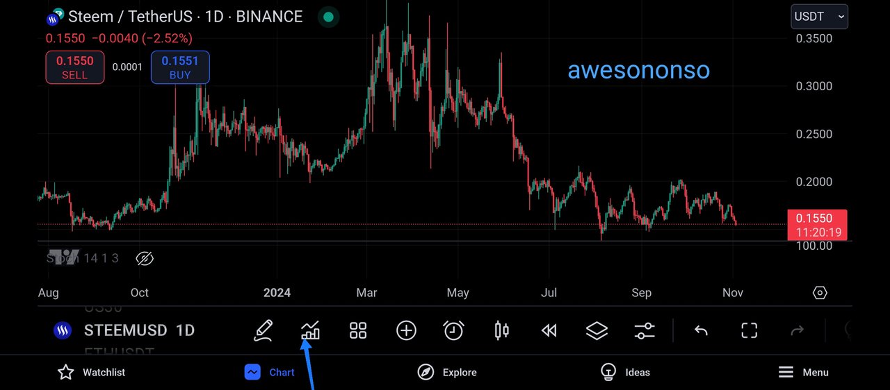
Getting to STEEMUSDT, I stayed on the daily timeframe, and on this timeframe I could see series of candles which confirms the activeness of the market.
Then I proceeded to add my the Bollinger band indicator, I did this by clicking on the icon as shown above.
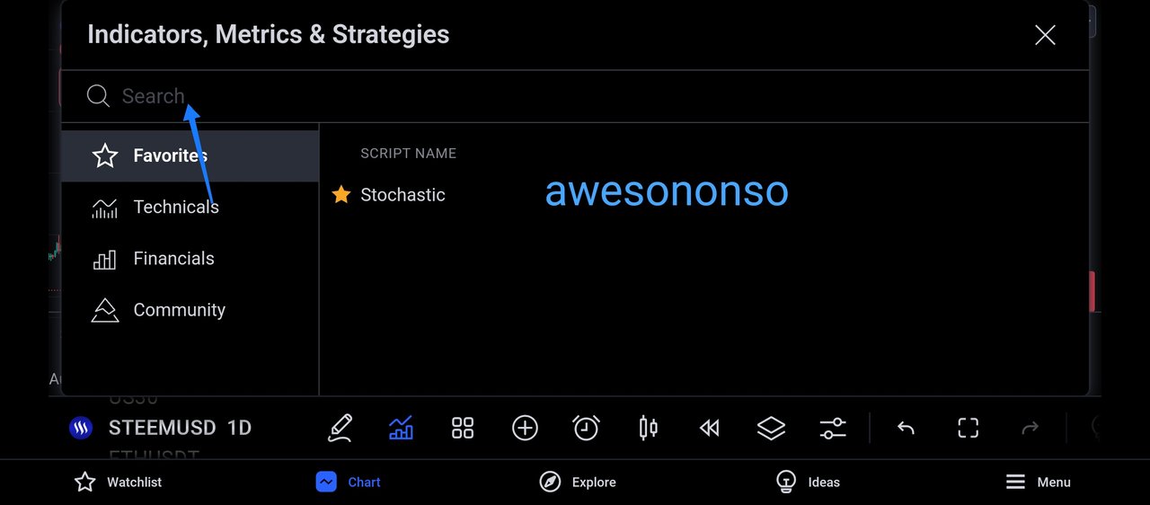
Then the above image appeared and here I could see the indicator I make use of the most and then I could see the search botton which I indicated above, which is useful in searching for the specific indicator I intend to make use of.
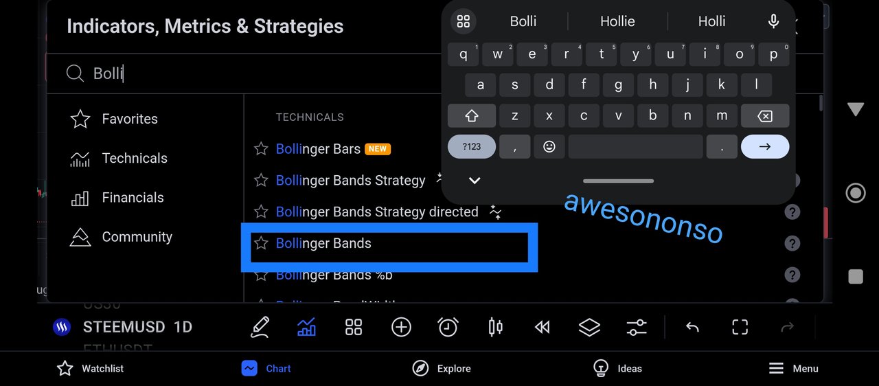
And then I searched for the indicator which I wish to use, which is the bollinger band indicator, and as seen above, several indicators with the name Bollinger came out.
Then I clicked on the specific indicator that will be effective for this job, and I identified it with a blue rectangular line as shown above.
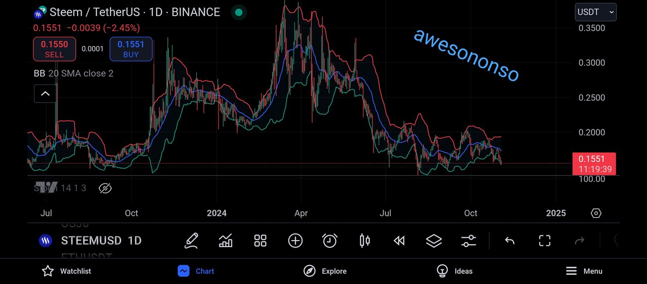
Then the above image appeared, which shows the Bollinger band on the price chart, and we can see that the bollinger band consist of 3parts and this parts have been earlier discussed in the above question.
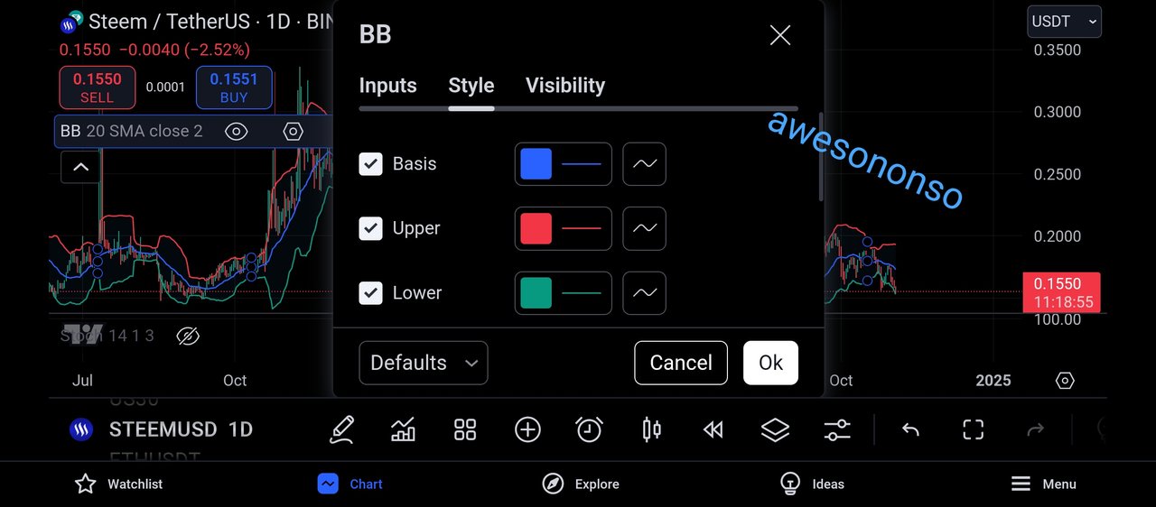
Moving to the settings, we can see the default of the bollinger band indicator, the blue line is the basis which we know to be the SMA indicator.
We also have the red line which is the upper band that plays it unique role in the market and we have the green line which is the lower band, and it also has it unique function in price analysis.
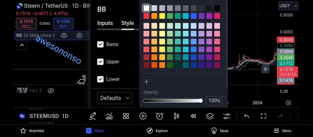
Personally, I do not like to see blue as my Simple Moving Average indicator, and as such, I decided to change it to a white line just as seen above.
And from the above screenshot, we can see that all lines of the bollinger band can be edited, and their colours changed.
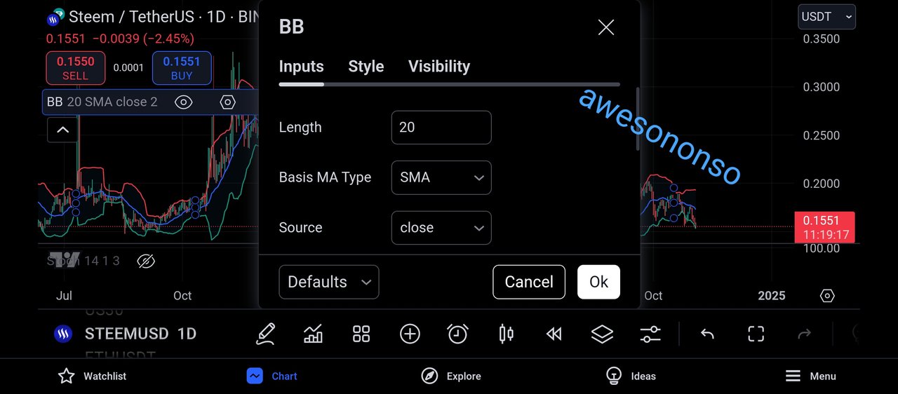
The simple moving average indicator can either be a long range indicator or a short range indicator, and this input section has helped us to see that it is a short range indicator.
This input section is helping us understand more about the sma in-between the upper band and the lower band.
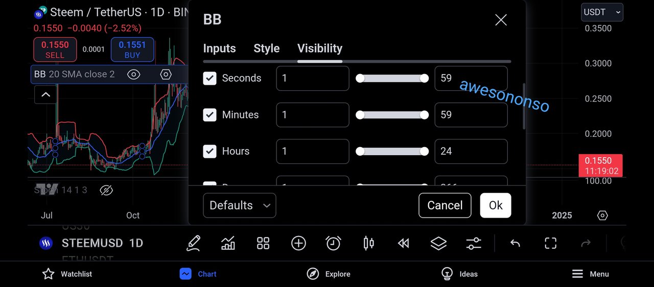
This visibility feature helps to ensure that you bollinger band indicator appears across all timeframe, and from the above screenshot, we can see that the all timeframes is being ticked good, and this implies that the bollinger band will appear on all timeframes.
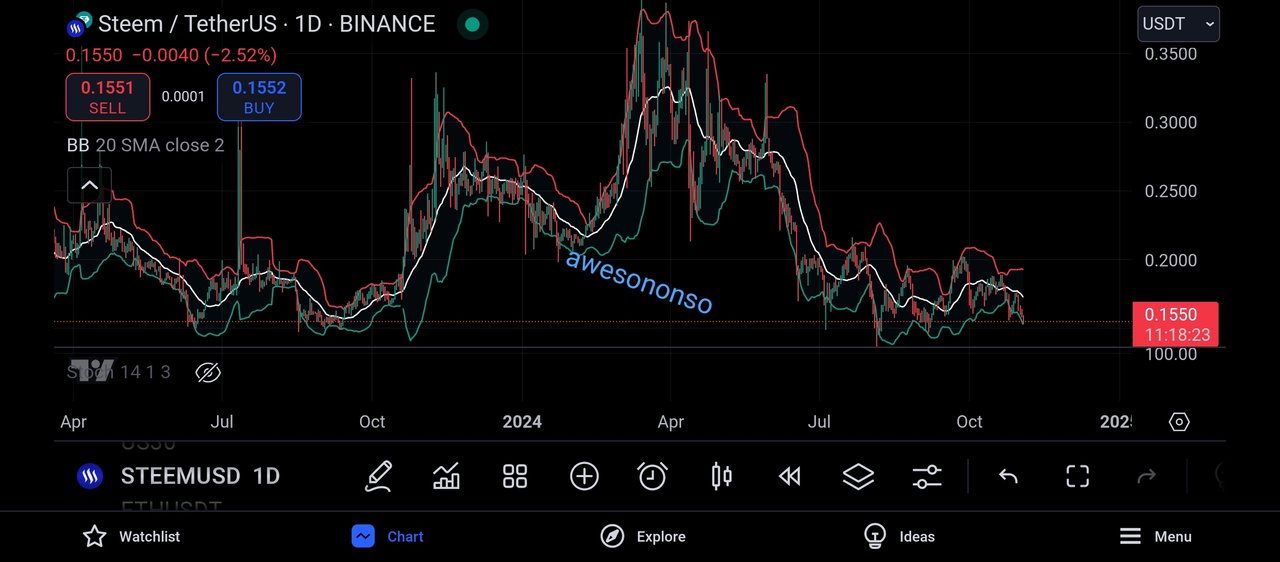
And from the above screenshot, we can see that the 20lenght moving average indicator has been changed from colour blue to colour white, which is exactly as I want it.
ANALYZING OVERBOUGHT, NEURAL AND OVERSOLD STATES
The concept of overbought, neutral and oversold states of the market is very easy to understand as it very much linked to demand and supply in every market.
- OVERBOUGHT STATE:
Bringing this to the understanding of a layman, an overbought commodity as the name implies is a commodity that has lots of buyers trying to acquire it in the market, and this often leads to scarcity of that commodity and also an increase in its market price.
The same is applicable to the steem market, for the market to be in an overbought state, it is understood that there are lots of buyers in the market, that is, the buying pressure on steem token is much when compared to the selling pressure.
And in the crypto market, when the market is being overbought, it is usually accompanied by bearish candles, which is done so the market can be balanced.
When the market becomes overbought, the buyers who have driven the market to its overbought state will begin to take profit from their assets and this will result to a decrease in the price of steem commodity.
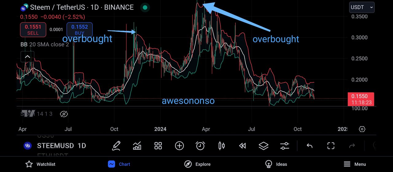
And to support my explanation with the chart, I decided to move to the pair STEEMUSDT and on the daily timeframe..
And from the chart above, we can see that I indicated the overbought region in this price chart, and looking carefully, we would see that there have been lots of buying pressure in the market before it got to it's overbought state.
And when the market got to its overbought state, we can see that it was immediately accompanied by bearish candles, which shows the buyers taking their profits from the market.
And we can see that an overbought market is signaled when the market touches its upper band of the bollinger band, as this can also function as a resistance level to the market price.
- NEUTRAL STATE:
The neutral state of the market is also very easy to understand, as just as the name sounds, it depicts neutrality in market movement.
When the market is neither overbought nor oversold, then we can say that the market is being neutral, as neither the buyers nor sellers are in control of the market.
And also, a neutral market often lack volatility, as there is a pause in market movement, and the market can be said to be consolidating.
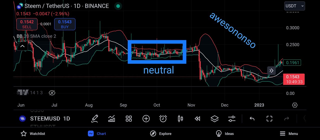
The above chart shows a good example of a neutral market, and we can see that the market is trading right on the SMA indicator.
When the market trades above the SMA indicator, we can say that the buyers are pushing the market and when the market trades below the SMA indicator, we can then say that the sellers are in control of the market.
- OVERSOLD STATE
Bringing this to the understanding of a layman, an oversold commodity as the name implies is a commodity that has lots of selling trying to sell it off in the market, and this often leads to availability of that commodity and also a decrease in its market price, whenever a commodity is readily available it often looses its value than when it is scarce in the market.
The same is applicable to the steem market, for the market to be in an oversold state, it is understood that there are lots of sellers in the market, that is, the selling pressure on steem token is much when compared to the buying pressure.
And in the crypto market, when the market is being oversold, it is usually accompanied by bullish candles, which is done so the market can be balanced.
When the market becomes oversold, the market participants see this as a great opportunity to re-buy the assets, and this time at a very low market price, so they can resell when it gets high again, and the cycle continues.
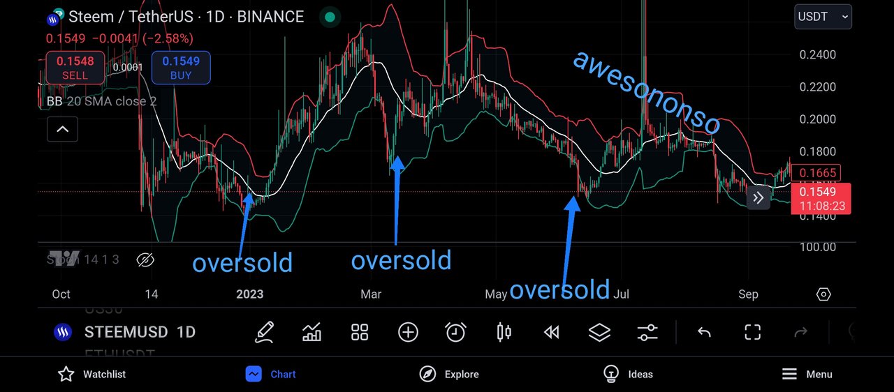
And to support my explanation with the chart, I decided to move to the pair STEEMUSDT and on the daily timeframe..
And from the chart above, we can see that I indicated the oversold region in this price chart, and looking carefully, we would see that there have been lots of selling pressure in the market before it got to it's oversold state.
And when the market got to its oversold state, we can see that it was immediately accompanied by bullish candles, which shows the market participants trying to re-enter the market and purchase Steem at a lower price.
And we can see that an oversold market is signaled when the market touches its lower band of the bollinger band, as this can also function as a support level to the market price.
BUYING AND SELLING OPPORTUNITIES USING BOLLINGER BANDS
Buying and selling opportunities using the Bollinger band is quite easy, once you can identify the oversold and overbought region using the Bollinger band, then it becomes easier to identify buying and selling opportunities.
- BUYING OPPORTUNITY:
Recall that we explained that one of the function of the lower band of the bollinger band indicator is that it functions as a support line to the price chart.
And using the principle of support level, the market is expected to experience a bullish rejection whenever it trades towards the support level, and this is because there are lots of buyers waiting at the support level of the market so as to purchase the market at a very low price.
And this is applicable to the use of Bollinger band indicator, when the market hits its lower band of the bollinger band indicator, we can expect to see buying pressure as buyers would want to join the market at a low price.
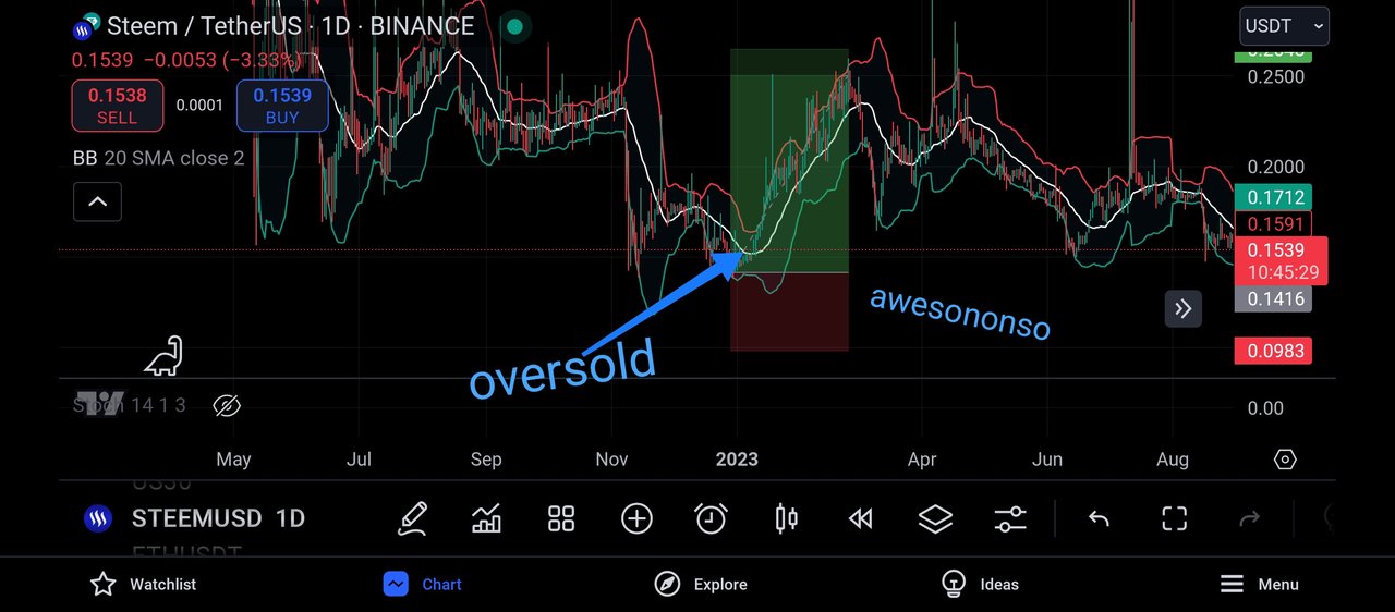
Using the chart above, we can see that I first of all identified the oversold region of the market which is also the support level to the market price.
And immediately the market traded towards this level, we can see that the market was immediately accompanied by several bullish candles, and I took this as a great opportunity to join the market on its bullish move.
- SELLING OPPORTUNITY:
Recall that we also explained that one of the function of the higher band of the bollinger band indicator is that it functions as a resistance line to the price chart.
And using the principle of resistance level, the market is expected to experience a bearish rejection whenever it trades towards the resistance level, and this is because there are lots of sellers waiting at the resistance level of the market to take profit of their crypto holdings in the market
And this is applicable to the use of Bollinger band indicator, when the market hits its upper band of the bollinger band indicator, we can expect to see selling pressure as sellers would want to sell off at an higher price since they bought at a low price
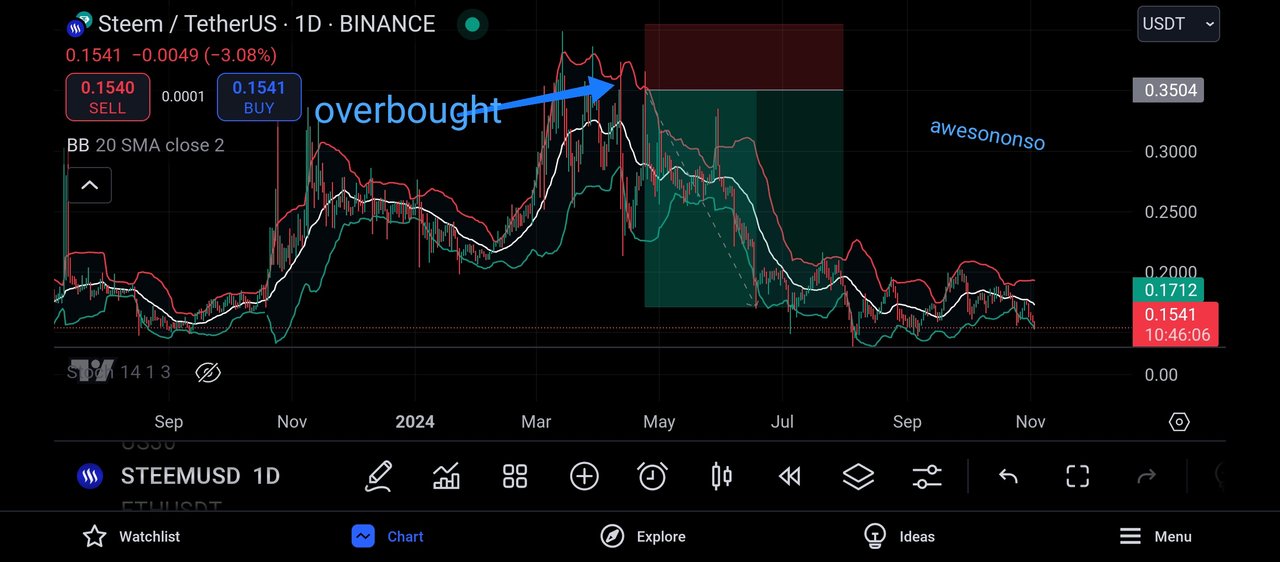
Using the chart above, we can see that I first of all identified the overbought region of the market which is also the resistance level to the market price.
And immediately the market traded towards this level, we can see that the market was immediately accompanied by several bearish candles, and I took this as a great opportunity to join the market on its bearish move.
QUESTION 3: IDENTIFYING VOLATILITY PATTERNS WITH BOLLINGER BANDS
Bollinger Bands are effective for measuring market activity since they fluctuate with changes in price levels and enable quick assessment of the current state of the market, whether it is stable or highly active. The plot consists of a central band which is a Simple Moving Average (SMA) and the upper and lower bands which are averages of the SMA and the standard deviation above and below it respectively.
When the price range is broad, this range increases, and when it is narrow, it decreases. In the case of lower activity, there is a squeeze and therefore the top and bottom bands get narrow and close up. This indicates that the price tends to be somewhat stable within quick fluctuations from the SMA. The buyers and sellers normally tend to be in relative equilibrium in the external market which results in minimum changes in price levels and the creation of tighter bands.
Bollinger Band B’s normal width is a sign of a different sequence about to happen in the normal markets and once this range is broken, price activity goes to the distant side. This phenomenon is important to the traders since breakouts occur during times when the price activity has been at its low.
On the other hand, as the market activity increases the distance between the upper and lower bands greatly increases as the Bollinger Bands broaden. This development takes place due to the increase in the standard deviation, which is a measure of the variability of price relative to its mean, because of large and rapid price changes.
There is such a measure as Bollinger Bands, and they also visually illustrate the market’s unevenness since the chaos in the structure will always be accompanied by the farther Bend of the Bands in the graphed picture. For traders, the widening of Bollinger Bands can be seen as a necessary signal which the market is actively engaged in pushing buyers and sellers out of the way. Such a widening tendency can be easily witnessed even when there are important economic events or news that can arouse great forces of buying or selling.
The extremes are sometimes the most difficult to call and traders might be more conservative over that period as there where great potential for reversals or deep slugs. The widening of the Bollinger Bands indicates a greater level of risk and possibility of abrupt alteration in the direction of the market that has been helpful for traders in modifying their strategies.
Bollinger Bands, along with other technical tools, incorporate the relationship of price with its own bands to interpret volatility dynamics. The closer the price gets to the upper or lower bands the more overbought or oversold signals are triggered, respectively. For example, when prices move toward the upper band, it often indicates that there is great buying pressure and suggests that the asset might be overvalued in context to its average price over a period.
On the other hand, falling lower in terms of prices suggests that there are many sellers for this asset looking for buyers which makes it widely accepted that the asset may be undervalued. This price-band relationship enables traders to evaluate whether volatility is likely to cause a reversal or confirmation of the trend. When prices read higher and lower bands frequently without any significant grappling toward the SMA, this is indicative of a strong momentum across the market.
On the contrary, if there are quick rub offs frequently after touching the outer bands, it simply indicates that market is at its extreme and is most likely to witness a correction. These details about overbought and oversold with the bands provide a good perspective over when should the traders go in or out of the market especially when dealing in volatile markets.
Bollinger Bands are advantageous because traders don’t have to be rigid when using them, especially in times of volatility. Instead of remaining static in relation to the price fluctuations, the Bands are made touchable by correlated actions by shifting pace to cover most recent occurrences of price developments.
In fast moving markets, this is a valuable trait allowing traders to see levels of volatility and act upon them as they alter their course of action. For example, if a trader observes that the bands are being pulled out and prices are consistently hugging the outer bands, it means much of the inner workings are already backed by a strong trend and it would be prudent for the trader to follow the trend. However, the opposite occurs when even the outer bands are coming so close, it means the volatility is barely there, making traders expect the start of a trend around the corner.
This is also the reason why Bollinger Bands are easily adjustable and exemplary assets in determining the market volatility as this will impact a trader’s strategy in both quiet and active times. Bollinger Bands enhance the arsenal of traders in all of the scenarios as they appreciate the volatility aspects in any conditions allowing them to manage risk well and manage their expectations.
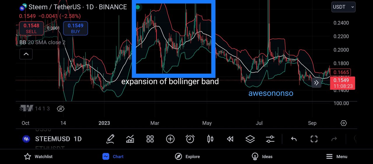
And moving to the steem chart, I was able to find a perfect example of the bollinger band expanding, and as we explained earlier, an expansion of the bollinger band means a higher volatility.
And volatility of the crypto market is understood to be how easy the market encounter changes in price, and this is far from stability of the market.
And from the above screenshot, we can see that there was a change in market trend immediately the expansion of the bollinger band occured.
The market was initially in a bullish move, and then there was an expansion of the bollinger band and we began to see the formation of several bearish candles in the market.
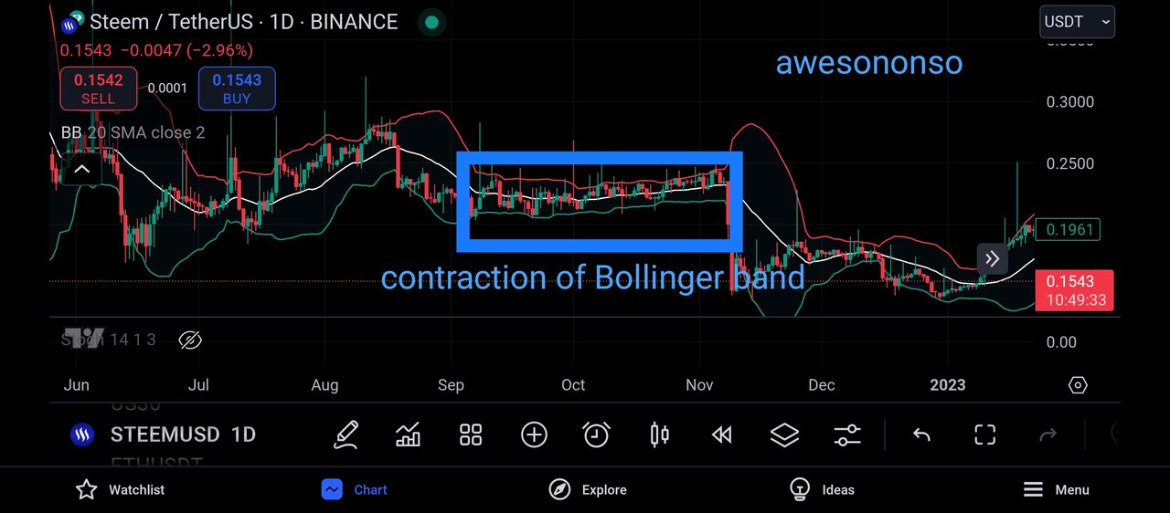
And when there is a contraction in the market, it means that at that moment, the market is somewhat stable, and this can be effectively seen from the above screenshot.
The market failed to experience big changes in its price, and this is as a result of its less volatile nature as at that time.
And in this kind of market condition, it is very much advisable for a trader to stay off the market, as anything can happen, and the market can go either ways, bullish or bearish.
QUESTION 4: DEVELOPING A TRADING STRATEGY WITH BOLLINGER BANDS
To develop a trading strategy using bollinger band is quite easy when you have mastered the trading technique and the working principle of bollinger band.
What every trader does in attempt to trade the crypto market is first of all identify if the market is in a bullish phase or not.
It is very important because, it is very wrong to place a sell order in a bullish market, as the market will trade quickly to your stop loss position
And one thing I have noticed as a trader is that the market respects the levels in the higher timeframe more than it respects those in the lower timeframe.
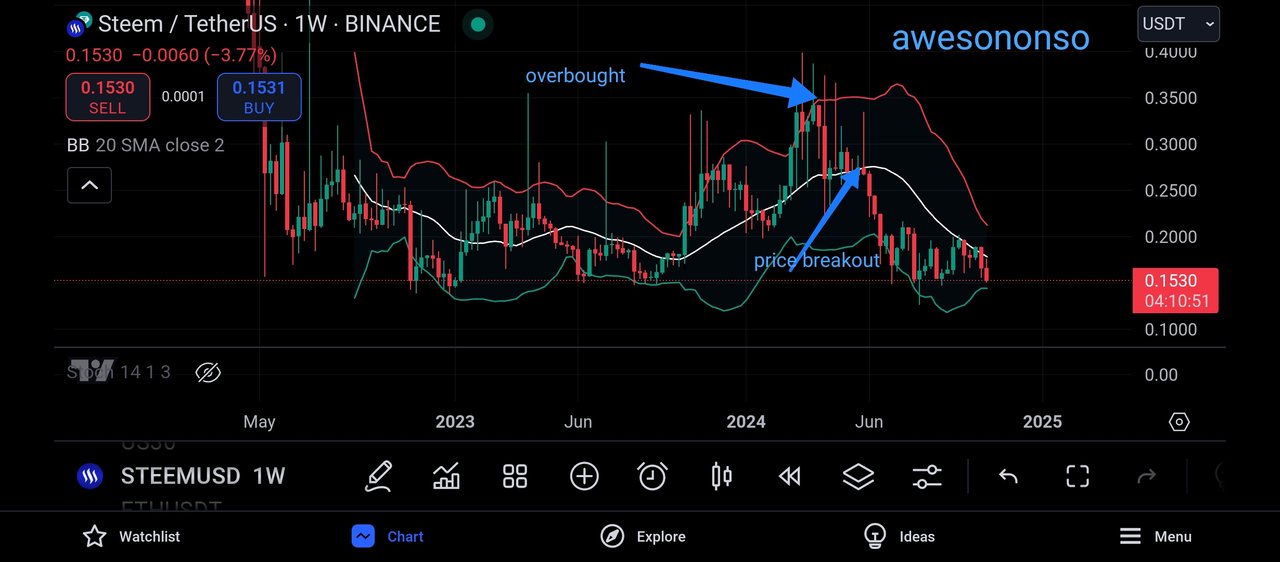
To identify the overall trend of the market, I decided to move to the weekly timeframe, as levels in the weekly timeframe are stronger than every other level.
And from the screenshot above, I could see the market breakout from below the simple moving average indicator, and this is an indication that the market is in a bearish move, and as we can see, the market kept forming lower lows and lower highs.
And also, I checked and noticed that the market is reacting to a rejection from its overbought region, and we can expect the market to continue it's bearish move.
- OVERBOUGHT AND OVERSOLD REGION:
Another trading strategy I will make use of when trading the bollinger band is the oversold and overbought region of the bollinger band indicator.
The overbought region is a trading region in the market whereby the buyers are exhausted and can no longer drive the market upwards anymore, and in this condition, the sellers will begin to sell off their holdings in the market, and this will drive the market downwards.

The screenshot above shows clearly the overbought region in the market, and as seen above this region, can be spotted when the market touches the upperband of the indicator.
And I also ensure to be very careful when spotting the overbought region of the market, I ensure to watch out that there have been formation of several bullish candles before the market touches the upper band of the indicator.
And the overbought region often serves as my bearish entry confirmation into the market.

The above screenshot shows me taking advantage of the overbought region of the market to take a bearish trade in the market.

And the oversold region of the market is just the direct opposite of an overbought market, and to detect an oversold region, I ensure to make use of the lower band of the bollinger band indicator.
And whenever the market trades into the lower band of the bollinger band indicator, I can ensure to take my buy entry into the market, just as seen below.

And from the above screenshot, I immediately placed the buy order when I confirmed that the market is being oversold.
- RISK MANAGEMENT:
And in applying risk management to the use of Bollinger band, I ensured that I risked only 10% of my trading capital.
This implies that if I am trading an account of $1000, I will be risking a maximum of $100 and this means that the market will have to hit my stop loss position 10times consecutively, which is near to impossible.
My take profit position will be placed on either the upper or lower band of the bollinger band indicator, depending on the position I am taking.
If I am taking a buy position, my take profit will be placed on the upper band of the bollinger band indicator and if I am taking a well position, my take profit will be placed on the lower band of the bollinger band.
QUESTION 5: PREDICTING PRICE MOVEMENTS WITH BOLLINGER BANDS
I am an intraday trader, and I am also a multi timeframe trader, this means that I carry out my trades on several timeframe.
And to begin my analysis, I decided to move to the weekly timeframe because it is on this timeframe that the market is easily predicted.
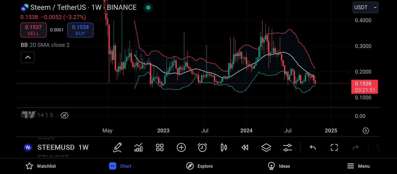
This timeframe is the weekly timeframe, and here I was able to identify the direction of the market, I could see that the market is currently in a bearish move and it is gradually approaching iys oversold region.
And when the market gets to an oversold region, we can expect the market to be accompanied by several bullish moves.
Also from the above screenshot, we can see that the market is trading below its 20lenght simple moving average indicator and this is a confluence that the market is in a bearish trend.
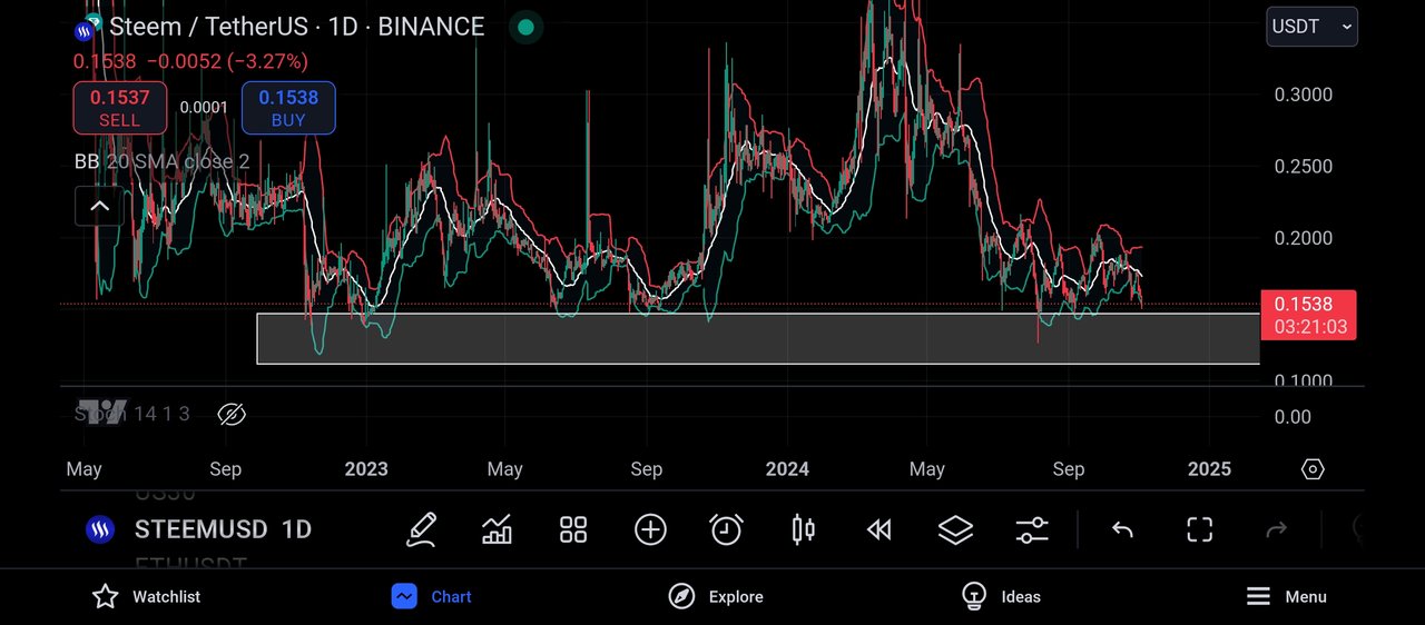
As a multiple timeframe trader, I then moved to the daily timeframe, and here my sole purpose is to identify the horizontal support level of the price chart, as I will take this as a confluence to trading the bollinger band indicator.
On this timeframe, I realised that the market has made several touches on its support level and has found it difficult to break below, and when the market trades towards this level again, I will place my buy order in the market.
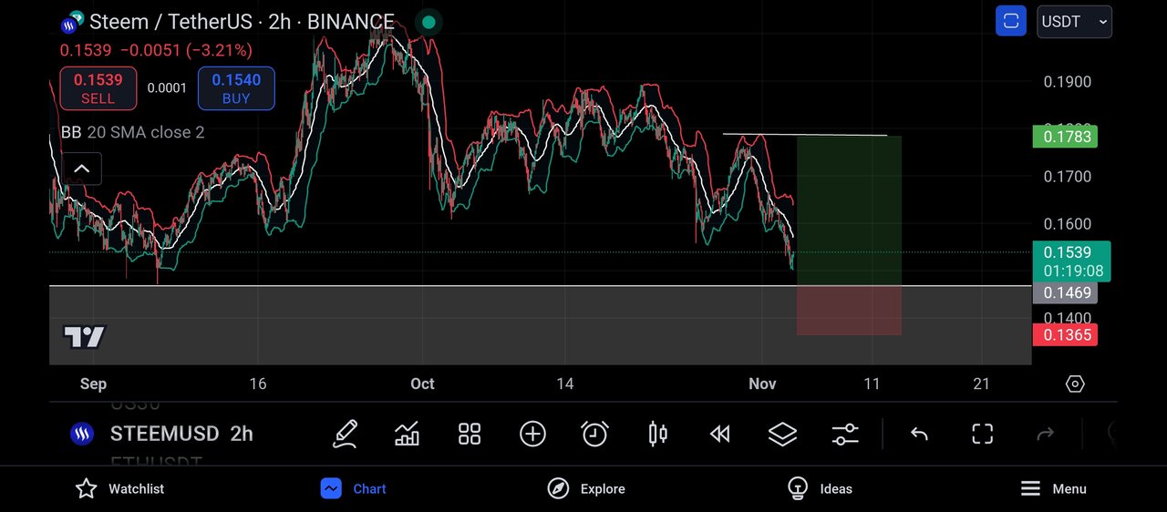
And finally, I move to the 2hr timeframe, and here I see that the market is about to trade towards its support level, and this level is also seen as its oversold region.
And my take profit as seen above was placed on the upperband of the bollinger band and my stop loss was placed in a way that I'll get a risk to reward ratio of 1:3.
CONCLUSION
The bollinger band indicator is a very effective indicator in the market that is used to identify overbought and oversold regions in the market.
And also with the use of the bollinger band, we can identify potential support and resistance level, which will help a trader to make profitable trading decisions.
.jpg)
Comments