SLC21/WK2: Introduction to Logo Design
6 comments
This is my homework post for Steemit Learning Challenge Season 21 Week 2 assignment of Professor @lhorgic’s class, Introduction to Logo Design.

Note :
- I performed this task on Windows 10 PC, Google Chrome.
Task 1 - Discuss Logo design based on your understanding about the topic
A logo is an identity. Through its concise form, it carries everything related to the entity it represents: mission, vision, goals, values, personality. Therefore, a logo is expected to be able to carry out this task: explaining the entity it represents to viewers.
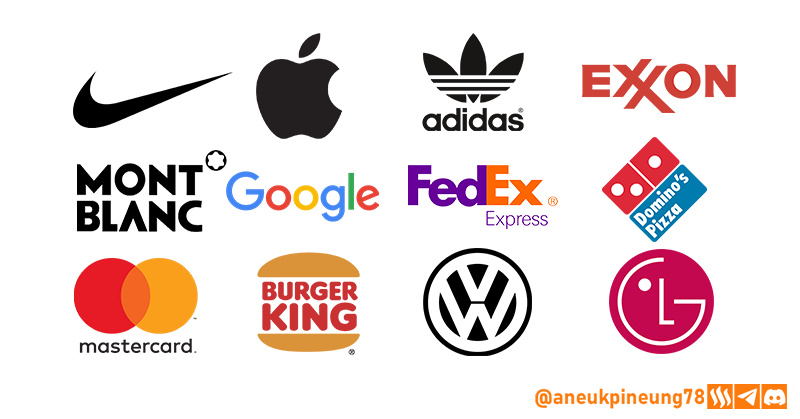
Logos are created by utilizing the play of shapes, colors, or typography and combinations thereof. Some examples of entities that utilize shape play in their logos are: Nike, Apple, Adidas. While those that utilize typographic play include: Exxon, Mont Blanc. And these entities make use of color play in shapes and typography in their logos: Google, FedEx, Domino's Pizza, Master Card. There are also those that utilize a combination of typography and shapes, such as the logos of Burger King, Volkswagen, LG.
The basic principles of a good logo include:
- Memorable. An iconic logo is easy for consumers to remember and recognize, thus leaving a strong impression and helping in creating customer loyalty. We all want to be remembered for our services and products, right? Make the logo memorable!
- Relevant. The logo should be relevant to the brand or company. This means that the logo should reflect what the brand offers or the values it upholds, without having to directly indicate a specific product or service. For example, a barbershop business can be represented with a simple logo of scissors and combs, and text that leads the user's imagination.
- Simple. A simple logo is more memorable and easily identifiable to the entity it represents. Simple designs are also more flexible, so they can be adapted in different sizes and formats.
- Versatile. The logo needs to be flexible and workable across different media and situations-digital or print, large or small, in color or black and white. Testing in different backgrounds and sizes ensures that the logo remains legible and does not lose its essence.
- Timeless. A good logo is one that can last a long time and is not easily affected by temporary design trends. Although we often see the renewal of an entity's logo, which is sometimes so massive like Twitter to X when it was bought by Elon Musk, and there are also simple changes such as the change of the Mozilla Firefox logo throughout its history which plays more on color gradations but does not change the basic shape of the logo so much.
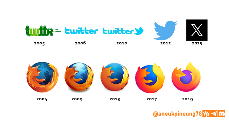
From various sources on the internet. Image is clickable and might show larger resolution.

Task 2 - Discuss extensively the role and impact of logo to a brand
Since a logo is a representation of an entity in the form of an image, it plays a crucial role in building a brand's identity and image. The main role of a logo can be broken down into, among others:
- Visual Identity. A strong logo can make the brand more memorable to the audience, so that they can immediately recognize and associate the brand with the logo, even from afar or in various media.
- Brand Value and Personality. As we have discussed above, a logo should represent the values, vision, mission, goals, and personality of the entity it represents, including the brand.
- Differentiate from competitors. A logo is a visual identity, so it must be unique and different from competitors.
- Reinforces customer loyalty. Customers who are satisfied with a brand will definitely be loyal to the brand. The more often customers see a consistent logo across multiple platforms, the more likely they are to feel connected to the brand.
- Can show changes or updates. When there is a change in the logo as experienced by Twitter until it became X and also experienced by the Mozilla Firefox logo as we talked about above, this can indicate a change or update, both in terms of management and vision, mission, brand personality.
- Can make a strong first impression. A good, professionally designed logo can instill a deep first impression on the audience.
While the influence that a logo can have on a brand, among others, are:
- Explaining about the product or service offered to potential customers.
- Making the audience understand at a glance the vision, mission, personality of the entity represented by the logo.
- Making the entity it represents look unique and separate from competitors.
- At some point, it can influence the decision of potential consumers to buy goods or use the services offered or not.
- A good and relevant logo will make the entity it represents embedded in the audience's memory.

Task 3 - Explain and demonstrate visually the do's and don't when it comes to Logo design. You can do more research to be outstanding and kindly ensure not to use my specimen logo
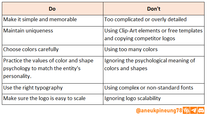
- Do : Make it simple and memorable; Don't : Make it too complicated or overly detailed. A simple logo is easier to remember and gives a better first impression than a logo that is too complicated and detailed.
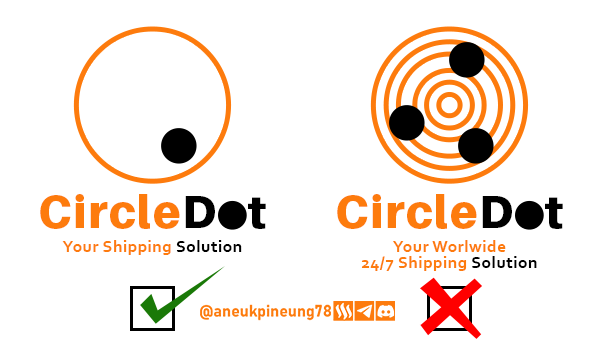
Image is clickable and might show larger resolution. - Do: Maintain uniqueness; Don't: Use Clip-Art elements or free templates and copying competitor logos. Using clip-arts or templates will make the logo unoriginal and may end up with similar logos to competitors.
- Do: Choose colors carefully; Don't: Use too many colors.
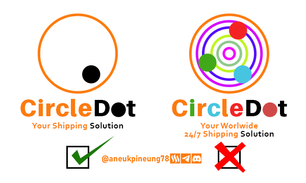
Image is clickable and might show larger resolution. - Do: Practice the values of color and shape psychology to match the entity's personality: Don't: Ignore the psychological meaning of colors and shapes. Colors and shapes will symbolize certain values. One of the following logo consists of two circular shapes which means something global, comprehensive, and consists of two colors: 1) orange, which carries the psychological meaning of energy, enthusiasm, creativity, optimism, friendship, vitality, and 2) black, which means strength, authority, elegance, seriousness, formality. While the other logo contains so many colors that it is so complicated, it has no clear personality.

Image is clickable and might show larger resolution. - Do: Use the right, simple, yet elegant typography; Don't: Use complex or non-standard fonts. Readability is one of the main reasons here. By ensuring readability, the entity represented by the logo will stick in the audience's memory more easily.
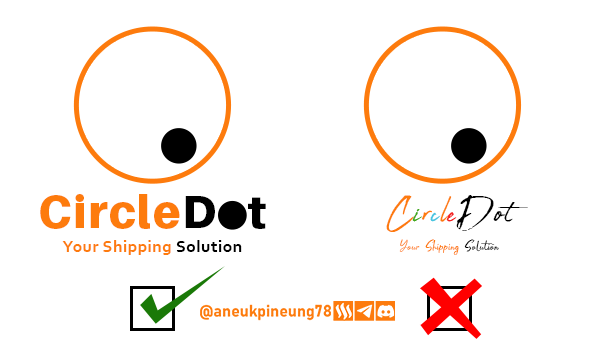
Image is clickable and might show larger resolution. - Do: Make sure the logo is easy to scale; Don't: Ignore logo scalability. At some point, the logo might be printed on different materials with different sizes: mugs, leaflets, shirts, banners, and so on. Therefore, make sure that the logo has no problems when it will be printed for different purposes.
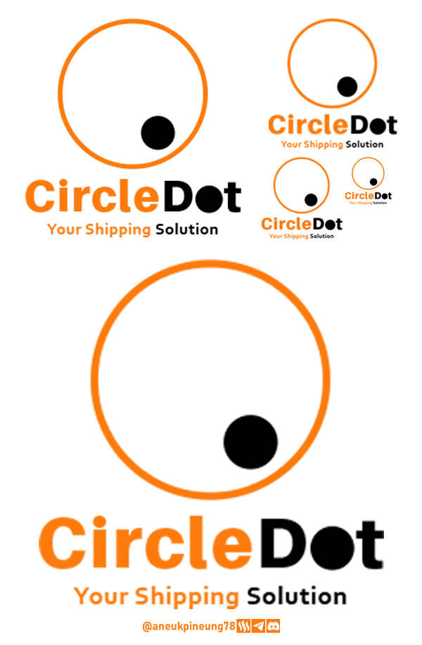
Image is clickable and might show larger resolution.

Task 4 - Design a simple logo with the knowledge you have gotten from this lesson by assuming that a client gave you a job to design for his brand (business). The outcome of your design should clearly tell what kind of brand/business organization you designed for. Also do well to be well detailed in your design.
So the story is, I'm going to create a simple logo in Canva for a barbershop called The Barberhood.
- I opened Canva and clicked the [Create a design] button.
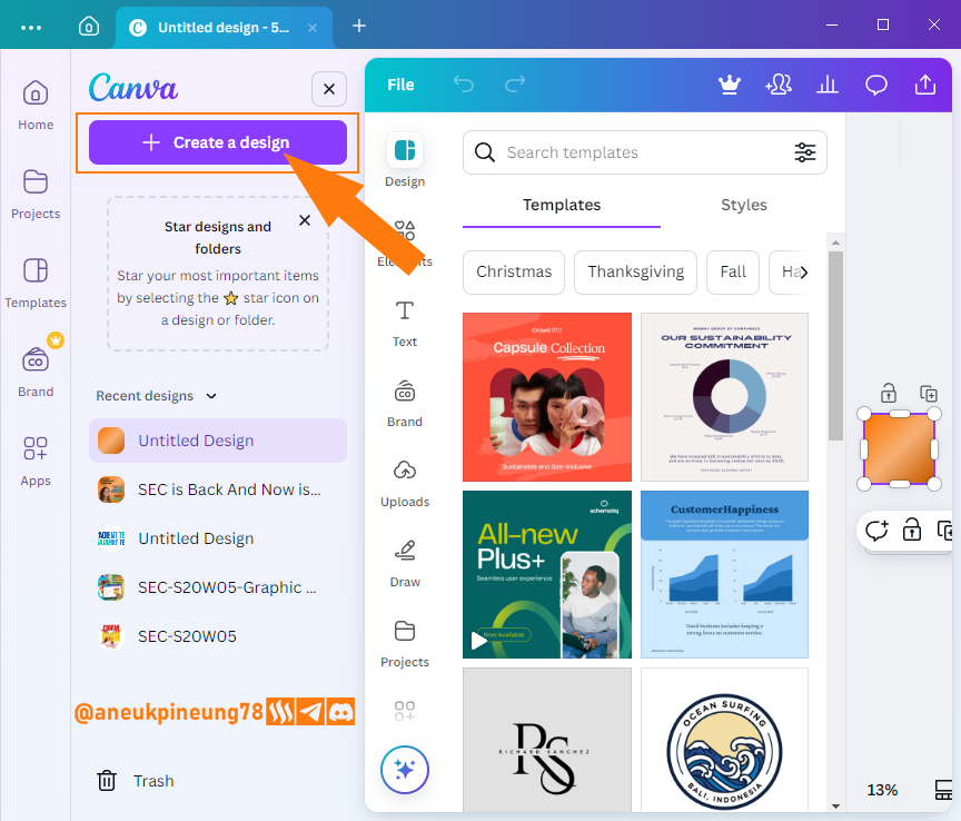
Image is clickable and might show larger resolution. - I chose the design's default size for Instagram, which is 1080 x 1080 pixels.
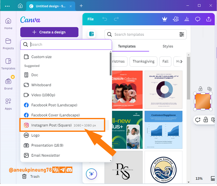
Image is clickable and might show larger resolution. - A canvas of 1080 x 1080 pixels with white background opened in Canva.
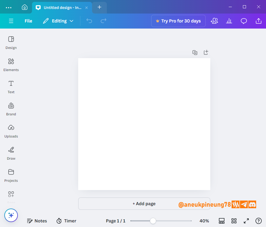
Image is clickable and might show larger resolution. - I uploaded a new file for the design I was going to make.
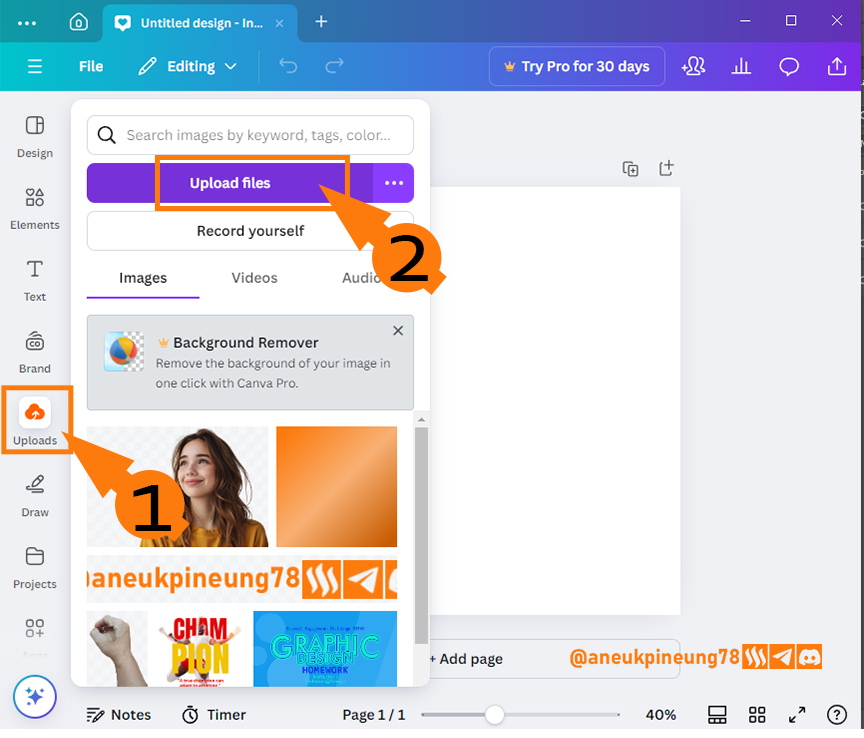
Image is clickable and might show larger resolution. - I browsed my PC and searched for the two files that I had prepared earlier, namely the images of scissors and transparent combs that I created through Adobe Photoshop 2021.
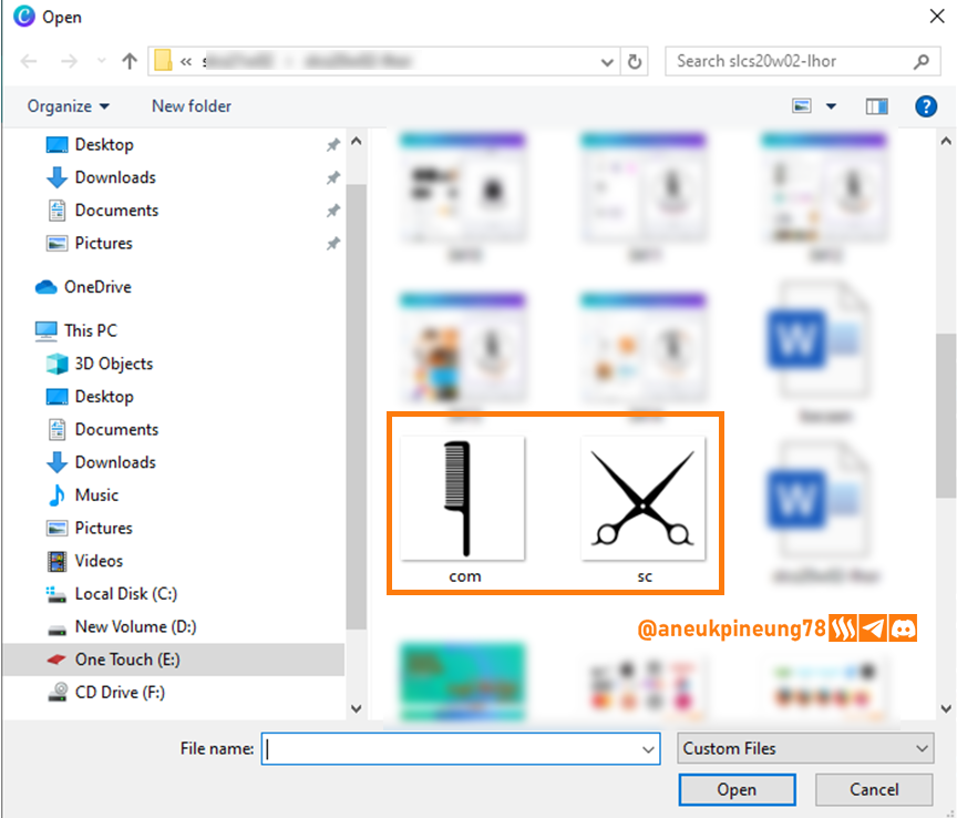
Image is clickable and might show larger resolution. - Both files were uploaded to the Canva library, I clicked on them to insert them into the canvas.
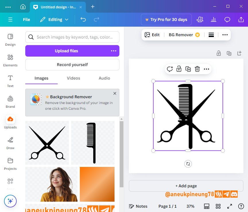
Image is clickable and might show larger resolution. - Next I added text to the logo.
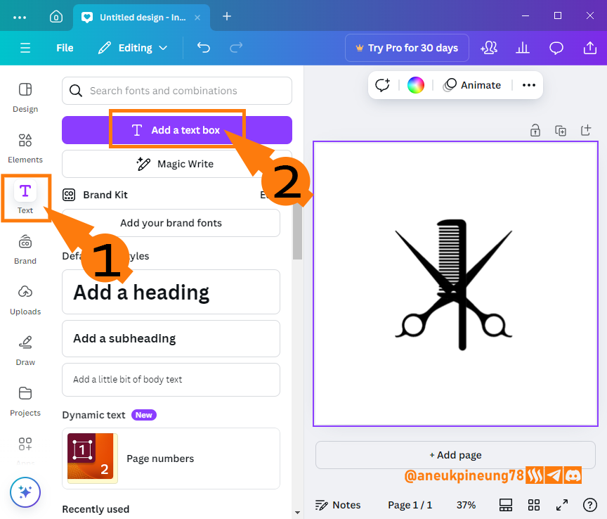
Image is clickable and might show larger resolution. - Now the logo has had text which is the name of the brand as the entity that will be represented by the logo.
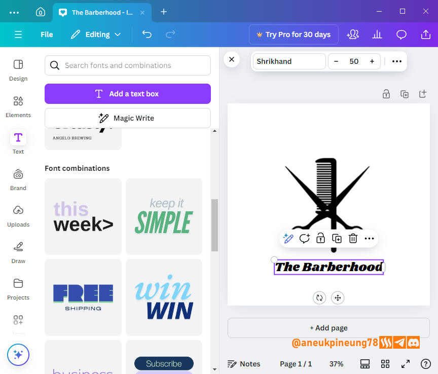
Image is clickable and might show larger resolution. - I then decided to make this logo in round shape, so I gave the text a curved effect.
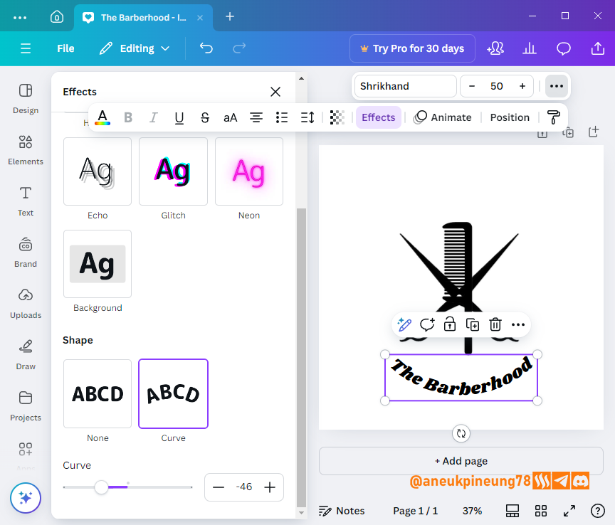
Image is clickable and might show larger resolution. - I added a circle from the Element dialog window.
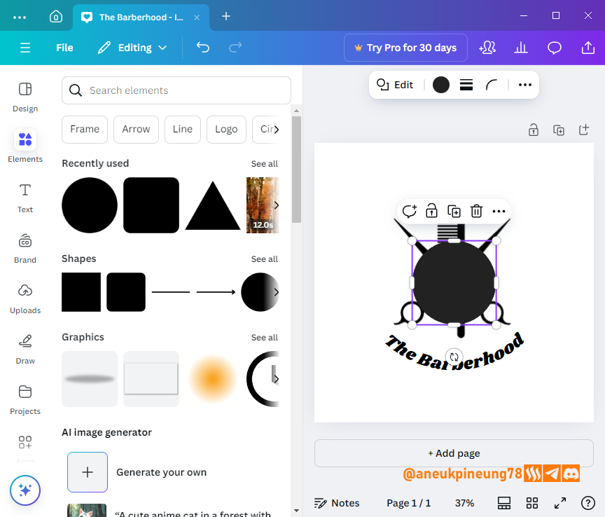
Image is clickable and might show larger resolution. - I changed the color of the circle so that it matched the color of the canvas, and then gave it a black stroke (outline). Then I adjusted the size and placement in such a way that it harmonized with the rest of the design elements.
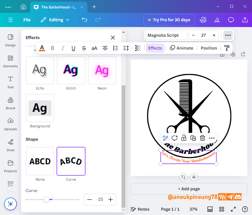
Image is clickable and might show larger resolution. - Next I added the tagline, and gave it a dynamic effect by including a new color, a variant of orange, which was
#fa741f.
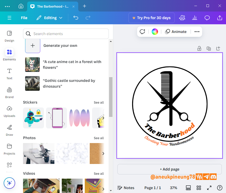
Image is clickable and might show larger resolution. - The next touch was for me to insert an image ownership watermark.
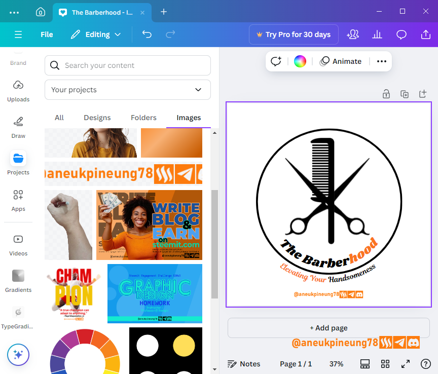
Image is clickable and might show larger resolution. - I then created an alternative model of the logo.
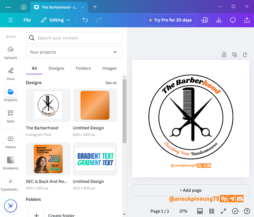
Image is clickable and might show larger resolution. - At last I had 4 logos to choose. I hoped my friend would be pleased.
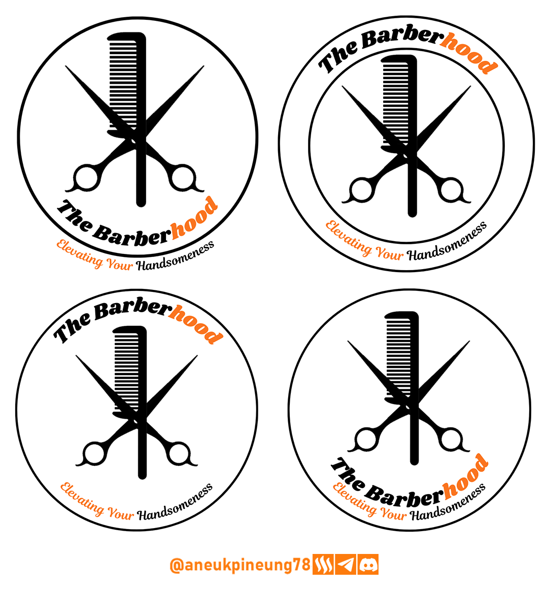
Image is clickable and might show larger resolution.

Thanks
Thanks Professor @lhorgic for the lesson. Inviting @anroja, @dhisky, @rayfa.
Pictures Sources
- The editorial picture was created by me.
- Unless otherwise stated, all another pictures were screenshoots and were edited with Adobe Photoshop 2021.
Sources and Reading Suggestion
- https://thefutur.com/content/the-best-logos-ever-designed-are-simple
- https://journal.ubaya.ac.id/index.php/jimus/article/download/3423/2557#:~:text=Logo%20merupakan%20salah%20satu%20aspek,kualitas%20suatu%20produk%20atau%20brand.
- https://journal.stimaimmi.ac.id/index.php/aliansi/article/view/463
- https://www.tailorbrands.com/logo-maker/why-a-logo-is-important
- https://www.manypixels.co/blog/brand-design/why-logo-design-is-important
- https://medium.com/@LibraReview/the-impact-of-logo-design-how-a-symbol-can-shape-a-brands-identity-and-success-2f9d756bc288
- https://www.thinkdonson.com/blog/revamp-your-brand-identity-the-impact-of-a-logo-update
- https://keylaydesign.com/how-logo-design-impacts-your-brand-peoples-perception-of-it/


Comments