SLC | S21W 3 | Logo Design - Part 2
2 comments
 |  |
|---|
Designed with canva
Greetings friends!♥️ I'm so glad to participate in this activity. Today we will be discussing logo design. Logo design is a very essential aspect of any business. Thus, care must be taken in this area. If a business is to sell very well and gain maximum audience, then the company or individual running the business must have a compelling logo as well as a slogan to demonstrate its features and attract public attention.
I'll have listed the types of logos with examples as well as when it can be used and when it may not be appropriate to use the logos.
. Discuss about each of the logo types we have and then talk about conditions when such a logo should be used and when not to be used for a brand. You can do a little research to aid you.
We discussed seven types of logos in this lesson. Below is my explanation of each type.
MONOGRAM LOGOS
Monogram logos are mostly used to represent the initials of a person or business. It consists of a combination of one to three letters at most to create a single symbol. Example in Nigeria we have Nigerian National Petroleum Company and it has been shortened simplified as NNPC which is widely called that way by everyone
WHEN IT CAN BE USED
These logos can be used for an already established business and a business that is well known among people
Can be used for companies with long or difficult-to-pronounce business names
It can be used to simplify names
WHEN IT CANNOT BE USED
It should not be used for a business that has just begun or hasn't yet achieved public notice
It should not be used for names that are already simple, short and easy to pronounce. Example Nike doesn't need a monogram logo anymore as it is already short.
MASCOT LOGOS
These logos are used to convey the personality or identity of a business. It often has a character or symbol attached to represent the company.
WHEN IT CAN BE USED
Mascot logos can be used when an individual is intending to create a fun and playful personality or outlook.
It can be used to create an impression that an activity is simple and easy to learn. Example sport teams can use a mascot logos to imbibe friendly competitions and team spirit
WHEN IT CANNOT BE USED
It should not be when offering serious professional services. For example a law firm cannot use mascot logos for such a service as it doesn't match the profession.
A healthcare industry can use mascot logos as well because it is a more serious business dealing with lives.
EMBLEM LOGOS
Emblem logos are logos that have a symbol surrounded by text most times the company's name as the text. It is more detailed and contains information such as the company's goals or a slogan alongside.
WHEN IT CAN BE USED
Emblem logos can be used for brands that are already established
It can be used for professional services
WHEN IT CANNOT BE USED
It cannot be used for individuals who are new to a business or trendy
ABSTRACT LOGOS
Abstract logos are logos that often hse shapes, colors and forms to create a design pattern. It consists of curves, icons and others styles of typography and fonts to convey an idea
WHEN IT CAN BE USED
It can be used for brands that are recognisable at all times and are popular
It can be used for brands that seeks to convey a sense of modernity or technology
WHEN IT CANNOT BE USED
It cannot be used if a brand is not well known or cannot be recognized easily
if a business offers simple services that are straight forward then abstract logos are not ideal
BRAND MARK LOGOS
Brand mark logos are logos that are often wordless. They use symbols to represent or convey a message without the use of words. Example the iPhone uses an apple symbol as a brand mark for an apple product.
WHEN IT CAN BE USED
If you want to appeal to the younger audience or age group, a brand mark may be ideal
If your brand name is difficult to remember or even hard to pronounce then a brand mark can be used to help the audience recall easily
WHEN IT CANNOT BE USED
If a company's brand name is already a word or a phrase then brandmark logos are not necessary.
If the audience are more local or traditional nature, it may not be ideal to use the brand mark logo
COMBINATION LOGOS
Combination logos are logos that combine words and symbols together to achieve a desired result. Example Microsoft uses the word and a symbol , pepsi and coca-cola uses the same
WHEN IT CAN BE USED
It can be used to convey two different messages or two service or product a company may be offering
It can also be used if a company decides to introduce a new product into a market and wants the product to be widely known soon.
WHEN IT CANNOT BE USED
If a business or brand is new to the market, combination logos may be distracting and the target audience may find it difficult to recall the exact service provided or the actual message to be passed
If the brand already has a simple message, combination logos may not be ideal as this will make the whole message complex
WORDMARK LOGOS
Wordmark logos are logos that consist of text and use few words to represent a brand. Example CNN, and Facebook which uses only the "F" letter
WHEN IT CAN BE USED
It can be used if the individual sees that the acronym to be formed from the brand sounds or looks more memorable and unique than the word itself
It can be used if the Individual seeks to simplify the word or make it short and easy to grasp
WHEN IT CANNOT BE USED
It cannot be used for long brand names. Since the aim is to shortened the name to the best acronym possible, it would be wise to still maintain a long array of letters as they can still be hard to remember
• Pick any two (2) of the Logo types discussed and then practically demonstrate how to make them, showing your detailed process.
I choose the combination logos and the Mascot logo.
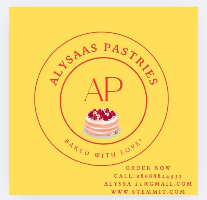
For the combination logo
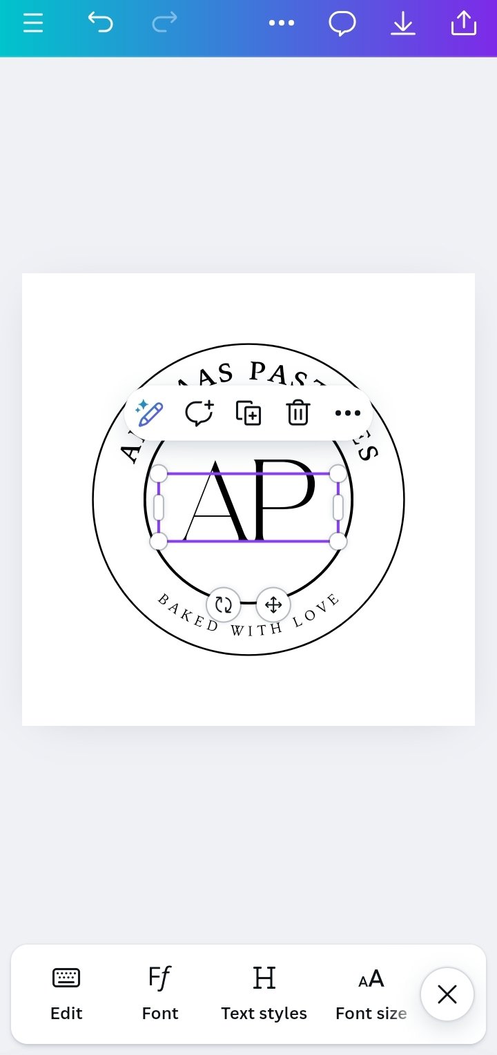
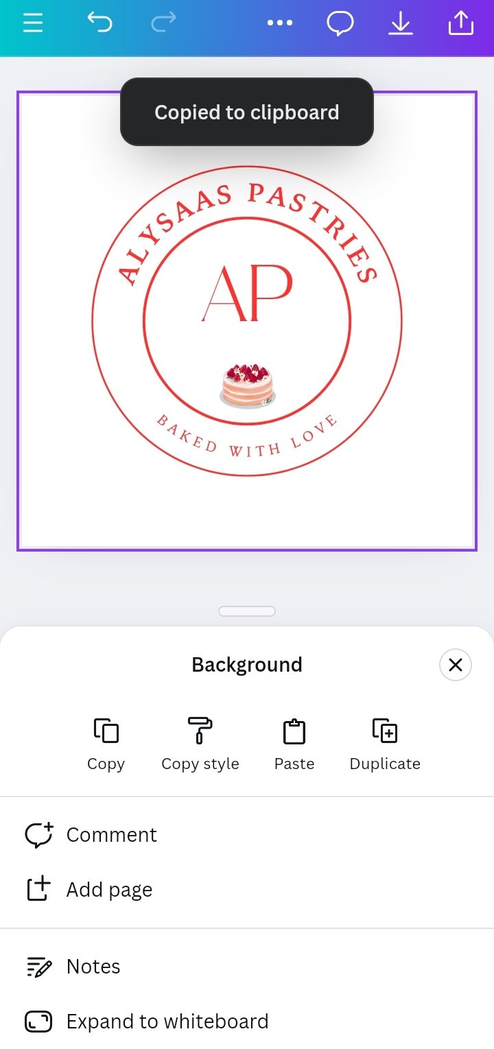
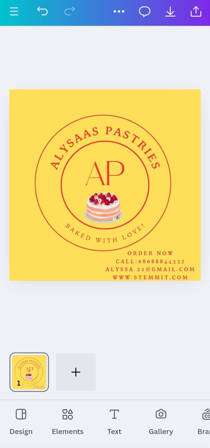
1 First, I drew a big circle and then a smaller one and inputted the brand name. In the middle is the acronym of just two letters
2 Next I attached the cake design as a combination of both words and symbols
Then I added a catchy slogan "Baked with love"
3 Next for the flier I made the background all yellow and added the logo making it yellow too to rhyme and finally added the contact information.
 |  |  |  |
|---|
• Design a simple flier for your brand and then strategically place one of the logos you made in the flier.
For the flier and logo to be strategically placed
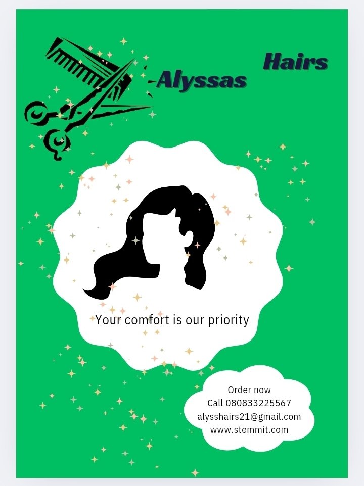
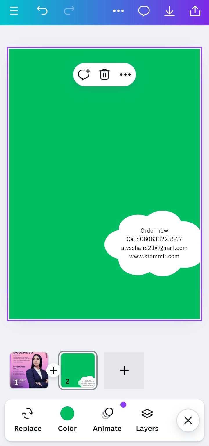
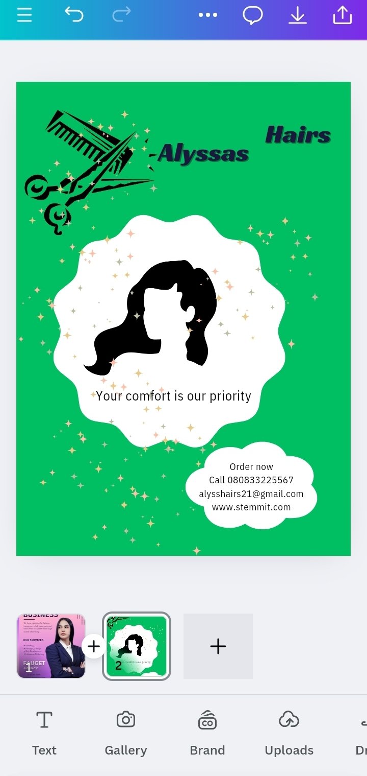
1 First I created my workspace on the Canva app.
2 Next after testing a few colors I chose light green as the background.
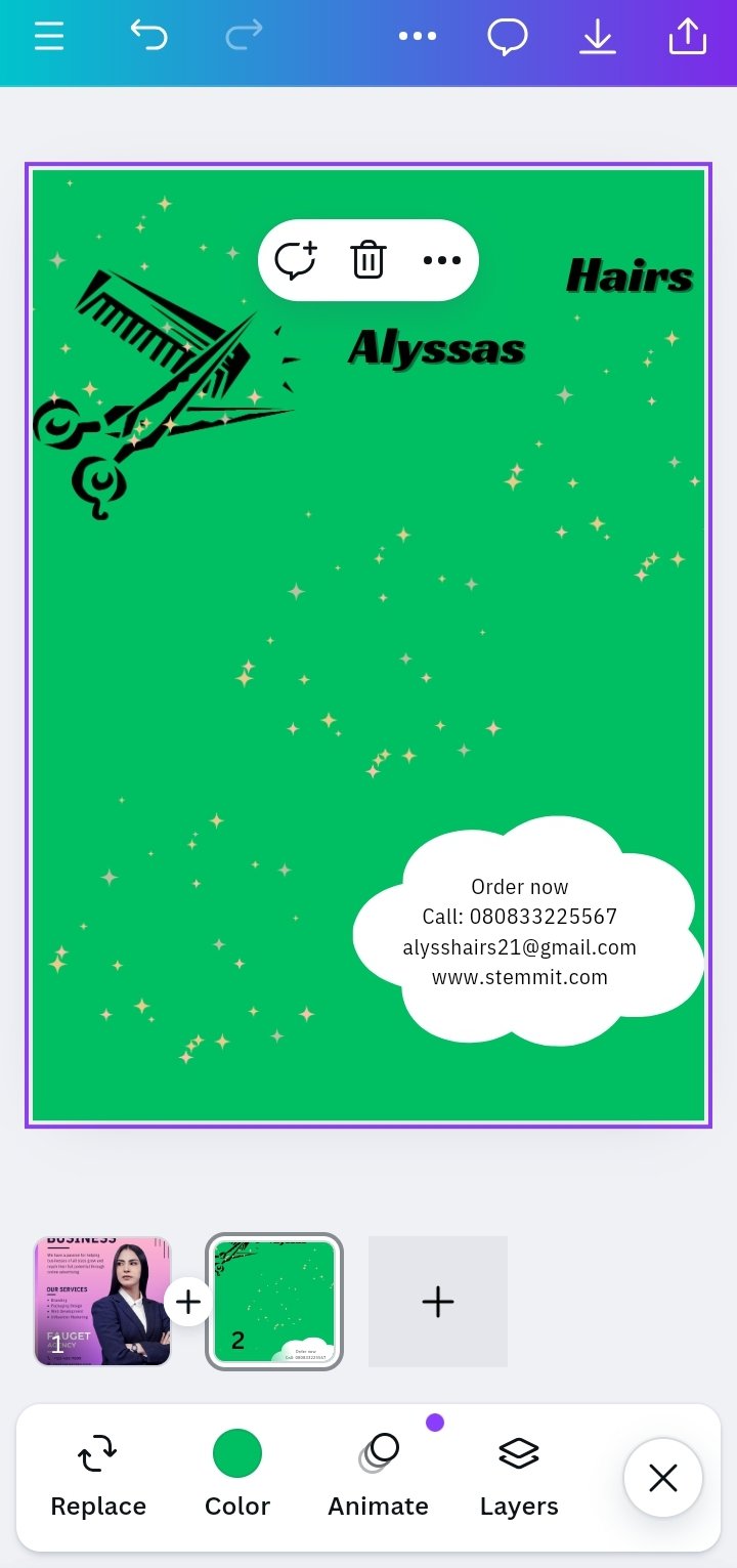
3 Then I attached the scissors symbol depicting a hair business obviously.
4 Next I decorated my flier with some stars.
5 Then I created a space for the contact information, which I attached at the lower right corner.
6 Finally I attached the brand name and arranged my design as shown below.
 |  |
|---|
For the logo
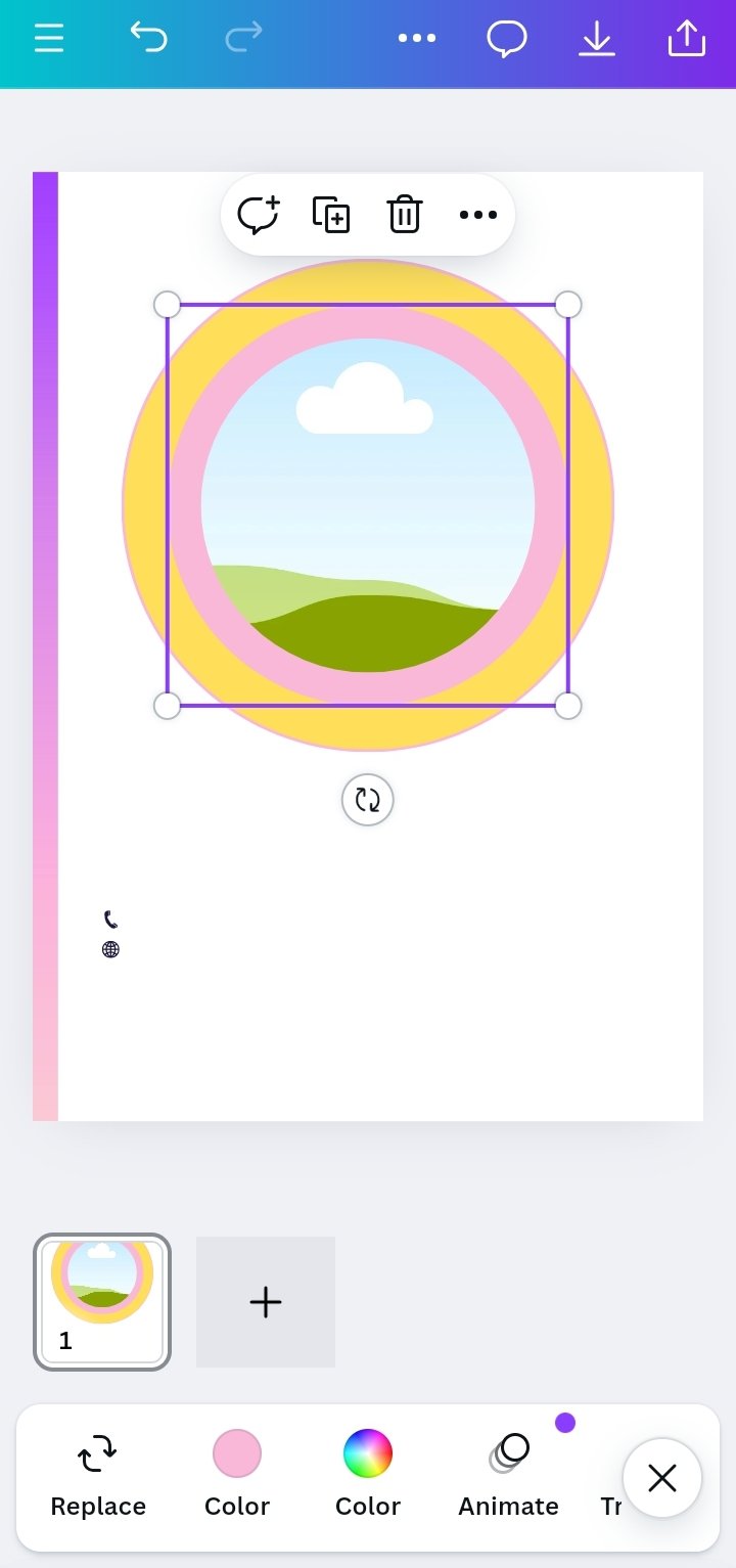
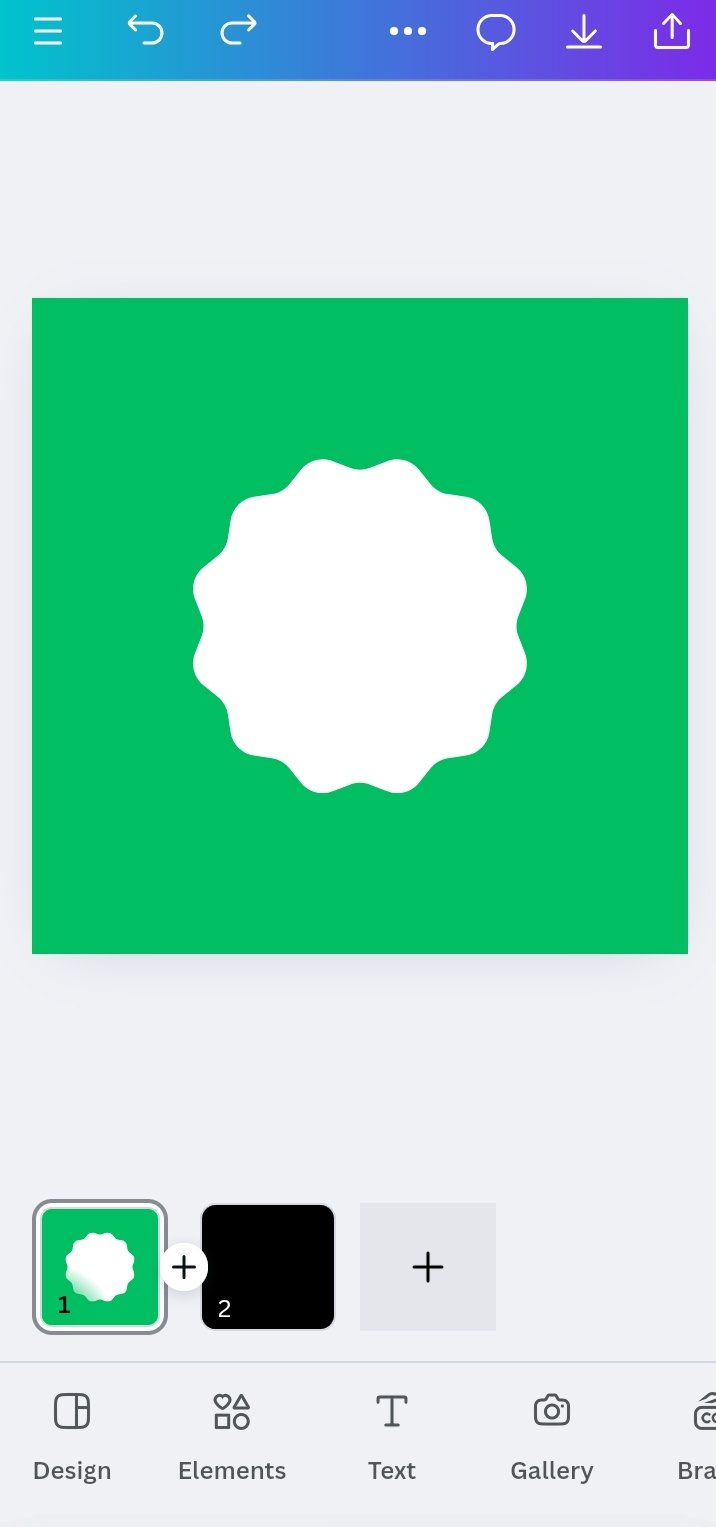
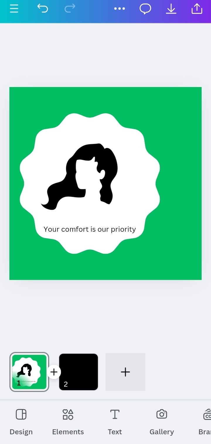
1 I used a green backyard as well to match with the flier. Next I used the circle shape with designs at the center
2 After which i positioned the diagram to be used and then attached the slogan just below the hair diagram
3 Then i placed the logo on the flier and made sure all angles are correct and balanced
The end result is seen below
 |  |  |
|---|
This is also an example of a Mascot flier which has a character or symbol (the hair diagram) and clearly depicts the type of business the individual is into - selling of hairs and can be easily understood by anyone seeing the flier
I enjoyed this activity and I've also learnt a lot of new ideas myself. I hope you enjoyed the blog too!♥️
I invite @goodybest @lovinah @ngoenyi
Comments